Drawing like a pro - 97, Masterclass -The Last Supper by Da Vinci - Lights and shadows study - part I
Hi friends!
We will now deal with the spots that allow us to define the illuminated areas and those that are in shadow.
The first thing we must look for is the light source.
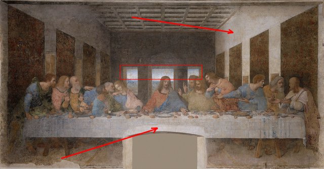
We notice here that the light is coming from the front left side, we can't see the source but we can see its results. The wall on the right and the front of the table are the brightest, as opposed to the dark wall on the left. At the top, on the ceiling, we can also see how the light falls and deduce where it comes from.
There is also another light source, the one from outside the room, which can be seen through the windows in the rear wall in the background.
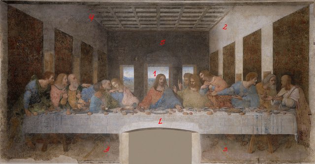
Here I have marked from the brightest parts, starting with 1 to the darkest, number 5 on the back wall.
We will keep this in mind throughout the drawing process.
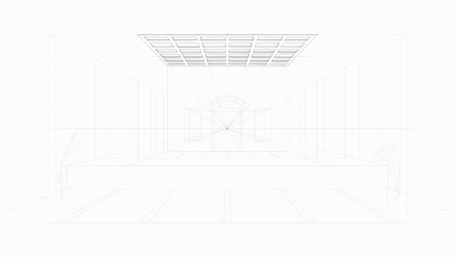
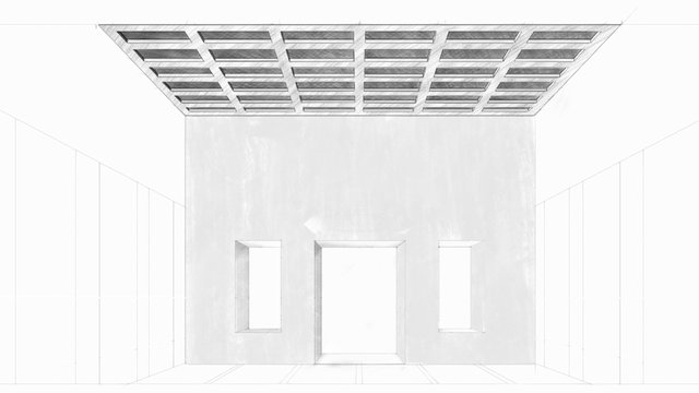
This is the drawing as we left it in our last lesson.
Well, the first thing we have to do is erase some vanishing lines that we no longer need, in case they are visible enough to harm our light and shadow work.
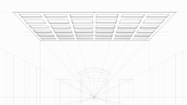
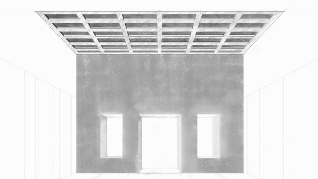
Once the lines have been erased, we can start by darkening the ceiling a bit as shown below.
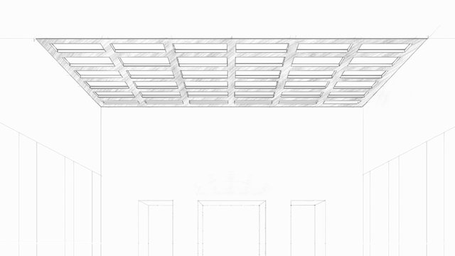
We then continue to darken the inside of the boxes that make up the ceiling. Do this by drawing several layers of greys until you feel they are dark enough.
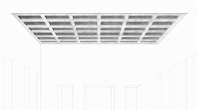
Notice that the inner, visible sides of the boxes on the left side are very dark, while those on the right side are very light. This tells us the direction of the light (that's for the three columns on both sides).
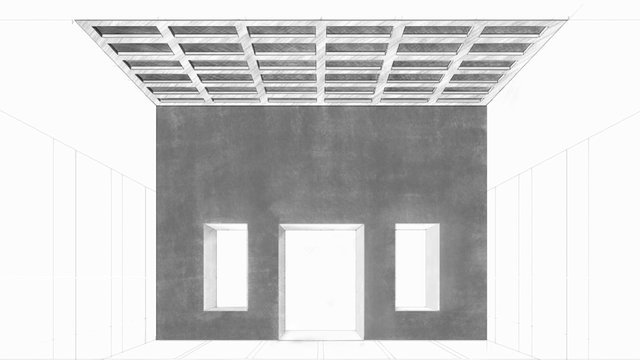
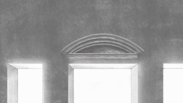
In the same way as before, we start with the back wall, paying attention to working the sides of the windows letting the left sides be a bit darker than the right ones.
By further darkening the wall, you will notice the effect on the side walls of the windows.
Darkening the wall even more...
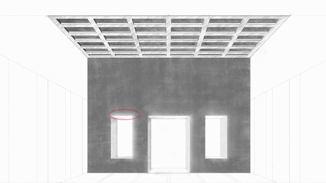
Here is a small detail, small but important. Compare this image with the previous one. Look at the edges of the windows... there is a very subtle luminosity on all the inside edges of the windows except on the left edges.
This is a result of the exterior light that enters here.
You can get this effect by making weaker strokes in those areas when drawing or by removing some of the graphite on the edges with an eraser.
Here I have drawn the frieze.
You can do this by reserving this blank place for the frieze when you work on the wall, or by erasing afterwards. Take care of the good integration between both surfaces, the wall and the frieze. Notice how the direction of the light is also signalled here by darkening the inner left sides more.
Here I have stained the side walls and the floor to start seeing the tonal value as a whole. Notice how the left wall was drawn darker than the right.
It is very important to pay attention to those details to maintain consistency in the drawing.
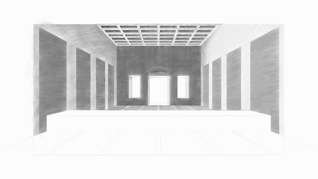
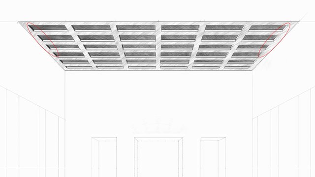
For example, look at the previous image... you will notice that the ceiling is lighter in relation to the whole. So I had to make it a little bit darker, maybe later I'll need to make it even darker, I don't know yet.
I wish you a very nice day and good exercise!
Well, our friend @arcoiris is back with his magnificent watercolour lessons.
Here are the links to the previous related posts.
1 - 2 - 3 - 4 -
5 - 6 - 7 - 8 - 9 - 10 -
11 - 12 - 13 14 - 15 -
16 - 17 - 18 - 19 - 20 - 21 - 22 - 23 - 24 - 25 -
26 - 27 - 28 - 29 - 30 - 31 - 32 - 33 - 34 - 35 - 36 - 37 - 38 - 39 -
40 - 41 - 42 - 43 - 44 - 45 - 46 - 47 - 48 - 49 - 50 - 51-feedback - 52-Masterclass - 53-Homework Contest #6 - 54-Lesson - 55-Lesson - 56-Lesson - 57-Lesson - 58-feedback - 59-feddback - 60 Masterclass - 61-HW Contest #7 - 62-Lesson - 63-Lesson - 64-Lesson - 65-Lesson - Lesson-66 - 67-feedback - 68-feedback - 69-feedback - 70-Masterclass - 71-Homework Contest #8 - 72-Lesson - 73-Lesson - 74-Lesson - 75-Lesson - 76-Masterclass - 77-Homework - 78-Lesson - 79- Lesson - 80-lesson - 81-feedback - 82-lesson - 83-Masterclass - 84-HW contest - 85-feedback - 86-lesson - 87-lesson - 88-lesson - 89-feedback - 90-feedback - 91-lesson - 92-Masterclass - 93-Masterclass II - 94-Masterclass III - 95-feedback - 96-lesson
Also, thanks to @xpilar for making these initiatives possible with their great support.
Light and shadows usually well seen in black and white. I am glad that oyu went through the explanation and giving the numbers so that is possible to see how dark is darkest area and light the others.
The ceiling looks great, due to small cells with their contrast of different intensity of shadows. It came out really nice.
Hi Stef, thanks for stopping by and for your great support!
It is interesting to observe the birth of volume :)
Yes, it is a pleasant experience.