Steemit Development Incentive Programme | Some Important Feedback and Suggestions For The Development of Steemit
Made with Canava
Since, I joined steemit I'm literally in love with this platform because it is unique from all other blogging platforms and I feel independent here. So, to make this platform more efficient, beautiful and user-friendly, I am going to add my feedback/suggestions here.
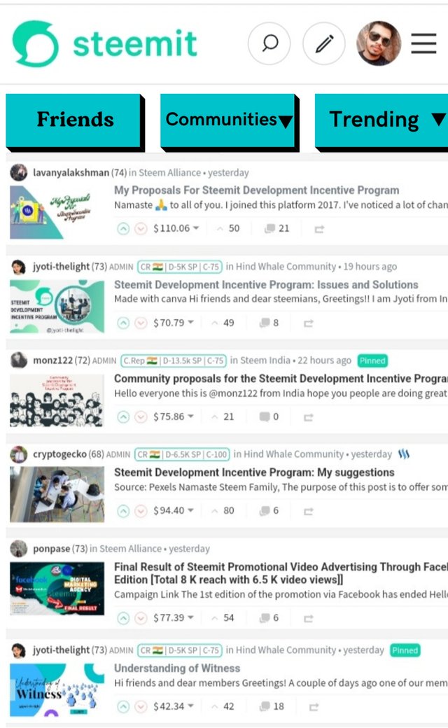
The Post Feed |
|---|
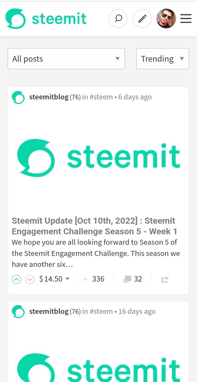
When, I first opened the steemit the first page I saw was the post feed and I didn't like it too much because it showed me the articles or posts which are trending but not the users I follow and it priorities communities over users.
So, I suggest that please add one more tab on the feed page for the friends without any drop down, another for the community and the third one for sorting the posts.
Made with Canava
And we have to change the sorting categories too. We must include, trending, new and muted and must exclude the payout as it is not necessary because a user will be interested in seeing posts which are new or best no one searches posts on the basis of payout.
I know steemit is an independent platform and everyone can see all the transactions, comments and likes of everyone, but as a category for sorting, it is not necessary.
The Posting Page |
|---|
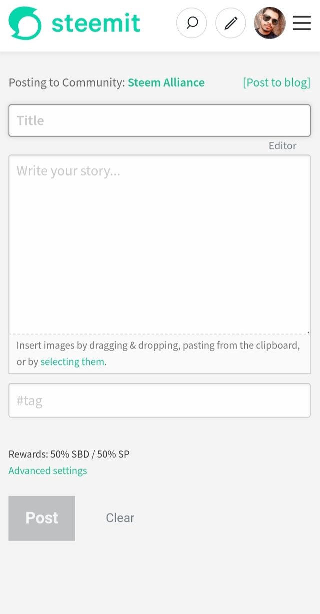
The posting page lacks a lot of tools. Not only lack it is just blank, so, we have to add some important tools here which will help us a lot in writing, we must add tools like bold, highlight, font, font size, colour, alignment etc.
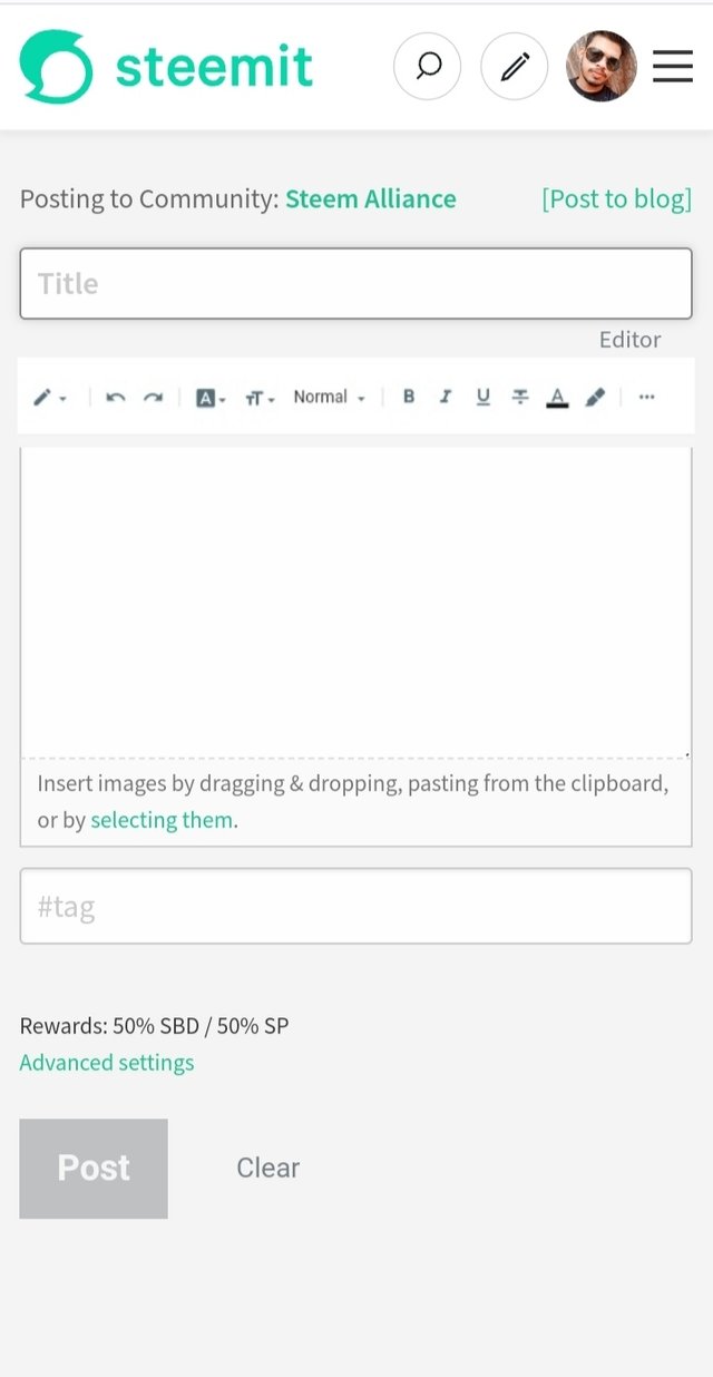
I know we can use markdowns to design our text, but it is a manual thing and not friendly for beginners either. So, we have to use the latest features to make our platform the best.
The Search Bar |
|---|
We will have to upgrade our search bar to make it more relevant. When I search for a topic related to any article, it doesn't show any relevant article to the topic, mostly it shows irrelevant things.
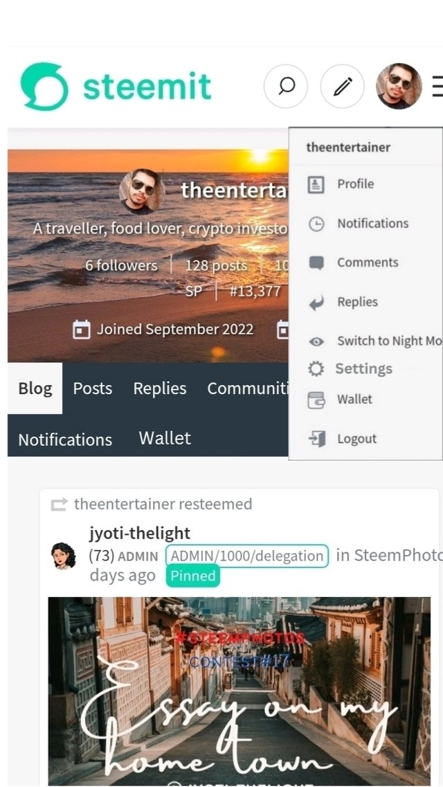
Our Personal Page |
|---|
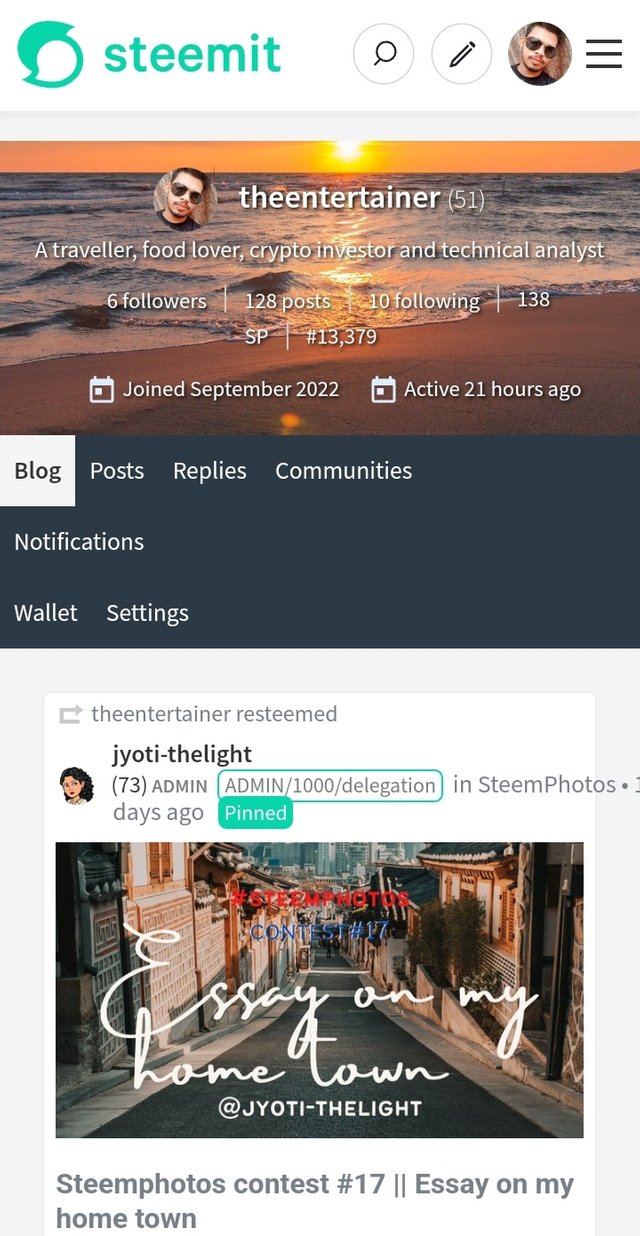
On our Personal Page we have tabs like, blog, posts, replies, communities, wallet and settings.
But the tab interface doesn't look good. It is clean and simple but it is not well designed and arranged, especially in the mobile version. So we have to add some borders between the tabs to separate one from another.
Secondly, we have to move the settings tab to the profile drop-down menu to make the menu a little bit more clean.
As a responsible member and a user, I found out these issues and I would appreciate it if the steemit team found my suggestions useful.
Thank You.
CC:- @hungry-griffin
25% of the post revenue will going to @null
Congratulations, your post has been upvoted by @scilwa, which is a curating account for @R2cornell's Discord Community. We can also be found on our hive community & peakd as well as on my Discord Server
Felicitaciones, su publication ha sido votado por @scilwa. También puedo ser encontrado en nuestra comunidad de colmena y Peakd así como en mi servidor de discordia
Esperemos que tus sugerencias sean tomadas en cuenta amigo .
Me ha gustado la de agregar las herramientas básicas para escribir y así facilitar nuestros momentos de redacción .
Éxito y bendiciones
Gracias por apreciar mi idea amiga.
I agree with you, I too searched several times but I got some unwanted results, the search should be on a keyword basis not a #tag
Thank you, sister.
Very well suggestions bro. all of above suggestions are very important for New commerce... and most important thing is
because It is not possible for all the new members to learn mark down immediately, so if we give such options on the post, then it will be easy for them to start journey in steemit
Thank you so much.