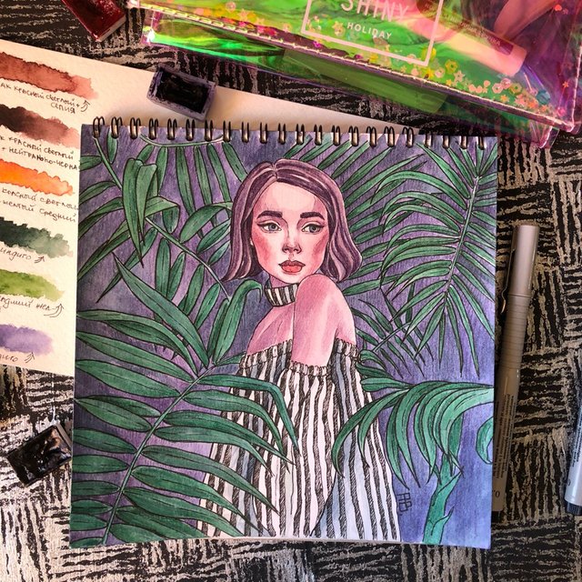
My new art is ready
Hi Steemit friends! My new art is ready.
A lot of bloggers today write about photography and correct processing. But not one of them does not write about how to still shoot the art or objects of our creativity. I will tell from my own experience a couple of tips 😏
❗️Good daylight
This is really very important, although earlier I did not understand it myself. Any other, except the daytime, not only distorts the color gamut of your work, affects the temperature (white balance), but also spoils the quality.
❗️Practice
Do not distort the perspective and all the other foreshortening. Yes, I understand that so many mistakes can be concealed. And, even if there are no mistakes, people will still think that you are hiding them (I know for myself, they criticized me a lot). Thank God that Instagram allows you to add several photos to one post - this is your opportunity, so to speak, to justify yourself. Let one photo be for a beautiful tape, and the second, for example, to "correctly" see the work, straight, without slopes and distortions.
❗️Phone
Nuuuu, everyone knows that it is better to use photophones - special backgrounds for layout and profile unity. But the point here is not only in the general form of your tape, but also in the perception of work in a separate photo. The quality, temperature, color distortion can also depend on the background. For example, I used to shoot pictures on the background of my desk - hence, certain warm colors, the work immediately "turns yellow", not to mention the fact that against such background it is difficult to perceive, merges with the surrounding environment. Creating photophones should be awarded a separate post 😅
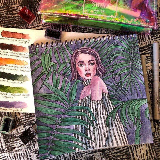
In my opinion, the best colors for the background are basic - black and white, and their design and variations can be used different. The main thing is to make the background homogeneous.
❗️Composition
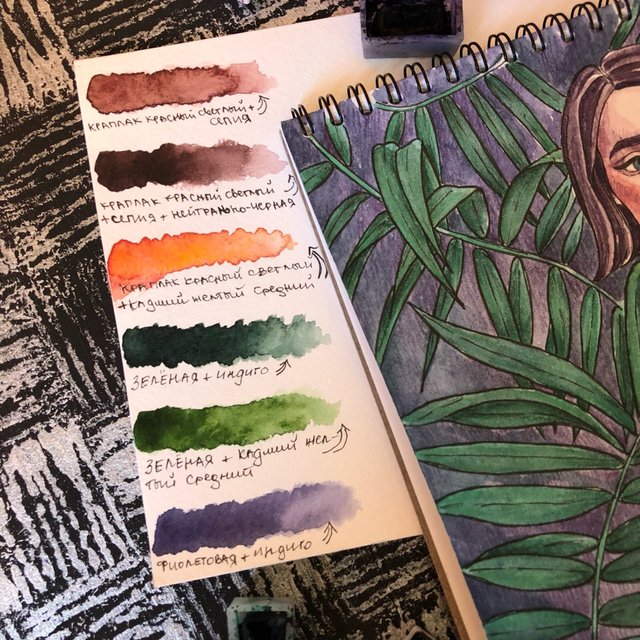
It means the composition of your photo - layout. A competent layout (but not a mess!) Will help make your photo - more beautiful, the profile - more diverse. Plus, you can add information: for example, lay out on the photo only pencils of used colors; add to the work photo-original, from which it was drawn; coloring and much more.
❗️Use popular editors to make your photo even better and fix errors
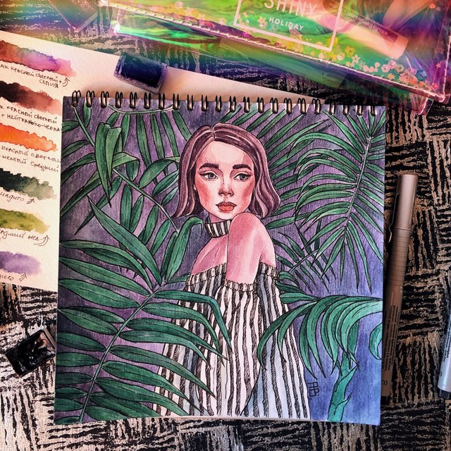
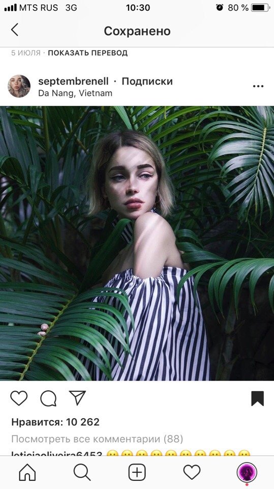
septembrenell
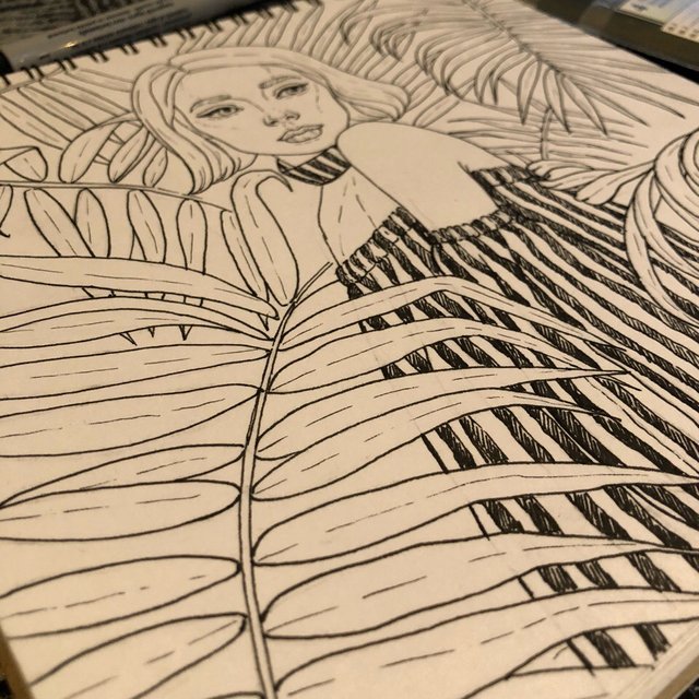
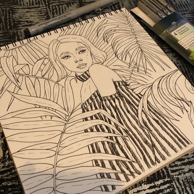
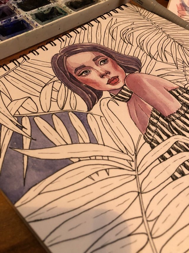
Process:
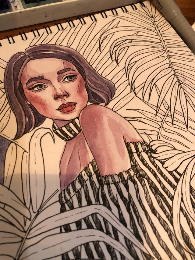
Done:

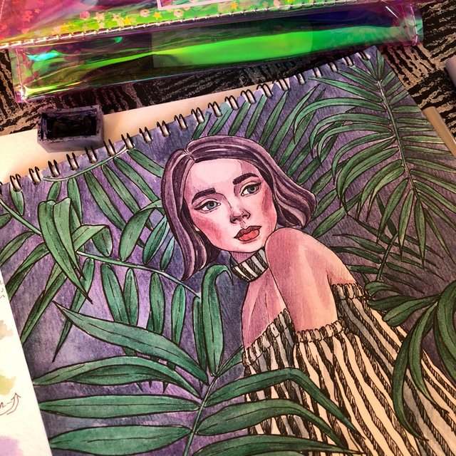
Очень много блогеров сегодня пишут о фотографии и правильной обработке. Но не один из них не пишет о том, как же всё-таки снимать арты или предметы нашего творчества. Расскажу по собственному опыту пару советов 😏
❗️Хороший дневной свет
Это действительно очень важно, хотя раньше я сама этого не понимала. Любой другой, кроме дневного, не только искажает цветовую гамму вашей работы, влияет на температуру (баланс белого), но и портит качество.
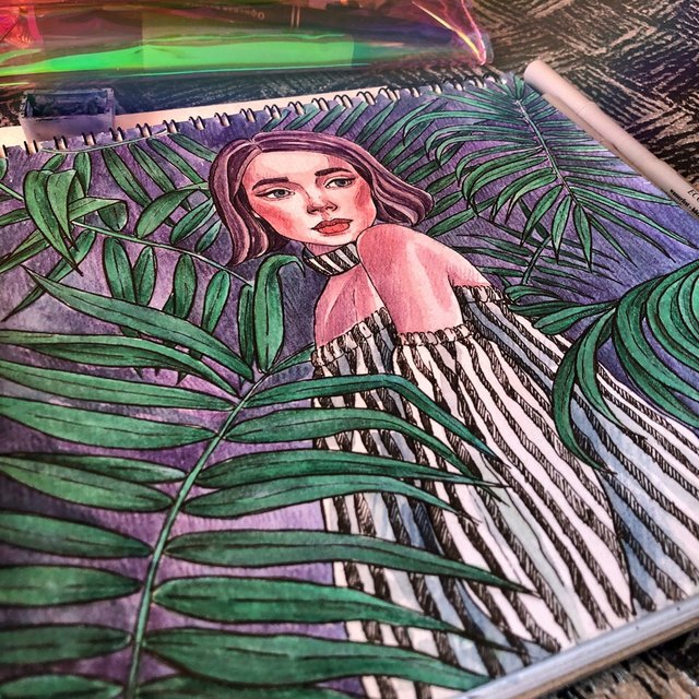
❗️Ракурс
Не искажайте перспективу и все прочее ракурсом. Да, я понимаю, что так можно скрыть многие ошибки. Причём, даже если ошибок нет, люди все равно будут думать, что вы их скрываете (по себе знаю, много меня за это критиковали). Слава богу, что Инстаграм позволяет добавлять несколько фото в один пост - это ваша возможность, так сказать, оправдаться. Пускай одно фото будет для красивой ленты, а второе, например, чтобы «правильно» увидеть работу, прямо, без наклонов и искажений.
❗️Фон
Нуууу, всем известно, что лучше использовать фотофоны - специальные фоны для раскладки и единства профиля. Но суть тут не только в общем виде вашей ленты, но и в восприятии работы на отдельной фотографии. От фона также может зависеть качество, температура, искажение цвета. К примеру, раньше я снимала работы на фоне своего стола - отсюда определённые тёплые тона, работа сразу «желтеет», не говоря уже о том, что на таком фоне она трудно воспринимается, сливается с окружающей обстановкой. Создание фотофонов должно удостоиться отдельного поста 😅
По моему мнению, самые лучшие цвета для фона базовые - чёрный и белый, а их дизайн и вариации можно использовать разные. Главное, чтобы фон был однородный.
❗️Композиция
Имеется ввиду композиция вашей фотографии - раскладка. Грамотная раскладка (но не бардак!) поможет сделать ваше фото - красивее, профиль - разнообразнее. Плюсом можно добавить информативность: например, выложить на фото только карандаши использованных цветов; добавить к работе фото-оригинал, с которого рисовалось; выкраски и многое другое.
❗️Используйте популярные редакторы для того, чтобы сделать ваше фото ещё лучше и исправить ошибки

Soooo cute art 🎨
thank you!you photographed a very romantic sky
Beautiful, love the colors and the shading.
thank you! "NEO's blockchain goes under maintenance as blockchain stalls again" - upped
So beautiful girl And good art my friend andrianna. All the best....
You Learn More From Failure Than From Success. Don't Let It Stop You. Failure Builds Character.
OMG really amazing art
many thanks!you made a nice snapshot of nature, a beautiful sky!
this is really nice sorry i see your profile after some days i miss lot of painting
Posted using Partiko Android
thank you! you wrote an interesting story
thanks and your all painting is really nice
Posted using Partiko Android
WOW
Fantastic work. Want to see you in the top on trending list friend.
Wish you all the best
Carry on with this type lovely work
MAny thanks! I really like your photos. I'm just crazy about the photos of the sky.
Welcome friend
I totally agree with you friend. I love sky too
Aww, she's so beautiful, I love your final artwork~really cute colors and looks almost same. well-done my friend andrianna ❤😊❤
many thanks!you work well with Photoshop. I like. bad that I do not know how)
Wow...excellent art....i like it
Yeah very nicely done
You do give your all in the paintings , liked it :)