CREATING MY FAVOURITE OIL PASTEL PIECE
One day,
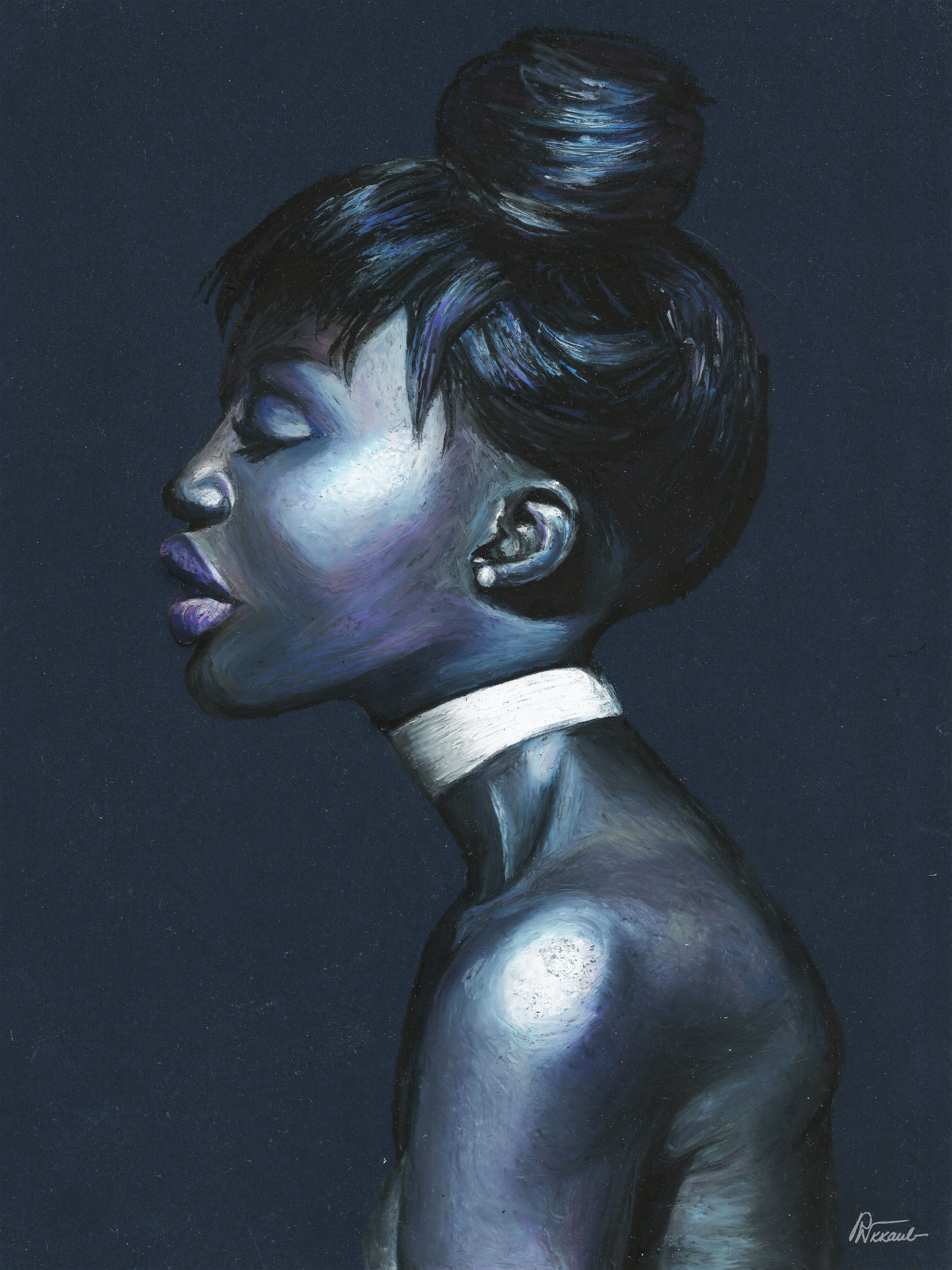
I came across a beautiful image, and I immediately felt that it had to be painted. For quite a time, I had wanted to experiment with oil pastels on background, especially, when painting human faces.
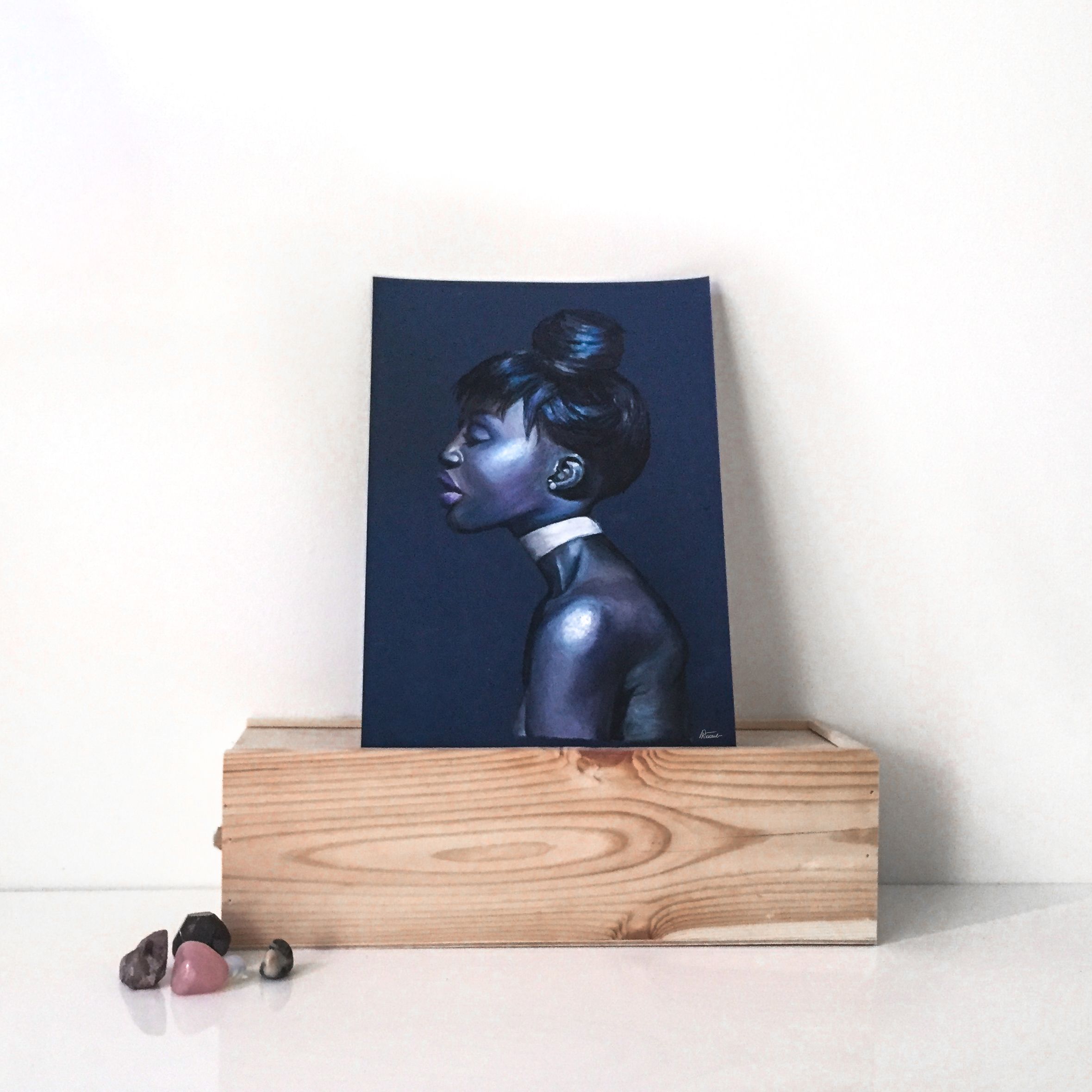
This is what I came up with:
Here is the image I found on Pinterest:
!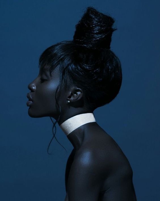
This time, it was this photo that was the main inspiration. Each work is a mixture of a reference image as a basis, the way I choose to see it, and a lot of fantasy. 🌌 You have to follow the thought your inspiration leads you to. This painting is an exploration how emotions can be shown though the mood of a color palette. Also, to me it was a close-up study on representing the different shades of the skin. A wonderful practice. 🌑
STAGE I
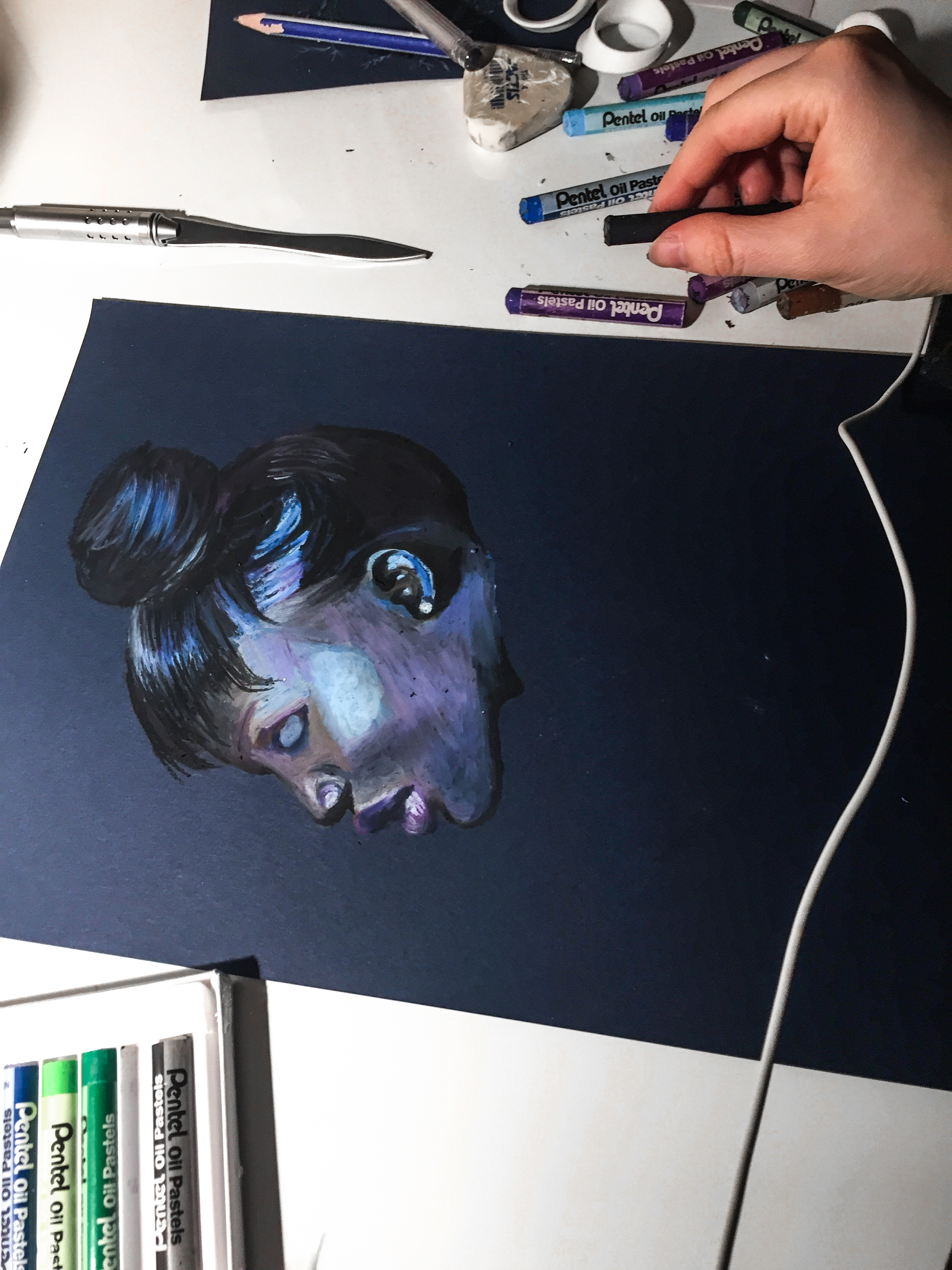
As a background I chose a simple dark blue cardboard paper. I drew the sketch very lightly with a pencil, scarcely enough to see for myself, because too much pencil can sometimes show through the colours, especially lighter. I rather chose to roughly sketch the subject, and then start to form the parts of her face in bulks. I was only slightly guided by the pencil sketch, there were only a few lines. So I estimated the proportions of her face, as I moved forward to paint.
If you like your sketches detailed, maybe try a super light pencil, and then do your sketch as you would.
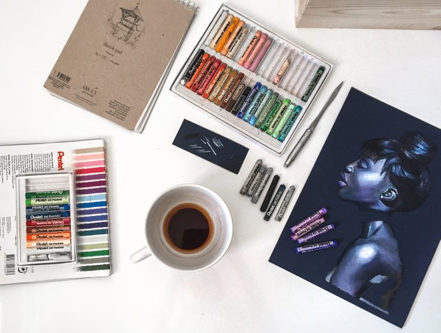
Then determine the colour palette you are going to use. After picking lovely shades of violet and blue, I started to use the bold colors as the undertones that her skin seemed to reflect, at the same time determining her facial features. You can notice that I've represented shadows stronger and darker, and coloured the highlights in glowing pastels. The midtones are somewhat brown in this stage.
STAGE II
I continued to paint until late night, getting a lot done in a relatively short amount of time, all the time listening to music, getting carried away by the sounds and the merging colours. Next morning, I woke up from the sun shining brightly through my window, drank a coffee, and I began to color away…
I continued doing the previous for the body. Basically, I built the painting by first layering the stronger tones underneath, then a layer of a muted neutrals - grey, mostly - was added to blend the strong colours together into the midtones. In this painting, I really wanted to emphasize the way light falls on her face, and accentuates the forms, so I exaggerated the highlights. Don't be afraid to experiment with the color of crayon for blending, as you can use basically whatever light crayon you want, depending on what goes into your general palette.
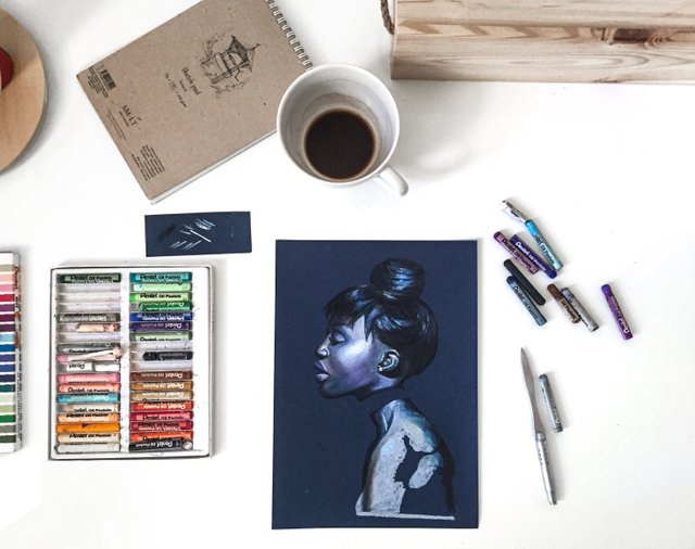
You can see the whole arsenal of my tools for this picture, in this image. I chose Pentel pastels, because I had them at home.
PRO TIP:
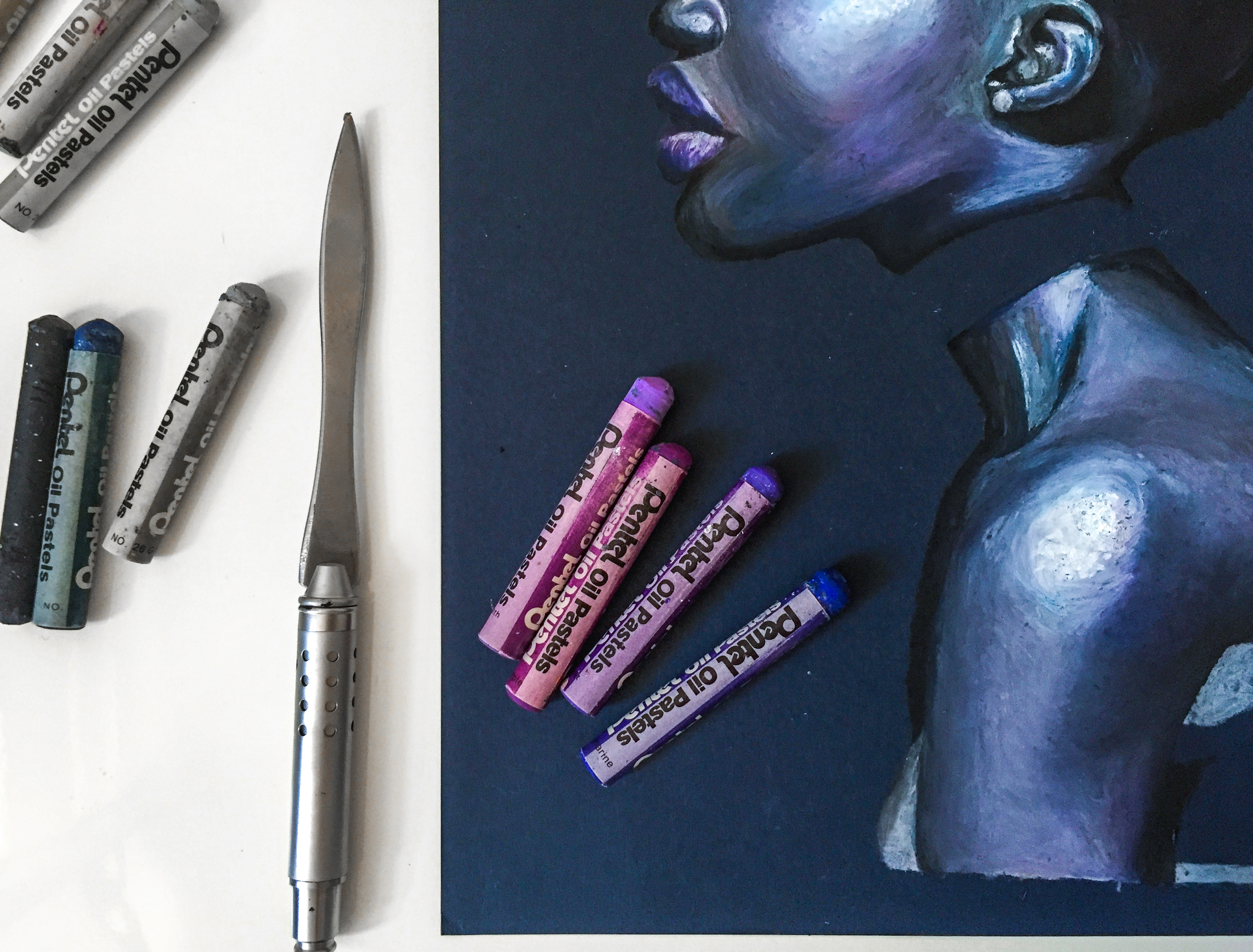
Pastels tend to smear, so for a more precise result use a paper knife or a palette knife and gently lift out the pigment from the paper (this works for correcting mistakes, too!).
STAGE III
Two coffees later, a lot of caffeine and excitement for the painting going on, and I decided to harmoniously arrange the crayons and take the picture...
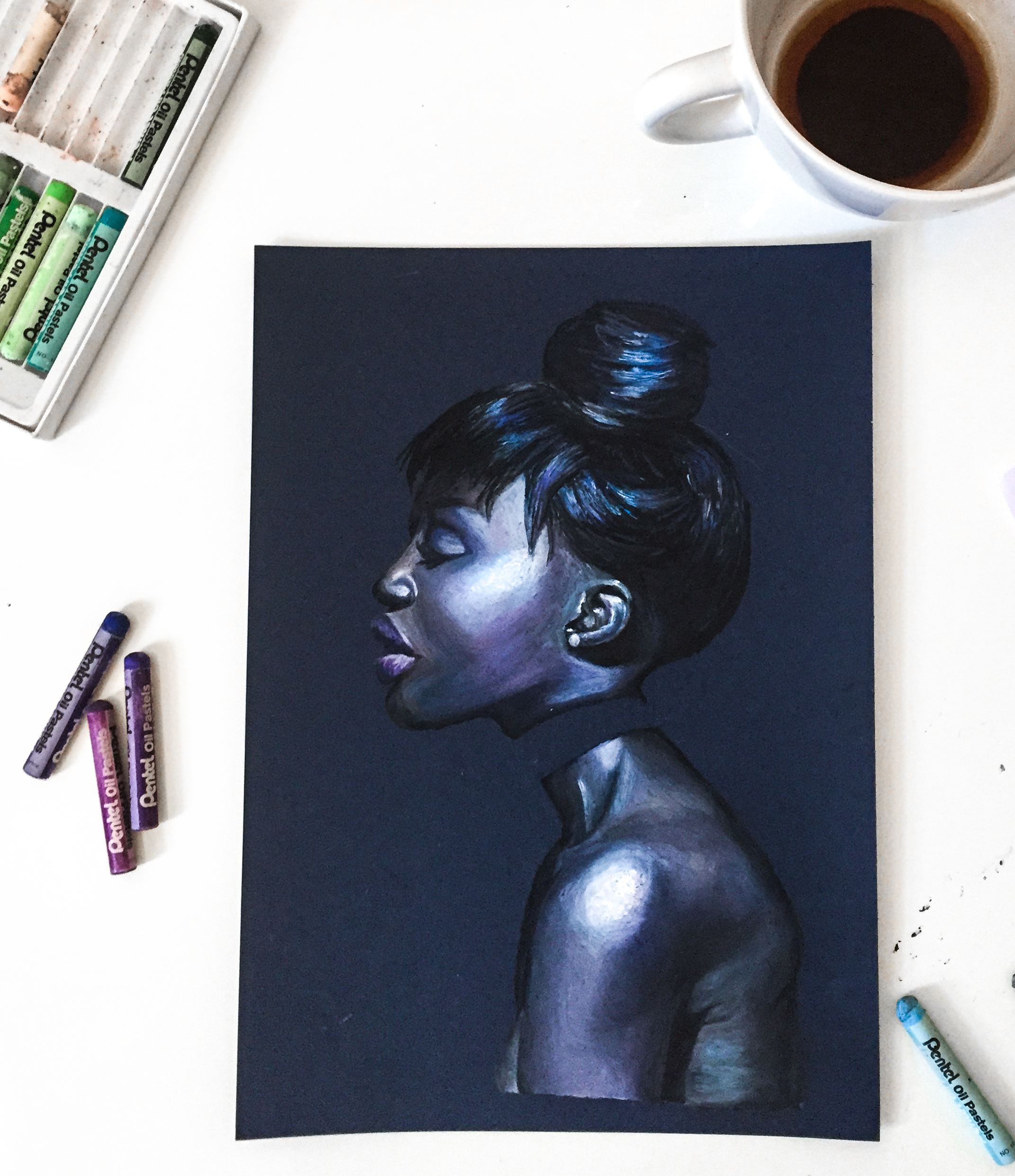
Here I have continued with the back part. See, I've coloured in a bit of brown near the midtone/shadow range down her back. Remember, that every part of the skin on face and body might be in a slightly different skin shade, so it's important to use a few strong colors of a harmonious palette. Typically, the human skin has pigments of red, green, and blue, so it's good to keep that in mind!
PRO TIP:
If you need (this might make it easier for you), keep a small piece of the same paper as the background, and use it as a palette. Before that crayon melts its doughy colour on your paper, try them together to see the result.
STAGE IV
Tis' the same coffee cup and a lot of blending
Then I blended in the shadows and the midtones with the light blue to give a natural appeal. If you want the pastel to have a smooth blend, rather than texturous, blend in the soft paste with your finger. I have parts in the painting where I've mixed the colours smoothly, and some parts I've kept slightly rougher in order to recreate a texture. Textures amaze me, so it's always fun to work with something thick and pasty for me. :)
You can freely experiment with the colour choice, as you paint! For me, painting with pastels is always an experimentation. As I paint, I choose techniques and the colour tones I intuitively feel I see through the color in the photo.
Pros of painting with oil pastel.
You'll see the effect of blended colours soon. It's one of the many pros of oil pastels. You don't have to worry about waiting for the paint to dry, and having a lighter/darker shade that you initially wanted as a result from that. Oil pastel is easy to work with - it blends well, it's flexible. Another plus is that you can quickly correct any mistakes and you build the painting layer by layer, slowly and logically going towards the result.
THE FINAL TOUCH
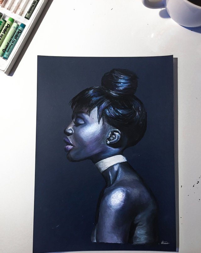
The white sash around her neck. The accent that ties everything together. By this time, I had got so excited seeing that the painting is turning out exactly how I wanted, I even paused a bit before the special occasion and savoured the moment of finishing the last detail. So I painted the sash, and voila!
DIGITALISED
Check out my other works: on my portfolio.
This is the final, scanned version. Remember to do the color and light correction and tweak the hue to match the real-life version. I was absolutely happy about finishing the painting in the first place, and the outcome was so beautiful, especially, in life. The matte parts of crayon contrasted with the slighty gleaming background of the paper. And I managed to capture what I wanted. Most of all, I enjoyed painting very much, and I couldn't feel the flying hours. Since the painting is relatively so quick in its build-up, I got carried away easily and forgot to take pictures in between painting steps. I love painting just too much. I enjoyed playing with the million different hues that the human skin reflects. I imagined that the light falling on her is so strong as if illuminating every undertone of her skin; light so bright, making her skin brilliant.
P.S.
Steemit for Resteem is a community that helps each other out on Steemit. If you are new to Steemit, check it out and take part in it!
Their FB page Steemit for resteem

And follow this account for more details about this project - https://steemit.com/@clixmoney
Hi @art.life. gr8 post and explanation of your process. I particularly liked how you described the nature of inspiration:
I feel similar in my writing, especially with poetry, except the word choices are the colours I choose and the imagery their expression. Ignore milosm2302, your write up of process is original and interesting regardless of whether you've posted this painting on your website. I am not a painter and I liked the way your description made me understand how to try painting with pastel oils. I may even give it a go or join an art class. Thanks for the inspiration :-)
Thanks a lot! I agree, poetry is the same as painting a picture, words are colours, and together they make a mood, sort of 'a palette'.
You're right, writing this post was like a fresh artistic experience.
I'll be posting step-by-step process of my newer paintings, as soon as I can. Simply, up until now, I've rarely done it, as I tend to get fully immersed by painting itself. :)
The best thing about your comment is that you felt inspired. Be inspired! :)
this is wonderful, but It is always better to post some new stuff rather than repost older works (:
Thanks! Sure, I'll be soon documenting some new works, when I start to do a new painting. :) I am new here and simply wanted to share my work, and writing the post was sort of a new experience, a new take on the same work.
Hi @art.life, you're artwork is truly outstanding. We would be honored to have you join us in our fast growing art group on Steemit, the Steemit Art Register. Your artwork will be viewed by many other great artists who are encouraged to support each other so we can all reach Steemit success! This initiative is run by real people who hand pick the best artists blog posts to promote and so they can receive more followers, more upvotes and more resteems!
Any artist who reads this post is available to join. The only requirement is quality blog posts and to join our SAR Discord Channel so you can be easily noticed and promoted as much as possible 😊
Hey! That's impressive! Thanks a lot!
I'll think about it! I'm all about helping each other out, and communicating with other artists.
I absolutely love this! From your artwork to your composition. Well defined I must say. And awesome job on the colors <3
Thanks a lot! It means so much to me to hear such positive feedback! :)
Well you deserve it :)
This piece is beautiful. Naturally the model in the reference has a glowing skin tone and you have recreated that so wonderfully! I find I still have trouble working shading and skin tones, but it's all about the practice. I've never used pastels before either, seems like it could be a fun medium to work with. Maybe I'll try it out one day and surprise myself!
Thanks a lot for the dear comment! Yes, it's all about practice, every painting is a practice. I've always been interested in drawing human faces, so I keep on exploring the light and shadow play on the skin. :)
Try pastels, you'll be amazed how easy it applies and how fast you can see the result.
I like the quality of this post, thanks for this nice work. ☺
Thanks a lot! :) The best of luck to you!
Congratulations @art.life, this post is the forth most rewarded post (based on pending payouts) in the last 12 hours written by a Dust account holder (accounts that hold between 0 and 0.01 Mega Vests). The total number of posts by Dust account holders during this period was 8488 and the total pending payments to posts in this category was $4791.29. To see the full list of highest paid posts across all accounts categories, click here.
If you do not wish to receive these messages in future, please reply stop to this comment.
Hello!
Wow, fantastic news!
Congratulations with your work, I understand when you talk about how happy it makes you paint and how fast time passes, I feel the same. I like how you got the hair, for me it's always one of the hardest things. I also try to create art, it's a way to survive, I hope to share my work soon
Thanks! <3 That's the best thing about it - the energy you get in return in the blissful process of painting. I agree, hair is a challenge. This time, I got through the hair part easily. One plus for pastels - recreates the texture; it adds an instant depth!
I'd be happy to look at your work!
this is something i would hang in my living room haha. Amazing piece. love the deep purple/blue hues you used to add depth to the color. you definitely did the beautiful woman in the photograph justice. Great work!
Aww, thanks! :)
You're awesome ture artist, out put it in a frame and be ready to blow up
Thanks! Be ready to blow up? What do you mean?