Material Design: Typograpy [Note]
Typography is another crucial element in a front-end interface as it is often the most direct factor to convey a message to users. Mastering the art of typography not only can bring out the value of brand and style, but also increase the website aesthetic dramatically.
Notes below are taken from the Material design page:
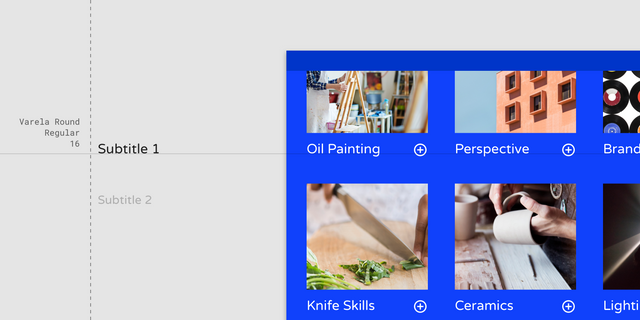
- Serif or sans serif typefaces work well for subtitles. Do not use expressive fonts for subtitles though as it is only suitable for header text.
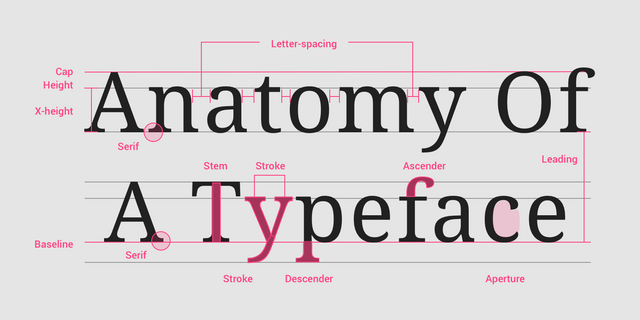
- Type properties explain brief typography concept in an overview.
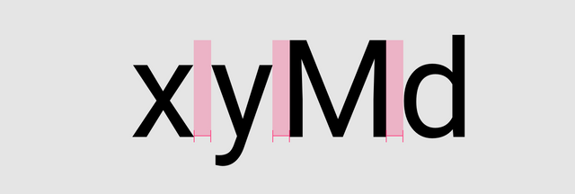
Smaller or more compact font size could use a looser letter spacing for better legibility and contrast. While larger type size can use tighter spacing.
Readability is crucial for body text. Ideal range usually between 40 - 60 characters. Could up to 120 characters in desktop mode.
Posted from my blog with SteemPress : https://fr3eze.vornix.blog/material-design-typograpy-note/
Hi @fr3eze!
Your post was upvoted by @steem-ua, new Steem dApp, using UserAuthority for algorithmic post curation!
Your UA account score is currently 4.060 which ranks you at #3405 across all Steem accounts.
Your rank has not changed in the last three days.
In our last Algorithmic Curation Round, consisting of 219 contributions, your post is ranked at #154.
Evaluation of your UA score:
Feel free to join our @steem-ua Discord server