How to make a Drawing in Photoshop with the Mouse, Without Dying in the Intent.
As the title of this publication announces, the content of this is just another small tutorial, with the most illustrious purpose that to help dissipate all misgivings, dread or doubt, to everyone who longs, to venture into the grounds of digital illustration.
Adobe Photoshop, by far the most idolized program in the entire extensive branch of graphic design. Originally and what should be its only function, the edition of photographs, but gala to its great and wide versatility of its editing tools, is ideal and skilled to capture any type of dream image, surreal and abstract, in other words with the enough creativity this program has no limits in its capacity for artistic creation.

For many years this was the program that covers more, in all the commissions that elaborate on the topic of design; Not for nothing but it got me out of more than one predicament. Turning to what is digital illustration there is an eternal debate "Bitmap or Vectors" and Photoshop uses the first, the bitmaps are a set of pixels of different shades, which form a pattern and in its accumulated an image, and the greater the set of pixels, the better the image produced will be perceived. This is why it is of vital importance to have a scrupulous care with the resolution with which it is occupied, 300 pixels per inch is the ideal and the norm. More, it will be much better, but only if the processing power of your computer allows it, you could end up demanding too much of your equipment and shorten its useful life in the process, if you work with a resolution much lower than 300, be sure that mediocre will be your results.
The ideal thing to draw using this interface and get the most out of it, is using a digitizing tablet, but because of the current economic situation (especially in Venezuela, the country where I am living) it is considerably difficult to get one, but this is not an impediment to do not try We always have what we can with what we have in hand.

The first thing that must be understood is that this program works with layers, and based on the order of these is that we will evaluate the result of our work in process. To start creating a new document (Ctrl + N) this time I decided that it will have the following dimensions 3300 pixels wide by 5100 pixels high. With 300 resolution.
As mentions you must be very scrupulous with the resolution and with the size of the format with which you are going to work, and know for what purpose the image that we are about to structure will be used, if it is for a printed work you should choose the CMYK color mode and the dimensions will be in centimeters or millimeters, otherwise if the image is only for digital purposes the RGB mode is chosen and the format will be measured in pixels. The resolution option should be about an inch and not over centimeters, or the file that we will be manufacturing will weigh more and unnecessarily.
At this point it is not necessary to point out that the notions of drawing are of vital importance. The first layer, we will make a sketch attempt using the mouse in substitution of the pencil by means of the Brush tool (B) "I notice that the result can be an offensive visual damage to your eyes" the mouse is an awkward and terrible Pencil.
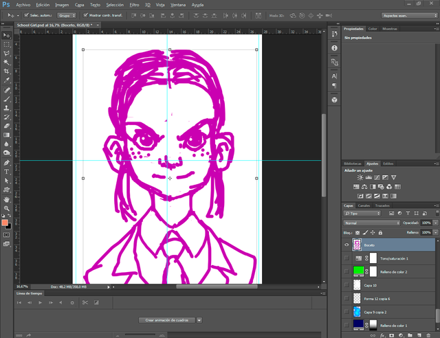
It is normal that the result of attempt of drawing is very unfavorable, The idea is that this will be the guide on which we will make our drawing. If the drawing you did on the pencil on paper, just scan it and place it on this layer. And you save yourself these annoyances.

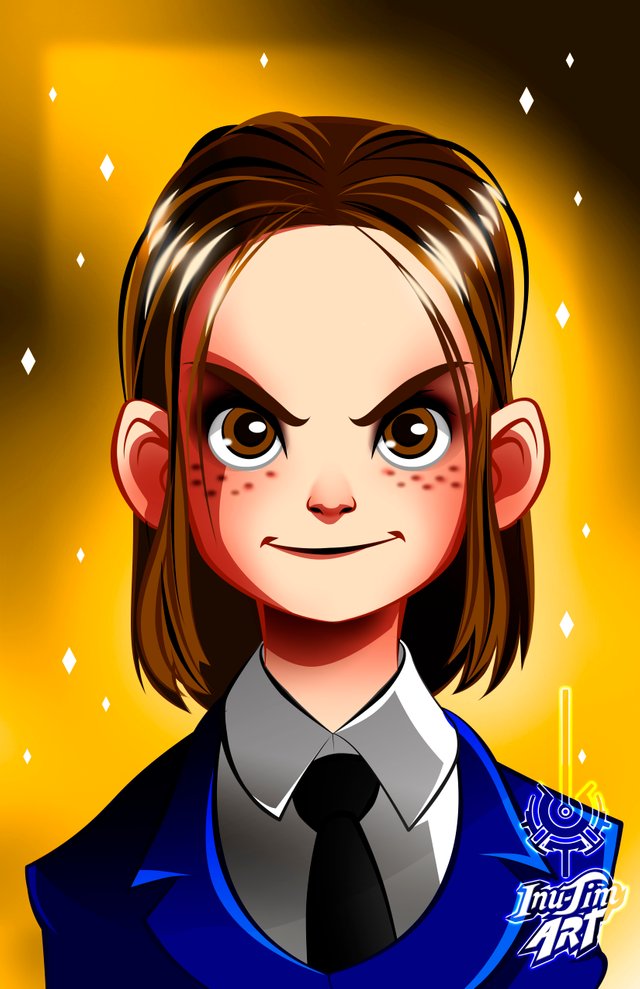
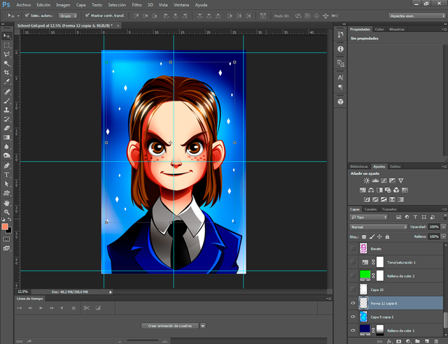
Being ready the sketch: which has as protagonist a young and vivacious schoolgirl. We proceed to lower its opacity, at 23% it will be adequate, we proceed to create a new layer on top of the sketch, and this is where we will make our real drawing.
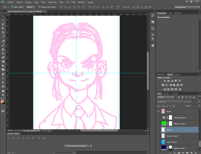
Due to the tools of the program, the drawing must be executed with the Brush tool (B) but as we witness the sketch, the result is fatal, unless you have the digitizing tablet and this is not the case . The solution to this drawback is to intersperse the layout of the path with the following two pen tools (P) and direct selection (A).
The execution of this trio of utensils is as follows: it starts with the pen (P) giving a click where it is decided to start the stroke and another one where it ends, "it should be noted that this procedure requires executing short strokes but strategic "with the direct selection tool (A), the curve of the stroke generated by the pen (P) will be perfected by providing a right click on this by adding a new anchor point, only if necessary, you may have left well to the first, we must emphasize that the line provided by the pen is not a real path because something is editable.
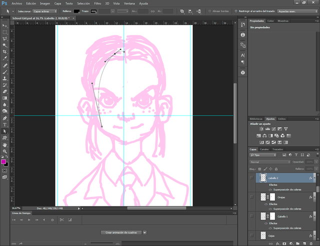
It is time to apply the brush (B) we right click and edit our brush, we must choose a hard and consistent and not a diffuse, the size of this should cover our need which will be variant, stipulated by the result final that we aspire to achieve, and with this done we resume the pen tool (P) by providing a right click on the stroke generated by this, we select the contour path option, and in the new window that will open we mark the box where it informs that if we want Simulate pressure, press "OK" Congratulations we obtain a perfect brushstroke, just press "Enter" to suppress the stroke of the pen that we no longer need. (If we do not do it, it will bother us a lot, believe me.)
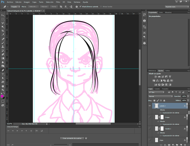
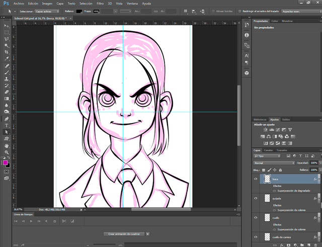
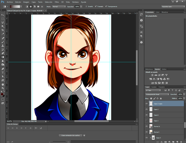
It is only a matter of repeating the whole procedure until the drawing is completed, one piece of advice is to make the parts in different layers Hair, jaw eyes, ears, clothes, etc ... For reasons to make some effects and facilitate the coloring over some contours.
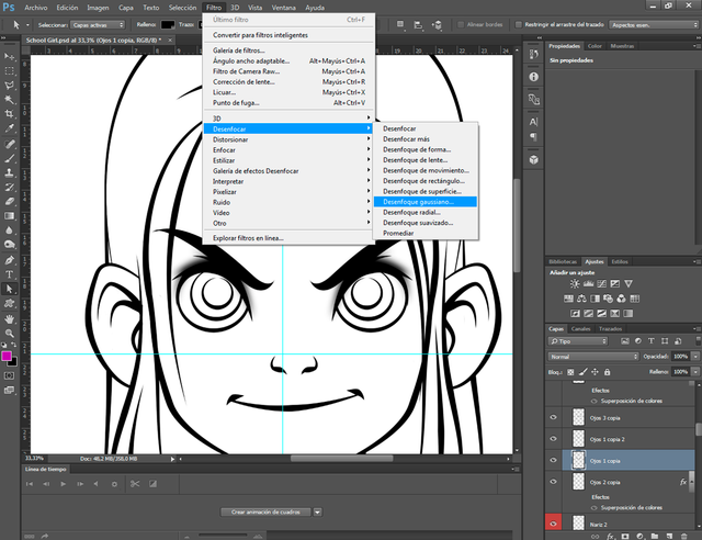
We proceed to hide the layer of the sketch, we will no longer need it, we will duplicate the layer of the eyelashes and on this we will go to the filter window and choose the so-called Gaussian blur.
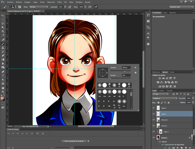
It is time to apply what will be the base color, for this purpose there are three procedures, obviously each color is made in its own independent layer, the first option, which is the most intuitive is to enlarge the tip of the brush and fill with several brushstrokes freehand, the truth is this option would proceed with a digitizing tablet, and in turn is the one that takes more time to run, with tablet or without tablet. The second option is to use the magic wand (I leave it as a task to investigate its use, in this task we will not use it) and fill it with the paint bucket, but since the layout is distributed in layers, it automatically discards its use. The applied method is to use the pen creating semi-vector shapes, filled with the color selected for our drawing, the good thing about applying forms is that only with a click you can configure the frontal color of these comfortably and they can be constantly modified with the tool direct selection (A).
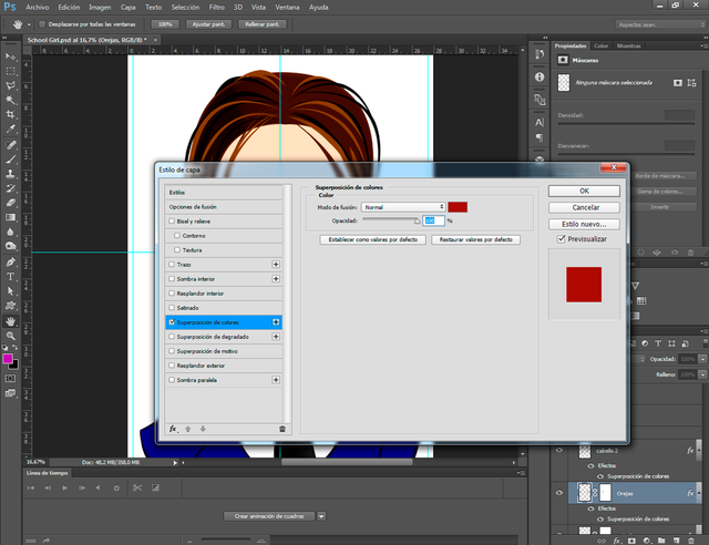
We return to the layout, in layer style, we apply an effect called overlay of colors, as its name indicates it uses a color on the object in question, this we will do with each of the tracings of our drawing.
In the same way we take advantage, and in a layer over the others we make several new strokes, to give abundance and volume the hair of our character.
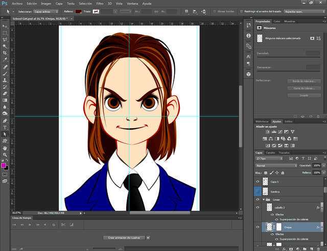
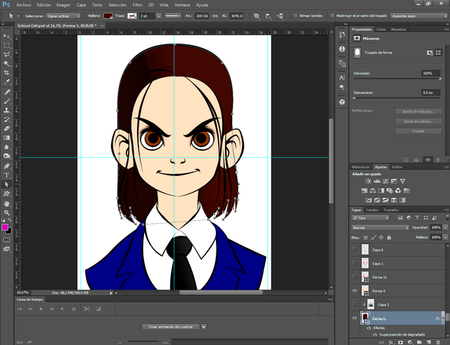
With the benefit of the pen (P) we will make the shadows of our drawing, this will be by means of Shapes each shadow must be located above the layer of its respective base color.
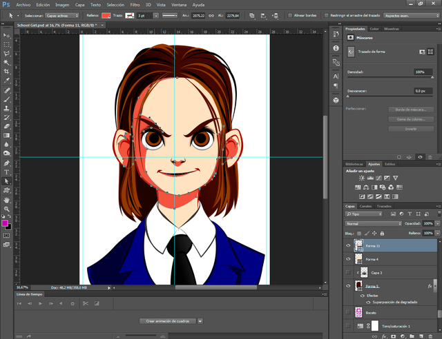
It is time to continue with more intense shadows, for this we will handle the Brush (B) freehand and the Gradient Tool (G) in transparent mode and its radial fusion for greater control. These shades must be applied in layers located by enzymes of the layers of their area where they will be located, they must be used with a darker color than the previous applied shade and most importantly the layers of these must be in the "Multiply Mode".
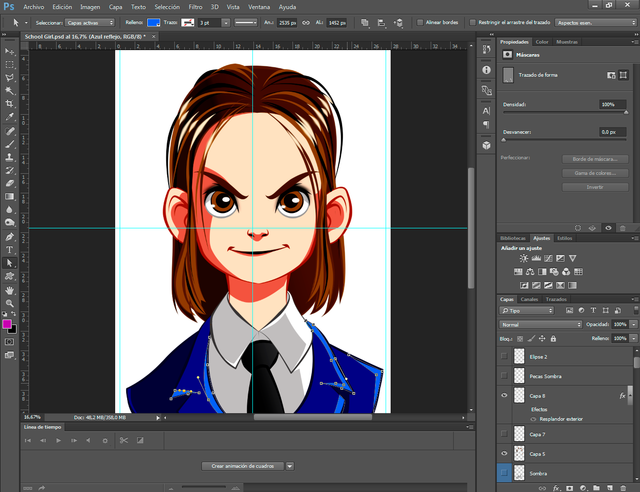
At this point we will use to apply volume to the face, here again we will use the brush (B) and the gradient (G) will use a red tone almost brick, and the layer must be in multiply mode.
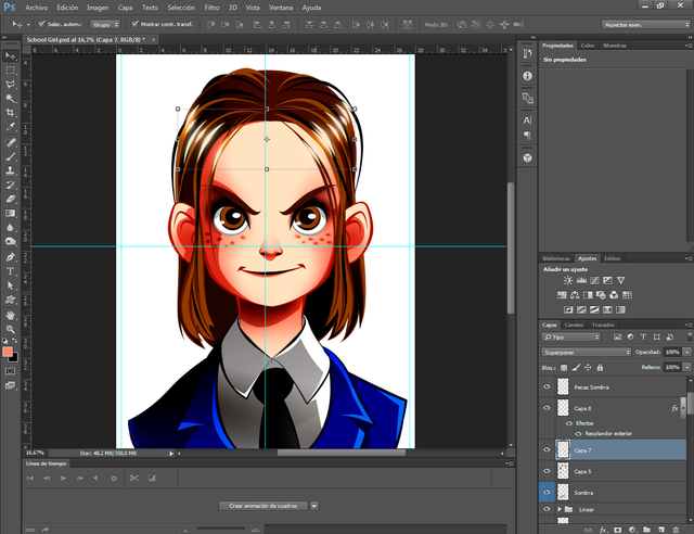
To finish our schoolgirl, protagonist of this tutorial, we will make some effects of radiance on her hair, applying warm colors in the area of the glitters with a layer in superimpose mode, we also take advantage of it and provide her with some freckles on her cheeks , freckles with the brush the Gaussian blur filter.
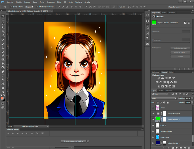
Our character is already finished, the illustration is not complete, we continue with the background design background, the design of this will be diffused to help highlight our character, the background will be located below all the layers that make up our character, to be more concrete below the layer of the sketch. You start with a layer of cold and dark color by applying a gradient mask on the bottom.
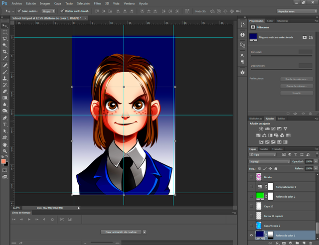
With the graduated tool (G) transparent and in its radial function, we made some lights that counteract with the cold background followed by another layer of white rhombs of varied and tiny sizes symbolizing brightness.
With the gradient tool (G) in a layer in superimpose mode, we execute a white flash that contains a large part behind the character's head. On this we create another layer of color fill in color mode, to modify the shades of the lower layers, but as it is not yet achieved in desired tone we proceed to create a layer of adjustments, to be specific to tone and saturation, and By manipulating the values of this layer we achieve the desired warm tone to conclude our illustration.
With this last mission accomplished we have made an illustration in photoshop, only using a mouse from our computer, I hope with all my heart this little tutorial will be very helpful to all that young adventurer who wants to venture into this so noble capo of the digital illustration.
Thank you very much for reading my post
All images, banners, stripes and gifs used in this publication are my property.
See you in a future publication
Inu-Jim

All images, banners, stripes and gifs used in this publication are my property.
See you in a future publication
Inu-Jim
Thank you! Very helpful not just for the beginners.
Photoshop works for me with photo editing and basic painting. There are other apps that allow for more powerful digital painting.
Wacom used to be the only real choice. But now you can also get good tablets from Ugee, XP-Pen, and others.
I'd recommend a XP-Pen Deco Fun Large ( https://www.xp-pen.com/product/905.html ) drawing tablet. You can pick them up on Internet in good condition for a very reasonable price.
Such a lovely portrait caricature. Great post, too! Keep up with the good work!
Thank you very much @trincowski, it was interesting and fun to make this girl, and we continue to provide pots of this type
Congratulations @inu-jim! You have completed the following achievement on the Steem blockchain and have been rewarded with new badge(s) :
Click here to view your Board of Honor
If you no longer want to receive notifications, reply to this comment with the word
STOPTo support your work, I also upvoted your post!
Gracias! Me encantó el trabajo. No me había tomado el tiempo para explorar las bondades de Photoshop, solo lo uso para quitar el fondo a las imágenes 😀. Estoy iniciándome en el arte digital y recién descubrí Inkscape. Es una buena terapia para las personas impacientes como yo. Pruebo cada vez, dedicarle tiempo a pulir los detalles. No hago un boceto preliminar a mano, simplemente trazo con mi mouse de los 80's jajajaja
Saludos! También soy de Venezuela.
(te descubrí en la web de @ntopaz)
Que bien que te gustara mi publicación, si revisas mi blog encontraras este mismo post en español, yo también estoy iniciando a la ilustración digital, mas bien aun estoy en proceso de Transición de dibujo tradicional a digital, no conozco Inkscape , pero ya decidí que illustrator es el que usare para la mayoría de mis trabajos, es el mas cómodo a la hora de editar los trazos, yo me siento mas cómodo haciendo el boceto a lápiz pero estoy consiente que es mas rápido y practico realizarlo directo en la pc ya sea con el mouse o con una tableta digitalizadora que algún día tendre jeje
It is a nice tutorial for creating portrait anime picture with a mouse !!! Very cool result and well explained !!
thanks I wanted it to be as clear as possible to help those who draw with the mouse
This post was shared in the Curation Collective Discord community for curators, and upvoted and resteemed by the @c-squared community account after manual review.
@c-squared runs a community witness. Please consider using one of your witness votes on us here
I also knew a guy who used mouse for his illustraions exclusively, and he was left handed. Something quite unique!
Wow! I'm impressed! Wonderful tutorial. You have a great understanding of how to create digital art!