Eng/Jpn. Color Columns technique of Color Scheme. 配色テクニック
Hello everyone! This is @miyabi.
This time I will talk about how to color.
I think that it does not matter much to people who do not draw pictures, but since the way of coloring is useful for coordination of fashion and choosing interior of the room, please try reference from such viewpoint.
coloring technique
Color scheme with harmony in hue
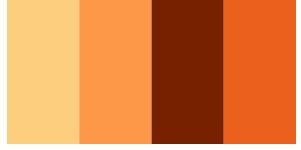
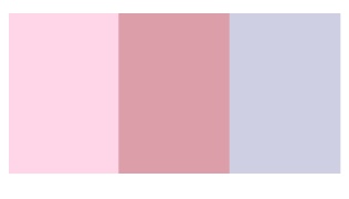
1 Dominant color
Dominant means "dominant" or "dominant" in English.
Color scheme by this method is suitable for uniform coloring of the whole system with the hue of the same system and you want to color multiple colors of three or more colors in a well-balanced manner.
For example, it is a color scheme like the image below.

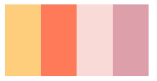
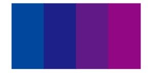
2 tone on tone
It is a type of dominant color, but the hue is unified in the same line, the tone is similar or a contrasting relationship is chosen to give a difference in brightness.
Although it can be settled down into a coherent impression, you can also produce a cheerfully impressive impression by adding lightness difference to the tone.
For example, it is a color scheme like this.
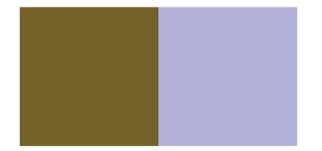
Color scheme with cohesive tones
1 Dominant tone
It is a way to unify the color scheme as a whole with tones of the same line and to color multiple colors of three or more colors collectively well.
By unifying the tones, the image of that tone can be expressed strongly.
For example, in the case of the following color scheme, pink is the whole image.
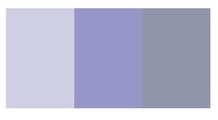
2 tone in tone
This is a type of dominant tone that makes it easy to express the image of tone, but we will choose the color so that the difference in brightness does not become large.
With the same brightness, choose the same tone and hue freely.
It will be such a color scheme.
An example is like this.

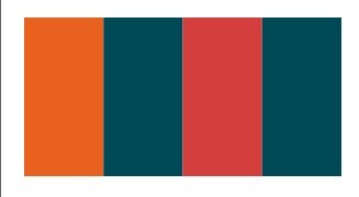
3 Tonal
Tonal is a kind of dominant tone, a method to unify with the so-called neutral tone of lightness and saturation around the middle.
There are darton, soft tone, light graysh tone, grateish tone for medium brightness, low to medium saturation tones.
By coloring with these tone colors you can make it a gentle, discreet, calm impression color scheme.
An example is like this.
Hue, color scheme with cohesive tones
1 Camaiueu
This is almost the same color scheme as both hue and tone.
Camaiuele means "monochrome method" in French, and this coloring method with its name also colors hue and tone in the same or approximate color.
So I can produce a blurred ambiguous impression that seemingly looks like one color.
Something like this. ↓
2 Fo Kamaire
This coloring method is a coloring method which is slightly changing than the above-mentioned Camaiue.
By coloring with a slight difference in hue or tone than Camaiue, you can make a different impression compared to Camaiu.
By the way, in the world of apparel, the difference in hue and tone is small, and we call the gentle color scheme collectively Fo · camaiueu.
An example is like this.
Color scheme by natural order
1 Natural Harmony
As the name suggests, this color scheme is a color scheme that emphasizes how it looks under natural light.
For example, if you look at the leaves under the sun, the bright part that hits the sun looks yellowish green, and the dark part of the shade looks bluish.
This way of looking is called "natural chain of hues".
Following this way of appearance, we call neighboring, similar hue to brighten the color close to yellow, and the color scheme that darkens the color close to blue violet is called natural harmony.
For example, it is like this.
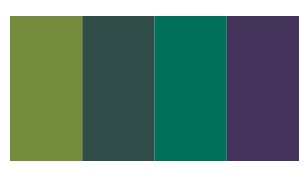
2 Complex harmony
Here it becomes a coloring method contrary to how it looks in the natural world.
Complex means "complex" and so on, coloring contrary to how it looks under natural light is called complex harmony.
Contrary to Natural Harmony, it darkens the hue close to yellow, and brightens the hue close to blue purple.
It is a coloring method that is suitable for expressing unusual images and novelty because it becomes a color scheme of combinations not so much in nature.
For example, this is the color scheme.
Regularly changing color scheme
1 Gradient
It is a coloring method in which the color changes rhythmically.
The multicolor color arrangement that arranges colors step by step according to a certain rule is the basic of gradation.
Regular changes create movement and rhythm.
Rules of change can be based on saturation and lightness with reference to hue, so it is quite rich in variations.
For example, it is like this.

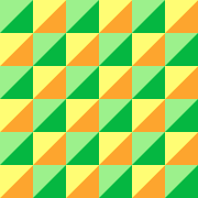
2 Reputation
It is a coloring method to harmonize the combination of two or more colors repeatedly.
Repetition means "repeating" or "repetition", but as a technique of coloring, it is a method of arranging it repeatedly with the color scheme of two or more colors without unification feeling as one unit.
Rhythm and order are given by repeating a certain pattern, and harmony is born as a whole.
Check patterns etc are typical.
An example is like this.
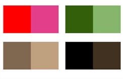
Color scheme according to prescribed color number
1 Bicolol, Tricolol
It is a clear color scheme consisting of 2 colors and 3 colors.
Bicolor means "two colors" in French, and tricolor means "three colors".
It is important that this color scheme is clear and the color contrast is clear.
For that reason, it is effective to combine colors of contrasting hue with high saturation, a combination of high saturation color and achromatic color, and so on.
French flag etc. are typical of tricolor. By the way the Japanese flag will be Bicolor.
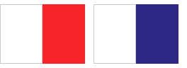
Bicolor
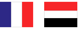
Tricolol
Color scheme by two hue division
This is a coloring method which combines colors of hues that are spaced equidistantly into 2 to 6 equal parts like a table with color hue circles.
By the way it is this color hue ring.
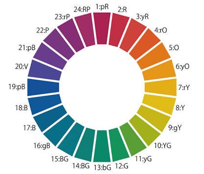
This is the way to divide and choose the opposite side and neighboring colors etc.
Color scheme to make points
1 Accent color
This color scheme is a way to make eye-catching points with a contrasting color.
Harmony and unity are when coloring with a common color
However, since it tends to be monotonous with poor change, it is the point of this color scheme to incorporate the emphasis color as an accent.
In the color scheme, the color with the largest area is called the base color, the area with the largest area next, the color supplementing the base color is called assorted color.
The accent color has an effect to make it easier to see the eyes by using colors that are significantly different from the base color.
If you set the base color 70%, assorted color 25%, accent color 5% ratio, the balance will be better.
This color scheme is fairly important in fashion, so it's good to remember.
For example, it is such a color scheme.
Color scheme to adjust contrast
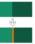
1 Separation
Separation means "split" and so on.
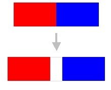
As its name suggests, this coloring method is a technique to create a boundary line by inserting a different color between color and color.
If the contrast is too intense or conversely too blurred, you can separate colors and harmonize each other.
The color to be inserted has a difference in brightness from other colors, and achromatic colors or low saturation colors that make other colors stand out are suitable.
For example, this is the color scheme.
How was it?
I hope it will be helpful for everyone.
If you do not mind, please follow up with UPVOTE.
+ My blog
+ Instagram
+ Twitter
========================================
こんにち@miyabiです。
今回は配色の仕方についてお話しします。
絵を描かない人にはあまり関係ないと思うかもしれませんが、配色の仕方はファッションのコーディネートや部屋のインテリア選びなどにも役立つので、そういった観点から参考にしてみてください。
配色テクニック
色相にまとまりのある配色方法
1 ドミナントカラー
ドミナントとは英語で“優勢な”や“支配的な”という意味です。
この方法による配色は全体を同じ系統の色相で統一して、3色以上の複数の色をバランスよく配色したい場合に適しています。
例えば下の画像のような配色です。
2 トーンオントーン
ドミナントカラーの一種ではありますが、色相は同じ系統で統一し、トーンは類似したものかもしくは対照的な関係のものを選んで明度に差をつける配色方法です。
落ち着いてまとまりのある印象にできますが、トーンに明度差をつけることでメリハリのある快活な印象も演出できます。
例えばこんな感じの配色ですね。
トーンにまとまりのある配色方法
1 ドミナントトーン
配色全体を同じ系統のトーンで統一して3色以上の複数色をまとまりよく配色できる方法です。
トーンを統一することでそのトーンの持つイメージが強く表現することができます。
例えば以下のような配色の場合は、ピンクが全体のイメージになります。
2 トーンイントーン
これはトーンのイメージを表現しやすいドミナントトーンの一種ですが、明度差が大きくならないように色を選んでいきます。
同じくらいの明度で、同系統のトーン、色相は自由に選ぶ。
そうした配色方法になります。
例はこんな感じですね。
3 トーナル
トーナルはドミナントトーンの一種で、明度と彩度が真ん中くらいのいわゆる中間色のトーンで統一する方法です。
中明度、低〜中彩度のトーンには、ダルトーン、ソフトトーン、ライトグレイッシュトーン、グレイッシュトーンがあります。
これらのトーンカラーを用いて配色することで、穏やかで控えめな、そして落ち着いた印象の配色にできます。
例はこんな感じですね。
色相、トーンにまとまりのある配色方法
1 カマイユ
これは色相もトーンもほとんど同一の配色です。
カマイユとはフランス語で“単色画法”を意味し、その名を持つこの配色方法も色相やトーンなどを同じもしくは近似した色で配色します。
なので一見一色に見えるようなぼんやりとした曖昧な印象を演出できます。
こんな感じですね。↓
2 フォ・カマイユ
この配色方法は、前述のカマイユよりもちょっとだけ変化にある配色方法です。
カマイユよりもわずかに色相やトーンに差をつけて配色することで、カマイユに比べて変化のある印象にできます。
ちなみに、アパレルの世界では、色相やトーンの差が小さく、穏やかな配色を総称してフォ・カマイユと呼んでいます。
例はこんな感じですね。
自然の秩序による配色方法
1 ナチュラルハーモニー
名前の通りこの配色は自然光の下での見え方を重視した配色です。
例えばお日様の下で木の葉を見ると、日が当たっている明るい部分は黄色味がかった緑に見え、日陰の暗い部分は青みがかって見えます。
このような見え方を『色相の自然連鎖』よ呼びます。
こうした見え方にならい、隣接、類似色相を用いて黄に近い色を明るく、青紫に近い色を暗くした配色をナチュラルハーモニーと呼びます。
例えばこんな感じですね。
2 コンプレックスハーモニー
こちらは逆に自然界での見え方に反した配色方法になります。
コンプレックスとは“複雑な”などの意味で、自然光の下での見え方に反した配色をコンプレックスハーモニーと呼びます。
ナチュラルハーモニーとは逆に、黄色に近い色相を暗く、青紫に近い色相を明るく配色します。
自然界にはあまりない組み合わせの配色になるので、非日常的なイメージや斬新さを表現するには向いている配色方法です。
例えばこんな感じの配色です。
規則的に変化させる配色
1 グラデーション
色がリズミカルに変化していく配色方法です。
一定のルールに従って色を段階的に変化させながら配列した多色配色がグラデーションの基本です。
規則的な変化によって、動きやリズムが生まれます。
変化のルールは色相を基準とするものは彩度、明度それぞれを基準にすることができるので、かなりバリエーションが豊富です。
例えばこんな感じです。
2 リピティション
2色以上の組み合わせを繰り返して調和させる配色方法です。
リピティションとは“繰り返す”とか“反復”という意味ですが、配色のテクニックとしては、統一感のない2色以上の配色をひとつの単位としてそれを繰り返して並べる方法です。
一定のパターンの繰り返しによってリズムや秩序が与えられ、全体的に調和が生まれます。
チェック柄などが典型です。
例はこんな感じです。
規定の色数による配色
1 ビコロール、トリコロール
2色、3色で構成されるメリハリのある明快な配色です。
ビコロールはフランス語で“2色”という意味で、トリコロールは“3色”という意味です。
この配色は明快で色のコントラスがはっきりしているのが重要になります。
そのために高彩度で対照的な色相の色同士の組み合わせや、高彩度色と無彩色の組み合わせなどが効果的です。
フランス国旗などはトリコロールの典型ですね。ちなみに日本国旗はビコロールになります。
ビコロール
トリコロール
2 色相分割による配色
これは色相環という色を輪っかにした表のようなものを2〜6等分にして、等間隔に離れた色相の色を組み合わせる配色方法です。
ちなみに色相環というのはこれですね。
分割してその反対側や隣り合った色などを選んでいくのがこの方法です。
ポイントを作る配色
1 アクセントカラー
この配色は対照的な色で目を引くようなポイントを作る方法です。
共通した色で配色をすると調和や統一性はありますが、変化に乏しくて単調になりがちなので、アクセントとしての強調色を取り入れるのがこの配色のポイントになります。
配色では最も面積が大きい色をベースカラー、次に面積が大きく、ベースカラーを補う色をアソートカラーと呼びます。
アクセントカラーはベースカラーと大きく異なる色を使うことで、目を引きやすくする効果があります。
ベースカラー70%、アソートカラー25%、アクセントカラー5%くらいの比率にするとバランスがよくなります。
この配色はファッションにおいてかなり重要なものなので、覚えておくといいでしょう。
例えばこのような配色です。
コントラストを調整する配色
1 セパレーション
セパレーションとは“分割”などの意味です。
その名の通りこの配色方法は色と色の間に別の色を差し込んで境界線を作る手法なんです。
コントラストが強烈過ぎる場合や、逆にぼんやりしすぎている場合に色同士を分離して調和させることができます。
挿入する色はほかの色と明度差があり、ほかの色が引き立つような無彩色や彩度の低い色が適しています。
例えばこんな感じの配色です。
いかがでしたか?
みなさんの参考になれば幸いです。
よければUPVOTEとフォローをお願いいたします。
@miyabiさん、こんにちは。私も色についてはいつか勉強しないといけないと思いつつ、つい先延ばしになってしまっているのでいい刺激になってます。
このサンプル自体もご自身で作っておられるんですか?
いつもサポートしていただいてありがとうございます^^
これだけ丁寧に記事を書いても、なかなか思うように記事を読んで頂けないのがしんどいところですね…。
少しでもお役に立てますように。resteemed.
Resteemありがとうございますm(__)m
僕も色彩について学び始めたばかりなので、なにかしらお役に立ててうれしいです。
サンプルは本やサイトで確認しながら自分で作成しています。今回の場合色相環の図だけはフリーの素材のものを拝借してきました。
ここ最近はなかなかイマイチ読んでもらえていない感じですが、自分の勉強のアウトプットの場やブログのバックアップ的に活用している面もあるので、気長にマイペースにやっていこうと思います(`・ω・´)