An artwork develops – All the sordid details by Crayven Part II [EN/DE]
![]()
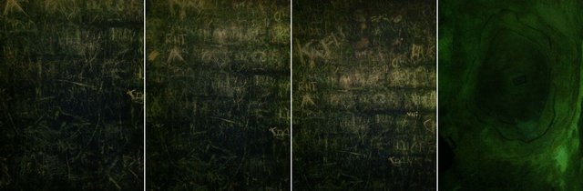
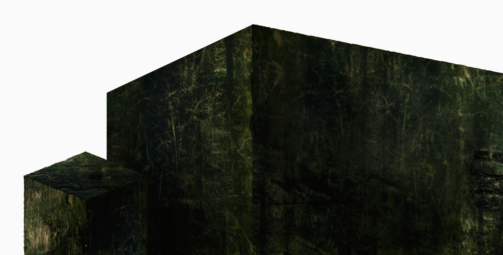
Nachdem ich euch die Band und die Logoentwicklung vorgestellt habe, möchte ich euch zeigen, wie ich das Artwork für ihr Debut-Album "All the sordid details" entwickelt habe. Lisa, die Frontfrau, schlug mir vor, die Bilder einzubauen, die sie in den Katakomben von Paris mit ihrem Handy geschossen hatte. Daher war die Qualität eher mittelmäßig für ein Printprodukt, aber ich mochte diese Texturen auch sehr:
So beschlossen wir gemeinsam eine Science Fiction Welt auf Grundlage dieser Wände zu bauen. Ich fing an in Photoshop unmögliche Räume zu bauen und machte ein paar Vorschläge für das Frontcover des Albums. Der erste Versuch war nicht der beste, ich mochte ihn nicht besonders, und die Band auch nicht. Aber es war ein guter Anfang, um warm zu werden mit dem Thema.
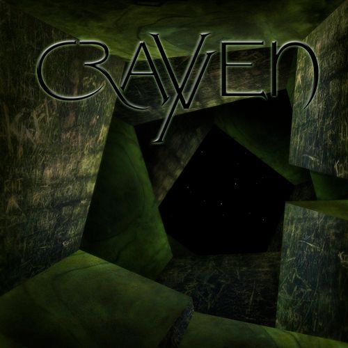
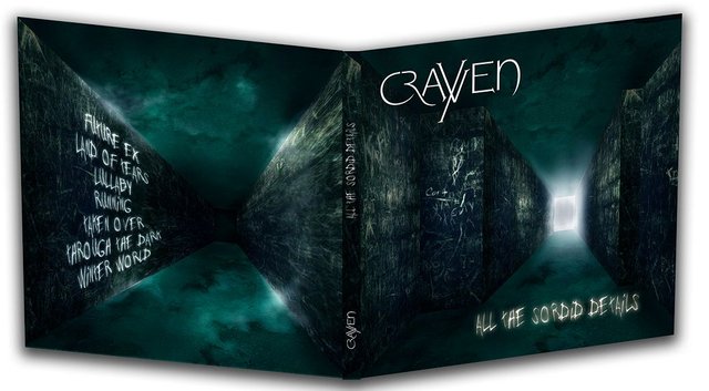
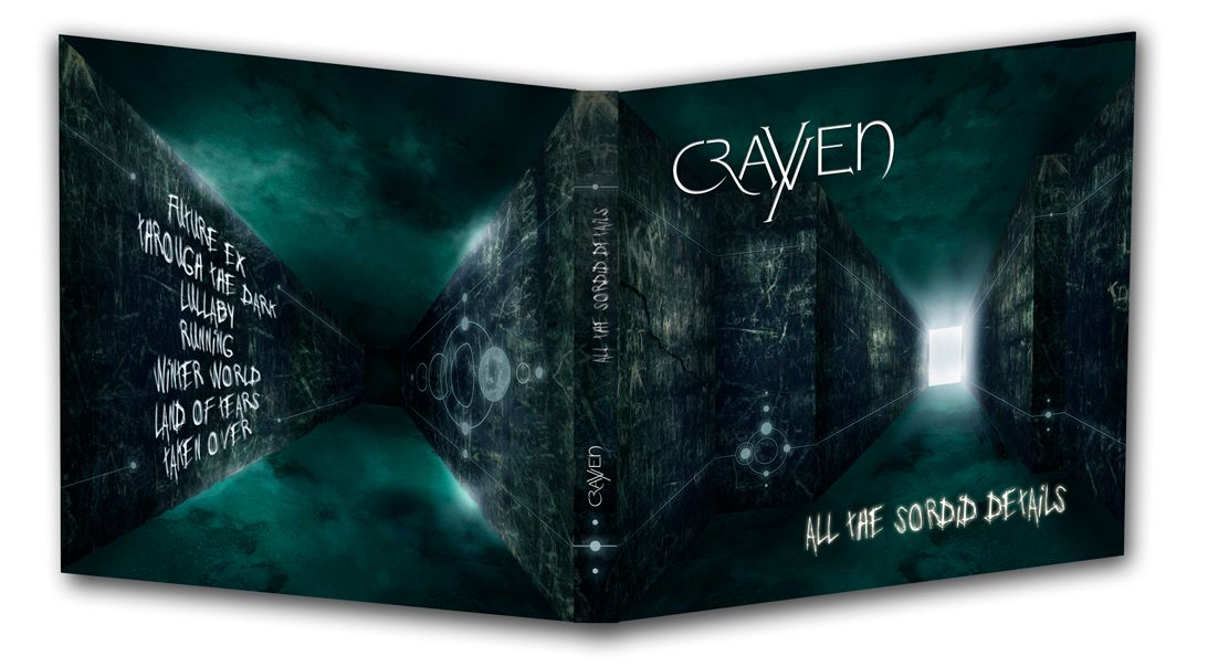
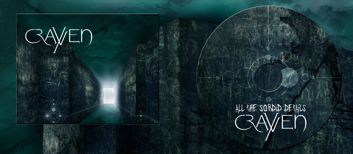
Der nächste Versuch war schon der, der später auf´s Album kommen würde. Ein dunkler Korridor, der ins Ungewisse durch eine Tür aus Licht führt. Die Wände sind voll von den leicht leuchtenden Kritzeleien und einer sanften grün-blauen Düsternis (im Übrigen sind das meine Lieblings-Farben). Ich habe verschiedene Versionen für die Rückseite gemacht, bis ich etwas gefunden hatte, das jeder mochte. Ich mache immer Dummies, digital und ausgedruckt, um ein Gefühl für das Endprodukt zu bekommen.
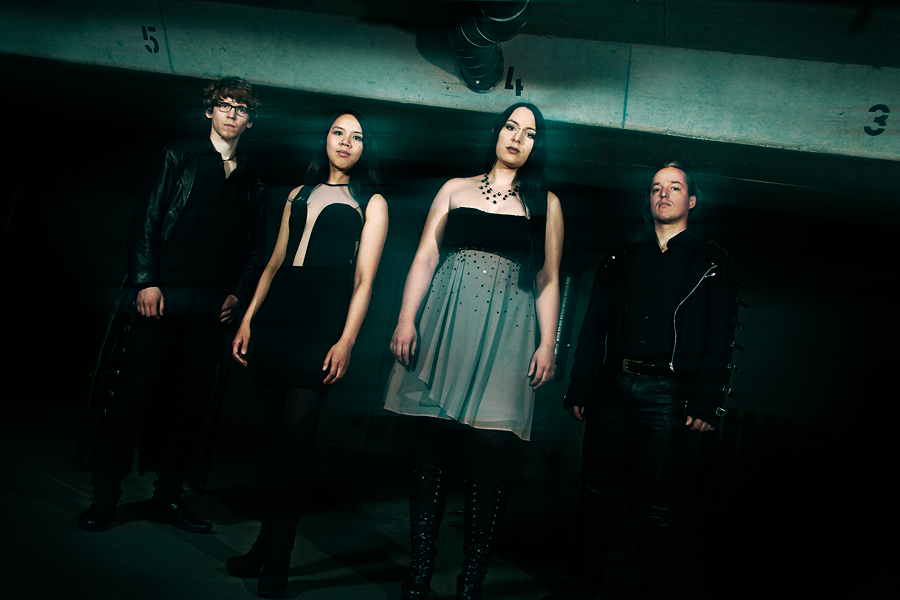
Zwischendurch organisierten wir das Bandshooting, das in meinem Wohnzimmer und meiner Tiefgarage stattfand. Die Band kam mit ihren vier Mitgliedern, die ein Haufen Klamotten zum Wechseln mitbrachten und ein nettes Chaos bei mir zuhause anrichteten. Ich war zu dem Zeitpunkt schon schwanger und die Band war ziemlich amüsiert, als ich zu ihren Füßen auf dem Garagenboden rumkrabbelte um Bilder zu schießen.
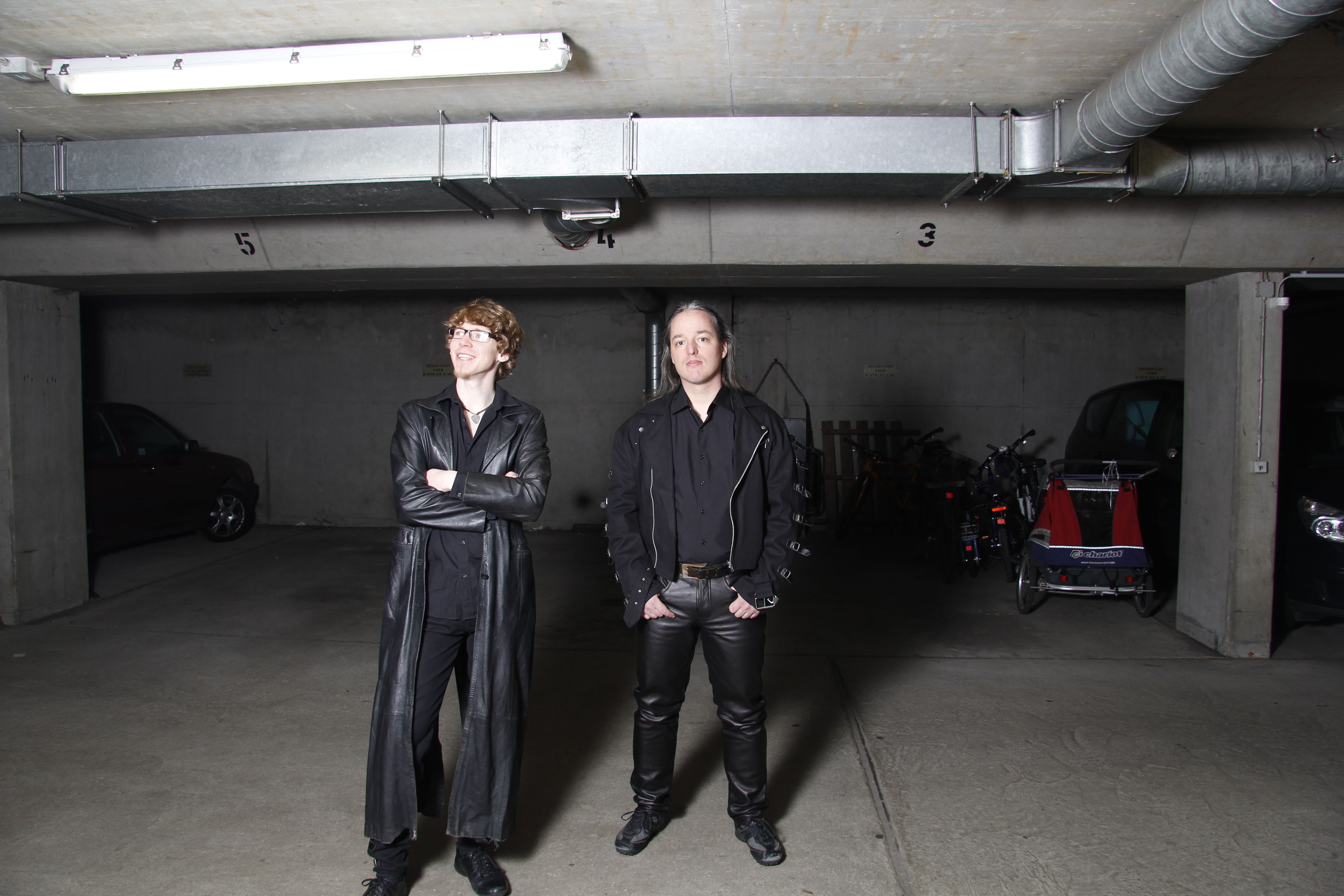
Even though it was very exhausting, we had so much fun this day.
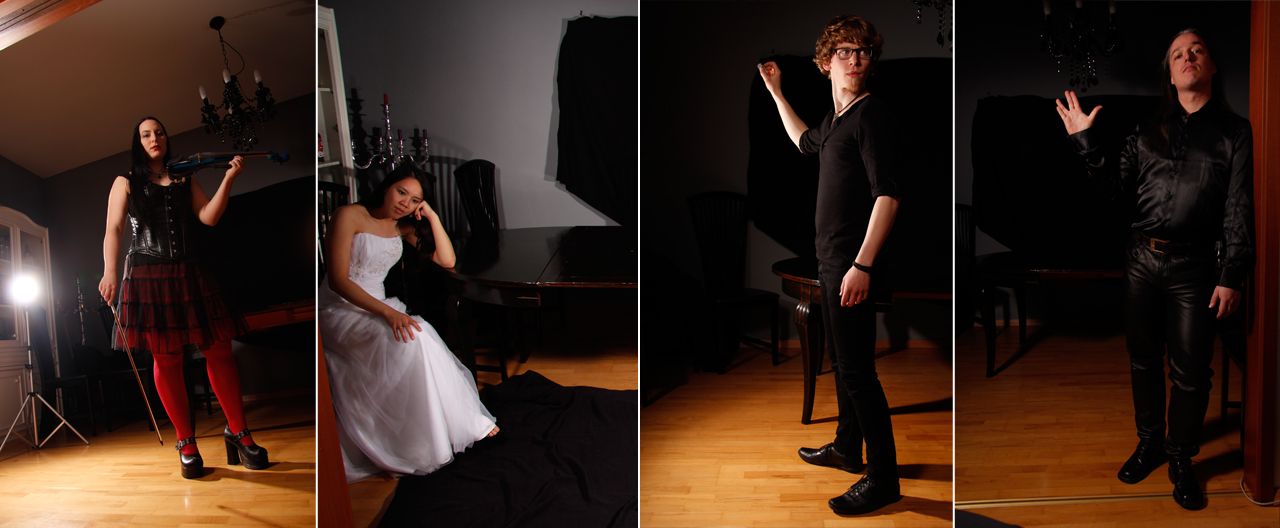
Zurück im Wohnzimmer habe ich jedes einzelne Bandmitglied in der Pose fotografiert, die ich für das Booklet im Hintergrund hatte. Da ich kein richtiges Fotostudio habe, muss ich einiges digital nachbearbeiten.
Auch wenn es ziemlich anstrengend war, hatten wir sehr viel Spaß an diesem Tag.
I decided to use a font that almost looks like the scratches in the background to get an overall feeling. It´s still good readable when printed. That´s a thing I was very worried about first...
Die nächsten Schritte waren: Das Layout für die 12 Seiten Booklet erstellen, die Bandmitglieder hinzufügen, Farben und Lichter anpassen und die Lyrics platzieren.
Ich entschied mich für einen Schriftzug, der den Kritzeleien auf den Wänden sehr ähnlich war, um ein einheitliches Gefühl zu erreichen. Es ist auch noch gedruckt sehr gut lesbar, worum ich am Anfang etwas Sorgen hatte...
Wir waren fast fertig, aber mir fehlte noch etwas. Nachdem ich ein wenig mit verschiedenen Formen herumgespielt hatte, habe ich eine Art Alien Planetensystem hinzugefügt, um den Science-Fiction-Look zu vervollständigen. Hier könnt ihr das finale Layout für das Digipack sehen:
Visit Crayven and show some love, if you want ♥
Crayven official website
Crayven on Facebook
♥
Thanks for reading! | Danke für´s Lesen!
♥
An artwork develops – All the sordid details by Crayven Part I [EN/DE]
Your post received an upvote by the @illuminati-Inc music curation team and its partner @curie.
You may consider voting for the Curie witness; all witness payouts are used to fund Curie operations including but not limited to more than 10 curation teams (vote here).
Thank you so much @illuminati-inc for your kind support ♬
love the tones
Thank you, @anomt. These are my favorite tones as well :)