Design | Creating the P3C Logo

First Things First
I always think that 'Gratitude is Attitude' so I always start off my design post with a little thanksgiving for the opportunities given for me to be able to be part of something great. I've been doing a lot of designs on Steemit over the past months here and this is my one of the first design that I'm doing for an initiative started not too long ago called P3C. I wrote a post about this newfound initiative a few days back and you can read it here :
P3C.io, an alternative version of powh3d, my best investment!
It's an investment platform with a really brilliant system and an awesome team. I'm thankful to be given an opportunity by the p3c Team to create a logo for them and hopefully that they'll like it. To know more about the this, you can head on over to our discord channel because I assure you that they're coming up with something really awesome really soon. You won't want to sit this one out.
P3C Links:
P3C Youtube Channel (cryptoliquid) - P3C New Front End 1.0 Ethereum Classic Game
P3C Wiki - P3C Explained
P3C Discord Channel - Come Join the awesome community and meet the people behind this amazing game.
Well, if you've decided to try to get on and buy some p3c tokens before the whales pop in, you can head over to my masternode and I would be very grateful.
Start here - p3c.io
Also, a word of advice, never invest with your savings/money you can't afford to lose. There is always a risk when it comes to investment be it big or small. Do your own research on this, I will link a few youtube links and p3c wikipedia for you down below for your reference.
Without further ado, this is my thought process behind creating this p3c logo.
The P3C Logo
The Idea
The idea was pretty straightforward. They already had a current logo which was a whale and I decided to improve on that direction. Though I do not have a degree or have ever studied graphic designing, I mostly self taught my way on the adobe softwares when I started on Steemit. Yes! I'm an animator but that doesn't mean I know graphic design. My first company was an advertising agency and that taught me a lot about the advertising and commercial line. I learned a thing or two about graphic design there and I am putting it to good use now. I mainly go for flat design and seeing the first logo version was already flat design, why not just remake it.

This is the first version of the logo. Pretty cute huh? So I just took the idea and improve on it.
Layout
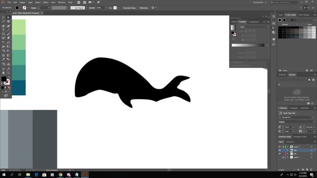
I started off with the whale's layout definitely using just the simple black colour. I prepared my colour palette as well as you can see at the corner of my desktop screen. I just needed to get the outline and shape the way I want it first before proceeding.
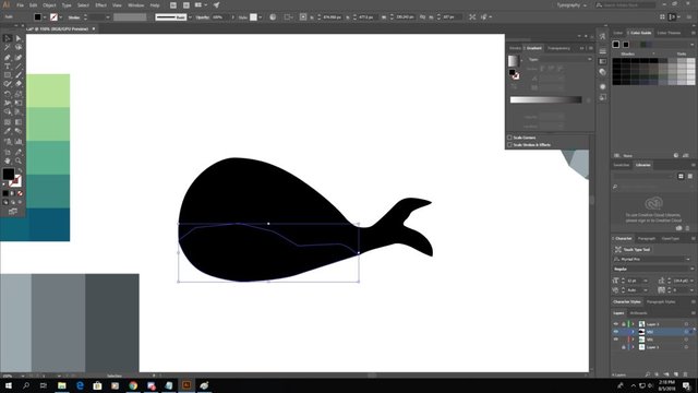
And I added the whale's belly too. Right now it looks like it's one piece but I assure you it's not. I just need to add the colours on em.
Adding Colours
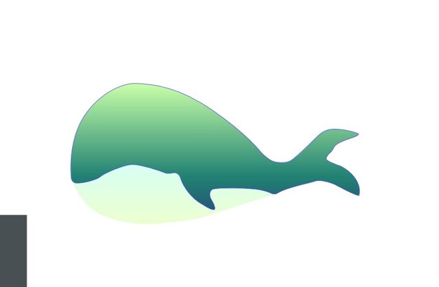
I decided to go with the green colour as the core colour because the theme was already green for the first version logo. I didn't want to run far from the initial concept so I went ahead and just add gradient to the colours. Greenish to yellowish.
Secondary Details
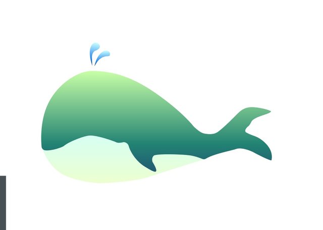
When I was pleased with the colours, I started to add the finishing touches by adding secondary details. Added the water sprout and gradient it too.
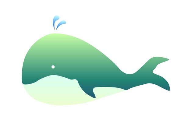
Added the last detail, the eye and I was allmostttt done. I thought that leaving the whale like this would make it look weird as it's supposed to be a logo. The initial logo concept is that there is always a rounded background or a squarish background. So I decided to add the last touch and finalize it.
Finalized
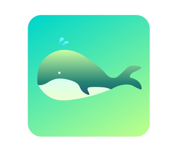
So there you go! The final product with the turquoise to yellow gradient background. I thought it looked much more professional now and more 'modern'. These modern logos love flat designs these days, it's a trend.
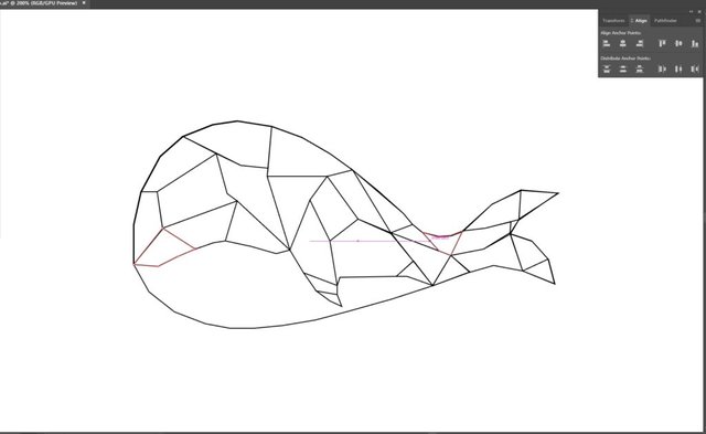
Alternate Logo
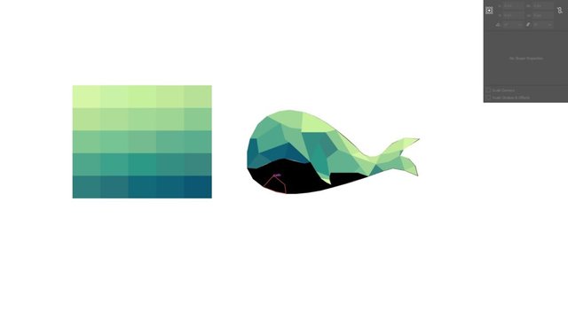
I created another logo before this one but was rejected. I made it polygonal style which was one of the trends now as well. The polygonal style is lightweight, simple and pleasing to the eyes. When we talk about this being a blockchain initiatives, I used this style because it also looked like network web connecting one another forming polygons.
Design Process
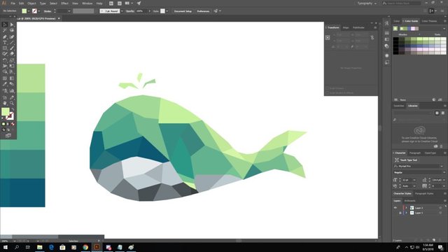
Finalized

This is the final version of the polygon style. I actually liked both logos very much. It wasn't that difficult to create because it was straightforward and simple but it did take some time to create them.
I hope you enjoyed looking at my design process for one of the amazing projects out there. Most importantly, I hope that you guys like the logo.
Thank You
If you like what I do, check out my other posts on meetups, animation, and designs.
Get your Personalized Steemit Profile Banner,Logos & GIFs

Posted from my blog with SteemPress : http://zord189.vornix.blog/2018/08/10/design-creating-the-p3c-logo/
Nice colour choice, I like logos to have some colour and such but not a freaking rainbow like some. I do also get a tinge of pity if I see someone in AI ;) but maybe just because I can't get past my 10min of suffering in that software. Well done simple and elegant.
Thank you very much!!! Trust me... it took me awhile to learn AI too. I hated that program but I need to learn it because I do a lot of designs here on Steemit. haha
It turned out really cute! I love the steps behind it and how you showed us the entire process of creating it. Good job!
Thanks @zen-art. :)
Another brilliant logo. I especially appreciate the step-by-step look inside the process. It is always fascinating to see behind the scenes, especially for art, which I admire, but am not that good at.
Proud member of #steemitbloggers @steemitbloggers
Hehe! Thanks! I try to document my designs. Not going to just post up the final product like that. No one would appreciate it. Hahaha.
nice tutorial! the polygonal style is cool, is there a method you're using to decide where all your lines go or are you just winging it? ironically I was working on a logo for a podcast I'm in and opened illustrator for the first time in years....talk about that learning curve lol.
Hahaha, I do some pre-planning first but they aren't as detail, so u can say 30% planned, 70% winging it. If it doesn't look nice, I would just readjust it, no harm there. Hahaha! I totally feel you! I was never born into the career world doing anything with illustrator.
the wonderful creative logo is this...what a color selected.
Lovely finish. Great work!
Thank you! :D
TIL that Zord is an animatorThe logo is super cute REEEEE. And it seems pretty mobile friendly so that they can make an app out of this any time :D
To be honest I prefer the simple whale logo more than the polygon whale, the latter feels a little too solid and sharp to be friendly XD.
Now probably I should get a little ETC with some of my spare DOGE to try this thing out :D
Nice nice, remember to use my masternode :D It's still in initial stage so u'll be an early adopter. Come in the discord and meet us
Really nice, bro! Digging the colour scheme
Thanks
@zord189 maybe something will change