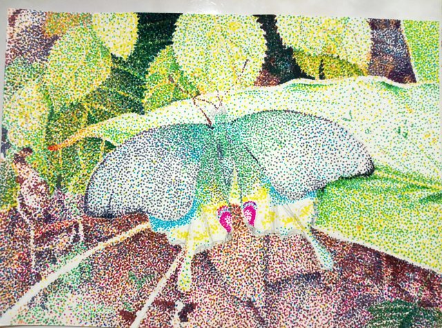
[CR] Pointilism butterfly and introducing pointilism technique
Hi! I want to share my dotted butterfly today and introduce you its technique.
[1. To get started]
First of all, many people told me, after seeing the one I've done, that I have a great patience to do all those dots....
Well, I don't!!
When I get tired, I rest, I do other things and continue it on the next day!
And you don't need a patience if you start it with a small piece, smaller than A4. I did this in A5 size.
Paper should be smooth and ink tolerant because you will be striking the pen many times just as you try to kill cockroaches!!! Sorry but it's the truth! 😄
Okay, but not the bumpy ones like watercolor paper, I think you might have difficulty getting the ink into crevice.
And if you have one of these pens?
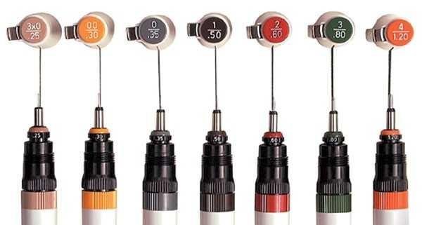
Source
These rotring and technical pens are very cool but choose not so small ones.
Long time ago, once I did with 0.05mm pen from Sakura, I only did a size of my palm because it wouldn't be done.
If you want try for the first time, find a marker pens like these.
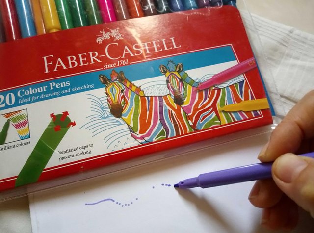
I am using this 20 pens set, very affordable and just the right size, and enough colors.
[2. Draft]
You will need something to refer on.
I used my own snap shot photograph, and magazine pictures before. If you prefer to use your sketch illustration, that's also good too.
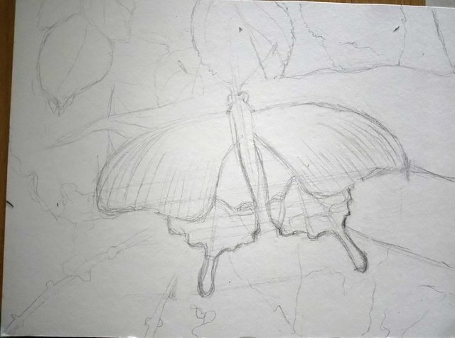
Draw the lines lightly with pencil.
And make sure you mark the area to be white because the white would only come from the color of white paper. I avoid these area to leave them white!
[3. Start dotting! ]
I made a gif!
Sorry I can't stop this gif😅.
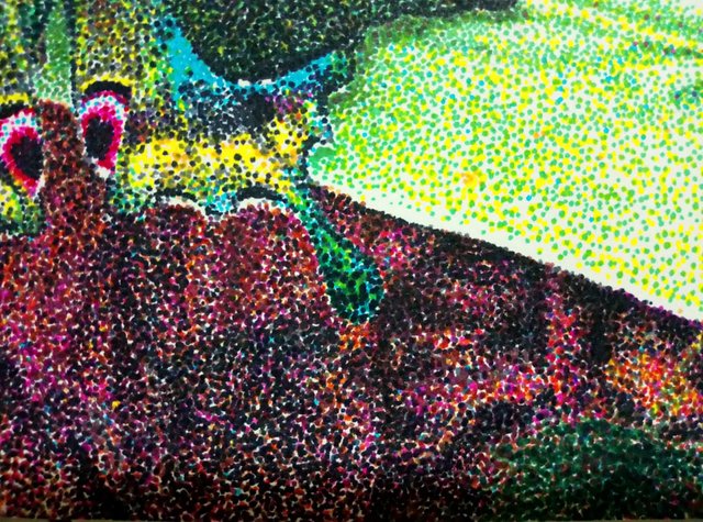
As you could see, it goes from light dots to dark dots.
Go over your pens, and find the lightest color of all!!
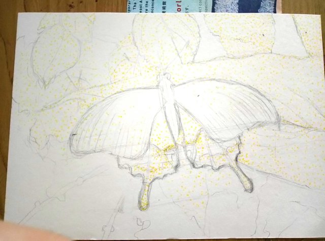
I go with yellow first.
There are many yellowish green leaves.
Then light orange for the background and some leaves.
Then lot's of yellow green.
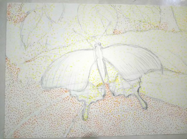
Since I can't erase darker shades, I think of it as adding a layer every time you change to darker pens.
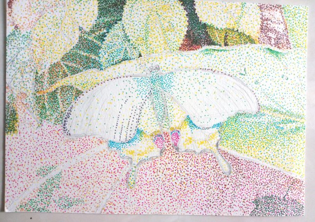
[4. Color blend]
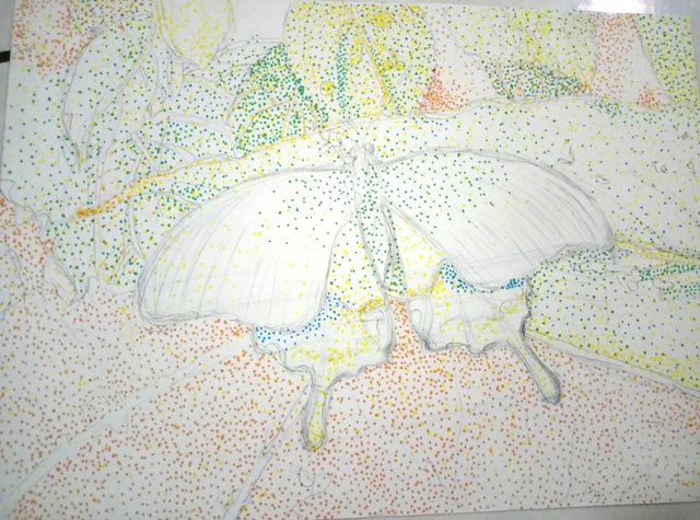
Okay, so the most important skill in doing this are not only dotting, but also applying a color blend and constantly comparing.
The yellow colors are there because the leaves did look yellow.
And I also applied yellow and light blue to geen leaves.
When yellow and blue coexist, from a distance, eye percieve it as green.
Okay, but it would look rough and awkward..........
so also added green dots to smooth it out.
This method is always been used throughout my pointilism.
So this color wheel is very handy!
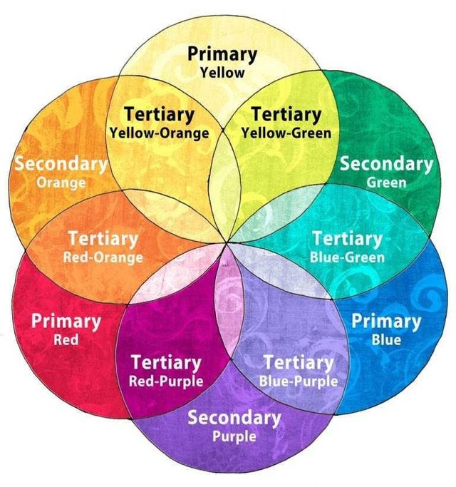
[source] (https://www.google.com/amp/s/100mandalas.com/2015/11/15/color/amp/)
For the background, I added pink.
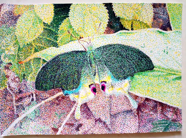
Here is a close up when its done.
You won't really see the pink any more.
It's buried by darker ones and could only see the glimps of it, just enough to give bright color punch!
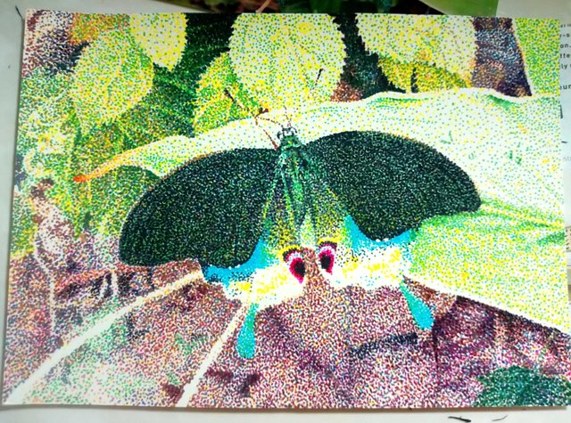
[5. Constantly compare]
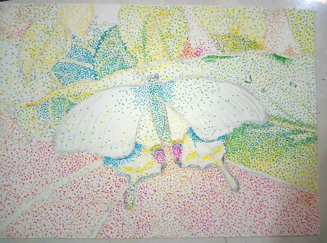
Here I added gray and grass green.
Getting darker now.
Constantly comparing means "is this green enough?" and check my photo.
"is this darker than that leaf?" and make it more darker.
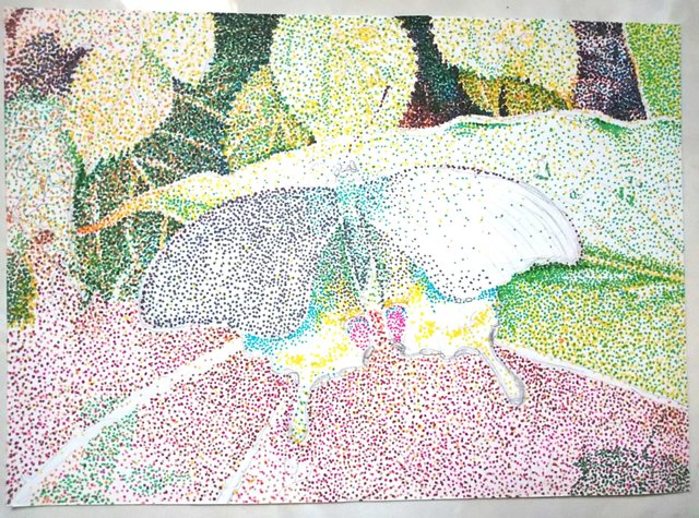
Gray on the wing wasn't dark enough, so I started using black from here. Finally!!
Keep working adding dark colors and black.
Still could dot bright and light colors for adjustments.
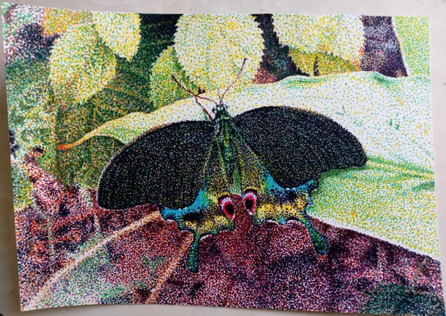
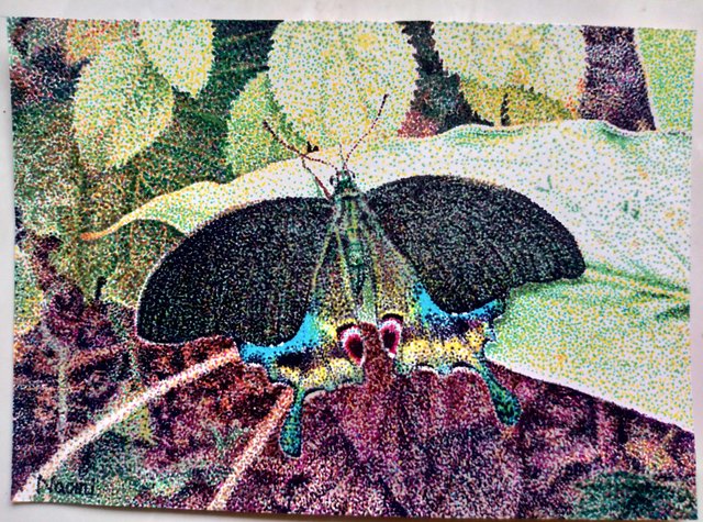
And done!
Done it in about a week.
Just optimized my time, no rush listened to my favorite music and TV program while doing it.😊
All the work and images which doesn't have source written are done by me, @naomipangolin.
Thanks for using eSteem!
Your post has been voted as a part of eSteem encouragement program. Keep up the good work! Install Android, iOS Mobile app or Windows, Mac, Linux Surfer app, if you haven't already!
Learn more: https://esteem.app
Join our discord: https://discord.gg/8eHupPq
Thank you @esteemapp!
Dear Artzonian, thanks for using the #ArtzOne hashtag. Your work is valuable to the @ArtzOne community. Quote of the week: Art, freedom and creativity will change society faster than politics. -Victor Pinchuk
Thank you, I am finally done @artzone! Lots of dots... I mean hug and love to you!
Your post was upvoted by the @art-venture account after manual review and included in Art-Venture magazine. The upvote and support of Art-venture magazine would greatly appreciated!
Wow, thank you @art-venture! You are making magazine? I go check it now!
Like you too❤️❤️❤️ cute kitty😊🐱
Your pointillism art is simply breathtaking, @naomipangolin ! Such beautiful control, and I love the colours you chose to work with, as well <3
Thanks @veryspider, always motivated and feel support from you!! Cheers!!!
This post was shared in the Curation Collective Discord community for curators, and upvoted and resteemed by the @c-squared community account after manual review.
@c-squared runs a community witness. Please consider using one of your witness votes on us here
Thank you so much! Very motivated and encouraged!! ❤️❤️❤️
So pretty @naomipangolin :) Love the effects of pointillism. Do you prefer this method compared to painting? I love how realistic the art piece look. Its like when we used the old printer type with low resolution printing quality.
Posted using Partiko iOS
Thanks @marblely!! Yah, I am 8-bit maniac now! Hehehe😁
Actually if you use bigger paper and smaller pen, those dots will be less noticeable. Takes forever though.... I do more for exhibition so see how it goes!!
@naomipangolin,.😍😍 i love it so much.. you now upgrade the marker pen hehehe.. i still use the economic marker pen you shown last time 😜 I still practice and it was a mess everytime.. I guess my weak point was the dot too big, i pressed it too hard.
Posted using Partiko Android
It looks so light and innocence!Especial complimenting you about the gif idea!