Does this Chart look Bullish or Bearish to you?
This is a weekly chart of Bitcoin, and it looks pretty bullish to me...
When you look at the chart below, what do you see?
Do you see a double top and the price rolling over?
Or, do you see a higher high, a higher low, and the price potentially putting in a bottom here in the context of a longer term bull market?
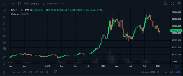
(Source: https://bittrex.com/Market/Index?MarketName=USD-BTC)
If the price holds up around this $40k level this chart looks pretty good to me.
If we lose that $40k level the chart will look significantly weaker, but it won't be over yet unless we lose that $30k level as well.
Until that happens I will remain bullish in the medium term.
Upvoted! Thank you for supporting witness @jswit.

I think if it breaks the resistance, goes slightly below 40k and then returns upwards, we might be in for a big bull run
It already did that... ;)
It's go time then
Bullish/Bearish we cant say now because its in exact support area,so now we need to wait.
I think it will go either up or down :)
Hmm