[CONTEST] Looking for new profile cover images
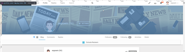
It's been a long time since I got my profile cover image by @zord189. Though, it is time to make some changes to the profile image as many of you could have noticed that I don't write often. Consequently, I would like to see something different than a representation of the news.
But I would also like to see more pieces than a cover image for Steem frontends. I wish to have a cover image for Twitter and Google+ as well. To be honest, I don't use them as much as I could and browse them less than in the past, but I suppose I can request all assets at once than creating tasks for each of them individually.
Topic
I have no idea. Yes, it is like that. Frankly, I often like to see what one can come up with while they have only a vague thought to work with.
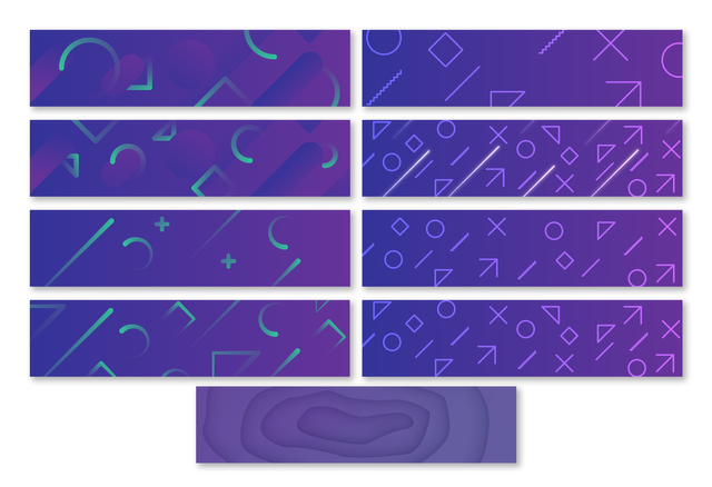
Despite that, I could give you some hints on the colours. Although I have no preferences in that aspect, I can provide a few images with colour palettes I like. I would say that darker is better than light, but you may convince me otherwise with your skills.
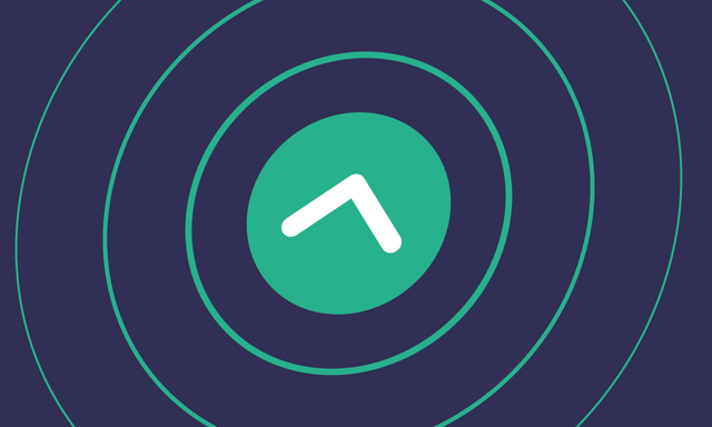 |  |  |
I may even favour something more abstract or geometric, using simple shapes and objects. A combination of circles, lines and squares could be fine as well, but remember that it is not a requirement.
I am going to use the cover images for personal purposes and thus would like to avoid using any logos and pictures that relate to companies and (commercial) projects.
If possible, I prefer a distinct image for each of the platform, Google+, Twitter, Steem.
Dimensions
I will use a cheat sheet that was provided to me on Discord, and I will rely on that in this post. If you see that the dimensions are not correct, don't hesitate to let me know and I will fix it.
https://www.mainstreethost.com/blog/social-media-image-size-cheat-sheet/
Twitter and Google+
As you could find out by reading the article above, there are some dimensions for images to fit perfectly.
Twitter:
Dimensions: 1500x500px
Google+:
Dimensions: 1084x610px
Steem apps
It may be more complicated for Steem apps as I believe that there is no standard for the cover image dimensions because every app uses different sizes. I will only include my observations from my environment (desktop). Though I was told that 2047x512px should work well.
I currently use Steemit and SteemPeak, sometimes Busy as well. The image should not contain elements that will make the text difficult to read on any of those apps. Be sure that you don't insert the main elements in the corners as they may not be visible.
File format
I will require images in a .png format in requested sizes, and if you work with vectors, a .svg is welcomed as well.
Source files and the final .png files will be requested upon selection and they will be sent in private before I send the reward.
Contest rules
I am curious whether more people can join this task and show what they can create. Therefore, I will run this task for 5 days till Thursday September 20. Be sure to submit your work by the end of the day (CEST).
I will be glad if you can send me your work in comments or in DM in Discord. You can find me in Utopian.io Discord as espoem#8461.
I will appreciate if you can show me how the images look like on the platforms.
Even though I am going to use for my personal accounts, I will request full rights for images that I will select.
Reward
I will give 25 STEEM to the one whose images I will like the most and pick for my use. Furthermore, I will select another two people who can win 5 STEEM each.
Another one
My favourite so far. I really appreciate and like that you try different colours every time.
I try different options ;)
I found 1920x400 works well for Steemit and the other Steem frontends, but 2048x512 should also be fine, but load a little bit slower. https://steempeak.com/steemit/@vikisecrets/steemit-secret-what-is-the-perfect-cover-photo-size-for-your-steemit-profile
Thank you for the input. I can do some compressions to reduce the file size and keep the dimensions.
My proposal:
View image
Hello, thank you for participating. Sadly to say, one of my expectations was not to have news as the main topic of the images. Yet, your proposal is focused on news and capturing the moment of reality.
Another option:

View image
I find the colours and the cubes quite interesting. Though, the bubble/circle pattern may be quite wild and too much if I look at it for a longer time. But still, I like the concept.
;)
And my last :)
View image
This one is interesting as well. It feels dark and a bit overwhelming. Not saying those are bad things in this case.
Hi @espoem!
Your post was upvoted by @steem-ua, new Steem dApp, using UserAuthority for algorithmic post curation!
Your UA account score is currently 4.311 which ranks you at #2348 across all Steem accounts.
Your rank has improved 12 places in the last three days (old rank 2360).
In our last Algorithmic Curation Round, consisting of 434 contributions, your post is ranked at #427.
Evaluation of your UA score:
Feel free to join our @steem-ua Discord server
And the last one, it's a little bit different.
View image
Well it was harder than I thought, I randomly worked on a 1920x480 canvas, here are some alternatives. Open to any adjustments. Don't forget to check out mockups on condenser
I've made a quick mockup of condenser's UI for myself to work quickly, anyone interested could download it from here
So many variations. :D I like the right column more in general. To be honest, the last image isn't my favourite as it displayed in here. However, I must admit that it looks good in the mockup. I think that condenser has the narrowest cover images of all apps. Is it possible to see it in steempeak as well?
Anyway, I'd say that I like the second from the top right the most but I also like how the circle from the image above looks like in the mockup.
I'm glad you didn't hate them :) I realized I wasn't working on a suggested color scheme when I was in the middle of the work.
Latest image actually work with multiple colors, but I didn't think it would fit that way so let's forget about it.
That 2nd one from right column was the latest iteration actually. It made me smile that at least I was going in right direction.
As you said condenser probably has the narrowest height after busy, and specially in your profile, since you didn't have any description text and location etc. Those at least add 70-80px to that space. Sure I'll try it with steampeak as well as mobile views. (I'm thinking about preparing major steem front-ends mockup btw. for general use)
Any further suggestions about colors, maybe icon sizes and density?
The density is fine. As I said, I like the circle(s) going outside the image but that would probably require to balance the sizes.
Covers on SteemPeak, one thing to mention, mockups are not precise but close to original ones as possible (especially for steempeak I tried to replicate the dark gradient coming from buttom, it's not the same values in css and photoshop). And images I use in those mockups are not full-quality exports but just quick screenshots. If you find some little fuzziness or distortion on some details, they won't be there with normal exports.
Thanks, @oups. Seeing these images, I am convinced that the second from the right top (original order) is the best choice from the list.
You're welcome, alright I'll try to focus on that one if I feel like to iterate and have some alternative colors. And applications of mobile versions. Don't worry there are two days ahead and you can expand the deadline, if you don't like the proposals.
I think big guns saving themselves for the last day. ;)
hi aspoem, this is my entry
what do you think??? I will wait for your advice, thanks
Hi, I like the first one more even though the symmetry of the second one is quite interesting. However, I could still find a few aspects that I believe could be improved.
Positives:
Negatives:
thank you for the advice, I will fix it as soon as possible ;)
hi sir, this is the result, i will also make the bright version for you ;)
what do you think, is this correct, thanks
Hi, can we talk on Discord about these images?
Another option
View image