Graphic designer Milton Glaser (b.1929) and his use of colour theory and design principles | Case study
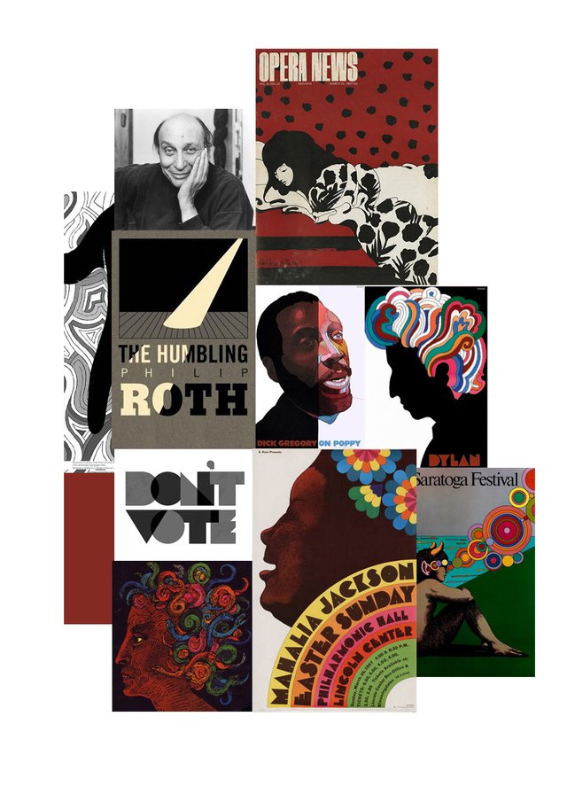
Image: A moodboard of Milton Glaser's works by Leysa Flores.
Milton Glaser was born in New York City in 1927 – a city which he would promote fifty years later with one of his most famous designs, the ‘I [heart] NY’ logo (1957):

Milton is a prominent American graphic designer who has won many impressive accolades throughout his life, perhaps most notably the 2004 National Design Award for Lifetime Achievement, and the National Medal of Arts, presented to him by then-US President Barack Obama in 2009.
Milton Glaser’s style emphasises strongly the use of forms, edges and line, rather than tonality. This stems from his particular interest in the nature of perception – how one recognises the message in a design and how well it communicates, regardless of the medium or technique applied.
Milton valued the artistic process led by intuition rather than reason or logic. “You see with your eyes, not your brain”, was one of his famous quotes. He discouraged analysing every small gesture and thought and sought to focus on the desire itself to change people and produce an effect in his art.
Milton used a lot of flat colour in an emblematic style – it was always chosen with care to ensure it enforced the communication of the particular composition at hand. For example, many of his designs used black, which produced a strong contrast effect against any other colours he used. Red, symbolic for blood, was used in his political pieces and again, red was used in the ‘I [heart] New York’ logo as many people also associate red with love and passion. Another of his famous designs, the Dylan poster (1966), used a selection of psychedelic-inspired colours in the organic forms and lines of the hair. It was equally oriented toward contemporary culture as well as the product it was promoting (Bob Dylan’s 1967 Greatest Hits album).
Milton’s emblematic use of colour applied to his organic forms, strongly contrasting edges and lines soon became recognisable as his iconic playful style.
By Leysa Flores.
Consider using one of your witness votes on untersatz!
Run by my husband (contrabourdon) and organduo—supporting the community with regular contests: Easy SBI Contest, Pinky and Spiky Drawing Contest and Secrets of Organ Playing Contest. Also powering the popular giphy bot and donating STEEM for deemarshall's creative contests.
Thank you for supporting @CatsMakeKittens by being a part of our community @leysa.
Each CATS you purchase gets you daily upvotes from me @CatScientist as our community grows so do your rewards for being a member!
You got a 7.42% upvote from @ocdb courtesy of @leysa!
@ocdb is a non-profit bidbot for whitelisted Steemians, current min bid is 2 SBD and max bid is 10 SBD and the equivalent amount in STEEM. Check our website https://thegoodwhales.io/ for the whitelist, queue and delegation info. Join our Discord channel for more information.
If you like what @ocd does, consider voting for ocd-witness through SteemConnect or on the Steemit Witnesses page. :)