[EN/JA] Consider Steemit's Smartphone User top UX/UI design / SteemitのユーザーTOPページのスマートフォン表示のUX/UIデザインを考えてみた
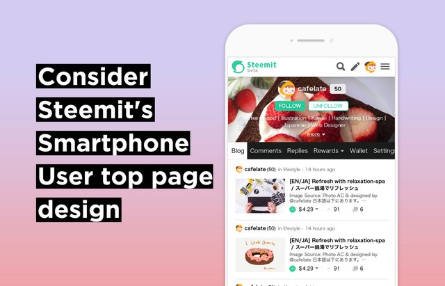
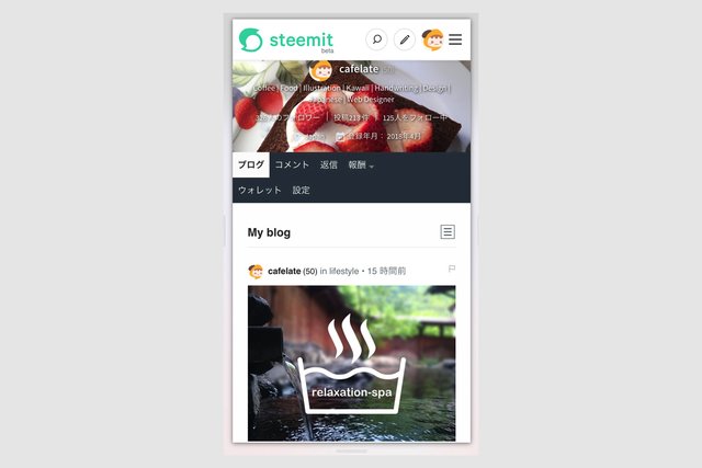
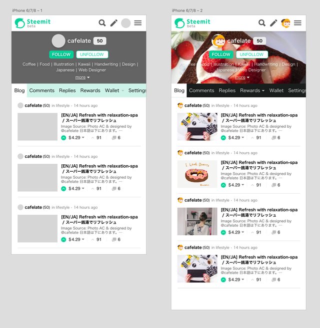
The current Steemit.com smartphone display is not easy to use. Especially TOP of the user page is covered with the header of the icon display, and since only one article is seen than anything else, it takes time to acquire the information.
Thumbnail images full of width are standard, but it seems that it does not suit you from the screen size of the current smartphone. I like the PC display version more easily, so after following the article list of the PC display version, I thought about designs that dipped other UIs without permission.

現在の Steemit.com のスマートフォン表示は、使いやすいとは言えません。特にユーザーページのTOPは、アイコン表示がヘッダーと被っているし、なによりも記事が1枚しか見えないので、情報を取得するのに時間がかかってしまいます。
横幅いっぱいのサムネイル画像は定番ではありますが、現在のスマートフォンの画面サイズからすると合わないように感じます。私はPC表示版の方が見やすくて好きなので、PC表示版の記事リストを踏襲した上で、他のUIをダイエットしたデザインを勝手に考えてみました。
Points to consider from the design of the current page / 現行ページのデザインから検討したい点
- I want to display 3 cases in First View (let's make reward display easy to see)
- I want to fix it because the header is too big
- Profile area is too large
- Because it clearly states that it is a blog on the "blog" tab, consider whether or not "My Blog" title is necessary
- 文字が小さくなってもいいからファーストビューで3件表示したい(報酬表示も見やすくしたい)
- ヘッダーが大きすぎるので直したい
- プロフィールエリアが大きすぎる
- 「ブログ」タブでブログであることを明示しているので「My Blog」タイトルは必要かどうかを検討する
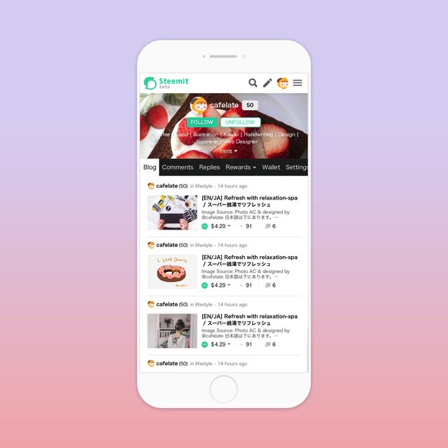
Finished image / 仕上がりイメージ
Major changes / 主な変更点
- Dieting the height of the header
- The number of followers and location are displayed by toggle with more clicks
- To swipe the tab display to the right
- Images and characters are reduced in size, images like PC display, 3 views displayed in the first view
I tried to reconfigure the structure without breaking the image of the current site.
I think that this display seamlessly connects the display between PC and SP, but what do you think?
- ヘッダーの高さをダイエット
- フォロワー数やlocationはmoreクリックでtoggle表示
- タブ表示を右へスワイプする形へ
- 画像と文字を小さくし、PC表示のようなイメージで、ファーストビューで3件表示
現行サイトのイメージを崩さずに、構成をし直してみました。
こちらのほうがシームレスにPCとSPの表示がつながるように思うのですが、みなさんはどう思いますか?
Workflow / ワークフロー
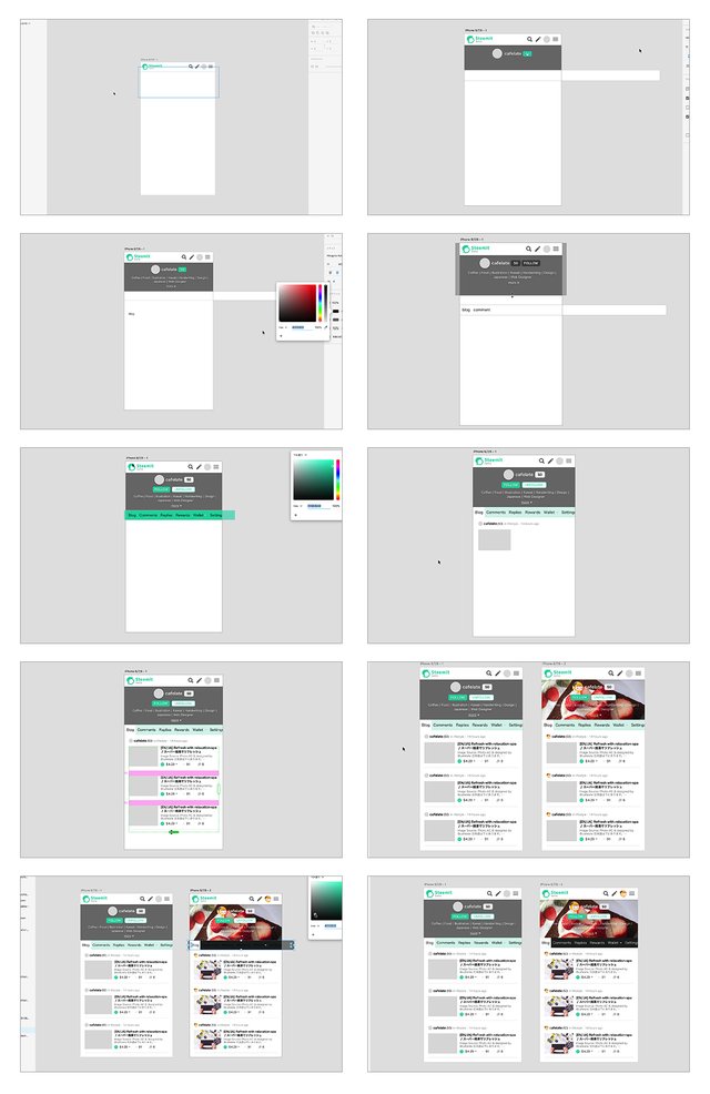
Final display with adobe XD / adobe XDでの最終表示
Material used / 使用素材
Mockup frame:Minimal iPhone 7 Concept Template by Xiaoxue(Ellie) Zhang - Dribbble
Use icon:Ionicons: The premium icon pack for Ionic Framework
Usage logo:Steemit
Some image sources:Free stock photos · Pexels
Go here https://steemit.com/@a-a-a to get your post resteemed to over 72,000 followers.
わぁ!ぜひ本家で採用して貰いたいですね!
細かな作業お疲れ様です。
あと、スーパー銭湯でリフレッシュしすぎです!笑
ありがとうございます^^あ、確かにスーパー銭湯行き過ぎですね(笑)
気が付かなかったです!😆
このデザインに賛成です!
スーパー銭湯でリフレッシュにも賛成です!
わーい。ありがとうございます^^
argonさんもランニングされてるから、スーパー銭湯好きそう!(*´∀`)
はじめまして、フォローさせていただきました。
スマホ用デザイン案イイですね!本家もまだまだβ版のステータスのようなので、これからの改善に期待ですね。
フォローありがとうございます!ですね。これからに期待です(*´∀`)
Hello @cafelate, thank you for sharing this creative work! We just stopped by to say that you've been upvoted by the @creativecrypto magazine. The Creative Crypto is all about art on the blockchain and learning from creatives like you. Looking forward to crossing paths again soon. Steem on!
Thank you!
UIデザイナさんなのですか?steemitのUI/UXももちろんですが、この記事自体がすごく見やすいですね!ja&enの記事なのにこんなに読みやすいことに感動しています!!フォローさせていただきます^^これからも記事楽しみにしています〜
フォローありがとうございます^^UIデザイナですよ〜。というか、Webの見た目をなんでもデザインしてしまうお仕事をしてます。
見やすさ頑張ってたのでお褒めいただいて嬉しいです(*´∀`)