Iconic Logo Proposal for KrazyKoin
KRAZY KOIN logo design

Link Contest
This contest was open by @krazykrista in https://steemit.com/@krazykrista/contest-krazykoin-needs-a-logo-win-free-krazykoin
Details.
KrazyKoin is a token from @krazykrista that is made to be shared with people in return for every act of kindness that is active and helps the community. This token will be reused to get votes from the @krazywitness account at the Whaleshares Chain.
Whaleshares Chain is https://beta.whaleshares.net
Logo
Logo Idea.
With a round Whaleshares logo, my first idea was to create the Krazykoin logo in a round shape too.
And with a request to be able to create a logo with the name KrazyKoin or KK I added the $ symbol. Even so, the KK I want is to add them to a hidden visual perspective, but not completely hidden in the Logomark Icon.

KK letter and $ in center is still cleary visible. And by the way, why do I choose pixels for this logo?
yeah, actually if you mean KRAZY in the form of tenacity perspective, KRAZY is not easy to guess in a town home. So, PIXEL is a thing that is suitable for visual KrazyKoin logos.
And also This is a token that rewards people for random acts of kindness and for being active, encouraging, and helpful in the community pixels are likened to a group of people. In design, pixel pixels form an object, in this case, every form of idea and effort from people will form a good community. very deep? maybe
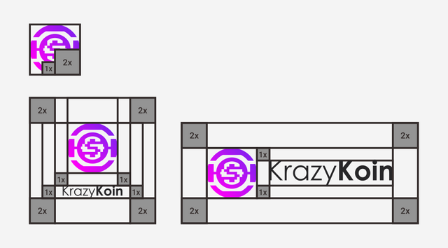
Logo Process (contruction)
The construction logo is based on the gridline system and adopts it to be more renposive in use. In the system, GRID LINE based aims to make the logo still has aesthetics of construction.
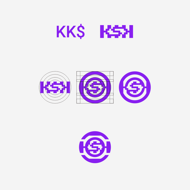
And BTW, here is the save zone for logo. Keep this clear space free of significant visual element such as text, border or document edges and another logos
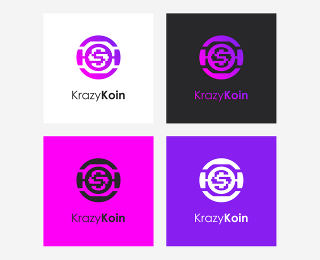
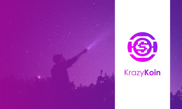
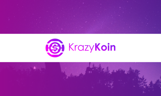
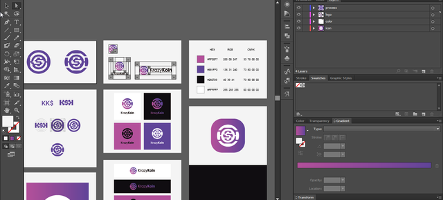
Logo Result
And here is the result for logo KrazyKoin.
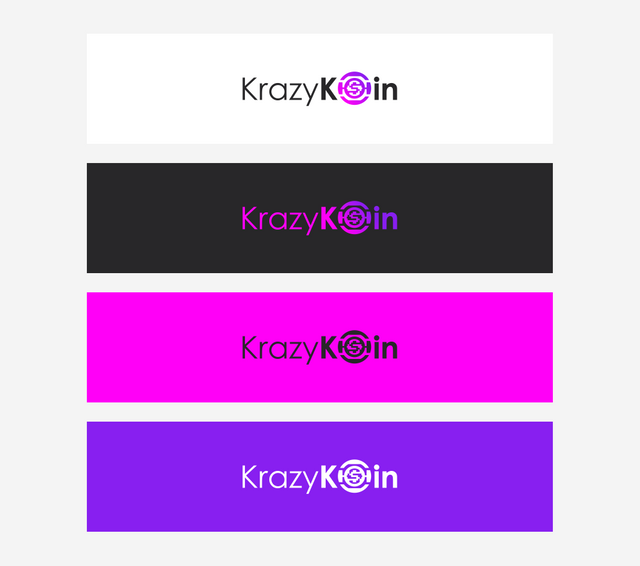
- Primary logo (horyzontal version) color, black and white color.
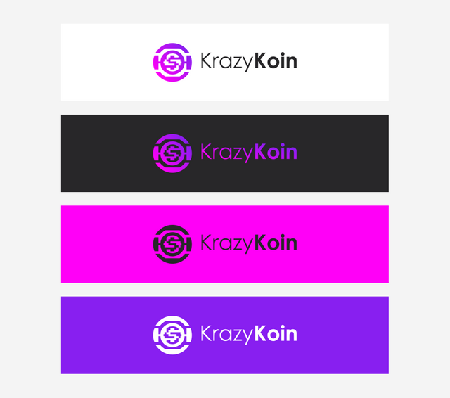
- Secondary logo (vertical version) color, black and white color.
- Alternative logo color, black and white color.
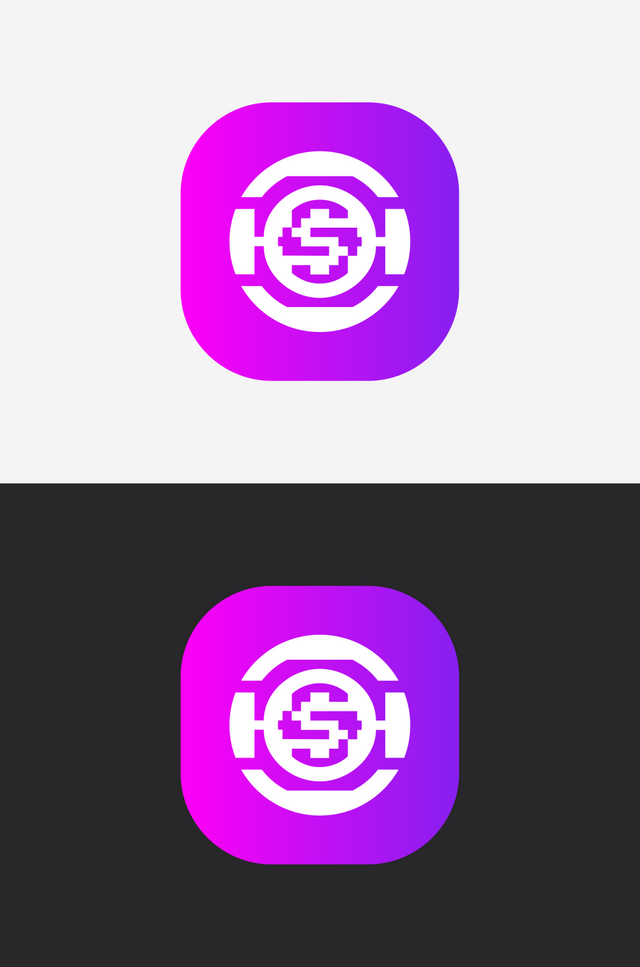
- icon version
- Profile version (sosial media profile)


- logo image thumbnail
Font.
Century Gothic
KrazyKoin logo used the Century Gothic typeface as logotype. https://www.wfonts.com/font/century-gothic
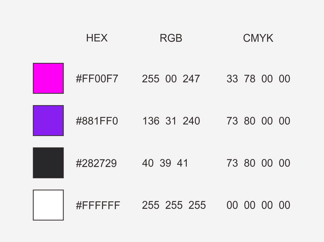
Color.
Benefit.
Benefits / Improvements
For the benefit of KrazyKoin logo are:
Logo visual is based on criptocuranci and koin on circle visual and letter KK + $ for represent to KrazyKoin.
Logo Visual that is easy to understand.
Simple and Modern logo and yeah, this is Metaphors innovative.
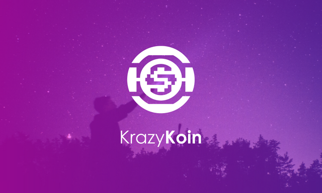
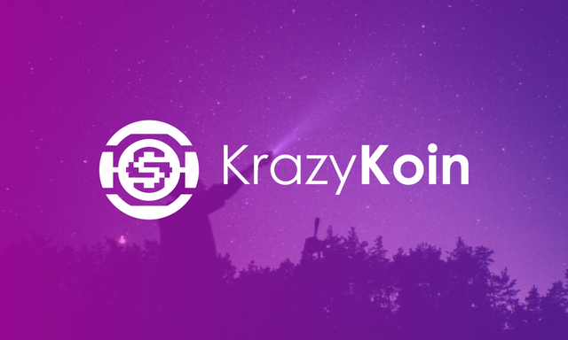
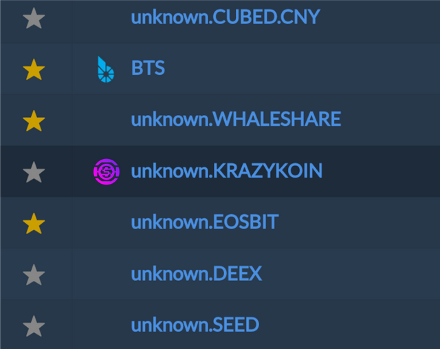
Some examples in applying.
Proof of authorship.
Tools.
I created the KrazyKoin Logo using Adobe Illustrator CS6 (64 bit). And I provide a vector file ( SVG ) for flexibility and scalability, as well as .PNG file format for immediate use of the designs.
Original files.
Download logo PNG file for immediate use and SVG file editable and scalability needed https://drive.google.com/drive/folders/1Wp9aLu26-iV6aJFs-M3HX1292Sg3?usp=sharing
License.
This work is licensed under a Creative Commons Attribution 4.0 International License.


Looks a bit schizophrenic :D I guess it fits the name.
🤭, yeah, that is metaphor analytic.
Wow man! Very well done! Very deep indeed! Congrats!
Thanks man for stoping by. Btw, this not a final decission. Maybe
congratsand mybeno. 🙂Yeah maybe! ;)