Rule of thirds (russian and google translate) | Правило третей
Начав в последнее время изучать фотографию, я посмотрел довольно много лекций, посвящённых композиции - расположению объектов в кадре. Её называют одним из главных инструментов, позволяющих автору донести до зрителей свою идею наилучшим образом.
Множество людей пытаются алгоритмизировать композицию, выдать любителям оптимальный набор шаблонов, позволяющих не особо задумываясь снять фотографию (нарисовать рисунок) оптимально по расположению предметов, людей, линий рельефа и т.п.
Хотя на самом деле множество шедевров мирового искусства не подчиняются этим искусственным правилам, но всё же есть несколько рекомендаций, которым стараются следовать почти все, сегодня рассказ о самом модном и простом.
Правило третей
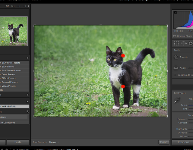
В графических редакторах при обрезке (crop) фотографий это правило стоит по умолчанию - каждый автор может редактировать снимок так, чтобы объект оказался на линиях, делящих поле на три равные части, самым лучшим в этой концепции считается поместить изображаемое в точках пересечения. Вот например я кадрирую свой летний снимок котика, чтобы он находился в районе этих "точек силы":
При этом рассказывают, что взгляд зрителя двигается слева направо и сверху вниз (так мы привыкли читать) и останавливается где-то справа внизу - именно там выигрышней всего располагать объект.
Хотя есть и другие мнения, некоторые фотографы рассказывают, что правило третей придумано производителями фототехники - в этих точках фокусируются камеры, здесь получаются наименьшие искажения и т.п.
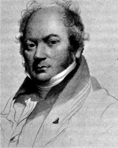
На самом деле, конечно, это не так. Правило третей упоминал ещё художник, гравёр и антиквар Джон Томас Смит (John Thomas Smith) в 1797 году, в письме к своему коллеге.
Этот англичанин рассуждал в том смысле, что нужно делить картину в пропорциях один к двум, чтобы равноразмерные части не заставляли внимание зрителя постоянно переключаться друг на друга. Именно таким образом по правилу третей сейчас рекомендуют делить фотографии горизонтом - либо треть неба, либо треть земли.
Помимо непосредственно географических линий, делящих холст, Смит писал о том, что нельзя включать в картину два одинаково ярких источника света. Последователи шли дальше и объявляли, что в эстетически выверенной композиции и отношение тёплых и холодных цветов должно быть один к двум (или наоборот), отношение светлого и тёмного должно подчиняться этой же пропорции и т.д. Впрочем, такие рекомендации не встретили понимания у художников и зрителей - слишком это сложно реализуемо и непросчитываемо заранее.
Смит писал, что на картине должна быть тёмная и светлая части, расположенные таким образом, чтобы внимание зрителя легко перемещалось и было понятно, что главное и что подчинённое.
Хотя собственные работы Джона Томаса Смита по современным представлениям далеки от идеальной композиции. Вот одна из гравюр, на которой изображён слепой попрошайка с собакой :
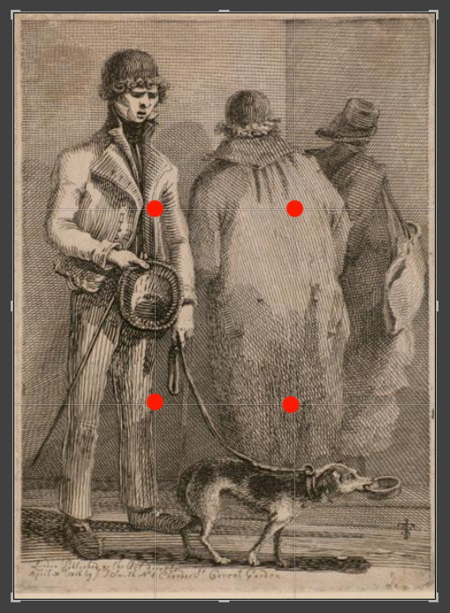
Можно заметить, что основные объекты сильно зажаты, находятся у краёв картины, и только вертикальная стена находится близко к одной из линий по правилу третей, но она мягко говоря не самый главный объект гравюры.
Из приятного в ней можно отметить более контрастное выделение главного героя и менее резкое - второстепенных фигур. Хотя их одинаковый размер и скученность сейчас бы вызвали критику специалистов.
Шедевры искусства далеко не всегда подчиняются правилу третей. Возьмём наиболее известную работу Леонардо да Винчи - “Мона Лиза”:

И что мы видим? Ни на одной из линий, делящих картину в отношении один к двум нет вообще никаких объектов :) И всё же ей восхищаются миллиарды людей уже много сотен лет. И таких примеров пруд пруди, это не какое-то единичное исключение.
Впрочем, всё же правило третей позволяет начинающему автору подбирать соотношение объектов на прямоугольнике картины или фотографии, поэтому совсем уж списывать его со счетов не стоит.
По крайней мере я во многих случаях стараюсь композиционно строить сюжет так, чтобы правило третей “работало”, вот из свежих фотографий:

Иногда этот подход приносит результат - фотография смотрится взвешенно и логично. О других правилах композиции я поговорю отдельно.
Источники:
https://en.wikipedia.org/wiki/Rule_of_thirds
https://en.wikipedia.org/wiki/John_Thomas_Smith_(engraver)
Google translate:
Having started recently to study photography, I looked quite a lot of lectures on composition - the location of objects in the frame. It is called one of the main tools that allow the author to convey to the audience his idea in the best way.
Many people are trying to algorithmize the composition, to give lovers an optimal set of patterns, allowing them to take a photo (draw a picture) without any hesitation, optimally by the arrangement of objects, people, relief lines, etc.
Although in reality many of the masterpieces of world art do not obey these artificial rules, there are still a few recommendations that almost everyone is trying to follow, today is a story about the most fashionable and simple.
Rule of Thirds
In graphic editors, when photographs are cropped (crop), this rule is by default - each author can edit a picture so that the object is on lines dividing the field into three equal parts, the best in this concept is considered to be placed at the intersection points. For example, I will frame my summer snapshot of a cat so that it is located in the area of these "power points":
At the same time, it is said that the viewer's eye moves from left to right and from top to bottom (as we used to read) and stops somewhere at the bottom right - this is where the object is most advantageous to place.
Although there are other opinions, some photographers say that the rule of thirds was invented by the manufacturers of photographic equipment - cameras are focused at these points, here we get the least distortion, etc.
In fact, of course, it is not. The rule of thirds was also mentioned by the artist, engraver and antiquarian John Thomas Smith in 1797, in a letter to his colleague.

This Englishman reasoned in the sense that it was necessary to divide the picture in proportions of one to two, so that equally-sized parts would not force the viewer's attention to constantly switch to each other. In this way, according to the rule of thirds, it is now recommended to divide photographs by the horizon — either a third of the sky or a third of the earth.
In addition to directly geographical lines dividing the canvas, Smith wrote that it is impossible to include two equally bright light sources in the picture. Followers went further and declared that in an aesthetically balanced composition both the ratio of warm and cold colors should be one to two (or vice versa), the ratio of light and dark should obey the same proportion, etc. However, such recommendations did not meet with the understanding of artists and viewers - it is too difficult to be implemented and unreadable in advance.
Smith wrote that the picture should be dark and light parts, arranged so that the viewer's attention easily moved and it was clear that the main thing and that subordinate.
Although his own work of John Thomas Smith, according to modern ideas, is far from the ideal composition. Here is one of the engravings showing a blind beggar with a dog:
You can see that the main objects are strongly clamped, are at the edges of the picture, and only the vertical wall is close to one of the lines according to the rule of thirds, but to put it mildly, it is not the main object of engraving.
From pleasant in it can be noted a more contrast selection of the main character and less dramatic - minor figures. Although their equal size and crowding now would be criticized by experts.
Masterpieces of art are not always subject to the rule of thirds. Take the most famous work of Leonardo da Vinci - “Mona Lisa”:
And what do we see? There are no objects at all on one of the lines dividing the picture in relation to one to two :) And yet billions of people have admired it for hundreds of years. And such examples are a dime a dozen, this is not some single exception.
However, the rule of thirds still allows the novice author to select the ratio of objects in a rectangle of a picture or photo, so it’s not worth it to write it off.
At least in many cases I try to construct the plot in a compositional way so that the rule of the third “works”, here are the fresh photos:
Sometimes this approach brings results - the photo looks balanced and logical. I will talk about other composition rules separately.