PHOTOGRAPHY COURSE | 8.1 Primeros pasos en gestión de color | First steps in color management
PHOTOGRAPHY COURSE
8.1 Primeros pasos en gestión de color | First steps in color management
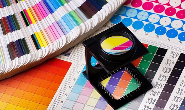
Fuente
Hola comunidad de Steemit
Ya vamos cogiendo el ritmo del curso de nuevo, vamos a aprovechar esta pequeña introducción que os queria hacer para repasar un poco lo aprendido en el curso :
- Hemos visto la unidad completa de composición , aprendiendo las reglas y como saltarselas ;)
- Estamos trabajando en la unidad de tecnica, en la que en las proximas semanas veremos más conceptos tecnicos fotograficos
-La unidad de teoria de la imagen la tenemos algo abandonada, creo que lo mejor antes de estudiar las grandes figuras de la fotografia y su obra, es conocer perfectamente el funcionamiento tecnico, ya que sera una ayuda para comprender sus tecnicas y directrices de trabajo, para asi, poder nosotros asumirlas en el nuestro, siempre y cuando sea eficientes para nosotros, no todo vale, recordarlo. - Las unidades de fotografia Analogica y Estenopeica, en las que estamos viendo su funcionamiento por el momento, aquí me aventuro a daros una gran noticia, ya tengo laboratorio de revelado, asique proximamente os enseñare como revelo mis trabajos analogicos a los que más cariño les pongo.
- y para terminar y no menos importante, las unidades de revelado basico y avanzado que desarrollaremos en el proximo més, para el cual, seguramente me apoye de la plataforma @D-tube para facilitar el aprendizaje.
Dicho todo esto y aclarado el rumbo de este curso, ¿comenzamos con la unidad de hoy?
Para continuar con las unidades de percepción del color que ya trabajamos durante el principio del curso, hoy traemos el principio de las unidades de revelado, la teoria obviamente ;)
Antes de comenzar con un revelado, o flujo de trabajo profesional, del cual procesas diariamente imagenes que van a finalizar en web, revistas o demás lugares de publicación, necesitamos saber muchos conocimientos de color y de calibración de monitores, ya que normalmente no es igual, el resultado en nuestro software de edición, ya sea Lightroom, photoshop, capture one...Al resultado final, en un periodico digital, fisico, o una foto impresa por un plotter calidad.
Tenemos que partir de un conocimiento muy importante y hago aquí hincapie, MUY IMPORTANTE.
- ¿ Que es un espacio de color ?
Es un sistema de intrerpretación del color, que organiza y especifica los colores de una imagen.
Podriamos tener varios ejemplos: Adobe RGB, sRGB, CMYK...
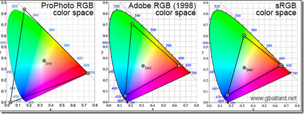
- ¿ Con que perfiles trabajaremos ?
Adobe RGB configurado en la camara y en postproducción.( No trabajeis en Profoto, salvo que tu ordenador y tu equipo fotografico lo soporte, solo perderas información y trabajaras a tasas de frame muy bajas).
Una vez terminado esa parte del proceso , convertimos a sRGB si su finalidad es web.
Si la finalidad es impresión, en unas unidades os explicaremos como darle una vida material a nuestra obra.
Una pequeña aclaración de ellos :
sRGB : perfil de color para web ( todos nuestros archivos que su finalidad es web, tenemos que exportarlos en dicho espacio o perfil para no perder la colorimetria obtenida)
Adobe RGB : perfil de color con un 99% de interpretación real, sera con el espacion con el que trabajaremos en nuestra camara y en la postproducción que hagamos en nuestra estudio.
Profoto RGB: perfil de color de casi más de un 100% de interpretación del color, capta más de lo que el ojo puede leer pero favorece a conversiones en rango dinamico y demás factores demasiados complejos para este curso.
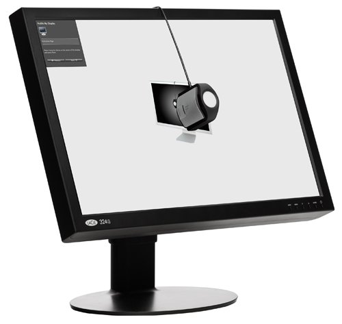
- Y ahora, depués de saber esto, ¿como calibro mi monitor?
Pues, amigo, no te va a gustar la respuesta, si quieres tener tu monitor completamente calibrado, y funcional para cualquier tipode trabajo, deberas invertir un poco de dinero en la compra de un calibrador externo de monitor, con el cual te aseguraras un monitor calibrado para el resto de su vida.
Ejemplo de calibrador muy bueno relación calidad precio listo para su compra: https://amzn.to/2l8J4sj
-Y ahora?, Conclusión.
Ahora, tienes tu monitor calibrado y conocimientos basicos para empezar en tu proyecto de gestión de color personal.
Te animo a que avances en esto y veas los increibles resultados que da, y no olvides en decirmelo en los comentarios ;)
English:
Hello community of Steemit, we are already taking the rhythm of the course again, we are going to take advantage of this small introduction that I wanted to do to review a little what I learned in the course:
- We have seen the complete unit of composition, learning the rules and how to skip them;)
- We are working in the technical unit, in which in the next weeks we will see more technical photographic concepts
-The unit of theory of the image we have something abandoned, I think the best thing before studying the great figures of photography and his work, is to know the technical operation perfectly, as it will be an aid to understand their techniques and work guidelines , so, we can assume them in ours, as long as it is efficient for us, not everything is worth it, remember it. - The units of Analogic and Pinhole photography, in which we are seeing its operation for the moment, here I venture to give you great news, I already have a development laboratory, so I will soon show you how I reveal my analogical works to those who love them most I put.
- and to finish and not least, the basic and advanced development units that we will develop in the next month, for which, I will surely support the platform @ D-tube to facilitate learning.
Having said all this and clarified the course of this course, we begin with today's unit?
To continue with the units of perception of color that we already worked during the beginning of the course, today we bring the principle of the development units, the theory obviously;)
Before starting with a development, or professional workflow, from which you process daily images that will end up in web, magazines or other places of publication, we need to know a lot of knowledge of color and calibration of monitors, since normally it is not the same , the result in our editing software, be it Lightroom, photoshop, capture one ... To the final result, in a digital newspaper, physical, or a photo printed by a quality plotter.
We have to start from a very important knowledge and I emphasize here, VERY IMPORTANT.
- What is a color space?
It is a color interpretation system that organizes and specifies the colors of an image.
We could have several examples: Adobe RGB, sRGB, CMYK ...
- With what profiles will we work?
Adobe RGB configured in the camera and in postproduction (Do not work in Profoto, unless your computer and your photographic equipment support it, you will only lose information and work at very low frame rates).
Once that part of the process is finished, we convert to sRGB if its purpose is web.
If the purpose is printing, in a few units we will explain how to give a material life to our work.
A small clarification of them:
sRGB: color profile for web (all our files whose purpose is web, we have to export them in this space or profile to avoid losing the colorimetry obtained)
Adobe RGB: color profile with 99% real interpretation, it will be the space with which we will work in our camera and in the postproduction that we do in our studio.
Profoto RGB: color profile of almost more than 100% of color interpretation, captures more than the eye can read but favors conversions in dynamic range and other factors too complex for this course.
- And now, after knowing this, how do I calibrate my monitor?
Well, friend, you will not like the answer, if you want to have your monitor fully calibrated, and functional for any type of work, you should invest a little money in the purchase of an external monitor calibrator, with which you will ensure a monitor calibrated for the rest of your life.
Example of very good price quality calibrator ready for your purchase: https://amzn.to/2l8J4sj
-And now ?, Conclusion.
Now, you have your calibrated monitor and basic knowledge to get started on your personal color management project.
I encourage you to advance in this and see the incredible results it gives, and do not forget to tell me in the comments;)
In case you are interested here we leave a list of the material we use:
Por si os interesa aquí os dejamos una lista de parte del material que utilizamos:
Nikon D500: https://amzn.to/2xKbSQN
Nikon D5: https://amzn.to/2Jcgchg
Nikon 28 mm F 1.8: https://amzn.to/2sx4x2c
Nikon 8- 15 mm F1,8: https://amzn.to/2swSDp4
Nikon 70-200 mm F 2.8: https://amzn.to/2sAd8Rz
Flash Profoto A1: https://amzn.to/2szhB77
Tripode that I use and totally reliable: https://amzn.to/2kNuzts
Safety straps that I use: https://amzn.to/2sAQEzO
Cleaning kit: https://amzn.to/2JiA0ey
- PREVIOUS POST : https://steemit.com/photography/@harmaa/photography-course-7-2-analogicovsdigital
- DIDACTICAL GUIDE: https://steemit.com/photography/@harmaa/frame-to-frame-informative-note-photography-course
- D-TUBE CHANNEL:
#Photography #art #FrameToFrame #artistcolective #authorphotography #beauty #creative #creativity #design #freedom #manoloelpescador #reydeuncastillodearena #wildnaturefeel #Audiovisual #cinema #film #production #sound #entertaiment #films #movies #doubleexposition #artistday #day #Documental #documentalphotography #documentalfilms #documentalaudiovisuals #spanishproductions #spanish #Histeemit #collorchallenge #color
You got a 1.61% upvote from @brupvoter courtesy of @harmaa!
You got a 4.08% upvote from @dailyupvotes courtesy of @harmaa!