Creating Normal Distribution Plots WIth R Programming
Hi there. This post features R programming and generating normal distribution plots. It is assumed that the reader is familiar with the normal distribution, Z-scores, standard deviations and R's ggplot2 data visualization package.
The original (from about a year ago) can be found here.

Topics
- Preliminaries
- Shading In Normal Distribution Areas Between Standard Deviations
- Generating Normal Distribution Summary Plots
- References
Preliminaries
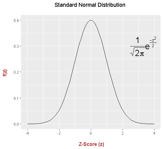
A Basic Normal Distribution Plot
# Normal Plots (For Steemit)

## Plotting Normal Distribution Plots in R with ggplot2:

library(ggplot2)

## Standard normal distribution:

xvalues <- data.frame(x = c(-3, 3))

ggplot(xvalues, aes(x = xvalues )) + stat_function(fun = dnorm) +
  xlim(c(-4, 4)) +
  labs(x = "\n Z-Score (z)", y = "f(z) \n", title = "Standard Normal Distribution \n") +
  annotate("text", x = 3.3, y = 0.3, parse = TRUE, size = 7, fontface ="bold",
           label= "frac(1, sqrt(2 * pi)) * e ^ {frac(-z^2, 2)}") +
  theme(plot.title = element_text(hjust = 0.5),
        axis.title.x = element_text(face="bold", colour="brown", size = 12),
        axis.title.y = element_text(face="bold", colour="brown", size = 12))
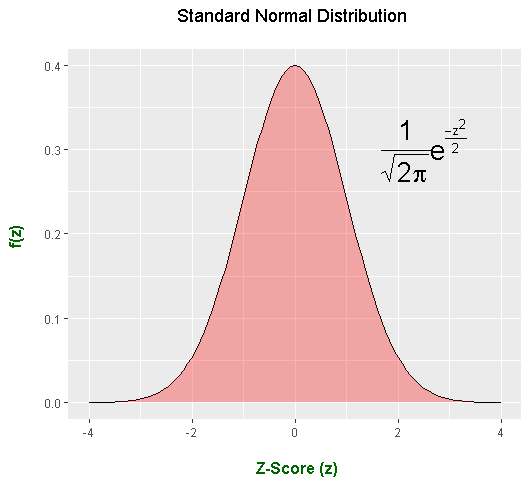
Adding In Coloured Shading
To add in coloured shading under the normal distribution curve, add in extra arguments into stat_function(). Instead of having stat_function(fun = dnorm), use stat_function(fun = dnorm, geom = "area", fill = "red", alpha = 0.3).
## Standard normal distribution With Shading:

xvalues <- data.frame(x = c(-3, 3))

ggplot(xvalues, aes(x = xvalues)) + stat_function(fun = dnorm) +
  stat_function(fun = dnorm, geom = "area", fill = "red", alpha = 0.3) +
  xlim(c(-4, 4)) +
  labs(x = "\n Z-Score (z)", y = "f(z) \n", title = "Standard Normal Distribution \n") +
  annotate("text", x = 2.5, y = 0.3, parse = TRUE, size = 7, fontface ="bold",
           label= "frac(1, sqrt(2 * pi)) * e ^ {frac(-z^2, 2)}") +
  theme(plot.title = element_text(hjust = 0.5),
        axis.title.x = element_text(face="bold", colour="darkgreen", size = 12),
        axis.title.y = element_text(face="bold", colour="darkgreen", size = 12))
Shading In Normal Distribution Areas Between Standard Deviations
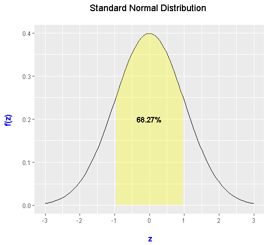
When it comes to filling in the area within one standard deviation of the mean, you need to create a custom function in R. I create a custom function called dnorm_one_sd which takes on the normal distribution density function. Anything outside of the interval of [-1, 1] for the z-scores (standard deviations) is missing.
# Shading from x = -1 to x = 1 (within one std deviation):

dnorm_one_sd <- function(x){
  norm_one_sd <- dnorm(x)
  # Have NA values outside interval x in [-1, 1]:
  norm_one_sd[x <= -1 | x >= 1] <- NA
  return(norm_one_sd)
}
If I want the percentage area under the standard normal distribution within one standard deviation, I compute the area going to x = 1 (horizontally) minus the area going to x = -1. This can be achieved in R using the pnorm() function.
(Note that the pnorm function is R's version of the cumulative density function/CDF where it computes the area of the random variable equal or less than a specified amount. In math notation we have P(Z < z) for a standard normal random variable Z and a fixed known quantity z.)
> area_one_sd <- round(pnorm(1) - pnorm(-1), 4)
> area_one_sd
[1] 0.6827
We see that the area underneath the standard normal curve within one standard deviation is 0.6827. Remember that the entire area of the normal curve is 1. The round() function is used to have the answer withing 4 decimal places.
These next lines of code and its output combines the above parts to create the plot. This plot has the standard normal curve with a label and a filled in area within one standard deviation of the mean centered at 0.
Two stat_functions are used where one is for the outline of the normal distribution and the second one uses the custom function for filling in under the curve within one standard deviation from the mean of 0. The alpha argument determines the colour shading/contrast.
# Plot:

ggplot(xvalues, aes(x = xvalues)) + stat_function(fun = dnorm) +
  stat_function(fun = dnorm_one_sd, geom = "area", fill = "yellow", alpha = 0.3) +
  geom_text(x = 0, y = 0.2, size = 4, fontface = "bold",
            label = paste0(area_one_sd * 100, "%")) +
  scale_x_continuous(breaks = c(-3:3)) +
  labs(x = "\n z", y = "f(z) \n", title = "Standard Normal Distribution \n") +
  theme(plot.title = element_text(hjust = 0.5),
        axis.title.x = element_text(face="bold", colour="blue", size = 12),
        axis.title.y = element_text(face="bold", colour="blue", size = 12))
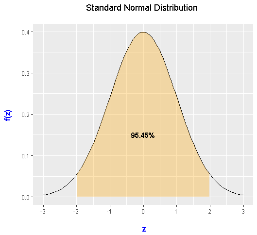
Filling The Area Within Two Standard Deviations Of The Mean
To save space, I have omitted most of the code and will show the output only. The custom function is called dnorm_two_sd with the modification where there would be norm_two_sd <- dnorm(x) and norm_two_sd[x <= -2 | x >= 2] <- NA instead of norm_one_sd[x <= -1 | x >= 1] <- NA.
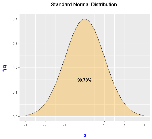
Filling The Area Within Three Standard Deviations Of The Mean
For three standard deviations, I have dnorm_three_sd with the appropriate modifications. Only the output is shown.
Generating Normal Distribution Summary Plots
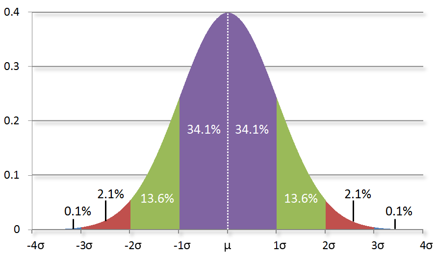
Everything in the previous two sections have led up to this. With R, you will learn how to make something like this.
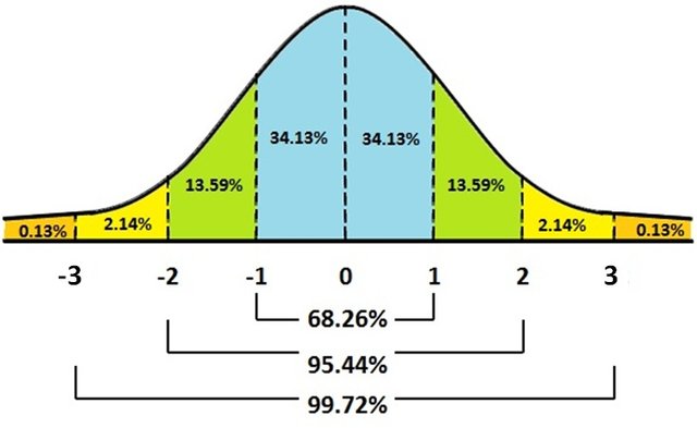
For the first normal distribution summary plot, four stat_function() parts are used along with ggplot(). The first one is for the density plot and the other three are for shading under the density curve.
The three geom_text() parts are for the percentage labels with the arrows. With geom_text() you have the option of placing the text with the use of x and y co-ordinates. The paste0() function is used for combining text and variable values. Note that the arrows are not perfect by default. You would have to save the image when it is at the right size.
Labels and custom text colours are associated with labs() and theme().
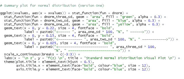
This plot came out nice. Colours can be adjusted with the use of HTML colour codes.
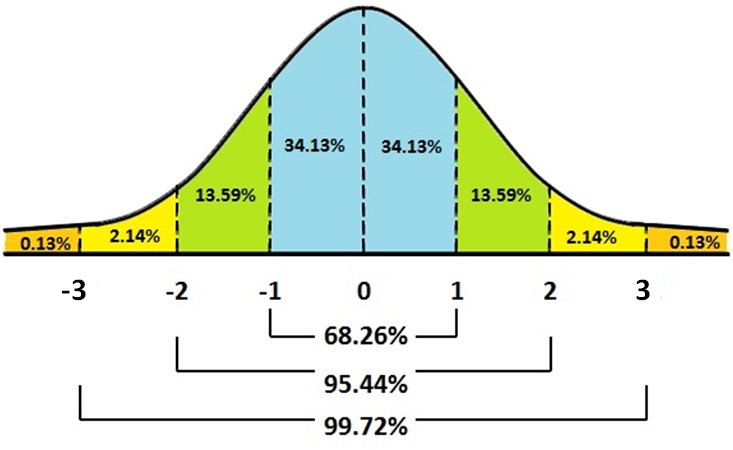
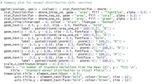
An Alternate Normal Distribution Summary Plot
This alternate version requires more code but the output comes out really nice.
Like in the previous plot, there are four stat_function() parts. With the geom_text() parts, there are six of them with three on the left and three on the right.
The dashed vertical line by the mean of 0 is produced by geom_vline(xintercept = 0, colour = "black", linetype = "dashed").
References
R Graphics Cookbook by Winston Chang (2012)
R Documentation (for the pnorm, dnorm functions).