Hawaii Watercolor Postcard - Step by Step!
Hey guys! It's Inktober 4th! I mean, October 4th!
I wanted to say thank you for the great reaction and support around my first 3 Inktobers. #4 will be coming out later today! It's also been a blast to see so many artists on here participating. More art is always a good thing!
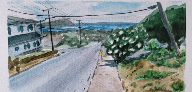
I wanted to take a slight detour and share a watercolor step-by-step of a painting I did last week (is it the painting we see in the header? Mayhaps). This will be a very photo-heavy post, so I hope you guys are ready and excited! As usual, this post is adapted from my off-steemit blog here. Now let's begin!
Reference
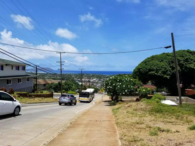
This is a photo my boyfriend took when he was on a run in Hawaii. He liked the view going downhill, and had suggested I use it for one of my paintings. I thought it’d be a nice, casual and residential view, contrasting with a lot of my more scenic/touristy vistas. I also liked the color contrasts with the greens, oranges, and dusty purple greys, all with a backdrop of bright blue. Composition-wise there’s some great 1 point perspective and diagonals which I thought would be fun and visually interesting. And of course, nothing quite brings a scene together more than telephone wires. I’m serious.
With the photo propped up on my laptop next to me, I started painting!
JK. Actually I sketched first!
Sketch
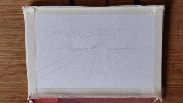
I started off with the horizon line, and the biggest shape. Looking at it now, I can see right away that I ended up flattening the image a bit, instead of going for that downhill slope present in the photo. That’s how important that beginning sketch is! But of course, if you didn’t necessarily want a downhill slip, well…the photo is just reference after all. No need to copy directly!
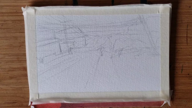
So here I’ve got all my big details blocked out, so I know where everything is. Everything is still super rough and just in shapes, but it’s only supposed to be a guideline for the painting. Speaking of, now we can start!
Painting!
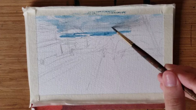
I started first by applying clean water onto the paper where my sky would be. I then applied blue paint to the still-wet areas and fiddled around until I got the sky looking how I wanted. This was the basis for my first wash layer. I then applied more amounts of blue to places I wanted more saturation to be, while the wash was still wet. This is called wet-on-wet technique. The benefit to laying down water first before paint, specifically with watercolor, is that you can get a lot of coverage pretty quickly without too much paint. And with wet-on-wet, the pigment will spread around of its own accord and interact with the wet layer underneath, doing some nifty things that you wouldn’t be able to do with a brush on dry. After I had the sky where I wanted, I painted in the ocean using a similar technique, but this time purposefully leaving some white for reflection.
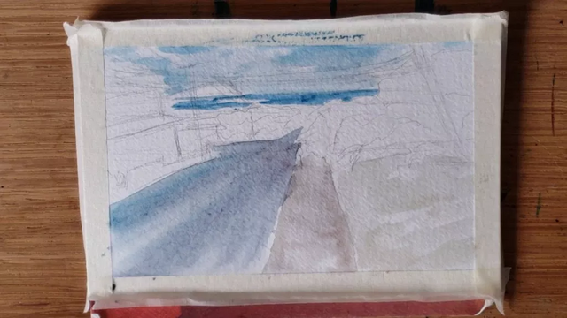
I did the same wash, then wet-on-wet for the sidewalk and road. Here I wanted to establish the base color and values. For the grass, I think I did a combo of wash and dry brushing. You can see some areas still white. With watercolor, it’s important to preserve the white in the paper, since you really can’t get it back once you paint over it! Of course, if you do, you can always go over it with some white opaque paint, like gouache or a white gel pen.
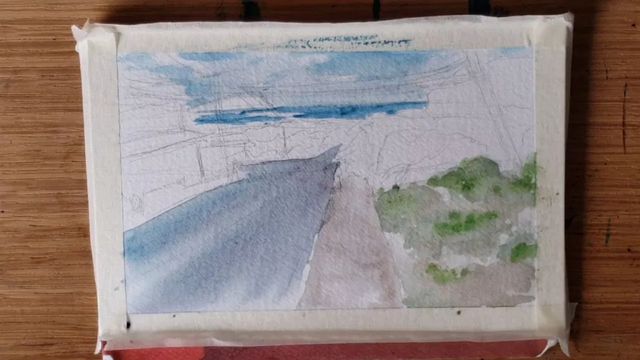
Here I started adding in the greenery on the dirt. This would take a lot of layering. You can see some of the green I applied mixing in with the brown, which was still wet at the time. Notice the cool color gradients. That’s what wet-on-wet does, baby!
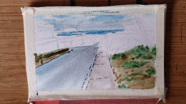
While wet-on-wet is pretty cool, it also lends itself to a more diluted look. To build up my layering of the grass, I had to wait for the paint underneath to dry a bit more, and then go in with less water on the brush and more paint. Areas with more defined edges are examples of wet-on-dry. After a lot of layering for the grass, I got to a point I was happy with, and started painting in some darker details.
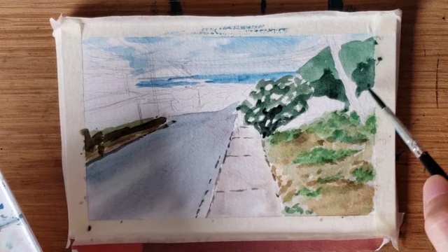
I started painting the trees next. Remember what I said about preserving whites? Since one of the trees had white flowers, this was especially important. I kept it loose and just noodled around with the brush, leaving white gaps in between while still blocking out that tree shape. I then added a darker value for some rudimentary shading. I tried to approach them both as just shapes, rather than specific light source calculations. I always did my best to try and give the two trees slightly different hues and values so they’d stand out from the other.
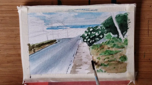
You can see now the trees are much darker. I added more layers to better match the photo reference. I then started adding more layers onto the road and sidewalk. By now the paint from the first washes has definitely dried, so you can see a stronger delineation in the edges, especially on the sidewalk. But just like makeup, you can always blend it in with the previous layer. The solution is to go in over the edges with some more water on your brush. Since watercolor is water-soluble, it’ll start softening up and you’ll get a nice gradient. Like so!
See? No edges! Now it’s time to tackle those houses and the city in the distance.
I kept it very loose for the background city, really just painting in patches of color and leaving it at that. It shouldn’t be super detailed anyways, since it’s so far away. By now pretty much everything has been painted, so it’s time to go in with a couple more layers and detailing to clean it up!
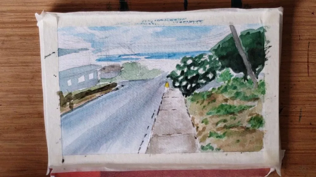
You can see I’ve painted in the windows. I also got to work on the shadows. I went with a dark blue, since the sky is blue. Plus, overall, I think shadows look nice when they’re a cooler color. We’re not going for extreme realism here anyways. A word of advice, try not to use black for shadows! (unless your piece is monochromatic, or your only two colors are black and another) It gives a weird ashy effect, and it just isn’t that pretty. I don’t think I’ve really used any black paint so far. You can get a dark color by mixing dark blue and green together, and maybe throwing in some purple or brown. If you want to use black, at least mix it with another color so that it’s a blue-black or a green-black or what have you. It’s important here to balance your water/paint ratio on the brush. I wanted to still have the shadows be a bit transparent so we can see the detail underneath. Kind of like a multiply function in photoshop, rather than just opaquely covering everything.
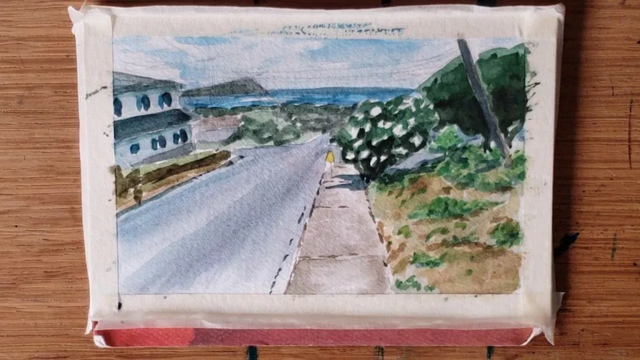
We’re pretty close to finishing here. You’ll notice some darkening of the island in the background, and the finished application of shadows. All that’s left are…
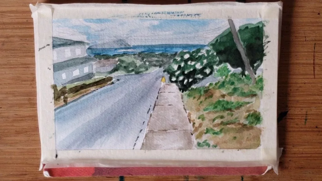
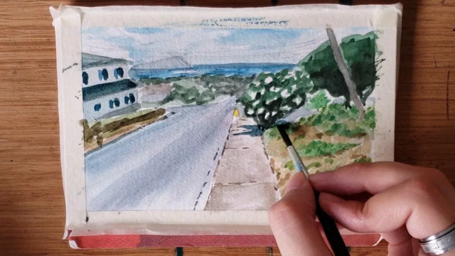
the telephone poles! Our favorite. Remember how I said I didn’t use black? Even for these, I used a mix of dark colored paints. I painted the closest one first, then went straight to the others. I was banking on the paint fading a little for the later ones, giving that atmospheric look and a sense of distance. Things look darker and more saturated and detailed the closer they are to you, and I wanted to use that to my advantage.
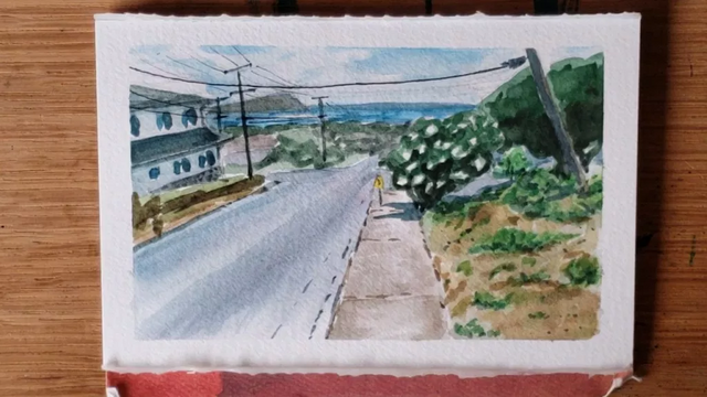
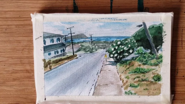
And now, finally, we have the wires themselves. This I used a pen for, so finally some black! I wanted to be careful not to overwhelm the photo, so chose the lines I wanted to keep carefully. I decided against outlining the painting as well, because I think it looks pretty good as it is right now! Then I pulled off the tape to reveal these nice, clean edges, and voila! We have our finished painting!
I hope you enjoyed seeing and reading about the process! Again I’ll have a timelapse up for you guys next week so you can watch it happen right in front of you. Where can you watch this you ask? Why, at my YouTube Channel of course! Was that a shameless plug? Of course it was. Be sure to subscribe so you don't miss any vids!
And now that you’ve read this, you can pick out those wet-on-wet moments in the video!
Thanks again for reading! Now to do some inking!
Thank you so much for being part of the #socalsteemit community.
aaaah, such a wonderful post with a great step by step <3 im learning watercolour myself so this has been an absolute treat <3 <3 <3
This post was shared in the Curation Collective Discord community for curators, and upvoted and resteemed by the @c-squared community account after manual review.
This is such a great step by step watercolor lesson! I really liked how many photos and explanations you included. Your painting really made that scene come alive far beyond the photo! Wonderful.