An Experiment in Visualizing Steem Voting Patterns (but not very well)
I thought I'd play around with the Steem API and see if I could built a visualization on top of it. I installed the steem-python library and found it pretty quick to start making API calls. My goal was to build a visualization of who contributes rshares to which other users.
I built a depth-first search starting with a given user, and calling the get_account_votes API to retrieve all their upvotes. I am surprised that this API exists at all, given that it doesn't seem very scalable--- other APIs have pagination built in so you can request only a chunk of data at a time. Then I total the reported rshares to each of the other users listed, and add them to the list of users to visit.
The first problem: graph is very dense, so searching even to depth 2 is not really feasible. A good visualization will have to narrow down the "interesting" users in some way.
A second problem: sometimes the API server reports "internal error" for a particular user. I don't think it's consistent, and moving on to the next user seemed to work, so I don't think I was being rate-limited.
I'm not sure I'm understanding the API response correctly. "Percent" is pretty clear, but "rshares" is sometimes zero on votes I've made, and I don't understand what "weight" actually means. An annoying discovery is that numbers which are sufficiently large are returned a strings by the Python SDK, instead of being converted to numbers. (I filed an issue on Github.)
{'authorperm': 'tcpolymath/heroes-and-the-creation-of-myth-spider-man-homecoming',
  'percent': 10000,
  'rshares': 610219348,
  'time': '2018-06-03T06:28:24',
  'weight': 36},
The graph of the people I have upvoted is pretty sparse yet, so I could graph it. None of them have upvoted each other, though some have upvoted me, and all have upvoted themselves. Thicker lines are meant to show more rshares, on a logarithmic scale.
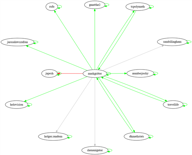
Even this depth is too much to graph for somebody with a larger history, like @tcpolymath; my attempts to get the graphing library GraphViz to behave sensibly turned up nothing better than this:
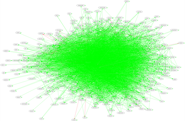
A final set of problems I encountered here is that the GraphViz that ships with Ubuntu doesn't have the "sfdp" layout enabled by default, which is what I ended up using for the above picture. The default "dot" program doesn't work at all since it tries to draw graphs hierarchically, so it ended up extremely wide. The "circo" program didn't complete in a reasonably amount of time, and "twopi" just mashed everything on top of each other. No doubt with more expertise I could play with the various parameters on offer to try to do better. But fundamentally some way of filtering or preprocessing the data is going to be necessary.
Source Code
#!/usr/bin/python3

from steem import Steem
from pprint import pprint
from graphviz import Digraph
import math

s = Steem()

root = 'tcpolymath'
maxDepth = 1

explore = [ ( root, 0 ) ]
visited = set()

dot = Digraph( format='png' )

while len( explore ) > 0:
    ( name, depth ) = explore.pop()
    if name in visited:
        continue

    visited.add( name )
    print( "Visiting", name, depth )

    dot.node( name, name )
    try:
        votes = s.get_account_votes( name )
    except Exception as e:
        print( e )
        continue

    outgoing = {}

    for v in votes:
        (author, perm) = v['authorperm'].split( '/' )
        rshares = int( v['rshares'] )
        outgoing[author] = outgoing.get( author, 0 ) + rshares

    for ( out, weight ) in outgoing.items():
        if depth == maxDepth:
            if out not in visited:
                continue

        if weight < 0:
            print( "->", out, weight )
            dot.edge( name, out, color = "red" )
        elif weight == 0:
            print( "->", out, weight )
            dot.edge( name, out, color = "gray" )
        else:
            width = math.log( weight, 10 ) - 7
            width = max( 1, int( width ) )
            print( "->", out, weight, width )
            dot.edge( name, out, color = "green", width = str( width ) )

    if depth < maxDepth:
        for neighbor in outgoing.keys():
            if neighbor in visited:
                continue
            explore.append( ( neighbor, depth + 1 ) )

dot.render( "rshares-" + root + ".gv" )
Lol, that green mass is much cooler than the nice pretty charts at steemreports.
It is interesting how you've found a whole bunch of people I don't know. This place is bigger than it seems.
I notice you've voted on some older posts, are those the ones with zero rshares? Posts pay out once at seven days and then never again, so votes on posts older than that have no value. (They still count against voting power, though.)
I've seen "weight" mean several things in different spots, but I'm not sure what this one is.
Hm, I'd seen conflicting accounts of what happens after seven days, but I guess that answers it.
I can understand a bias towards recent posts, but as a publishing model having no back catalog kind of sucks. Particularly for applications like musing.io or for tutorials where somebody may have an old answer that is still relevant and I would like to reward.
Yeah, but witnesses processing active payouts for a geometrically-increasing amount of content also sucks. I think if you found a solution for that everyone would be thrilled.