Liquid STEEM Report Dec 3, 2018
This is a historical graph of both Total STEEM and Liquid STEEM supply
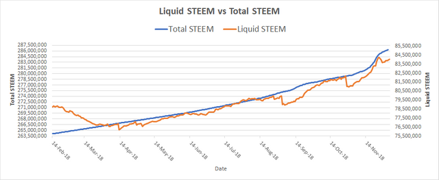
(Note) There are two different scales on this graph. For full scale, see graph below.
Liquid STEEM is the remaining STEEM that has not been converted into Steem Power. (Orange Line)
- When STEEM is liquid, it can be readily sold and purchased.
- When STEEM is locked away in SP, it is not liquid, It takes a significant amount of time to convert it back to a liquid form.
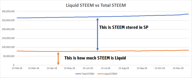
This is a graph of the same data. The data of this graph was plotted on the same scale to show the massive difference between Liquid STEEM and STEEM stored in SP
I created these charts with data that I collected over the last few months.
Why are these graphs important?
STEEM is created at a high rate. Currently 8.65% per year. Many Steemians have a concern about STEEM inflation with the high rate of new currency creation. These graphs show that there is a limited supply of STEEM. Inflation is being offset by the rate of STEEM converted to Non-Liquid STEEM.
I hope you enjoyed reading my Blog. Please remember to Upvote, Resteem, and Follow. Thank you.
---------------------------------------
For a breakdown of how Steemit Rewards system works:
https://steemit.com/steemit/@socky/simple-steemit-rewards-breakdown-how-it-works-since-hf20
For a breakdown of Steemit Keys:
https://steemit.com/life/@socky/do-you-understand-your-steemit-keys
For a breakdown of why Steem Power is Important:
https://steemit.com/steemit/@socky/why-is-steem-power-important-beginners-read
How to improve STEEM payment system:


So from what I can interpret from this chart, is that people apparently won't power up anymore? Because otherwise the amount of liquid steem wouldn't be rising so quickly.
What you don't see is the two different lines are on different scales. The amount of new STEEM production is higher than normal due to SBD being converted to STEEM. Since it is on a different scale, it doesn't look as big. The actual amount of STEEM being stored in SP is the highest I've ever seen.
Another way to put it.
If the blue line would have continued the linear direction, the orange line would have a dramatic drop. The reason that there is no dramatic drop is because there is a flood of new STEEM being created.