Hello friends of Steemit.
Since recently I have been receiving good comments about the style or form of my publications, apparently there are people who like it. The few articles that I have had the opportunity to post contain information that do not require a formal rigid structure.
Considering the different articles that I have seen and the recommendations received in the servers (communities) to which I belong, I have taken advantage of the very little knowledge I have in the use of technological tools to convey the information presented in a fresh and pleasant way.
Among my readings, I noticed that there are people dedicated to developing paragraph separators for blog, which according to what I have seen are very well prepared, for which I consider that work very respectable and recognized, this does not mean that any of us with some computer knowledge they can not elaborate a separator adapted to the subject that wants to transmit, that is why in this article I will explain how I prepare the paragraph separators.
These procedures are focused primarily on Windows and Office users, however users of other operating systems and office applications can follow them with similar tools and achieve the same result.
For this the following is required:
Mainly I use Windows 10 (Paint) with Office 2010 (PowerPoint), I must assume that the following versions of Office, contain the same tools that I use with some updates that will give them better results. The images included in this article are software in Spanish version, however they can be guided by the icons of the buttons indicated in the images
How to choose the separator?
Well, basically you need the following:
For this I require an image, photo, drawing, or any object that contains the colors that match the theme. Example: if it is a children's education it would be multicolored, if it is university education more serious colors, if it is of construction, wood or silver colors or any other associated with the subject, if I speak of water or sky I can use images that contain water and sky, etc.
Practically, this consists of an image or drawing that is intended to be shown in the separator or simply using text with one or several words associated with the main theme. The text or image must be reduced to include it (align it) to the separator.
How to proceed?
The program that I use is PowerPoint, I will try to explain as best as possible so that they can make their own separators. Of course, this article is not a PowerPoint course, there will be some things that I may assume you know, but if that is the case and you can not proceed with great pleasure I will clarify your doubt.
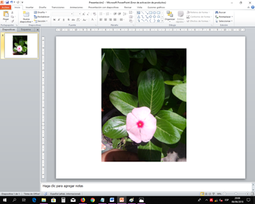
The image shown below is the PowerPoint program already executed
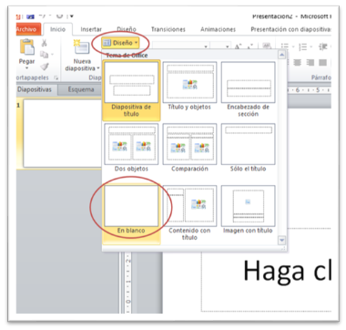
To work better, we clean the template or change the design in order to obtain a completely white page, for this we proceed to click on "Design" and then "Blank". So that they can be guided, when it is necessary to choose or click on buttons of options or tools, I will present the image of the program and in it I will enclose with a red oval where they must click, as can be seen in this image.
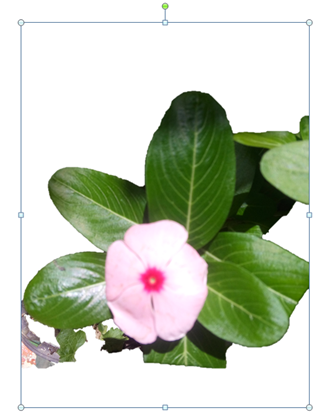
Then we must paste the image, drawing or photo chosen for the line, we can choose it from personal files or from the internet. For the example I'm going to show you, I'm going to use a personal photo I took of a flower as shown below.
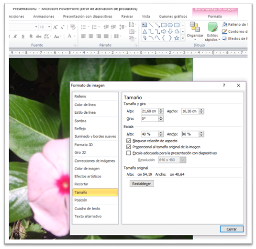
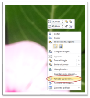
If the image is very large, they should reduce it in size, one of the ways to reduce it manually by clicking on the image and take the point of one of its corners and drag it into the image. The other way is to click with the right (secondary) mouse button on the image and press "Size and position", as shown.
This will bring up the Image Format dialog box, there in the scale area the High value that indicates 100% can be changed to a smaller value, for example 40% and then click on the value of Width, automatically the 100% that appears there will change to the same value that you placed in Alto. At that moment the image changes in size. To remove the dialog box, click on Close.
Continuing with the preparation of the separator, we double click on the image so that it appears in the upper part the Image Tools tab, "Format". In it we choose the "Remove background" button that is in the Adjust tab, as shown.
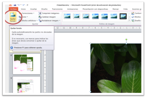
When that tool is used, the area of the image with the actual colors shown will remain in the image and the violet areas will not be displayed. There is also an internal box that can be enlarged or reduced which will also delimit the area to be displayed.
To improve the components of the image that you want to show or remove, you can use the buttons that appear at the top:
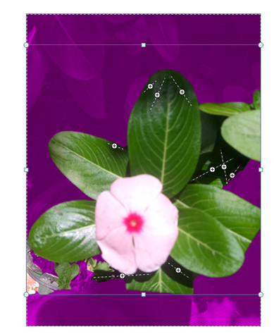
You will use it to mark the areas you want to show, to do so, simply press that button and then on the image, you can draw lines or click on the violet areas and those areas will be displayed.
You will use it to mark the areas that you do NOT want to show, to do so, simply press that button and then in the image, you can draw lines or click on the areas with real color and these areas will be shown in violet color, which means that will be removed from the image.
This button presses it and you can click on the marks made in the image and they will disappear, leaving without effect the condition that generated that mark.
This shows the choice of areas that will be displayed and those that will be removed.
Finally, when you have already chosen the areas to be displayed and removed, you can press the escape button on the keyboard or click on this button and the image will remain as shown.
Following, we proceed to change the size of the image. For this I prefer to do it manually because I am observing how it is going. The changes consist in reducing the image vertically and expanding it horizontally if necessary, for this we use the lateral marking points of the image. And it would be as shown. Ah! That image I had to place wider than 14 centimeters (you can use the upper ruler to guide yourself) to make it look better.

Now, if we only reduce the image without using the Remove Background tool, the separator will have another presentation, therefore, it will depend on what you want to show. Then you can see how it would be without the use of "Remove background".

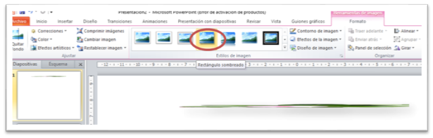
The separator is already taking shape and to improve it, we now proceed to give it depth. For this, in the upper part we choose the fourth button of the section "Image style" that corresponds to the option "Shaded rectangle".
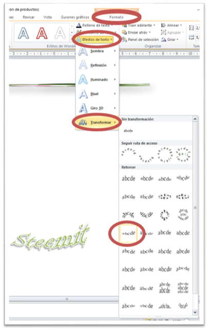
If we want we can leave the separator like this, however, we can correct or expand the separator with an additional object. For the case of this separator I will place the word Steemit. You can use any tool that masters better, but since I am already in PowerPoint I will use WordArt.
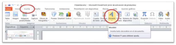
When we click on WordArt, we choose the style and color that best suits us and we click, in that moment a rectangle appears where we will write the words we want to show.
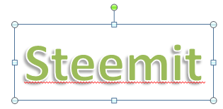
To improve it, I use the tools to change the font type, in this case I chose the "Informal Roman" typeface. Then I apply an effect to it by choosing the "Format" tool, "Text effects", "Transform" and finally the "Curve up" option as shown in the image.
Now we simply adjust the size of the object and place it at the level of the separator, where we consider it looks better.

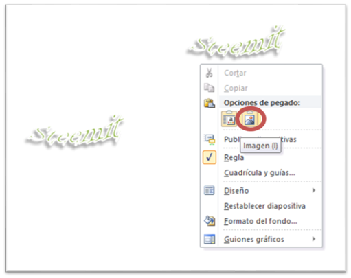
And you can still improve more, by placing the same shading effect on the text as the separator, but there is a detail, so that the effect works correctly, the object must be an image, and the word Steemit is currently a WordArt object, to convert it in image we simply select the WordArt object and copy it, then we click with the right mouse button on any white part and click on the "image" button in the "Paste options" section.
Now we simply perform the same steps that we use to place the shading of the separator, remember that this corresponds to "Shaded rectangle". The separator is definitely like this ...


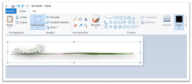
Now, working in this way, between PowerPoint objects and images, many times it is not possible to correctly adjust them when copying them in the Steemit editor, since when uploading the images there is probably a lot of space between the image and the text, giving them a Inadequate or very separate aspect. That is why before uploading the objects prepared in PowerPoint, first I paste them in the Windows Paint program, in this way I make sure to choose only the image, cutting the selected area to a more adjusted area.

Observe in Paint the object pasted from PowerPoint, the upper and lower area has a lot of space, then to upload the final image to Steemit, we proceed to select and copy a smaller area that correctly includes what it is intended to take, taking care not to Cut out the shadow, as shown.
That way we can design separators with our own style, adapted to our considerations
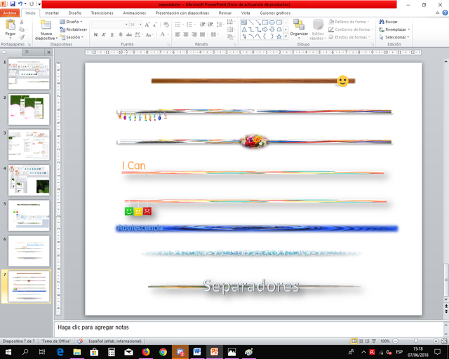
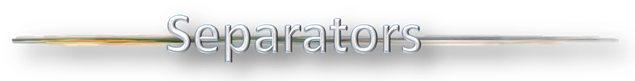
Then, several separators that I have made, which will serve as a reference of what you will achieve with the instructions left in this article.


For the last two separators, instead of using "Shaded rectangle" as the style of the image, the effect "Soft edge oval" was used. In this case the image should not be too thin so that the effect can be displayed correctly.
I hope this article is taken advantage of, so do not stay with it, if you consider that this Post can help other users, share it. Any questions I will try to clarify, and your recommendations are welcome.


Good article.
Thank you
This article has been very helpful to me.Thank you very much.
I'm glad to know that it helped
You got a 8.73% upvote from @redlambo courtesy of @ojap02! Make sure to use tag #redlambo to be considered for the curation post!
ok