INTRODUCTION TO CARTOGRAPHY - 3D COLOR SPACE
Hey everyone!
How's life? Hope you're doing well! Life is great as far as I'm concerned. I'm always super busy and always happy about it, so I'm not going to whine at all. I had the chance to enjoy nature this weekend, which I did in the company of my best friends. I don't mean to waste your time though, so let's do this!
As promised in the previous parts of this Introduction to Cartography series, which I have linked down below, this is the ninth blog regarding the scientific field of creating 2D depictions of our 3D world with accuracy and precision. This time I'm sharing introductory information regarding the 3D Color Space. (Spherical Coordinates coming up soon, just a reminder for those of you who have been following!) We will also discuss the nature and the various attributes of color, so stay tuned!
As the title reads, these are still introductory posts. What does that mean? Well, it basically means that I will just present introductory information so this is going to be an easy read for everyone. As always, I will try to approach business in a humoristic manner and try to reward your attention with probably failed jokes. Yeah, it worked in the past. It is worth noting at this point that there's a high chance to learn a thing or two by reading through these blogs, so give it a try!
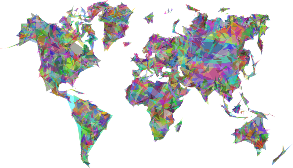
Image Source: pixabay.com (CC0 Creative Commons Author: Gordon Johnson)
History
The use of color in the creation of various kinds of mappings dates back to the ancient Egypt times, however mass adoption was not induced until the 15th century, when the first printing systems were developed in Europe. Printing color was initially too expensive and a technically demanding task, especially taking into consideration the complicated process that had to be followed in order to achieve proper use of color and therefore serve the map's purpose efficiently. Things would change a couple centuries later though, along with the development of Photography during the 19th century, which inevitably affected the quality of colored maps produced in a positive manner.
Further technological development that took place during the 20th century in combination with the invention of computers provided Engineers with the ability to design and build colored mappings in digital environments like CRT (cathode ray tube) for the first time in history. Apart from a technical breakthrough, this fact also served as a scientific obstacle that triggered further development as it induced high demand for the creation of accurate physical copies of those useful digital tools. This was a huge challenge for Cartographers and a great opportunity for the ''Whales'' of the digital print industry. See what I did there?

Image Source: pixabay.com (CC0 Creative Commons Author: DariuszSankowski)
Nature
In order to fully comprehend the significance of the proper utilization of color in Cartography, one must possess advanced technical knowledge regarding the natural, normal and perceptual identity of color. The acquisition of this sort of knowledge is essential for the creation of precise and rather useful Color Specification Systems. It is worth noting at this point that Cartographers borrowed already existing Color Measurement Systems from various scientific fields which were used as tools in the design and creation of the Color Specification Systems that are broadly used nowadays and which we will elaborate on in one of the next parts of the series.
Due to the fact that color as a perceptual phenomenon is a product of the interaction between electromagnetic radiation and consciousness, the utilization of Color Specification Systems in the process of selection of colors is essential. The accuracy regarding the observation of colors depends on the observer's sensory reaction to Spectral Color radiation of a wavelength of approximately 375nm - 750nm [375 x 10^(-9)m - 750x10^(-9)m], which is known as the visible spectrum. Another important factor is the fact that the color one observes depends on the selective absorption of the incidental electromagnetic radiation by surfaces present in an observer's environment. In other words, the color we observe depends on the reflected electromagnetic radiation and is therefore referred to as Reflected Color.
Spectral Color
During the 1670s, Isaac Newton conducted a series of experiments regarding the scientific field of Optics and concluded that white light can be separated into a sequence of component wavelengths if diffracted through a prism. The moment this sequence of wavelengths interacts with our optical receivers, the electromagnetic radiation of the visible spectrum is 'translated' into the various colors we can see according to wavelength. Violet color radiation has the smallest wavelength of all visible electromagnetic radiation, at a wavelength of approximately 375nm [375 x 10^(-9)m], while red color radiation has the largest wavelength at a value of approximately 750nm [750 x 10^(-9)m].Reflected Color
In reality, the colors we see in nature and in all sorts of items in our surroundings are very rarely genuine spectral hues, due to the fact that the amount of white light that is diffracted is trivial. On the contrary, the vast majority of colors we see are hues produced by combinations of various diffracted wavelengths, due to the fact that surfaces absorb various wavelengths and reflect others in different analogies. It should be pretty obvious by now that the colors we actually see stem from the reflected wavelength that belongs in the visible spectrum. No? If a surface absorbs all incidental electromagnetic radiation then it gives the optical outcome of black, whereas a surface that reflects all incidental electromagnetic radiation gives the optical outcome of white color.
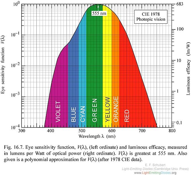
Eye Sensitivity Function Values - Wavelength Chart./ Image Source: commons.wikimedia.org (Creative Commons Attribution-Share Alike 3.0 Unported Author: Jordanwesthoff)
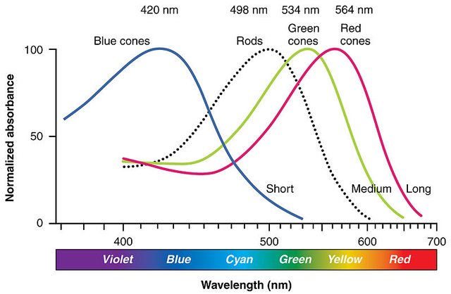
Normalized Absorbance - Wavelength Chart./ Image Source: commons.wikimedia.org (Creative Commons Attribution-Share Alike 3.0 Unported Author: Connexions)
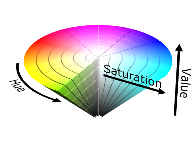
Dimensions of Color
Until this point we've only discussed one of the three dimensions of color which is known as Hue. The remaining two dimensions are Brightness which is also broadly referred to as Intensity, and Saturation which is commonly referred to as Repleteness. It is worth noting at this point that the term 'dimensions' in this case is utilized in order to describe variable attributes with values that are not correlated, and therefore any potential variation of an attribute's value has no effect on the rest. We should always keep in mind that such variations occur in a systematic manner due to the nature of the attributes observed and the technical process of registration regarding the system utilized in order to describe these properties efficiently.
Hue
As we've already discussed, Hue is an attribute that is correlated with the various primary wavelengths and is the optical result of the interaction between diffracted electromagnetic radiation and the observer's eye receptors. The Spectral Hue of electromagnetic radiation of specific wavelength, which is also known as Spectral Color, is graphically represented as a vertical straight line in reflectance diagrams. Non-Spectral Hues' reflect more than 50% of the incidental electromagnetic radiation at a specific wavelength, however colors like yellow, cyan and violet reflect big percentages of the incidental elecromagnetic radiation at various wavelengths.Brightness
All colors can be classified according to brightness, which is a term used to generally describe the behaviour of a surface regarding reflectance. This attribute is also affected by the amounts of diffracted electromagnetic radiation from any present nearby surfaces. Intensity is another term used to describe this very specific attribute, with the significant difference that the Intensity of a surface's color is measured compared to standard black or white surfaces, that were designed by Cartographers in order to be utilized for this specific reason.Saturation
Saturation of a color is the perceptual amount of white color in an observed hue in relation to the brightness. The term Repleteness bares a similar meaning and basically translates into the amount of white color in a hue, compared to a gray shade of the same levels of Intensity. For any specific hue at a certain point of Intensity, Saturation varies from hues totally affected by the gray color to genuine hues without any gray shades. Various terms, such as genuineness or authenticity are broadly used by Cartographers in order to describe this specific dimension of color.
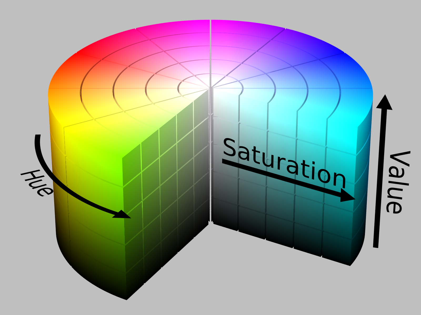
HSV Color Solid Cylinder./ Image Source: commons.wikimedia.org (Creative Commons Attribution-Share Alike 3.0 Unported Author: SharkD)
HSV Color Solid Cone./ Image Source: commons.wikimedia.org (Creative Commons Attribution-Share Alike 3.0 Unported Author: SharkD)
Alright people, that's it for today! Thank you for dropping by and reading, hope you managed to make it to this point. This was the ninth part of this Introduction to Cartography series. If you do have any questions, feel free to let me know in the comments below and I will do my best to provide promt and detailed answers. Follow me and stay tuned for more Engineering blogs, I am about to launch another two series regarding Photogrammetry and Geology in the near future! ;)
PREVIOUS PARTS OF THE SERIES:

IMAGE SOURCES:
REFERENCES:
University Textbooks & Course Lectures:
Χαρτογραφία Ι/ Cartography I -TSOULOS(National Technical University of Athens, School of Rural & Surveying Engineering, Course Lecture Notes)
Αναλυτική Χαρτογραφία, Πανεπιστημιακές Εκδόσεις Ε.Μ.Π./Analytical Cartography, University Publications NTUA -NAKOS (National Technical University of Athens, School of Rural & Surveying Engineering, University Textbook)
Internet Links:
http://hyperphysics.phy-astr.gsu.edu/hbase/vision/specol.html
https://study.com/academy/lesson/color-white-light-reflection-absorption.html
http://www.workwithcolor.com/color-properties-definitions-0101.htm
http://learn.leighcotnoir.com/artspeak/elements-color/hue-value-saturation/

Thank you for your attention!
Hope you enjoyed this post and did learn a thing or two.
Follow me and stay tuned for more engineering blogs.
Highest Regards
@lordneroo
Are you familiar with color cycling in the Mandelbrot set? It seems like it might have a similar function the color in topography, but in a complex iterative system the colors cycle and move like a gif - it's quite beautiful!
Oh yeah! It's so beautiful indeed. Here it is:

Mandelbrot Set Color Cycling Animation./ GIF Source: commons.wikimedia.org (Creative Commons Attribution-Share Alike 4.0 International Author: Aokoroko)
Just wait until the next part of the series is out, I will present technical information regarding the Color Theory and its subdivisions, as well as broad introductory information regarding Color Model Systems.
Very nice, i meet @geke outside the Magic City. ☺
Thanks for this amazingly well researched post.
Your post has been selected as #adsactlyspostoftheday :)
Join us in our Discord channel here to drop your post in our post promotion page, and make sure to use the @adsactly tag in the post itself.
@adsactly Thank you so much for the support! Your kind words mean a lot to me and the fact that my blog was selected as #adsactlypostoftheday definitely made my day!
Thanks again, have a great day! :)
Αντί να πιάνεις το Μάη και να βγάλεις φωτό κανένα δέντρο (που δεν το συνηθίζεις) κάθεσαι και γράφεις σοβαρά ποστ; Είναι δυνατόν;!
Καλά λέω εγώ ότι οι πολυτεχνίτες είναι ανώμαλοι!!!
Καλό μήνα! :Ρ
Xαχαχαχαχα!!! Γέλασα τόσο πολύ με αυτό το σχόλιο!
Η αλήθεια είναι ότι το ετοίμαζα μέρες και είπα απλά να το τελειώσω πριν πάω να κυλιστώ στα λιβάδια και να φωτογραφίσω 3478 δέντρα. Σίγουρα πάντως δεν είμαι ο πιο φυσιολογικός άνθρωπος στον κόσμο :P
Καλό μήνα και σε σένα με υγεία και ευτυχία!!
Aχαχαχαχαχα! Κατάλαβα, είπες να διώξεις το αρχείο από τον υπολογιστή για να κάνεις χώρο στο σκληρό για τα δέντρα που ξεπερνάνε κατά δυο δεκάδες (+1) τα επεισόδια της Λάμψης!
-Τι εννοείς, Βίρνα, ότι είναι Πρωτομαγιά σήμερα;
-Θέλω να πω πως έχουμε πρώτη Μαΐου, Γιάγκο.
-Δηλαδή σήμερα ο Μάιος έχει μία;
-Ναι, Γιάγκο. Ο Μάιος έχει μία σήμερα.
-Και πώς είναι δυνατόν να είναι σήμερα η πρώτη του Μάη;
και κάπως έτσι φτάνουμε στο Μάη του 2068 :P
Χαχαχαχαχαχαχαχα θα πέσω απ'την καρέκλα!
-Τι εννοείς, θα πέσεις απ' την καρέκλα;
-Ναι, θα πέσω απ' την καρέκλα.
-Δηλαδή για να καταλάβω, θα πέσεις απ' την καρέκλα;
-Ακριβώς, θα πέσω απ' την καρέκλα.
-Μα δεν είναι δυνατόν, δεν το χωράει ο νους μου, θα πέσεις απ' την καρέκλα;
-Κι όμως, όπως το ακούς, θα πέσω απ' την καρέκλα.
...
(x 2^1000)
Πάντως δεν έχω κόλλημα με τα δέντρα, ούτε καν.
Ουπς!
🤣🤣🤣🤣🤣🤣🤣
Παρανόια δε γκρικ γουέι... καλά που η Abigail δεν ξέρει ελληνικά να μας αρχίσει στην ψυχανάλυση
What language is this...?
It is Greek. I bet that's Greek to you as well :P
Xαχαχαχαχα is hahahaha?
Yeah! Oh wait a minute, do you speak Greek? :P
A little. 😕
Who are you taking about? In any case, we have a nice intermezzo on colors to patient with. So... ;)
I am looking forwards to the next post of the series, just to see more pratical applications of this!
Hello @lemouth, thank you so much for the comment and the support! :) Have a great day and see you around!
PS: I was talking about a Particle Physicist :p
PS 2: I will share info regarding Color Model Systems soon!
I hope I won't miss it ;)
This is a wonderful and informative post. I really like the way that you have laid things out. You have taken a topic and made it accessible and easy to understand. You should consider joining the ADSactly discord and submitting your work for the post of the day. Thanks for sharing. https://discord.gg/nz2eB5
Hey there, I've already joined.
By the way thank you so much for taking the time to read this and leave a kind response! :)
I understood the concept of hue very well but I had a confusion regarding the brightness and the saturation, I feel like they are the same thing ! Any simpler way to put it?
Hello @fancybrothers!
Thank you so much for reading. Brightness refers to luminosity and is therefore relevant to the amount of electromagnetic radiation that is reflected from a surface, while Saturation refers to the authenticity of a color and is relevant to the amount of white color present in a hue, compared to a grayscale shade of equivalent Intensity.
Hope this helps.
Still confused but am on my way to reading the introductory part if this topic
It's a research worth reading
Thanks for sharing
Thanks for dropping by and reading!
incredible combination, is the most suitable for this system, you have a lot of creativity
Thank you for the kind words!
Amazing post! I love it. Hey UPVOTE my post: https://steemit.com/life/@cryptopaparazzi/chapter-one-let-there-be-the-man-and-there-was-a-man-let-there-be-a-woman-and-there-was-sex and FOLLOW ME and I ll do the same :)