INTRODUCTION TO CARTOGRAPHY - COLOR SYSTEMS
Hey everyone!
How is everything going? I sincerely hope all of you are having a great time. It's been almost a week since my last Cartography blog as I've been too busy lately. Fortunately I had the chance to enjoy our beautiful natural landscape during the weekend and I'm thankful for that. But I won't waste your time anymore, let's do this!
As promised in a previous Cartography post regarding 3D color space, this is the tenth part of this Introduction to Cartography series. This time I'm taking the chance to share some general information regarding the Color Systems that are mainly used nowadays. We will also discuss broad information regarding the Trichromatic Theory of Color Vision, as well as the Opponent Process Theory of Color Vision, so stay focused!
Once again, let's always keep in mind that these are introductory posts. This basically means that we will be discussing general information in a simplified manner to make sure that nobody gets bored to death. Kidding. There's a high possibility of learning a thing or two by reading this post, so stay with me!
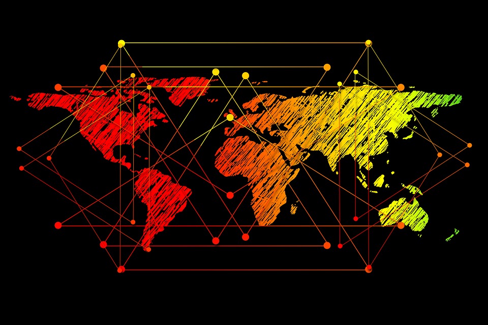.jpg)
Image Source: pixabay.com (CC0 Creative Commons Author: Geralt)
Color is a 3D phenomenon that requires the presence of three basic elements in order to occur: a source of light, an object to reflect light, and the human system of visual processing in order to expound the reflected electromagnetic radiation. Obviously, color is a matter of perception as it is the product of an observer's mental reaction that follows the reception of light in the obeserver's eyes. Not all parameters of the physiological basis of this phenomenon are known, therefore scientists have come up with two opposing Theories in an attempt to explain the mental process through which electromagnetic radiation is transformed into the optical outcome of color. The two Theories are mentioned below:
Trichromatic Theory of Color Vision
Opponent Process Theory of Color Vision
Now let's take a deeper look at each one of those Theories.
Trichromatic Theory of Color Vision
The Trichromatic Theory of Color Vision was developed and formulated by James Clerk Maxwell (1831-1879) in cooperation with well known Physicist Herman von Helmholtz (1821-1894), after Maxwell's attempt to produce the first colored photography in 1860. The method utilized by Maxwell included the capture of three black and white photos of a colored object by placing red, green and blue filters over the lens successively. The filters are put in place in order to help divide the reflected radiation into the three primary color components.
This Theory is based on the assumption that human eyes function in the exact same way as the filtered lens in Maxwell's experiment. According to this Theory, human eyes should be equipped with visual receptors capable of separating electromagnetic radiation into the three primary color components and calculating each component's intensity. This information is then transferred to the brain, where the polychromatic image of the object is synthesized in a similar way to the process utilized in the production of the colored photography by Maxwell.
Nowadays it is a known fact that our visual receptors are comprised of approximately 115 million rodent cells that demonstrate electromagnetic sensitivity at all wavelengths between 400nm [4 x 10^(-7)m] and 600nm [6 x 10^(-7)m], and 7 million cone cells of three different types(a, b, c), with maximum sensitivity demonstrated at 400nm [4 x 10^(-7)m] (blue color), at 530nm [5.3 x 10^(-7)m] (green color) and at 570nm [5.7 x 10^(-7)m] (red color). Electric impulses proportionate to the intensity of the visible light that is detected by the rodent cells are directly transmitted to the visual cortex brain area, enabling us to feel and observe differences in brightness.
However, Physiologists have gathered evidence that proves that no instant transmission of electric impulses between cone cells and the visual cortex brain area takes place. It is therefore fair and safe to say that scientific findings support the claims of the Opponent Process Theory of Color Vision in this battle of the Theories. Let's take a deeper look at the Opponent Process Theory of Color Vision and find out what it is about.
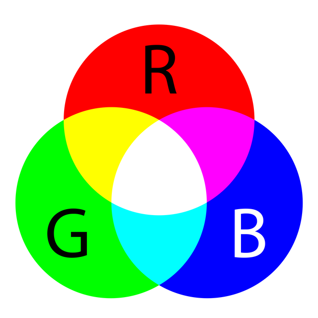
Primary & Secondary Colors./ Image Source: commons.wikimedia.org (Public Domain Author: SharkD)
Opponent Process Theory of Color Vision
The opponent Process Theory of Color Vision was developed by the well known German Physiologist Ewald Hering (1834-1918) in 1877. This Theory is based on the assumption that electric impulses generated by rodent cells and the three different types of cone cells are not transmitted to the brain directly through the optical nerve, but interfere with each other so as to transmit three different, separate signals. Rodent cells and cone cells are connected with ganglion cells, which constantly transmit electric signals to the visual cortex through the optic nerve.
The transmission of color information in the brain depends on the stimulation caused by the signals generated by the three main types of ganglion cells, which are known as BY (Blue-Yellow), GR (Green-Red) and WBK (White-Black). WBK ganglion cells react to impulses generated by cone cells proportionally to the power of the signal. The more powerful a signal and therefore the generated impulse is, the bigger the intensity of the message transmitted to the brain which results in the optical outcome of high brightness.
GR ganglion cells function in a different way, as they basically react differently to electric impulses generated by different types of cone cells. Powerful and weak signals transmitted to the brain by the GR ganglion cells are red and green information signals respectively. This is one of the primary reasons why Green and Red color are considered to be opposite colors; the signal is either powerful or weak, it can't be both at the same time. BY ganglion cells behave in a similar manner, as they also react differently to electric impulses generated by different types of cone cells. Similarly, powerful and weak signals generated by the BY ganglion cells are Yellow and Blue information signals respectively.
The hue is specified in the visual cortex which is achieved by the comparison of the power of signals generated by GR and BY ganglion cells that have been received. The color's repleteness is proportional to the GR and BY signals' power, which basically means that the more powerful the signal, the brighter the hue of the color. It is worth mentioning that the processes of contrasting basic coloring studied in the Opponent Process Theory of Color Vision have been the basis of development for Color Systems, as we will see in the following paragraphs.
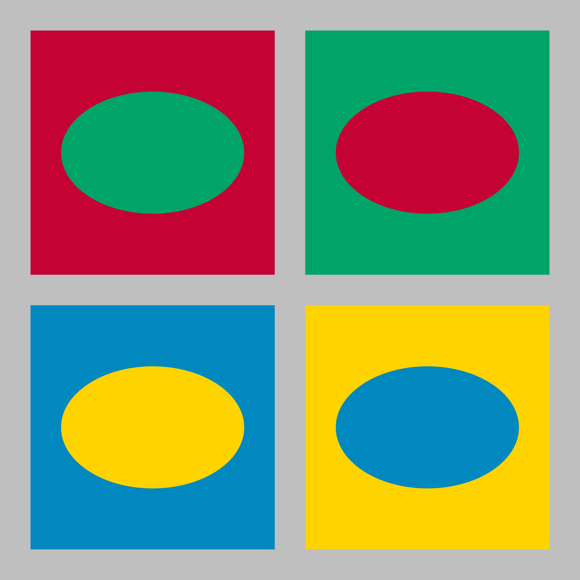
Complementary Colors in the Opponent Process Theory of Color Vision./ Image Source: commons.wikimedia.org (Creative Commons Attribution-Share Alike 4.0 International Author: Ellywa & Uploader: Zupanto)
COLOR SYSTEMS
Color Systems were designed and developed by scientists studying color in different proffesions in order to serve multiple purposes. Cartographers never actually wasted energy in the development of those systems and methods, but instead borrowed the existing models from other fields. The various Color Systems that are mainly used nowadays are related to the approach taken by the researchers studying the phenomenon of color vision. This approach varies slightly in relation with the different sorts of applications, from artistic to industrial and commercial activities including Cartography as a scientific field.
The colorimetric approach is based on measurements of light that is reflected from maps and other surfaces with the utilization of an instrument known as spectrophotometer. The most well known Color System used nowadays is CIE (Commission International de l' Eclairage), which is often referred to as the most objective system of all. The approach taken is based on the human ability to observe color and the optical increment of color. Apart from the CIE, we will also take a deeper look at two more Color Systems: the Munsell System and the NCS (National Color System). The three Color Systems that are most commonly used nowadays are mentioned below:
CIE (Commission International de l' Eclairage)
Munsell System
NCS (National Color System)
Now let's share a few words regarding each and everyone of those Color Systems.
CIE SYSTEM
The CIE was established in 1931 by the Commission International de l'Eclairage which is also known as the Global Lighting Association and is considered to be an objective colorimetric system that enables scientists to precisely register specific hues by utilizing numerical values. Color spesifications in CIE are used to describe the findings of cartographic research regarding the use of color and to assist Engineers with the production of mappings. The utilization of spectrophotometers in professional typography is a common phenomenon. There are three necessary requirements for the CIE system's function, as demonstrated below:
Standard Lighting Sources
A surface can onlly reflect the wavelengths emitted by the lighting source, while reflectance is limited by the amount of radiation that corresponds to each wavelength. The CIE system utilizes various standard lighting sources that are relevant to Cartography as a scientific field, such as the average daylight under cloudiness and incandescent light bulbs. Each standard lighting source is described by a radiation spectral curve.Observer
Since color is the product of human consciousness, all Color Systems are based on the technical characteristics of the human visual system. As a result, the CIE was developed taking into consideration the way the average human eye reacts to spectral colors. The observer's potential is defined by the amounts of the primary colors (red, green, blue) that are necessary in order to simulate the sunlight at every wavelength in the visible spectrum.Chromaticity Coordinates
CIE Chromaticity Coordinates are the most important tool. All colors are described by their Chromaticity Coordinates (x,y) and the value of brightness (Y). CIE colors can also be specified by their primary wavelength, authenticity and brightness. The promary wavelength refers to the hue, whereas authenticity refers to repleteness on a scale from 0 to 100. Brightness is the luminous reflectance of a color and refers to intensity.
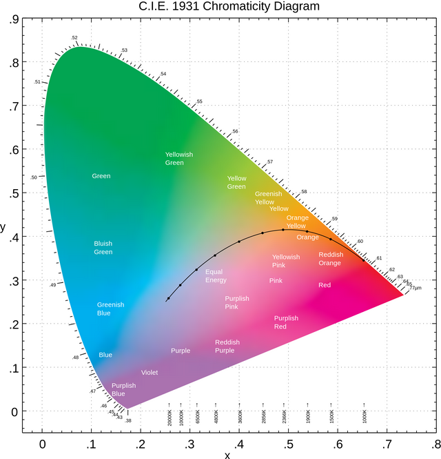
CIE Chromaticity Diagram./ Image Source: commons.wikimedia.org (Public Domain Author: BenRG)
MUNSELL SYSTEM
The Munsell System was designed and developed by Albert Henry Munsell (1858-1918) in 1905. This system is broadly used in industrial applications and is one of the most popular systems among Cartographers due to the fact that it is mainly comprised of three primary dimensions (hue, intensity, saturation). Each category of those is easily divided into a series of successive surcharges, which makes observation and experimentation a lot easier. Let's take a deeper look at each one of those three dimensions used in the Munsell System:
Hue
In the Munsell Color System there are one hundred visual increments enjoined in a circle, all of which are equal. Those increments are dictated according to spectral position. There are ten main hues in the Munsell System, divided into two categories of five primary and five secondary hues. Complementary hues are the ones that are situated opposite in the circle. Complementary hues generate grey color when mixed.Intensity
All colors in the Munsell System are defined by intensity, which refers to the absorbed luminosity of a hue in comparison with the existing black and white boundaries. The Munsell scale of intensity is divided into eleven equal surcharges of grey, from 0 which refers to black color, to 10 which refers to white color. This is a continuous scale that is described by a fifth grade polynomial equation.Saturation
This specific dimension utilized in the Munsell System refers to the degree in which a hue varies in color repleteness from a grey hue of the same intensity. This attribute is similar to the authenticity used in the CIE system, however the increments regarding saturation are visually equal. All combinations of hue and intensity have different levels of maximum saturation.
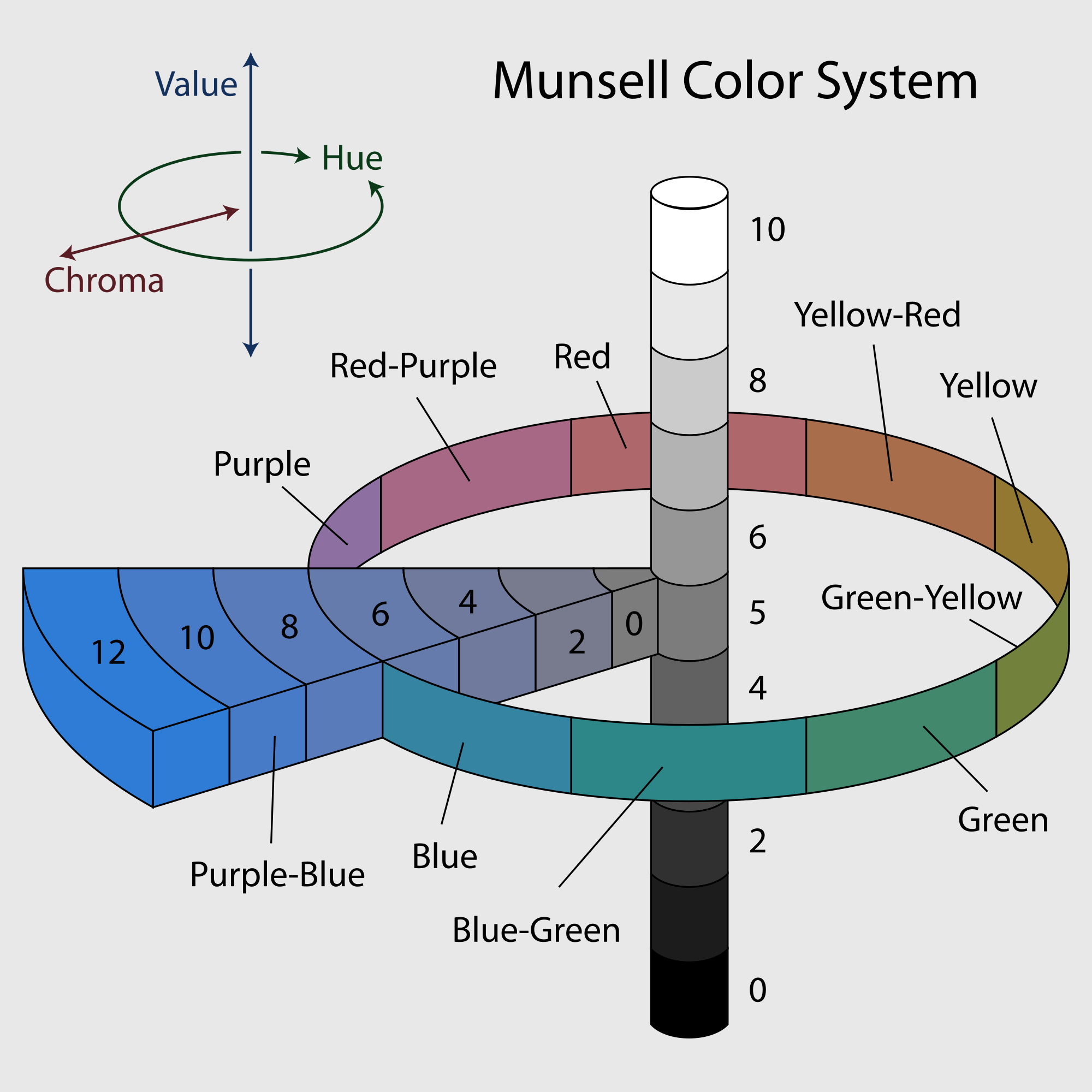
Munsell Color System./ Image Source: commons.wikimedia.org (Creative Commons Attribution-Share Alike 3.0 Unported Author: Jacobolus)
NCS SYSTEM
The NCS system was designed and developed in Sweden during the 1960s. This system represents the most well known application of the Opponent Process Theory of Color Vision due to the fact that it was engineered based on the three pairs of complementary colors (GR-BY-WBK), and therefore the dimensions used in this system refer to the dimensions of those six colors mentioned (Green, Red, Blue, Yellow, White, Black). Those dimensions can be simplified into two categories: hue, blackness/whiteness. Let's take a look at those attributes.
Hue
Hues in the NCS system are dictated in a circel, where complementary hues are always placed at a distance of 90 degrees from each other on the surface of the circle. Hues are placed clockwise and it is worth noting that all intermediate hues are combinations of the neighboring primary colors. A grey hue is situated in the middle of the circle, pointing out that the visual outcome of mixing complementary colors will always be grey color.Blackness / Whiteness
Apart from the attribute of hue, the colors used in the NCS system are also defined by their levels of blackness and whiteness. You might be wondering what this is about, well: the percentages of authentic white and black color that are hue is comprised of can be graphically represented in a triangular diagram. In this diagram, white color, black color and the authentic hue of interest are located at the angles and all colors that stem from combinations of white and the authentic hue of interest are located on the W-H side (White-Hue). The same process is followed for the B-H side (Black-Hue).
Opponent Colors./ Image Source: commons.wikimedia.org (Creative Commons Attribution-Share Alike 3.0 Unported Author: Spooky)
Alright everyone, that was it for today! Thank you so much for taking the time to read this blog, it means a lot to me. That brings us to the tenth part of this Introduction to Cartography series. Feel free to let me know in the comments below if there are any questions and I will provide detailed responses. Again, I would like to mention that I am about to launch another two series regarding Photogrammetry and Geology in the near future, so follow me for more Engineering blogs! :)
PREVIOUS PARTS OF THE SERIES:

IMAGE SOURCES:
REFERENCES:
University Textbooks & Course Lectures:
Χαρτογραφία Ι/ Cartography I -TSOULOS(National Technical University of Athens, School of Rural & Surveying Engineering, Course Lecture Notes)
Στοιχεία Χαρτογραφίας, Πανεπιστημιακές Εκδόσεις Ε.Μ.Π./Εlements of Cartography, University Publications NTUA -A.H. ROBINSON, J.L. MORRISON, S.C. GUPTILL, A.J. KIMERLING, P.C. MUEHRCKE,(National Technical University of Athens,School of Rural and Surveying Engineering, University Textbook)
Internet Links:

Thank you for your attention!
Hope you enjoyed this post and did learn a thing or two.
Follow me and stay tuned for more engineering blogs.
Highest Regards
@lordneroo
Colors can be very decisive at times. U explained the basics quite gently. This article reminded me of the dress issue. I always see that as 'white and gold' but many of my friends see 'black and blue'.
Thanks for explaining the basic standards and the color system.
Cheers man!
Thank you for taking the time to read this! Yeah I remember that dress thing on social media!
Have a great day!
the system of colors in cartography is really important because it represents reality in a convincing way, since it emphasizes the graphic conventionalism and what you apply is really amazing it is very funny but representative at the same time and aesthetic.
Yeah, that's right. It's all about human perception.
Thanks for dropping by!
unfortunately I do not understand ,good morning my friend,
No problem, thanks for the support!
You are wlcme
great information for futer thanks
@lordneroo