Do You Agree With Motley Fools’ Buys For July???

I read a Motley Fools article this weekend that talked about potential buy opportunities.
International Paper, Nutrien, and Royal Dutch Shell each boast an above-average dividend yield -- and all are worth a closer look for distinct reasons. I think continued execution toward long-term strategic goals makes International Paper's 11% drop in 2018 an opportunity. Nutrien is making swift progress against its immediate post-merger plans, which could make it the fertilizer stock best positioned to capitalize on any potential rebound. Meanwhile, Royal Dutch Shell's ho-hum performance through the first half of the year, coupled with its 6% dividend yield and ultra-long-term transition to renewable energy, makes it an intriguing oil stock right now.
What I have learned in recent years is it's never a good idea to take someone else trade blindly and without doing any research because in trading only you are responsible for the hitting the sell/buy button. With that said, lets go to the charts to see if we agree with the buy recommendations.
Monthly Chart (Curve Timeframe) – price made an all-time high back in January of this year, but has since pulled back. Price is closer to monthly supply vs monthly demand and price broke the monthly trend line.
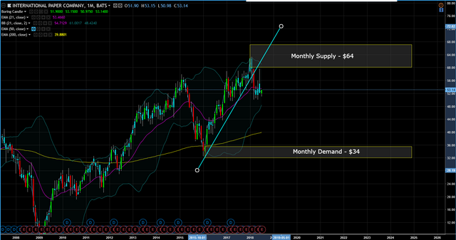
Weekly Chart (Trend Timeframe) – price is sideways, not trending down or up, but if price closes below $50, the trend will be down.
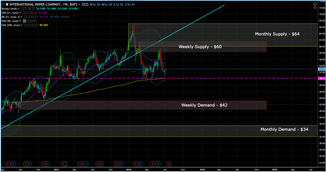
Trade-Set Up - None at this moment, but my bias is to the downside. If price can break the $50 level to the downside, I think short the stock on a pull back.
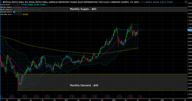
Monthly Chart (Curve Timeframe) – price is closer the extremes high at $56 vs the extreme low at $40.
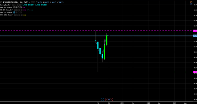
Weekly Chart (Trend Timeframe) – price is sideways, not trending down or up.
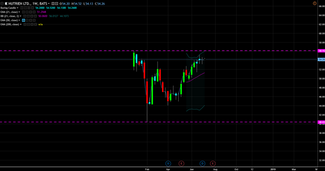
Trade-Set Up - None at this moment, but if price can break the $56 level, I see a potential buy on a pull back.
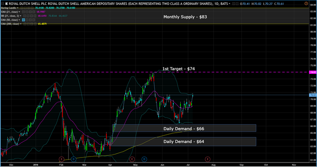
Monthly Chart (Curve Timeframe) – price is in the middle of the curve.
Weekly Chart (Trend Timeframe) – price is in an uptrend.
Daily Chart (Entry Timeframe) - buy on the pull back to the daily demand zone at $66 and/or $64. 1st target is $74.
This post is my personal opinion. I’m not a financial advisor, this isn't financial advise. Do your own research before making investment decisions.

Any company that does fracking gets a solid "No" vote from me. To Hell with Shell!
I hear ya brother.
Personally, I look at the 9day EMA and the 50 DMA. When the 9 DEMA is above the 50 DMA is a bullish cross. I look at well as MACD to see if there is a bullish positive divergence. Finally, I love watching the relative strength index (RSI) to see where it at. I never buy if its close to 70, which if significantly over bought and like to make trades when a stock is ready to move out of oversold (<30).
I also stopped following Motley Fool when I realized they were a bunch of 25 years with no experience. I started buying subscriptions to the top financial newsletters. I have more than 10 and since 2011 have spent well north of $30K. My main newsletters are from Stansberry Research and Palm Beach Research.
Good stuff. Do you have an example of the 9 / 50 e/dma RSI, MACD set up?
Apple has a good example. RSI is at the top of the chart. The bottom of the chart is the MACD. The bands around AAPL's price curve are Bollinger Bands. They represent the statistically expected price rang for AAPL. Rarely does the price overshoot in either direction. In most cases, the bands act like rubber bands and if the price hits the upper or lower, there is usually a snapback inside the bands. Now look at Feb. You three incredible things lining up. First the price went below the lower Bollinger band. Second, the MACD hit a bottom. Third, the RSI was below 30 signally significant oversold conditions. What happened next is instructive. The price snapped back inside the BB, then took another dip to the lower BB before starting a significant uptrend. Look at the RSI. It then move above 30 and the 12 DMA of the MACD (black line) crossed over it's 26 DMA signifying a positive relative strength. This was a most ideal time to buy and a high probability set up.
Also, in the price graph, the pink line is the 9 day exponential moving average and the blue line is the 50 DMA. When the 9EMA crosses the 50 DMA it's called a bullish cross.
You can look for the opposite when a stock is overbought and you can use the set up to sell out of a position.
Look at November 2017 as an example.
Thanks for sharing, I let the methodology as I use RSI in my trading as well.
To the question in your title, my Magic 8-Ball says:
Hi! I'm a bot, and this answer was posted automatically. Check this post out for more information.
I gave you an upvote on your post! Please give me a follow and I will give you a follow in return…