Google’s enterprise ambition is the reason behind Gmail’s redesign

The recent redesign of Gmail is exciting news and has been a long time coming. While Gmail has looked pretty much the same for years, it hasn’t gotten in the way of its growth. Well over a billion people worldwide now rely on Gmail for their email and the service continues to expand rapidly.
The majority of those who use Gmail for personal email may not be aware of how aggressively Google has been targeting and gaining traction in the enterprise space, and that they have successfully converted millions of businesses to G Suite and corporate Gmail.
If you take a step back, you can see how the convergence of these two trends shaped the outcome of Google’s recent Gmail redesign. What we see in the new design is a sense of reluctance to do anything too dramatic with the user experience of what has become the most popular email service in the world combined with the desire to more fully integrate Gmail into the fold of G Suite applications to support Google’s continued expansion among enterprise customers.
Gun-shy Google
Given Gmail’s success, it’s not surprising that Google has taken a careful approach to the latest redesign. In 2014, Google introduced a radical new direction with Inbox, but it failed to gain mass-market adoption standpoint despite having many die-hard users.
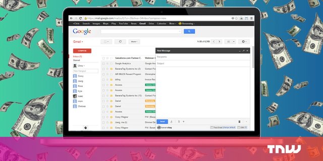
This time around, it didn’t take the radical approach it took with Inbox. The things that have changed can all be turned on or off so you’ll have the same basic Gmail view that one billion users have gotten used to. It’s introduced some of Inbox’s innovative views of the inbox, but alongside a main view that looks the same as current Gmail.
Most of the buttons and features are in the same place. Google’s also added functionality in terms of the calendar, tasks, and keep view along the right side of the window, and the snooze function for messages that’s used by some of the most popular third-party plugins for Gmail such as Boomerang and RightInbox.
Taking aim at enterprise
What’s great about G Suite is that, with its success in enterprise adoption (400 percent growth in 24 months, announced by Sundar Pichai in January), Google is now throwing the kitchen sink at it. Anyone developing for Google Docs, Sheets, and Slides will have noticed that the pace of new features and development has dramatically increased over where it was before.
Most of those changes are clearly moving in the direction of closing the gap with Microsoft Office in terms of functionality — especially in Google Sheets, which at least until recently was the most-used even over Docs, with Slides following far behind.
If you paid attention to recent visual changes that Google has quietly made in some of its other G Suite products such as Docs, Sheets, and Slides, as well as Calendar and Drive, you can tell now that they were being revamped ahead of this new Gmail launch. Google’s been headed in this direction, and we could have guessed in retrospect how some of new Gmail elements would look.
In the past three to four months, Google has been rolling out subtle changes to how the headers in Docs, Sheets, and Slides look — from square boxes to a mostly white look with an application icon in the corner. It changed the Calendar, making the header white, adding a lot more white space, and soft, gray buttons.
A recent change to Google Drive shows it has the exact same search bar look as Gmail. It’s notable that this is a departure from the visual look of its other implementations of Material Design — with the strongly contrasting colored bar along the top in apps like Inbox and the newer look for Google Contacts.
It’s notable that Google added offline functionality for Docs, Sheets, Slides, and even Calendar over the past two years. Offline is also a big thing and makes sense in terms of enterprise adoption.
One of the objections companies typically have when moving off of Outlook is the lack of email access offline. Google downplayed this last year and pointed to its Gmail Offline plugin for Google Chrome, but it’s head-scratcher that the plugin hadn’t seen any updates since way back in 2013, and was woefully lacking. This is a major undertaking and a big shift that is once again being driven by the businesses.
Adoption will be slow
Will this redesign be successful? My prediction is it’ll see slow adoption that’ll take years. The new Calendar design seems to be the most successful redesign to any part of G Suite that Google’s rolled out over the past few years. Google new Contacts view is still called a “preview” even though it was launched in early 2015 and the option to use it is almost invisible on the Contacts page. Inbox has gone the way noted above.
In addition, the significance of third-party plugins on the adoption of this whole design is huge. Most important here is that the most likely people to adopt a new interface to Gmail are also the ones likely to have adopted some of the many powerful third-party plugins that companies like Boomerang, Grammarly, Contactually, and Streak have made. These companies will have to spend months to a year to bring them over, and it’ll slow down early adopters as well as Gmail’s many business users.
Read next: Cyberpunk 2077 gives us a beautifully twisted glimpse into the future
More details at http://feedproxy.google.com/~r/TheNextWeb/~3/LdotnIuI6vQ/Posted from my blog with SteemPress : https://networkurl.com/googles-enterprise-ambition-is-the-reason-behind-gmails-redesign
Go here https://steemit.com/@a-a-a to get your post resteemed to over 72,000 followers.