UI designer color matching - red
1 Red - with a color scheme with urban flair

Knowledge reading
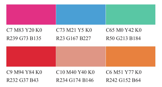
1. In the performance of the urban-style interface the color matching can choose red as the main color and other
     bright pink can be used as the matching color.

2. with red you can choose some bright cold color or warm color red is best to use the same color color purity should
     not be too high.

3. When matching red it should be noted that the purity of the color should not be too high the hue of high purity
     should not be too much and the difference between color and warmth should not be too large.
The red color is warm the character is strong and outgoing it is a kind of color that is very irritating to people and it is easy to make people feel excited excited nervous impulsive and so on. Red in different states of lightness and purity (dark red bright red pink etc.) the emotions expressed are different the feeling of deep red is more mature and stable and the atmosphere gives a youthful vitality and positive The feeling of upwards while pink is more inclined full of urban charm; bright red gives people a feeling of warmth enthusiasm and eye-catching. At the same time red has a strong warning. Because red is the fastest visual transmission people like to use red as a warning color.
In the interface design there are many colors that can be matched with red. You can use red or white or gray directly or you can use red and black directly. At the same time red can also match the color of the same color. When matching colors red is the main color to be placed in the most important position followed by some gray tones or the purity and brightness are not very high cold otherwise it will cause confusion of the entire color.
1 passionate color matching case analysis

The bright red has a fire-like enthusiasm which makes people feel very comfortable. The use of bright red in combination with gray and light yellow in the design of the APP interface will make the whole picture more dynamic. Red is used as the primary color gray as the secondary color in the function partition and yellow as the reminder button which makes the whole picture more energetic and vibrant.

2 bright color matching case analysis
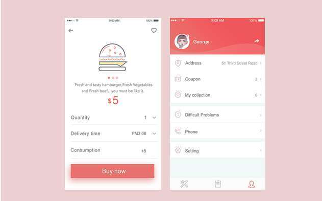
Bright color matching can choose a little bright red red adds a small amount of yellow and the brightness is improved. When matching colors the overall background color can be white some main areas can be filled with red and the secondary part can be With a light yellow and light gray with a higher brightness the overall color brightness is higher giving a brighter feeling.

3 male color matching case analysis
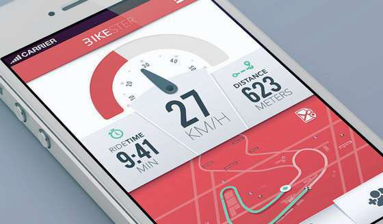
The contrast between the high-definition red and the low-light gray-green color is very strong. In the APP interface design the red area is larger representing the warm and energetic side of the male and the low-light gray-green represents the male's calm. On the one hand in contrast to the bright gray background the high-light pink green plays an embellishment role in the picture.

Case appreciation
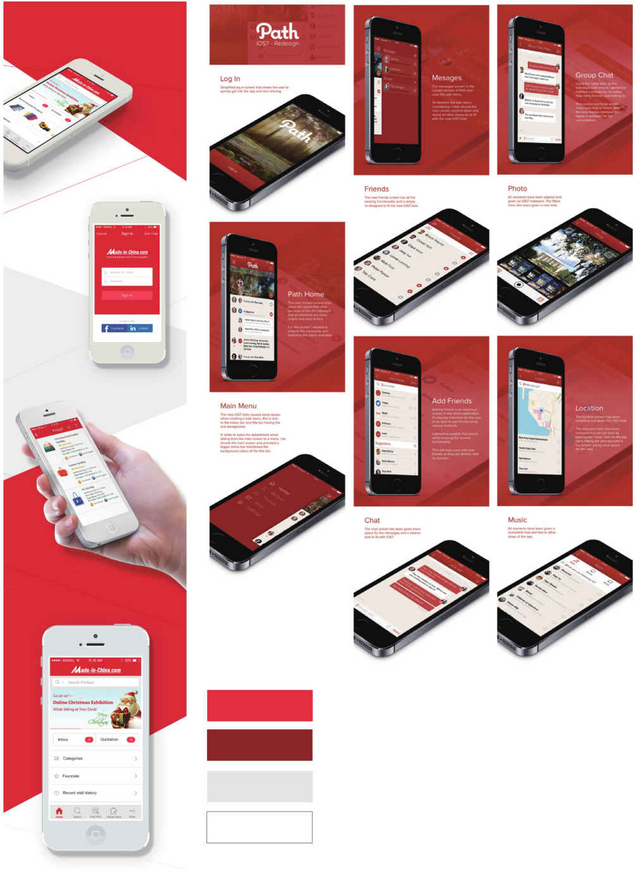
In the two APP interfaces red is the first color. When matching colors the bright red is most suitable for high-definition gray and white. The overall color is brighter giving a strong modern sense. Crimson and light gray are a good match. The deep red will not jump too much. It is relatively calm. The color in this design is not too much. The light gray is enough to be used as a deep red foil.

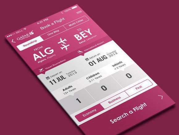
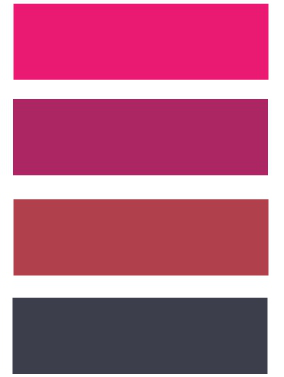
The interface above uses a brighter red wine color which can directly reflect the company's enthusiasm for service purposes. The burgundy color uses a gradient of color from deep to light and with a white and gray background the overall tone is harmonious unified energetic and enthusiastic.
The picture below is a mobile phone detection app. The red is alert. It is red and black. It gives a very stable feeling. The upper part uses a deep red color and has a strong warning. Sex the dark gray background is used below as well as the silver-gray icons and texts. The overall color is more complete atmospheric and stable.

I upvoted your post.
Best regards,
@Council
Posted using https://Steeming.com condenser site.
@yakamoz001, I gave you a vote!
If you follow me, I will also follow you in return!
Enjoy some !popcorn courtesy of @nextgencrypto!