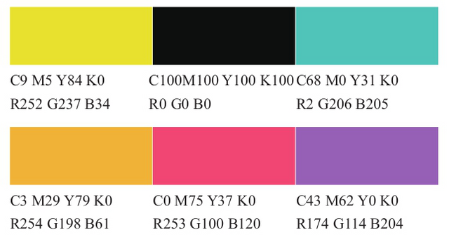
UI designer color matching - yellow
2 Yellow - with a color scheme with speed
Knowledge reading
1. The use of yellow in the design of the mobile phone interface can improve the brightness of the overall tone making
     the entire interface color jump and bright.

2. yellow and black are classic combinations the color contrast is bright and occasionally you can use the same color
    to match or use contrast colors to match.

3. When pairing with yellow avoid the combination of lemon yellow and pure white because the brightness of the two
    colors is very high can not form a strong contrast the effect is not very good you can add some dark colors.
The highest brightness of yellow with lively and brisk features gives a very young feeling symbolizing light hope nobleness and happiness. Yellow also represents land symbolizes power and has a mysterious religious color. The light yellow color gives a feeling of clarity happiness liveliness and hope; the yellow color gives the psychological feeling of sublimity honor brilliance attention and expansion; the deep yellow gives a noble gentle restrained and steady psychological feeling.
In the interface design the most classic color matching with yellow is black and gray. When using high-definition lemon yellow it is not suitable for white background you can use black background or dark gray background two kinds of brightness contrast Large color combinations give a very steady atmospheric feel. The warmer yellow and black combination can show a strong sense of speed. You can also consider using a similar combination so that the overall color and picture are more layered but if it is not good it will be too uniform and rigid.
1 bright color matching case analysis
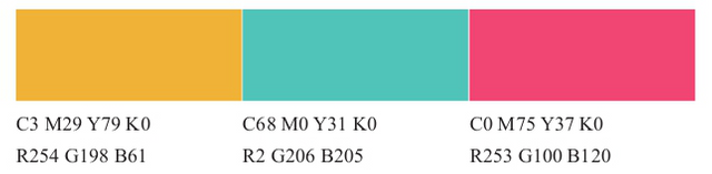
Bright color matching generally uses citrus yellow with higher brightness and the color matched with it is blue and green with higher brightness. Other colors such as gray and white background the overall brightness of this combination is higher visually very bright. .
2 youth color matching case analysis

The color of youth is colorful so you need a lot of colors to match. Don't use the color with lower brightness. The recommended blue and green colors are brighter plus the overall brighter color. Feel youthful and energetic.
3 modern color matching case analysis
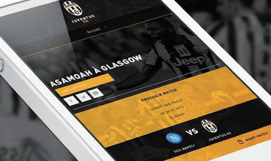
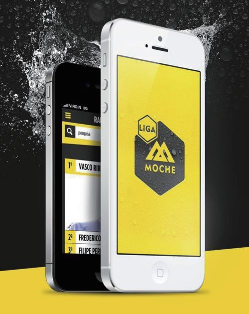
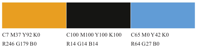
Black and yellow are classic color matching cases but remember that the yellow brightness combined with black should not be too high the color is moderately warm such color matching is very stable atmospheric and has a strong modern design.
Case appreciation
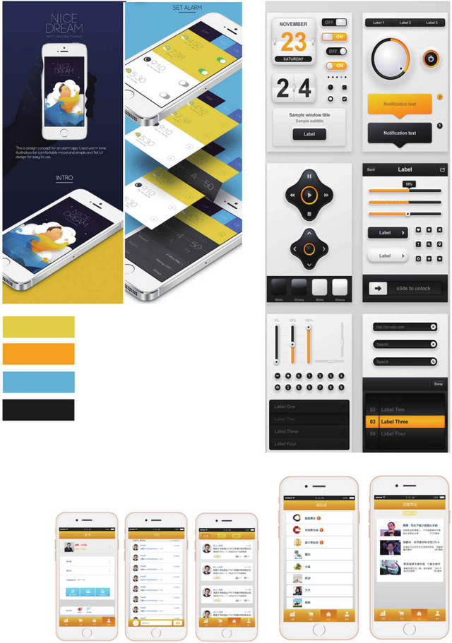
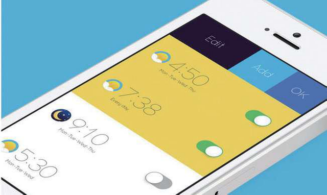
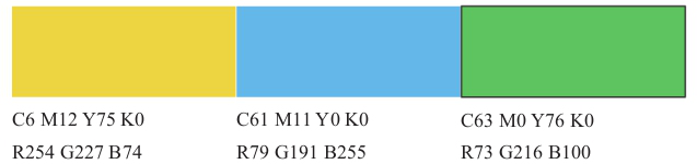
In the upper left corner this is a combination of light yellow and high-definition blue. The two high-definition colors are matched together and the whole design style is more fashionable and avant-garde. The color in the upper right corner is mainly a classic combination of warm yellow and black the colors are set off against each other and the overall atmosphere is relatively calm. The overall color of the bottom of this group of APP interface is very bright mainly yellow and white with a small amount of blue and gray adding a little color to the picture the overall is relatively clean and bright.
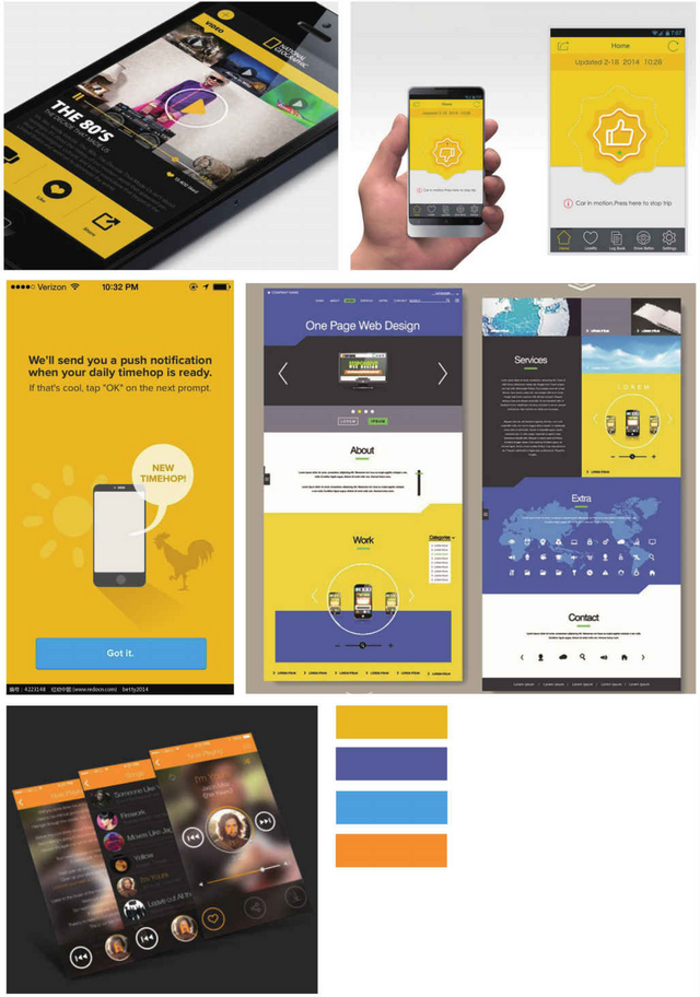
These app interfaces basically use a combination of yellow and black yellow and gray yellow and sky blue yellow and blue purple orange and black etc. Features.
Be sure to pay attention when using yellow with color such as the picture in the lower left corner because the background color is a little flower and the black itself is rather dull. If it is matched with warm yellow it looks a little burnt so try to use high brightness. Yellow and black.
I upvoted your post.
Mabuhay, keep steeming.
@Filipino
Posted using https://Steeming.com condenser site.