The UX Pyramid: The REAL reason Steem is stagnant.
This image and many of the ideas presented were taken from this article.
Back in April I wrote a post titled "What is UX and why it's the #1 Problem holding Steem back" where I went through what UX is (especially opposed to UI) and why it's the underlying, under addressed issue with Steem. Since I know you probably aren't going to go back and read that whole thing, I'll repeat the major points here. If you're already familiar with that post, you can skip this section.
First off. I am a visual designer. I have two degrees in different areas of this field. I have worked as a UI and UX designer in the past although it's not my primary specialization. I teach at the university level about design and visual communication. I can tell you all from the perspective of someone experienced in this, IT'S THE UX.
Now something that I realized is that I've said this before, but I've never really explained what UX is and many people here might not really know, so here's a simple explanation.
UX stands for User Experience. I guess UX looked cooler than UE. Anyway, user experience design is not about visuals. Some of the Steem interfaces have rather nice user interface(UI) design, but they all have TERRIBLE UX design. Part of this is not really their fault I imagine, it has to do with limitations of operating in a decentralized system, as well as the overall maturity level of the crypto industry.
Regardless, this is the issue. UX design deals with the psychology of the user and mapping out their "story". A well designed UX will enable the user to complete their tasks/goals in an intuitive, easy, and stress free way. We all know Steem is SEVERELY lacking in this area.
On Monday I'll be going on @pennsif's Tribe Talk show and chatting about tribes. I imagine some of what I'm going to talk about here will come up, but be sure to tune in. Also, let me apologize in advance for the screaming kids. I'll try to bribe them with ice cream beforehand. I found this great article and image as I knew I wanted to talk about UX today, but was doing a bit of research first. I think this article is a good frame, to frame the conversation around.
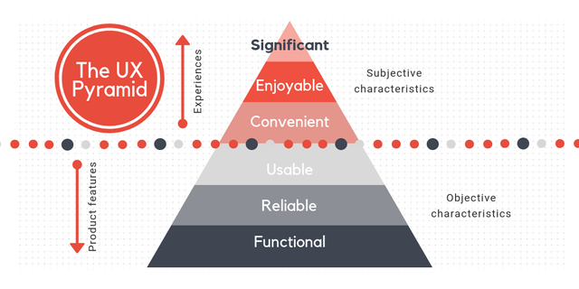
Level 1: Functional level
This level is complete when the design meets the requirements for the proper work of the product. The design has some purpose and include the key features, works in all modern browsers and passes basic accessibility.
How to improve the functionality of your design? There’s a recipe to prioritize the accessibility by moving the most important tasks in high-value areas; by minimizing the number of clicks from homepage to functionality; and by making scrolls and clicks purposeful.
The other things will help you improving functionality are simple registration process, not requiring the same input multiple times, and making the transactional data saved and retained for users to leave and return.
Don’t forget about the learning curve for the new user that should be simple and intuitive. You can do this by:
- Making buttons easily associated with the related function;
- Emphasizing the CTA;
- Using progress bars for multi-step processes;
- Adding sorting and filtering functions when they needed;
- Making additional features stopped or skipped and off by default.
Honestly I feel like most of Steems app are stuck at level one. There are aspects that drift into two and three, but for the most part that's where we are. Things are functional, for the most part, but even this level is failing in some key areas. If you visit a Steem frontend, what are the things you might want to do?
- Find and consume content
- Curate/Vote on content
- Create a post
- Transfer some Steem or SBD
- Power up/Down Steem
- Check on the progress of your actions (author/curation rewards)
- Vote on a witness
- Vote on a proposal
- Learn about Steem
- Engage other users of the platform
- Buy Steem
- Sell Steem
- Trade Steem
- Check the Steem price
- Check your Voting Mana
There are probably other things I'm forgetting, but this is a pretty good base for the main things a user might want to do. Now ask yourself, on how many frontends can we do all of these things?
How much friction is there to accomplish these goals?
Can we achieve these goals via multiple paths?
A good example of achieving a goal through multiple paths and how that improves User experience is Steempeaks new integration of an ever present voting mana bar that you can check no matter where you are in the site. It was always accessible here
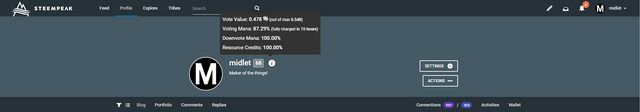
but now it's also accessible here
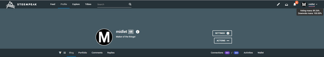
Which is visible on every page, where the former is only visible from your profile page. So before that feature, if you were about to vote on a post, but wanted to check your voting mana first, you'd either have to leave that page and come back or open a new tab and check there, or if you're using Steem Keychain, you could check that, but from the app design perspective, you shouldn't assume the user is using a plugin that's not directly connected to your application, that's why I think this is a great add-on, and again is showing what I've been saying for a while in that Steempeak seems to be the only Steem application putting in work to improve their UX. Trying to break out of the bottom three levels into the top three, but all the applications need to dedicate as much energy to this as they do for functionality and usability IMO.
Why?
There will always be bugs. If you squash all the bugs, more bugs will pop up. Find a balance. Steem as a blockchain is really getting stronger and stronger in it's functionality, reliability, and efficiency, but it's all for nothing if there aren't applications built on it that are convenient, enjoyable and significant.
Level 2: Reliable level
This level is complete when the design is available and accurate, with clean and reliable data, used on mobile and > standard device types.
How to improve the reliability of your design? First of all, you should be aware of device types the design will be available on and make the design fit all of them. The accuracy depends heavily on the UI part.
Most of our web apps are not optimized for mobile.
Level 3: Usability level
It’s good if users don’t get lost or confused and if they can easily find the content or products they need. That is the point where a website or an application meets basic UX heuristics and best practices.
How to improve the usability of your design? There are a bunch of different methods you can use. First of all, you need usability experts along with user testing to explore your design. Secondly, don’t hesitate to study the best design practices from famous designers and popular resources. Learn about how to conduct heuristic evaluation. To make it even simpler, when you have the design, you can use UX check site to identify the usability issues it might have.
So of course Steem is extremely confusing, and this is where I feel every application fails. There are no detailed instructions detailing the different features of a particular frontend or application on any of them. The best we have is the Steemit FAQ page which has a lot of information, but the presentation of that information is better for reference, not for initial learning. For that we need video tutorials preferably. Steem onboarding has videos to explain basic concepts, but there is no way for a new user to know that Steem onboarding exists so unless there was a link on frontends taking you to that site, it can't actually fulfill its purpose.
From past contests I can tell you there are multiple users who would be willing to help out on this front, I'm one of them, but this is a LOT of work and there's no way I would do this unless I had a guarantee it would actually be used.
Level 4: Convenient level
This level is completed if users want to use the product and can find situations when they can use it frequently.
How to achieve convenience in your design?
Eliminate the physical and cognitive barriers that make using a product or service difficult. That stands for actual convenience.
Also, you should improve the user flow to place the content exactly where it is needed.
Make the perception experience and expectations clear and smooth.
Give your users the control to manage their own experiences.
Level 5: Enjoyable level
Is this product worth sharing? On this level, users invest themselves into the product and promote it, share it with their friends and make it a part of everyday life.
How to achieve the enjoyable level for your design? In some point, this is similar to delightful UX design. So, technically, you can reach it by implementing:
- beautiful animations;
- tactile transitions;
- gestural commands;
- high-resolution imagery;
- sound interactions;
- microcopy;
- guidance if your users run into errors;
- navigating hints with questions and advice.
Level 6: Significant
This level is complete when the product with this UX design becomes loved by the users. At this point, I talk mostly about the behavioral experience and reflective level of how the product performs.
How to reach the significant level for your design? You must minimize pain points and reduce the number of obstacles the user might face. The second important thing is personalization. Here your product should help users improve their skills, their health, and their lives. It should be tailored according to their needs and reflect the changes they experience. To reach all of this you should conduct regular researches about your users, their habits and interests. Actually, this is all the UX design is about.
I included the top three for reference, but looking at them clearly we're not there yet, but that's what we should be aiming for.
So as usual, I want to make clear that this is not about bashing our developers. I want to give you all feedback from a user perspective. So while I can't know what's in your heads, as someone who is paying close attention to the developments across all applications this is a gross simplification of what it LOOKS like:
- We're squashing bugs
- We're improving FUNCTIONALITY (as opposed to experience)
- We're developing tools to make it easier for other people to build things.
- We're building new applications(at level 1)
My suggestion is that WHILE you're doing the things above(which are all super important) You also work on and improve the UX as you go.
An example of this is adding the beneficiary feature to tribes and then the addition to condenser.
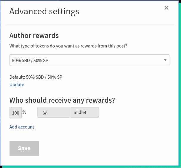
While I'm glad to have the feature, the UX is at the bottom of this pyramid. You can do the function. It doesn't tell you what a beneficiary is, there's no indication it's there without first clicking a button that give you little to no information. If I want to find out more information about it once I click that button I can't. If I add someone as a beneficiary, that person won't know I did. etc.
Here is an example of a more ideal UX flow for that feature.
- First off, the "Advanced Settings" button being reworded to "Additional Settings" If a user is new or somewhat new, they will think they don't need anything advanced, so they'll probably be less likely to click this. Additional is more inviting and lets them know they may be missing out on something cool behind this button.
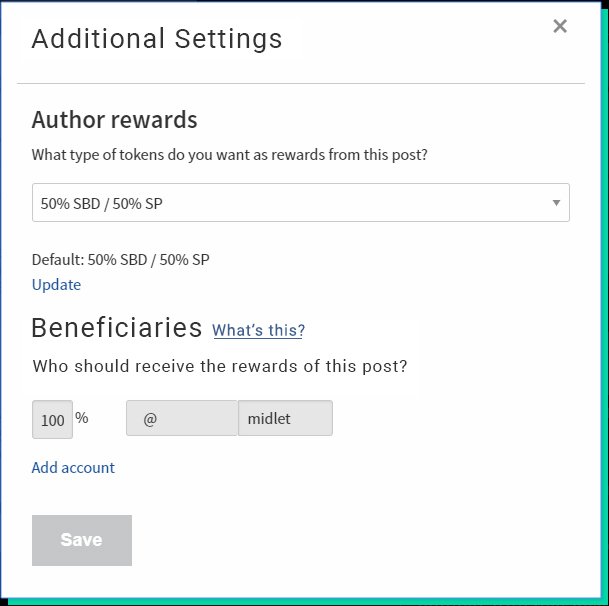
- Invoke the actual name. As a user is interacting on the blockchain they may hear this term thrown around. If they see it here they'll know this is what people were talking about.
- The "What's this" button brings up a pop-up or opens in a new tab a FULL description of what Beneficiaries are and how and why you might use them. Here's an example:
"Making another user or account a beneficiary on your post shares the rewards of that post with that user or account. You can determine this as a percentage and you can add as many users as you want(Can you? Don't know if that's actually true)
Sometimes applications automatically set themselves as a beneficiary on posts authored from their application as a means of monetization, but the beneficiaries feature is a powerful way to share and exchange value on the Steem Blockchain.
Let's say there's a cause you want to support. You could author a post where you talk about the cause and why you think it's worthy of support, then make that cause or whoever is in charge of it a beneficiary of that post to show support. As another example, let's say you create a post where you review a song posted by another Steem user where you include their song in your post. You could make that user a beneficiary of your post to share some of the rewards with them since you used their content in collaboration with your own."
- Clarifying the quick description. Just changing "Who should receive any rewards?" to "Who should receive the rewards for this post?" For clarity.
- Beyond that I'd also extend this to where a user is notified when another user has added them as a beneficiary, I'd allow users to set a default set of beneficiaries, I'd keep that information as something that applications could identify so that you could see how many people and who have you set as a default beneficiary, I'd make that something that could be fast tracked into a clickable button similar to delegations, where people can ask for delegations of different amounts as a button. I'd create additional marketing content to normalize the behavior of asking for this as a means of support, similar to what we do with delegations, as with delegations, beneficiaries as a feature is a unique value proposition of the Steem Blockchain. It's currently being squandered IMO.
These are the sorts of small changes that once piled on top one after another end up making a huge difference. I can guarantee you that big tech companies spend a LOT of resources tweaking these things to perfection.
This is the area that I feel is being neglected the most on Steem and again, the #1 reason for the lack of stickiness with Steem.
What do you all think? Let's talk about it in the comments.
My personal opinion is that the addicting features miss...Why do we spend so much time on Youtube and FB? Because they feed us more and more and it tastes good. On Steem, even if you're hungry, it takes effort to find something tasty. Which makes you consume less and spend much time and eventually give up & leave.
for me FB just fucked it up with all the changes they tried to make our feed what they think it should be.
but yes there are strange paths of youtube when you ask yourself why the f. am i looking at this and you got there by clicking at 10 recommended videos.
on one side i do like my feed here as it is, but on the other i would love some kind recommended page to find new people more easily
You can definitely end up going down some weird vortexes but the overall result of that is definitely positive as it gets people connected to stuff they're likely to want to see.
This is absolutely true @r00sj3. Content discovery is one of the main functions of a content sharing platform and it's pretty much non-existent here.
it makes me immensely sad that hardly anyone acknowledges the importance of this part...
I hope that once SMT's are launched they put the work on UX, especially the part of different passwords, and making them less technical and more easy to remember.
I think this is something the rest of the world will just have to get used to unfortunately. The security here is just a lot more important. There are people with millions of dollars powered up and if there was a security issue where accounts got hacked and it wasn't because of user error, that would be it for Steem.
If they don't do that,honestly, I can't see steem making it to mainstream.
This brought back a few memories, though back when I was learning ux it was called HCI (human-computer interaction) XD
I like the mana bar on SteemPeak though it took me an embarrassingly long time to work out what it was, when I initially saw it both lines were full so I thought it was was just some cutesy underline hover and I was like why, oh well it's kind of eye candy and I eventually cottoned on as I noticed they were getting shorter and shorter XD
It's a really helpful feature and Steempeak is really getting to that point to where there is literally no reason to use any other frontend. Right now I still come by Steemit to see their featured posts, but that's it. Browsing, curating, wallet actions, all on Steempeak.
Super valuable insights as ever.
I feel like there needs to be an ‘advanced’ button that unlocks everything an experienced Steemian might encounter, to operate. (Which is what we have now)
But the default Steemit when anyone lands should be the most beautiful easy to use fool proof thing with language and references that would probably make tech geeks feel sick.
But there’s no need for some to even read the word blockchain, rewards curve, or node.
They need things like ‘Pay me!’ (Claim Rewards), ‘What would you like to say?’ (Make a post), ‘Unlock bigger votes’ (Power Up) ‘Cash out!’ (Power down) etc
And that’s it. With some info and tabs to hover over that explain more if want to know more about its function.
Lastly, gamify it more.
Make it a challenge - people love to earn and see the numbers go up. It would get competitive which makes it exciting.
Love your ideas man!
Yea, it definitely needs to be completely braindead easy at that first level, but have accessible information for the users that want to learn more.
Also I totally agree about more gamification. I would add more fish levels more frequently that Minnow,Dolphin, Orca, and Whale. Each one is 10x the previous! There should be a lot more in the beginning then have if be more rare as you get bigger.
Those are good ideas, especially making it so there are more fish levels to accomplish
Thank you so much for participating in the Partiko Delegation Plan Round 1! We really appreciate your support! As part of the delegation benefits, we just gave you a 3.00% upvote! Together, let’s change the world!
To listen to the audio version of this article click on the play image.

Brought to you by @tts. If you find it useful please consider upvoting this reply.