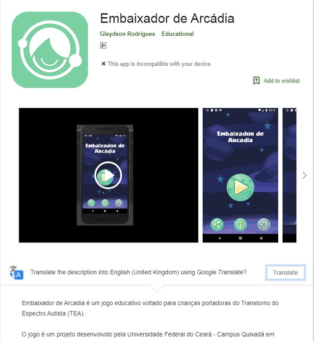
My Logo Design - For Ambassador Of Arcadia
Repository
https://github.com/gleydson/AmbassadorOfArcadia
Issue/Linked Task Request
https://github.com/gleydson/AmbassadorOfArcadia/issues/14
Pull Request Merged
https://github.com/gleydson/AmbassadorOfArcadia/pull/102
Details
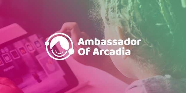
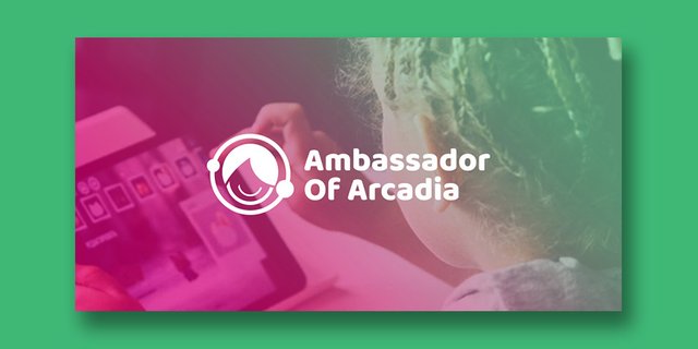
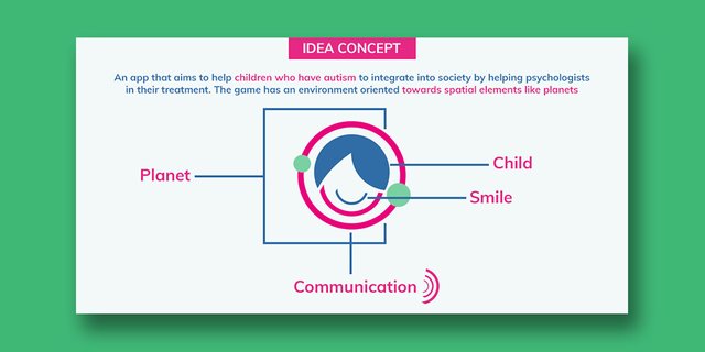
An amazing project. An app, game that aims to help children who have autism to integrate into society by helping psychologists in their treatment. I came across the project and I decided to create a logo for the project. I reached out to the project owner and we had conversations and shared ideas throughout the process until the final logo design which he liked and merged to his project.
Proof Of Contact With Project Owner
https://github.com/gleydson/AmbassadorOfArcadia/issues/14
Presentations
Benefits/Improvements
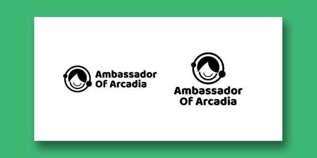
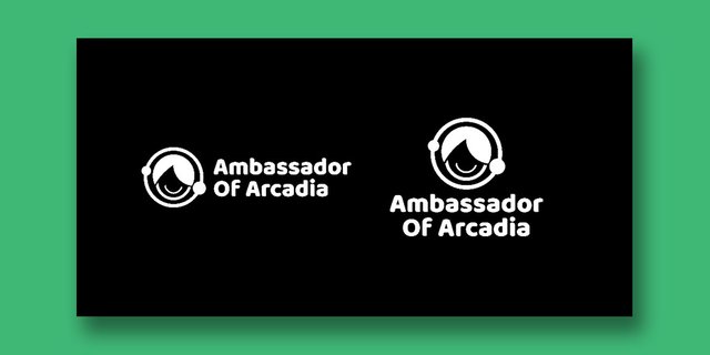
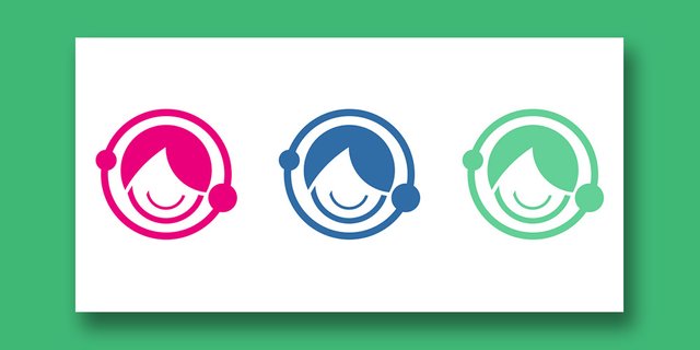
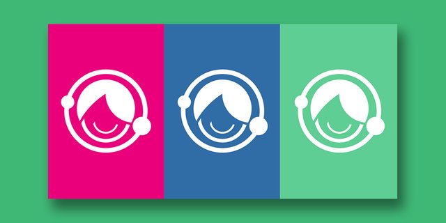
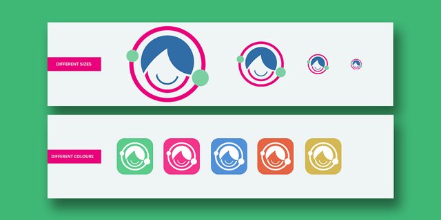
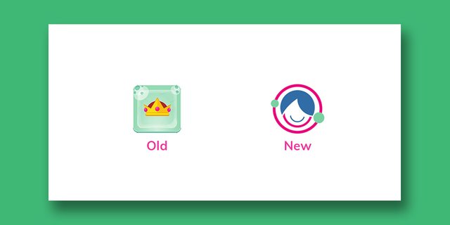
The logo gives a unique identity to the project and the app. The logo minimal, clean, modern and represents the project and also work well in different variations and sizes.
Proof of authorship
Mockup
Tools
- Computer (windows PC)
- Adobe illustrator CC 2015
- Adobe Photoshop CC 2014
Font Here
Image Here
Devices Mockup Here
App Playstore Here
Original Files Here
Proof Of Work Done

This work is licensed under a Creative Commons Attribution 4.0 International License.
Hi @chimzycash, thank you for your contribution to this amazing project.
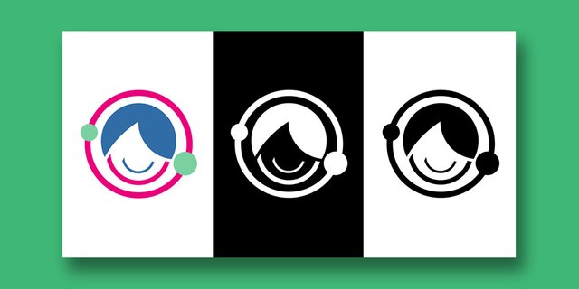
I see the idea of your logo, it's very clear and i think it will represent the project better than the previous logo. I found some inconsistency in the logo, the gap betweenelements should be concistent, specially on a symetrical logo like this one. see images bellow for example.
I see this project doesn't have a proper readme and license, next time make sure you are contributing to project that has both proper readme and license in it repository.
Your contribution has been evaluated according to Utopian policies and guidelines, as well as a predefined set of questions pertaining to the category.
To view those questions and the relevant answers related to your post, click here.
Need help? Chat with us on Discord.
[utopian-moderator]
hello @nilfanif ... the logo was created to feel more natural and not just mechanical. Not all logos need to follow the perfect symmetrical rule... sometimes Asymmetrical also counts. Every logo does not always need to follow the strict construction principle especially when it involves organic feel.
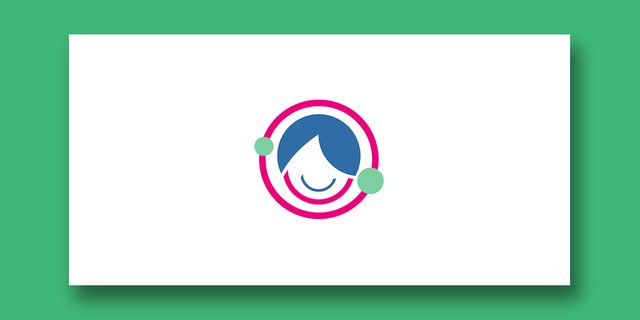
if you look at the logo, you will see that the planet ring has two circle shapes with different sizes which makes it feel have of that organic and natural feel.
The face in your version feels just circular which doesn't feel like a natural face and planets have different sizes while your version just have the same size.
The logo was created to feel natural based on the idea of the project.
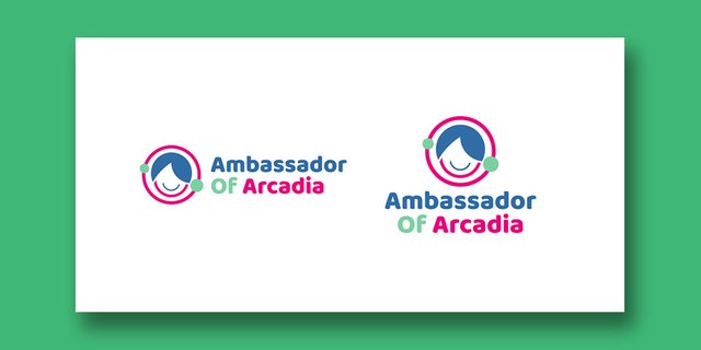
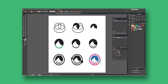
well if you say so, i agree with not every logo need to follow the symetrical rules, in this case the outer circle lead our mind to think symetrically, it's not intentional. our mind then will compare the outer circle with the "child head" that also looks like a circle. and we will see the inconsistent gap. but if you insist about the organic fell, there is another way to make it looks more appealing, you can make the "child head" a little bit smaller so the inconsitent gap will be less noticeable. see the image bellow for comparison.
That is not an outer circle... it is a different added design and not an outer circle, in this case a planet ring which was the idea...
Talking of making the child head smaller, does it mean the creator of the logo doesnt have his/her own decisions to make for designs?
Making it smaller appeals better to you, and not to me, and i am sure there are other logo designers out there that will have their own opinion. The smaller the child head, the more it feels disconnected from the design and the goal is to make the whole design feel like a unit and not separate elements
Art/Logo/designs is relative and only have more meaning to the creator... Making the head smaller doesn't mean it will appeal to other persons, it is just a matter of how I wanted the design to look and the SATISFACTION OF THE PROJECT OWNER
Yes planet ring, and what is the shape of that ring? Circle. I said it outer circle because it is placed outer most.
And yes of course you as the creator has your own decision. I am here as a moderator giving a suggestion on how the logo could be better by following the way of a designer which is solving a problem. In graphic design, inconsistency is a problem and designer should solve this problem. Again, i am here as a moderator and a graphic designer give my two cents on how this logo can be improved. Eventually it is up to you whether you want to follow it or not. :D
Thanks a lot... I really appreciate your input
I would love to ask... Was yours an improvement ?
Talking of inconsistency, what makes this logo inconsistent? cos of the two different circle shapes that interfered with the spacing?....
Yes it is up to designers to follow what they want... But is that the same thought when ANSWERING THE UTOPIAN QUESTIONS?
And about the meaning of a logo is relative, i totally agree. But you know in logo design there are basic principles that should be followed to make a good logo, and one of them is consistency and balancing. Every logo designer should know this. Or else someday someone or a 5 year old kid will submit a doodle, like literally just a doodle and said it is a logo and thats all he want and it's perfect in his opinion. But when you show it to other logo fesigner they will say its just a doodle not a logo. Imagine utopian have to give 100% reward.
I am not saying mine was a perfect improvement, it is just to show how gap inconsistency can affect the balancing of the logo.
I am answering the questions base on my knowledge in graphic design. And based on my knowledge gap inconsistency is a problem and ahould be fix. That's why i suggest it to you.
I hope you are clear that i am not holding your points so youget less reward. Once againg i am moderating based on my knowledge in graphic design. If you think i am not capable of doing so you can suggest to utopian community manager to kick me out from moderating. :)
I appreciate your efforts in what you are doing... Really nice...
But my point was that gap consistency and symmetry are great rules but part of the least rules to follow in logo design in cases when it is little and can not be avoided. Making it perfectly consistent in the gap would mean i would alter my idea concept and also making the circle shapes same sizes.
Remember... The bottom part of my idea concept was a voice or communication wave... so the whole design had to match... Mking it perfect like in your first version would affect the SPACING IN THE SPEACH WAVES
The Apple logo isnt sysmetrical and it is one of the valuable logos out there
... It could apply to graphics design in general
Anyways... have a great day ahead :)
Thank you for your review, @nilfanif! Keep up the good work!
As a follower of @followforupvotes this post has been randomly selected and upvoted! Enjoy your upvote and have a great day!
Hi @chimzycash!
Your post was upvoted by @steem-ua, new Steem dApp, using UserAuthority for algorithmic post curation!
Your post is eligible for our upvote, thanks to our collaboration with @utopian-io!
Feel free to join our @steem-ua Discord server
Congratulations @chimzycash! You have completed the following achievement on the Steem blockchain and have been rewarded with new badge(s) :
Click here to view your Board
If you no longer want to receive notifications, reply to this comment with the word
STOPHey, @chimzycash!
Thanks for contributing on Utopian.
We’re already looking forward to your next contribution!
Get higher incentives and support Utopian.io!
Simply set @utopian.pay as a 5% (or higher) payout beneficiary on your contribution post (via SteemPlus or Steeditor).
Want to chat? Join us on Discord https://discord.gg/h52nFrV.
Vote for Utopian Witness!