Part 6: Build a CSS-in-JS React App with Styled Components and Priceline Design System
Users don't like surprises.
As a matter of fact, most people are not very comfortable with sudden, unexpected occurrences. This is due to the association of abrupt events and their startling natures with uncertainty. Instinctively, we tend to avoid jarring, unexpected changes to our natural environments.
To get a better picture, carefully observe the plot sequence in movie releases from the horror genre. You could easily notice a trend; events with the most shock value are typically abrupt introductions of agents (either malevolent or benign) into the set. It's a well known physical principle that linear changes do not occur in nature, rather natural mutations are seemingly eased or graduated.
Since our ideal interaction experiences with digital devices tend to be an approximation of our interaction with everyday items, it is completely rational that we try to model the physical world within our applications. This means the reduction of "surprises" or unexpected occurrences to a bare minimum.
Typically, most jarring and disorienting changes within user interfaces occur when content is being rendered. First of all, when loading a web resource there is the infamous blank white screen followed by the abrupt appearance of content. While this ought to be really disorienting, hedonic adaptation allows us to simply gloss it over and get on with our business. Modern interfaces designed by some of the most successful tech enterprises work within the constraints of principles governing the user's mental interaction model.
Prime among the principles governing the interaction model, is the principle of progressive content rendering. This simply means the appearance of content is first simulated before said content is available to avoid the flash of a blank white screen. Content appearance must first be simulated by displaying visual placeholder content prior to the requested content being available.
Last time around we explored the use of infinite scrolling techniques to improve perceived responsiveness. Today, we will explore skeletal content placeholder screens as a technique for improving perceived app response times. We will also look at action notifications as an effective feedback mechanism.
Disclaimer:
This tutorial may be pretty challenging for a first time reader of this series. I sincerely recommend that visitors get at least a cursory gaze at the previous articles in this series for easier comprehension. Links to the previous articles are available at the bottom of the this tutorial.
Repository
Tutorial Repository
Difficulty
- Advanced
What Will I Learn?
By the time we get to the end of this tutorial, you should be able to apply these techniques to your React apps:
- Reducing user attrition by utilizing layout placeholders or skeletal screen.
- Simulating production level constraints with asynchronous function resolution.
- Leveraging PropTypes for reusable React components.
- Keeping users engrossed and interacting with our app via action notifications as a feedback mechanism.
- Introducing micro-interactions for greater user engagement.
Requirements
- Node.js 8.0 or greater.
- NPM 3.0 or greater.
- Yarn package manager
- Git
- FireLiners Github Repository Code
- An intermediate level of ReactJS knowledge.
- Keen interest and patience.
Brief Introduction.
In the brief ramble above, we got a clear picture of the problem. We also clearly outlined the techniques we hope to use to address said problems. We'll now take a look at skeletal loading screens and what they entail.
Skeletal Loading Screens:
Skeletal loading screens are an anticipatory design technique used to suggest a visual structure for content while it's still loading. Skeletal loading screens are fairly commonplace and are currently employed by Facebook and YouTube for progressive rendering in their application user interfaces.
How does skeletal loading work? Its working principle is fairly easy to wrap your head around. Skeletal loading works by detecting the loading state of your app: if your app is currently loading, the skeletal placeholders (usually <div></div>) elements with some styling attached are displayed.
You can generate a skeletal screen by first observing the fully loaded data state and then attempting to mimic it by using elements styled to resemble the content structure.
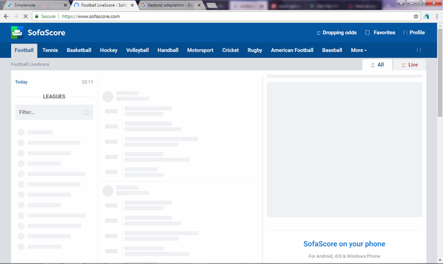
Below are some apps with skeletal loading screens:
- Sofascores Skeletal UI
- Twitter Skeletal
Adding Skeletal Screens to FireLiners
You can add skeletal screen functionality by designing it as a React component and toggling it by checking the application's loading state.
To save on time, we'll be using the awesome dvtng/react-loading-skeleton package. You can get it installed by running
npm install react-loading-skeleton --save
With this package installed, let's examine our structure once more
fire-liners/
- config/...
- node_modules/...
- public/...
- scripts/...
- src/
- assets/
- data/
- authors.json
- liners.json
- img/...
- data/
- components/
- Header/
- index.js
- logo.svg
- Header/
- containers/
- App/
- App.test.js
- index.js
- constants.js
- reducer.js
- App/
- redux/
- reducerInjector.js
- reducers.js
- sagas.js
- store.js
- screens/
- AddLine /
- index.js
- actions.js
- Home /
- index.js
- constants.js
- actions.js
- Loading /
- index.js
- AddLine /
- services/
- DataService/
- index.js
- DataService/
- index.js
- registerServiceWorker.js
- assets/
- package.json
We'd like to add some skeletal loading functionality to our Home screen. To do this, we'll leverage the react-loading-skeleton package and a bit of Boolean toggling logic. Opening up the Home class at src/screens/Home/index.js we'll be making some changes. In the constructor method, we'll add a state Boolean property called isLoadingLiners and we'll set it to true by default. This means that whenever we start the app, we understand that our liners are yet to load.
    constructor(props) {
        this.state = {
            linersSetIndex: 0,
            hasMoreItems: true,
            linersTotal: 0,

            // we'll use this to track the current loading progress of our liners.
           isLoadingLiners: true
        }
     }
Next, we'd like our app to fetch liners whenever it runs. We do this by calling the this.props.fetchLiners method. After we fetch the liners, we'd like to wait for about 3500 milliseconds before we switch off the loading state. We do this by calling this.setState and setting the isLoadingLiners to false within a setTimeout function effectively letting our app now we're done with loading. This is done to ensure that we are able to reasonably simulate production environments.
Since we are loading our data from a JSON file, loading is nearly instantaneous however this is not the case on production environments as only the fastest 4G networks can guarantee near instantaneous loading. So, we use the setTimeout call to simulate production levels of uncertainty.
    componentDidMount() {
        // Previous code here...
        this.props.fetchLiners({
            linersSetIndex: this.state.linersSetIndex
        })

        setTimeout(() => {
            this.setState({
                isLoadingLiners: false
            })
        }, 3500)
    }
Also, we'll be applying the same technique to our fetchMoreData method that is called by our Infinite Scroll component whenever we need to fetch more liners. In this method, we start of by setting the isLoadingLiners local state property to true to signify that we're loading liners. Within the setTimeout call, we wait for 1500 milliseconds and then we send a request to fetch liners. We also switch off loading by setting isLoadingLiners to false.
    fetchMoreData = () => {
      // a fake async api call like which sends
      // 20 more records in 1.5 secs
      this.setState({
          isLoadingLiners: true
      })

      setTimeout(() => {

          if (this.state.hasMoreItems) {
               // previous code
              this.props.fetchLiners({
                  linersSetIndex: this.state.linersSetIndex
              })

              this.setState({
                  isLoadingLiners: false
              })
          }
      }, 1500);
    };
Great! We are now able to switch our loading on and off and even simulate loading using the asynchronous setTimeout call. Next, we need to fix our <Feed/> component to enable it work with skeletal loading properly. We'll be introducing the isLoading attribute to the Feed component props in our render method. We'll set the value to be equal to the isLoadingLiners state Boolean. This will help us communicate to the Feed component the current state of our loading.
                    <Feed
                        liners={this.props.liners}
                        linersSetIndex={this.state.linersSetIndex}
                        authors={this.props.authors}
                        isLoading={this.state.isLoadingLiners}
                    />
It's now time to work on our Feed component class. We'll be enforcing proptypes within our Feed component. To help us do this, we'll simply need to import the PropTypes class from the prop-types package. We'll also be importing the Skeleton component from react-loading-skeleton.
import PropTypes from 'prop-types';
import Skeleton from 'react-loading-skeleton';
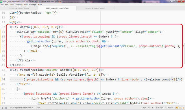
We'll also be making changes to the JSX markup we have in the render method. The markup below is responsible for rendering the photo of the author. Thankfully, we had enough sense to make a placeholder-like Circle component. We'd like to only show a simple gray circle if the liner data is not fully available. To do this, we run a check that only shows the image if:
props.isLoadingis false. This stops us from showing the image if theisLoadingproperty value isfalse.The number of liners is greater than or equal to the index of the current liner under evaluation: Let's make it a little easier to understand. We'll assume we've got five liners at first and the current liner is the sixth liner. Since six is greater than five, the image is not rendered at first, however when the liners are updated to ten, then the image is rendered.
                                <Circle bg="#d5d5d5" mr={5} flexDirection="column" justify="center" align="center">
                                  {!props.isLoading && (props.liners.length) >= index ? (
                                      getLinerAuthor(liner, props.authors).photo &&
                                        <Image src={require(`../../assets/img/${getLinerAuthor(liner, props.authors).photo}`)} style={{ borderRadius: '50%', width: '60px' }}/>
                                    ) : null
                                  }
                                </Circle>
We also apply the above to the body of the liner. Here, we resort to showing a skeleton composed of three full width lines to represent the liners if our app is still loading liners. We can generate the number of lines required by simply passing in a value to the count prop.
                                <Text mb={3} width={1} italic fontSize={[1, 2, 3]}>
                                    {!props.isLoading && ((props.liners.length) >= index) ? liner.body : <Skeleton count={3}/>}
                                </Text>
We also do the same for the author name. This time however, we don't want a very long line (names are usually short) so we generate a line that is 100px long by passing 100 to the width prop. We also place it within a Flex component with the flex direction set to row-reverse as this helps us put the line to the right.
                                {
                                    !props.isLoading && (props.liners.length) >= index ? (
                                        <Link href={'/authors/' + getLinerAuthor(liner, props.authors).slug}>
                                            <Text fontSize={1} mb={3} color="gray" align="right" bold>{liner.author}</Text>
                                        </Link>
                                    ) : (
                                        <Flex flexDirection="row-reverse">
                                            <Skeleton width={100}/>
                                        </Flex>
                                    )
                                }
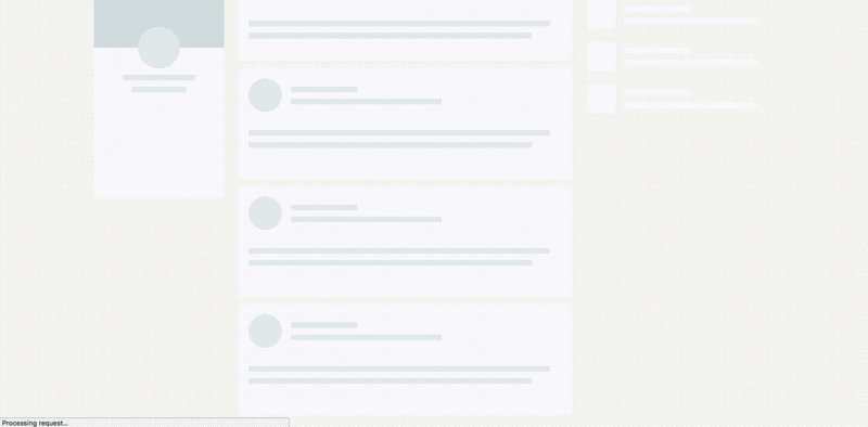
Awesome! We're done with our mini skeletal screen. You can see skeletal loading below.
Action Notifications as a Feedback Mechanism.
Before we proceed, let's step back a little and role play. In today's scenario, you are an impatient shopper with a really long wish list. You visit the nearby mart and you fill your trolley. You pull up to the attendant for a checkout and you ask, "Hi, I'd like to pay for my stuff." surprisingly you get no response. You keep going on but yet again no acknowledgement. You storm out of the establishment frustrated. The previous story displayed is analogous to the scenario that plays out when you offer no indicators to your users when they perform an action.
On optimum user experience is all-encompassing as it involves you making sure all sources of pain for your users are eliminated. A typical pain point for users is the process of form submission especially asynchronous form submission. The pain involved usually emanates from the uncertainty generated by some actions. For example, if you attempt to submit a form on the web, you usually expect some form of interaction or feedback to enable you know if your form submission is being processed or if it has failed.
We'll be adding subtle action notifications as feedback for our app. These notifications will be twofold:
- Small interactions for user triggered events.
- Success notifications for users whenever an action is completed.
We'll be adding an interaction that allows us to signal to the user that their action is underway. We'll be adding this interaction to the button with which we'll submit our liners. To do this, we'll display a little loading indicator along with descriptive text when we attempt a submit. We'll also be adding micro-interactions for our application's loading screens. We'll grab the react-spinners dependency and be on our way.
npm install --save react-spinners
We'll first start by adding some loading spinners to the loading screen. Open up src/screens/Loading/index.js and we'll get to work. We'll simply import the SyncLoader spinner type that comes with a really cool bouncing animation. We'll then position the sync loader in the middle of our loading screen. How cool is that?
import { SyncLoader } from 'react-spinners';

const AppLoadingScreen = props => (
    <Flex style={{ height: "100vh", position: "fixed", top: 0, bottom: 0, width: "100%" }} bg="lightYellow" flexDirection="column" align="center" justify="center">
        <SyncLoader
          color={'#a1a1a1'}
          loading={true}
        />

        <Text mt={3} bold>Whipping up Awesomeness...</Text>
    </Flex>
)
We'll also add this micro-interaction to our Infinite Scroll loader. We can do this by editing the Home Screen class available at src/screens/Home/index.js and modifying the Infinite Scroll instantiation code to use the SyncLoader instead of text. We update the style for the Infinite Scroll list to prevent annoying scrollbars from popping up. We then simply instantiate our SyncLoader where our text used to be.
  <InfiniteScroll
        dataLength={this.props.liners.length}
        next={this.fetchMoreData}
        hasMore={this.state.hasMoreItems}
        style={{
            height: 'inherit !important',
            'overflow': 'hidden !important'
        }}
        loader={
            <Flex justify="center" alignItems="center">
                <SyncLoader
                  color={'#a1a1a1'}
                  size={10}
                  loading={true}
                />
            </Flex>
        }
        endMessage={
          <p style={{textAlign: 'center'}}>
            <b>Homie, you done seen all the liners we got.</b>
          </p>
        }
  >
 //...other code
</InfiniteScroll>
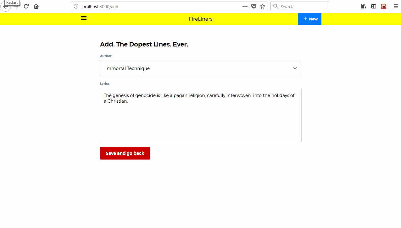
Creating an Action Indicator for our Submit Action.
We'll now attempt to create an action indicator for our Submit button. We'll hop over to our src/screens/AddLine/index.js and make some changes. First of all, we'll use the ScaleLoader now available thanks to react-spinners and we'll also add a new state property called isSubmitting. We'll use this Boolean state property to keep track of our submission. By default, we set it to false but we'll make it true when we make a submission. We'll also simulate production level constraints by using setTimeout before adding our liner.
import { ScaleLoader } from 'react-spinners';

class AddLine extends Component {
    constructor (props) {
        super(props);
        this.state = {
            // ...previous code
            isSubmitting: false
        }
    }
}
Next, we modify our RedButton (our submit button), We disable the button once a submission action is in progress. This keeps users from making double submissions. We also check if we're currently making a submission and if we are currently doing so, we show our ScaleLoader along with some descriptive text. If we are not currently submitting, we simply show the regular text.
    <RedButton
        disabled={this.state.isSubmitting}
        type="submit">
        {
            !this.state.isSubmitting ?
            <span>Save and go back</span>:
            <Flex>
                <Text mr={2}>Submitting</Text>

                <ScaleLoader
                  color={'#fff'}
                  height={17}
                  loading={true}
                />
            </Flex>
        }
    </RedButton>
In our handleSubmit event handler, we start of by setting isSubmitting to true to set the stage. We then wrap our submission code within the setTimeout function to simulate production level environments. Finally, we also introduce a method called this.props.addNotification that will be our next focus.
    handleSubmit (e) {
        e.preventDefault();
        this.setState({
            isSubmitting: true
        })
        setTimeout(() => {
            let newID = this.props.liners.reduce((maxId, liner) => Math.max(maxId, liner.id), 0) + 1;

            this.props.addLiner({
                id: newID,
                author: this.state.author,
                body: this.state.body
            })
            this.props.addNotification({
                type: 'info',
                message: 'Added new liner.'
            })
            this.props.history.push('/')
        }, 3500)

    }
Here's our little micro-interaction in action.
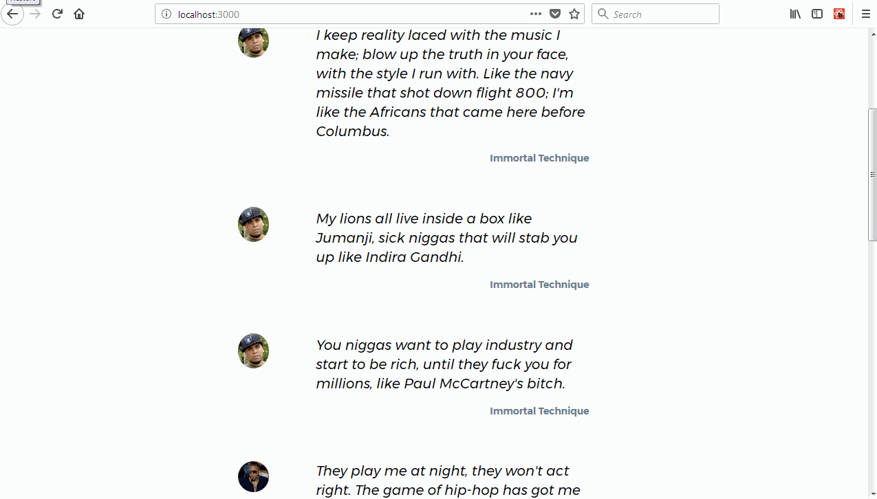
Creating App Level Notifications for our Liners.
We did great by adding micro-interactions for actions taken by our users when using our applications. We can now fully augment the experience by adding app level notifications. We'll use these to indicate that actions have been successful or otherwise.
How do App Level Notifications Work?
Well, app level notifications are simply items in an array that we can go through and display to the user. It's really that simple.
To add app level notification functionality, we'll edit the core App class and make some provisions for them. We'll edit src/containers/App/index.js and get to work.
First of all, let's grab our dependencies. We'll import the Priceline Banner component and the deleteNotification method from our actions.js file.
import { ThemeProvider, Flex, Banner } from 'pcln-design-system'

import { deleteNotification } from './actions';
Next we'll check if we have any notifications and if we do we'll go through all the notifications available within this.props.notifications and display them. We'll define this.props.notifications soon. We'll use Priceline's Flex component to keep the notifications just to the right of our liners feed. We also make sure we iterate through our notifications and for each notification we render a Banner component (also made available to us by Priceline design system). Within the onClose handler (triggered when we hit the close button) we call the deleteNotification action that we'll define soon passing the current notification as an argument.
            {this.props.notifications.length > 0 && (
                <Flex>
                    <Flex
                        width={[ 0.4, 0.4, 0.27 ]}
                        style={{
                            position: 'fixed',
                            top: 100,
                            right: 0
                        }}
                        flexDirection="column" p={3}>
                    {this.props.notifications.map((notification, i) => (
                        <Banner
                            key={i}
                            bg={notification.type === 'info' ? 'darkBlue': 'black'}
                            py={2}
                            px={3}
                            iconName="circleInfo"
                            iconSize={20}
                            onClose={() => {
                                this.props.deleteNotification(notification)
                            }}
                            showIcon={true}
                            mb={3}
                            style={{
                                color: 'white',
                                borderRadius: '3px',
                                fontSize: '11px'
                            }}
                            textAlign="center"
                            text={notification.message}
                            />
                        ))}
                        </Flex>
                </Flex>
            )}
We also make sure we define this.props.notifications and this.props.deleteNotification below. We use the ever-useful mapStateToProps and mapDispatchToProps to do this.
const mapStateToProps = (state) => {
    return {
        notifications: getAppState(state).get('notifications').toJS()
    }
}

const mapDispatchToProps = (dispatch) => {
    return {
        fetchAuthors: data => dispatch(fetchAuthorsRequest(data)),
        deleteNotification: data => dispatch(deleteNotification(data))
    }
}
We now need to define the deleteNotification method at src/containers/App/actions.js. We import a couple of constants that we'll be defining soon. We also define the deleteNotification and addNotification methods. These are fairly standard right about now.
import { ADD_NOTIFICATION_REQUEST, DELETE_NOTIFICATION_REQUEST } from './constants';

export const deleteNotification = data => {
    return {
        type: DELETE_NOTIFICATION_REQUEST,
        data
    }
}

export const addNotification = data => {
    return {
        type: ADD_NOTIFICATION_REQUEST,
        data
    }
}
We'll also define some new constants at src/containers/App/constants.js
export const ADD_NOTIFICATION = 'app/ADD_NOTIFICATION';
export const ADD_NOTIFICATION_REQUEST = 'app/ADD_NOTIFICATION_REQUEST';
export const DELETE_NOTIFICATION = 'app/DELETE_NOTIFICATION';
export const DELETE_NOTIFICATION_REQUEST = 'app/DELETE_NOTIFICATION_REQUEST';
export const REDUCER_NAME = 'app';
We'll also need a saga to process our actions. Let's create src/containers/App/saga.js. We import our dependencies which are constants and some methods from the redux-saga package.
import { all, put, takeLatest } from 'redux-saga/effects';
import {
    ADD_NOTIFICATION,
    ADD_NOTIFICATION_REQUEST,
    DELETE_NOTIFICATION,
    DELETE_NOTIFICATION_REQUEST
} from './constants';
Next, we'll define a couple of saga handler methods. We'll use addNotification and deleteNotification methods to dispatch corresponding actions to the store.
export function* addNotification (payload) {
    return yield put({
        type: ADD_NOTIFICATION,
        payload
    })
}

export function* deleteNotification (payload) {
    return yield put({
        type: DELETE_NOTIFICATION,
        payload
    })
}
Finally, we define our export function. In this export function, we'll simply take the latest action requests and delegate them to the appropriate method.
/**
 * We process only the latest action
 */
export default function* root() {
  yield all([
    takeLatest(ADD_NOTIFICATION_REQUEST, addNotification),
    takeLatest(DELETE_NOTIFICATION_REQUEST, deleteNotification)
  ]);
}
We'll now need to add this saga to our src/redux/sagas.js file so our app knows to load this saga when it runs.
import AppSaga from '../containers/App/saga';

/**
 * rootSaga
 */
export default function* root() {
  yield all([
    fork(AppSaga),
    // previous code
  ]);
}
Defining Our Reducer.
Our very last step for this phase of our notifications system is the updating of our reducers. We can do this by editing src/containers/App/reducer.js and making some changes. We'll first import some constants.
import {
    ADD_NOTIFICATION,
    DELETE_NOTIFICATION
}
Next, we'll update our initial state object. We'll set an empty notifications array to hold our info.
const initialState = fromJS({
    notifications: []
    // previous code
})
We'll now handle ADD_NOTIFICATION actions. When a notification is sent, we'd like to do three (3) things.
- Calculate a new
idfor the new notification. - Add the calculated
idto the new notification data & - Push the new notification into the notifications array.
We calculate the new id using JavaScript's reduce method. We use the spread operator to extract the action's payload data into a new object. We then push that new object into an array.
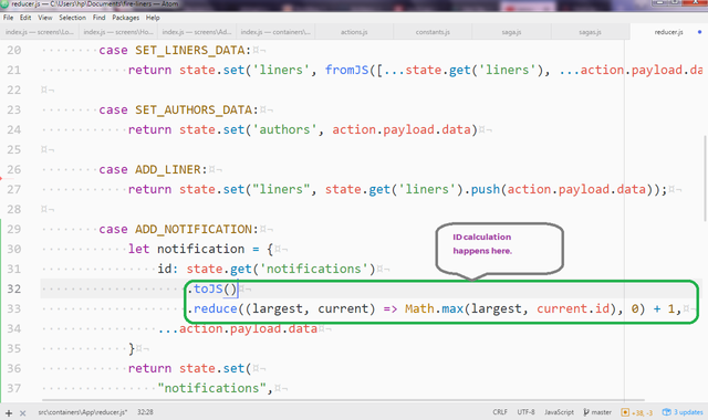
        case ADD_NOTIFICATION:
            let notification = {
                id: state.get('notifications')
                    .toJS()
                    .reduce((largest, current) => Math.max(largest, current.id), 0) + 1,
                ...action.payload.data
            }
            return state.set(
                "notifications",
                fromJS(
                    state
                    .get('notifications')
                    .push(notification)
                )
            );
For our delete notifications functionality, we simply set the notifications array to a new array that excludes the notification we wish to delete. We do this using the filter method to exclude notifications matching the one we want to remove.
        case DELETE_NOTIFICATION:
            return state.set(
                "notifications",
                fromJS(
                    state
                    .get('notifications')
                    .filter(notification => notification.id !== action.payload.data.id)
                )
            );
Finally, we've accomplished our goal today. You can see our application in action below.
Conclusion
In this tutorial, we covered multiple concepts. We learned more about the importance of perceived fast loading in the success of our applications. We also added skeletal loading to the FireLiners application. We then added app-level notifications and user facing micro-interactions for data loading and asynchronous actions without connecting to an external API.
In our next tutorial, we'll explore more advanced performance techniques. We'll look at interactive lazy-loading as opposed to passive lazy-loading as a means of increasing perceived application responsiveness.
Proof of Work
- App Level Notifications and Micro-Interactions in view_
Curriculum
Part One: Build a CSS-in-JS App With Styled Components and Priceline Design System
Part Two: Build a CSS-in-JS App With Styled Components and Priceline Design System
Part Three: Build a CSS-in-JS App With Styled Components and Priceline Design System
Part Four: Build a CSS-in-JS App With Styled Components and Priceline Design System
Part Five: Build a CSS-in-JS App With Styled Components and Priceline Design System
God bless you. https://steemit.com/@biblegateway
Congratulations! Your post has been selected as a daily Steemit truffle! It is listed on rank 8 of all contributions awarded today. You can find the TOP DAILY TRUFFLE PICKS HERE.
I upvoted your contribution because to my mind your post is at least 38 SBD worth and should receive 60 votes. It's now up to the lovely Steemit community to make this come true.
I am
TrufflePig, an Artificial Intelligence Bot that helps minnows and content curators using Machine Learning. If you are curious how I select content, you can find an explanation here!Have a nice day and sincerely yours,

TrufflePigCongratulations @creatrixity! You have completed some achievement on Steemit and have been rewarded with new badge(s) :
Click on the badge to view your Board of Honor.
If you no longer want to receive notifications, reply to this comment with the word
STOPDo not miss the last post from @steemitboard!
Participate in the SteemitBoard World Cup Contest!
Collect World Cup badges and win free SBD
Support the Gold Sponsors of the contest: @good-karma and @lukestokes
Thank you for your contribution.
While I liked the content of your contribution, I would still like to extend one advice for your upcoming contributions:
Looking forward to your upcoming tutorials.
Your contribution has been evaluated according to Utopian policies and guidelines, as well as a predefined set of questions pertaining to the category.
To view those questions and the relevant answers related to your post, click here.
Need help? Write a ticket on https://support.utopian.io/.
Chat with us on Discord.
[utopian-moderator]
Hey @creatrixity
Thanks for contributing on Utopian.
We’re already looking forward to your next contribution!
Contributing on Utopian
Learn how to contribute on our website or by watching this tutorial on Youtube.
Want to chat? Join us on Discord https://discord.gg/h52nFrV.
Vote for Utopian Witness!