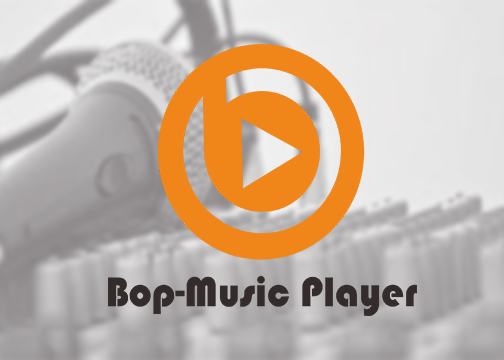
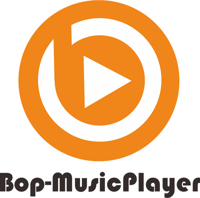
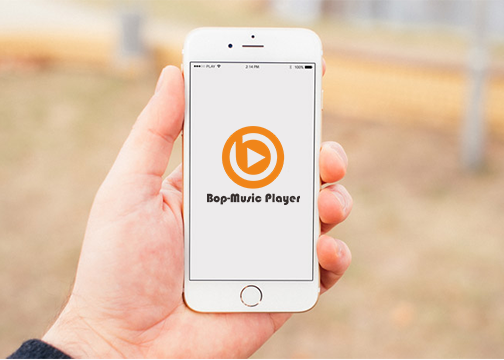
New Logo for Bob-Music Player app
Repository
https://github.com/iamSahdeep/Bop
Details.
A lightweight, powerful, fast and open source Music Player with elegant and stylish UI design, in just 5MB. This audio player supports almost all types audio or music formats. Easily play music by genres , albums , artists , songs. Music player was designed to bring better experience to user when they listen to music. It scans all music automatically and group them by title, artist, album, genre. Easy to find the song you want with search option. Supports audio equalizer to improves music sound, you can customize with own style.
Idea
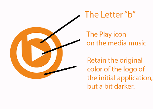
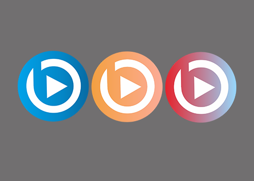
I tried to enter the first letter of the application name (Bop-Music Player) which is the letter "b" in this logo design and tried to insert a mix of play music icons in the middle of the letter "b" so that the application's character was clearer, I did not remove the initial color character the application but I chose a slightly darker color to make it look more sweet and simple.


Benefit
Benefits / Improvements
For the benefit of Bop-MusicPlayer logo are:
- Character applications more prominent.
- Sweet and simple and not overdone.
- logo visually easy to understand.
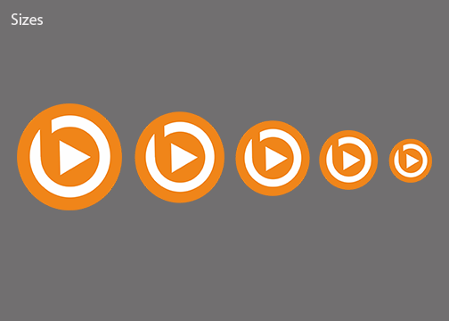
- A logo made in context-based gridlines. aim for proportional.
- Logo created with the concept of responsive and highly context. Here symbolizes that the brand should make design aesthetics and have an understanding in a different context so that the design can be applied to posters, business cards, and more.
Proof of request approved.
https://github.com/iamSahdeep/Bop/issues/28
Tool.
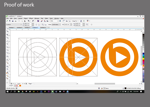
I made the Bop-MusicPlayer Logo using CDRx7. And I provide vector files (SVG, PDF, EPS and PSD) for flexibility and scalability, as well as the .PNG file format for immediate use of the design.
Hey @riyandacountri ,
Thank you for the contribution. I appreciated your effort. However, your logo design is too generic. I made a research for 2 min on google and found these logo designs: 1 2 3 4
There is some alignment problems on your logo design. As you can see below, parts which I mentioned with green dots should be straight.
I think the typeface is not looks professional. In my opinion it has different style when I compare with the icon which you create. In addition, sizes of text and icon on logotype version is not compatible. You should make icon smaller or make text bigger. The difference of dimension between them should be less.
Also, you need to do 'create outlines' or expand the text. The typeface you are used does not appear on editable vectoral files. If the user does not have this typeface on his computer, cannot use it or change it.
Your contribution has been evaluated according to Utopian policies and guidelines, as well as a predefined set of questions pertaining to the category.
To view those questions and the relevant answers related to your post, click here.
Need help? Chat with us on Discord.
[utopian-moderator]
Thank you mod
Thank you for your review, @baranpirincal! Keep up the good work!
Hi @riyandacountri!
Your post was upvoted by @steem-ua, new Steem dApp, using UserAuthority for algorithmic post curation!
Your post is eligible for our upvote, thanks to our collaboration with @utopian-io!
Feel free to join our @steem-ua Discord server