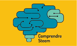
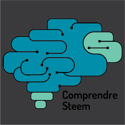
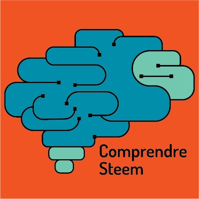
Logo Design for TelePost COMPENDRE STEEM
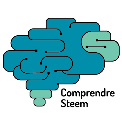
Following that request, I created the logo Base on:
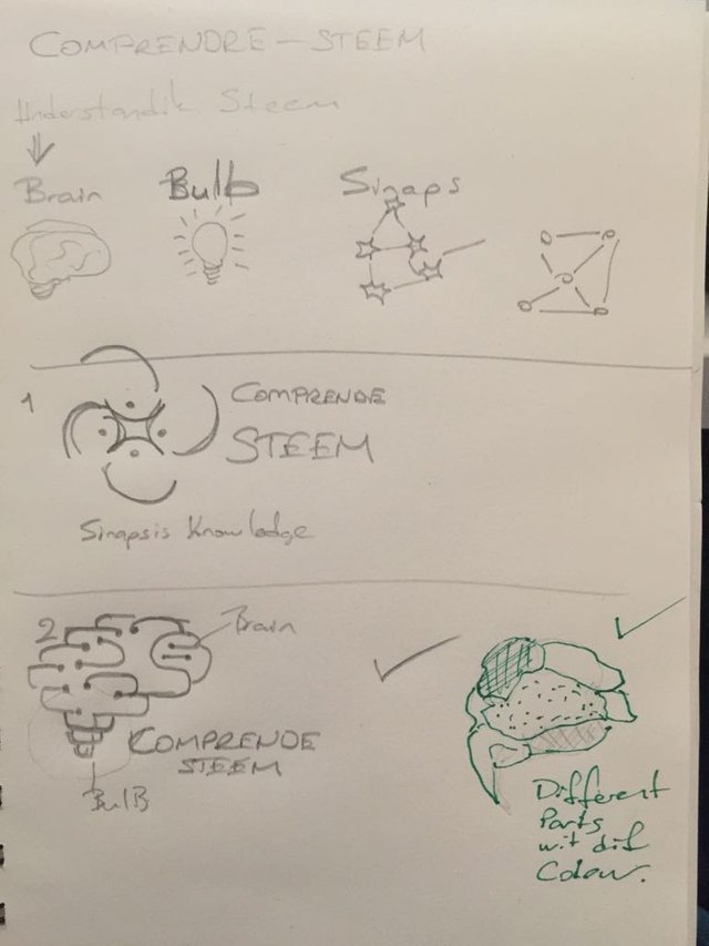
IDEA
Brain: Represent intelligence
Bulb: Represent knowledge
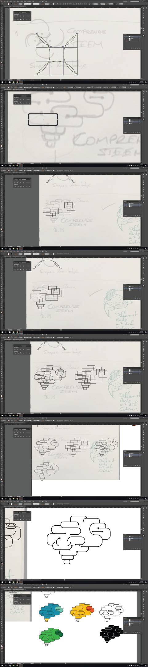
My sketch:
Tools
For this work, I used Adobe Illustrator.
Details
It is a platform that aims to index a set of resources (text, videos, tutorials, etc.) to better understand the Steem blockchain in order to use it to its full potential. The platform is in French only and has been created almost a year ago to onboard the French newcomers on Steem.
In French, Comprendre-Steem means "Understanding Steem".


Font Used in Logotype
Colour Used in Logo

Benefits / Improvements
- Easily adapt to digital or printing media
- Have a modern and elegant shape of the logo
- Different colour for usage
Proof of authorship
Original files
You can Download the original and editable files from the link
My Github Profile

Bu eser Creative Commons Atıf 4.0 Uluslararası Lisansı ile lisanslanmıştır.
ııı beğenmedim bunu nedense, çok karmaşık geldi gözüme. Daha iyilerini yapıyorsun normalde :))
Teşekkür ederim. Benim en sevdiklerimden biri oldu aslına bakarsan 😇
iki kere yollamış steemit yorumumu sildim ben de :))
ben biraz daha sadece minimalist yaklaşım seviyorum sanırım.
I like your concept, but I think the use of color does not help, and I also think the lines are too thin.
I've made a proposal too, if you want to give me your opinion visit my post
https://steemit.com/utopian-io/@camiloferrua/logo-design-or-comprendre-steem
Thanks 🙏 for kind review and comment. I will consider it for future contributions.
good job :D
Thanks Mate 😇
Too similar to free vectors. If you mentioned it as inspiration, it would be ok, but you did not and presented it as your own idea.
Your contribution has been evaluated according to Utopian policies and guidelines, as well as a predefined set of questions pertaining to the category.
Need help? Write a ticket on https://support.utopian.io/.
Chat with us on Discord.
[utopian-moderator]