Mr. Fear: A Music Video Analysis
SIAMÉS has just released a new song on YouTube called “Summer Nights” and are preparing a second album, so now is a better time than ever to talk about my favorite song off of the first: “Mr. Fear”. I first heard this song when the music video came out late last year, and it is an absolute treat. I recommend watching the video first, since I’m going to be discussing the visual elements of the video.
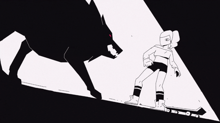
If you do like animation, you may recognize the band from another song from Bounce into the Music: “The Wolf”. The music video went viral, and for good reason: the limited color pallet of black and white with pink accents leads to a very distinct look, not to mention the action and animation of the wolves is incredibly exciting. While the style of the music video is the same (both were animated by the wonderfully talented RUDO Co.), the look of “Mr. Fear” is very different from “The Wolf”.
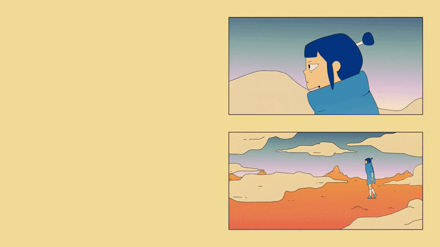
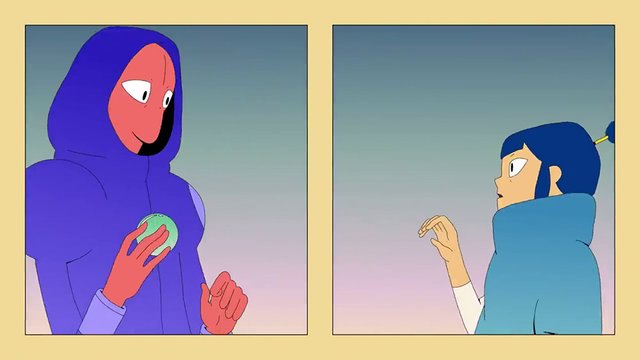
A unique aspect of the aesthetic of “Mr. Fear” is the framing of scenes throughout the video. Very rarely does a shot take up the entire screen- rather, scenes will be kept in comic-esqe boxes and circles that are placed against a yellow background. The only times the action takes up the entire screen is when two characters are together (literally), and as has been pointed out by many people who have seen the video, the framing has a thematic purpose in showing that the two characters in the video are not complete without the other- for better or worse.
The color pallet is much more broad than “The Wolf”, and features a lot of gradients on larger shapes. Many parts of the world of “Mr. Fear”, from the sky to the clothes to the city is colored in by gradients, with some being softer (such as the prison complex having a gradient from lavender to a more pinkish hue) and some being much more dramatic (like the city, which is dark blue at the top and tan where the buildings meet the ground). Some objects, such as skin color and smaller objects, remain one solid color, but most are affected by these gradients.
There’s also very minimal shading. The only times objects are “shaded” are certain shots where a character’s shadow is looming over another, and the area around them becomes darker as a result. Otherwise the coloring is very flat, and smaller shadows cast by objects are a solid black along the ground.
The points that I’ve just made about the framing and colors have already been covered before me in much more intricate detail in a video essay by Aaron Draws, which I highly recommend watching if you’d like to learn more about the tricks that went into how to video was animated. However, while Aaron only briefly mentioned the thematic significance of the framing of the video, I’d like to go into more detail about the significance of the other visual aspects in the context of the video’s story.
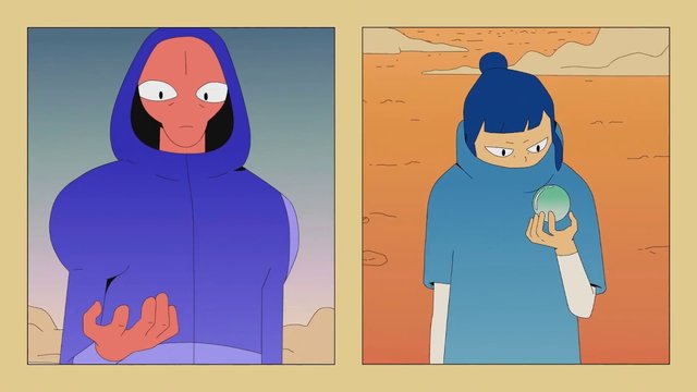
Take the colors, for example. I’ve already discussed the gradients, but I haven’t gone into detail about the pallet. For the most part, the city and the forest have a distinct color pallet. The city is very desaturated, with prominent dark grayish blues and tans. The forest, meanwhile, has brighter oranges and greens. This serves to make each of these areas visually distinct, emphasizing their differences from each other. It also serves to let the main characters stick out like a sore thumb. The human is most obviously dissident from the rest of the environment with their vibrant blue poncho and hair. Meanwhile, the alien has a dark blue hoodie that is much more saturated that the rest of the environment around him, making him more subtly distinctive while still sticking out like a sore thumb. The desert in between the two worlds has bright orange sand and a sky with an interesting gradient from the dark grays of the city sky to the darker pinks from the bottom of the forest sky, creating a literal and metaphorical middle ground for the two characters.
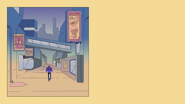
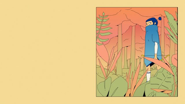
Something also worth noting is the use of the distinct gradients in the forest and city. In both areas the tops of areas are dark colors (the reds of the treetops and the grey-blues of the city skyline), and they have a harsh gradient to the lighter greens and tans of the grounds respectively. This really gives the two areas a sense of incompleteness, like there were touches missing. The only area that feels complete is that middle ground- but even it is littered with smaller city buildings that seem to blend directly into the sky. This creates a feeling of incompleteness that permeates the world around the characters that inhabit it.
.png)
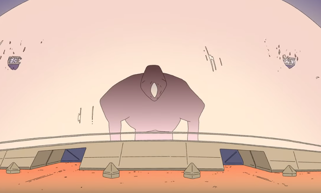
Finally, Aaron Draws made a note that the alien almost always occupies the left side of the screen, and the human almost always occupies the right. That is why the scene where the characters are in the dark is so jarring. This is the only part of the video where the characters are depicted on the opposite sides of the screen, which adds to their desperate search for familiarity. Once they find each other, they go back to their respective sides- until they go to form the monster again, when the camera pans to once again feature the character on opposite sides.
.png)
.png)
.png)
It's clear that the relationship between the two characters is complicated, and whether it is healthy or not is really up to interpretation. The band has regularly pinned comments to the YouTube upload featuring fan theories about what Mr. Fear means. While we may never have a definitive answer, it’s fun to look at how the video’s style contributes to the puzzle.
Thanks dor tge great analysis. I woukd surely listen to it.
Posted using Partiko Android
This post was shared in the Curation Collective Discord community for curators, and upvoted and resteemed by the @c-squared community account after manual review.
@c-squared runs a community witness. Please consider using one of your witness votes on us here
Congratulations @paigeautumneve! You have completed the following achievement on the Steem blockchain and have been rewarded with new badge(s) :
You can view your badges on your Steem Board and compare to others on the Steem Ranking
If you no longer want to receive notifications, reply to this comment with the word
STOPVote for @Steemitboard as a witness to get one more award and increased upvotes!