Here kitty kitty, my water ledge obsession
I had trouble sleeping last night so I decided to work on the technique we will be studying in some upcoming classes. Someone requested to work on eyes in one of my classes so I thought it wise to investigate this project a little further. It is interesting to do close ups like this to understand elements that usually are much smaller in the composition. It is always a good idea to go more into detail with the face, especially for an illustration like for the images you would see in a graphic novel. We call the eyes the windows of the soul for a reason.
When working with ink, cross-hatching offers an excellent way to depict light and dark. By working quickly, the result is expressive. For example I added some S marks in the iris to give a sense of its ethereal appearance, avoiding the highlight.
I also mixed the marks with stippling in that area. Stippling is a collection of little dots to create tone.
The cross-hatching under the eye is inspired by the texture of the skin which was clear on the photo. This is a good example of something I may not play with in a full portrait because it may be distracting.
It takes dexterity to go a few times over a line like the broader one for the top lashes. For beginners, let your line wiggle a bit as you reiterate the mark but keep it consistent. A broader fine liner is also an option to avoid having to go over your line with exactitude. It should not split until you’re at the longer eyelashes.
Notice how the crops hatching follows the volume, this creates a lot of depth.
I may have exaggerate the water ledge but what can eye say, water ledges are truly fascinating!
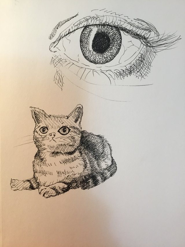
For the cat, you can see the quick guidelines as there was no pencil drawing to start. I made both the drawings directly with ink and had no possibility to erase. Where hatching conveys the texture of the hair, I use cross-hatching under the chin to articulate a shadow. I layer my marks on the tail for the darker stripes.
Making things darker is generally referred to as shading but for the stripes on the tail, I shade because of local colour. Because the fur is actually darker, not because there is an actual shadow.
Most of the hatching is fun and whimsical. It is airy on the chest and under the eyes with lots of white from the paper to bring those parts forward. One area for improvement is that the kitten should seem even more as though it is looking up because that is a strength in the original photography. It is all in the tilt of the head; such subtleties make a drawing much stronger.
Keep in mind that the speed at which you make your marks matters. Since you cannot erase, I suggest embracing your mistakes and often going faster makes for a more streamlined look. If your pen is at an angle, your lines will be lighter and even break which is great for the early layout. The more upright, the more deliberate the lines will be as the ink will flow unimpeded out of the pen.
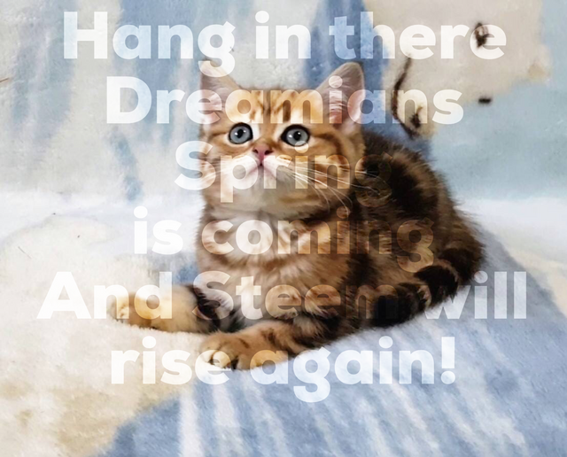
Photo by Alexander Kovaleskiy
absolutely love what you're saying here :)
Hello @edouard, thank you for sharing this creative work! We just stopped by to say that you've been upvoted by the @creativecrypto magazine. The Creative Crypto is all about art on the blockchain and learning from creatives like you. Looking forward to crossing paths again soon. Steem on!