Huge-Full Power Creation of UV Reactive Screen Printing Design - Step by Step - Time Lapse Video Process
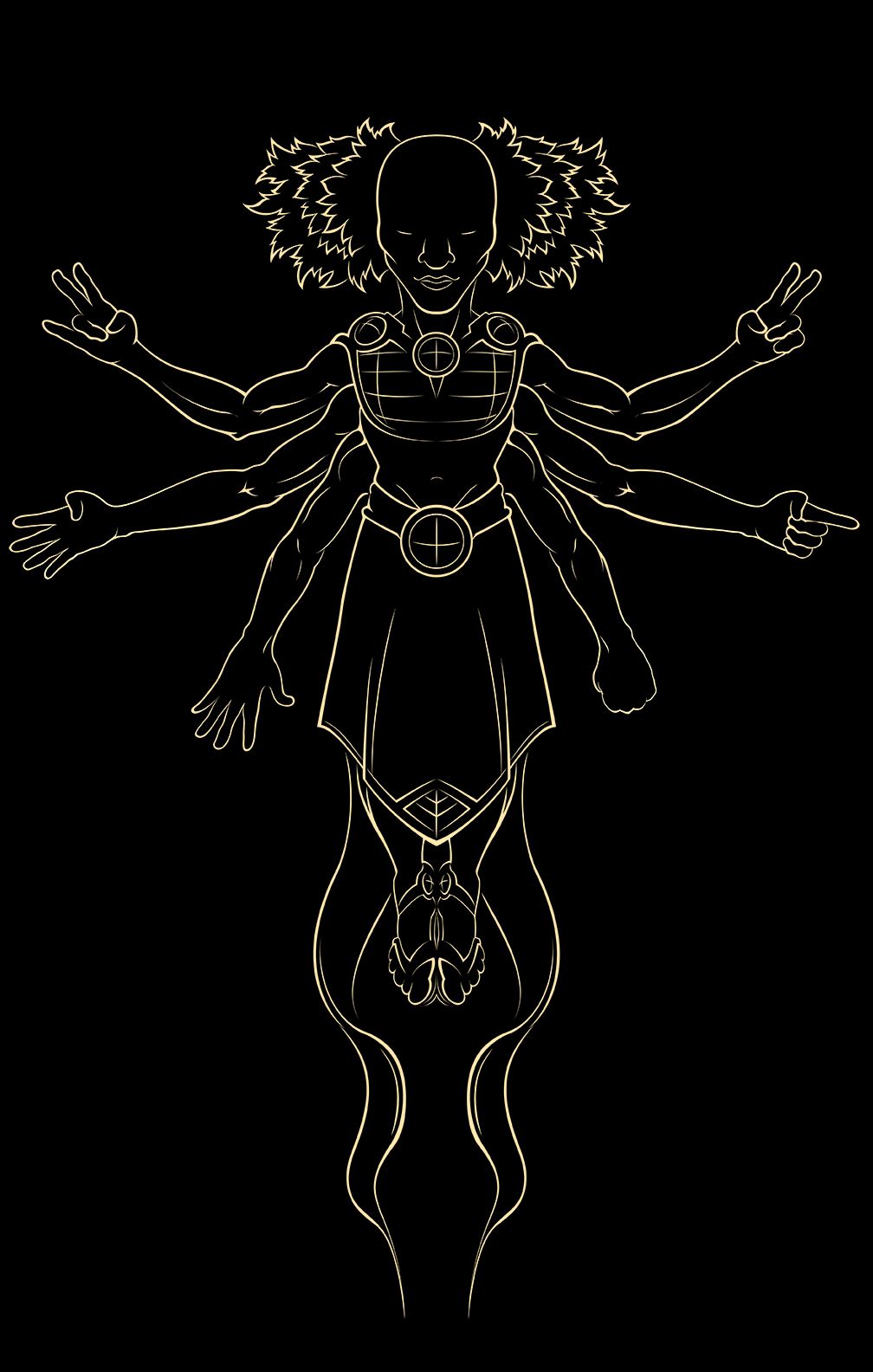
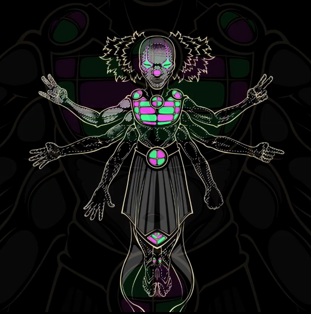
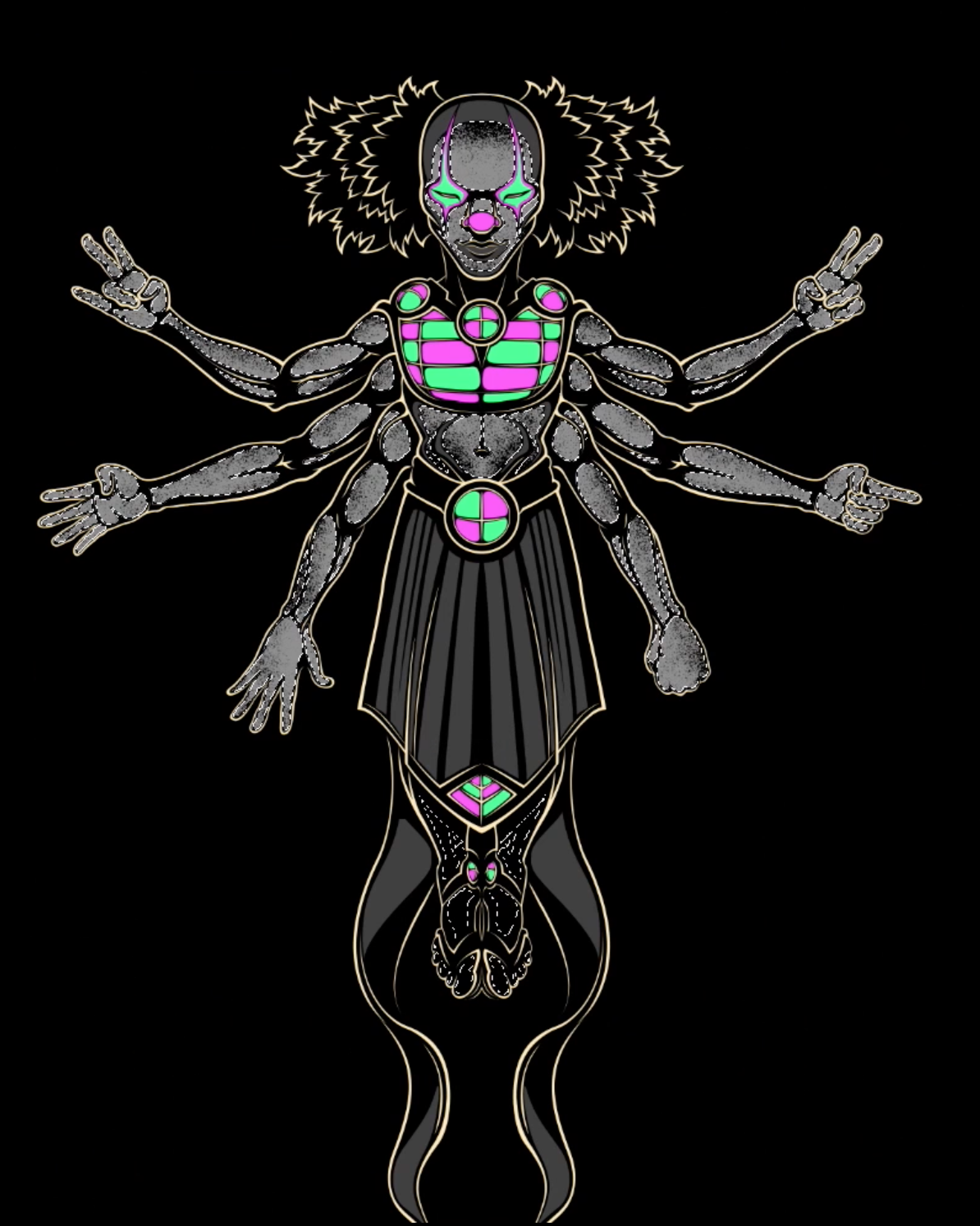
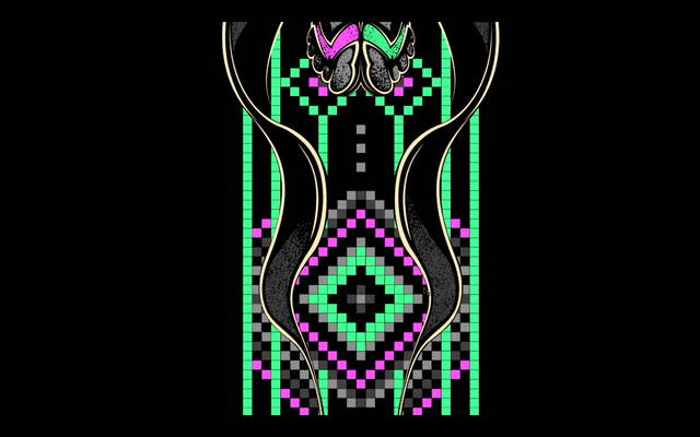
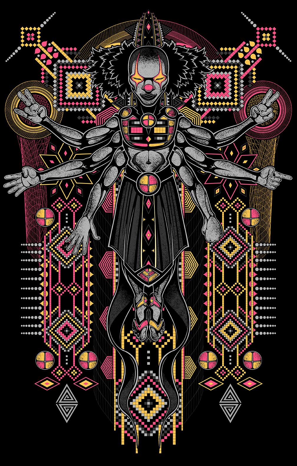
Heyoka UV Reactive Screen Print Design
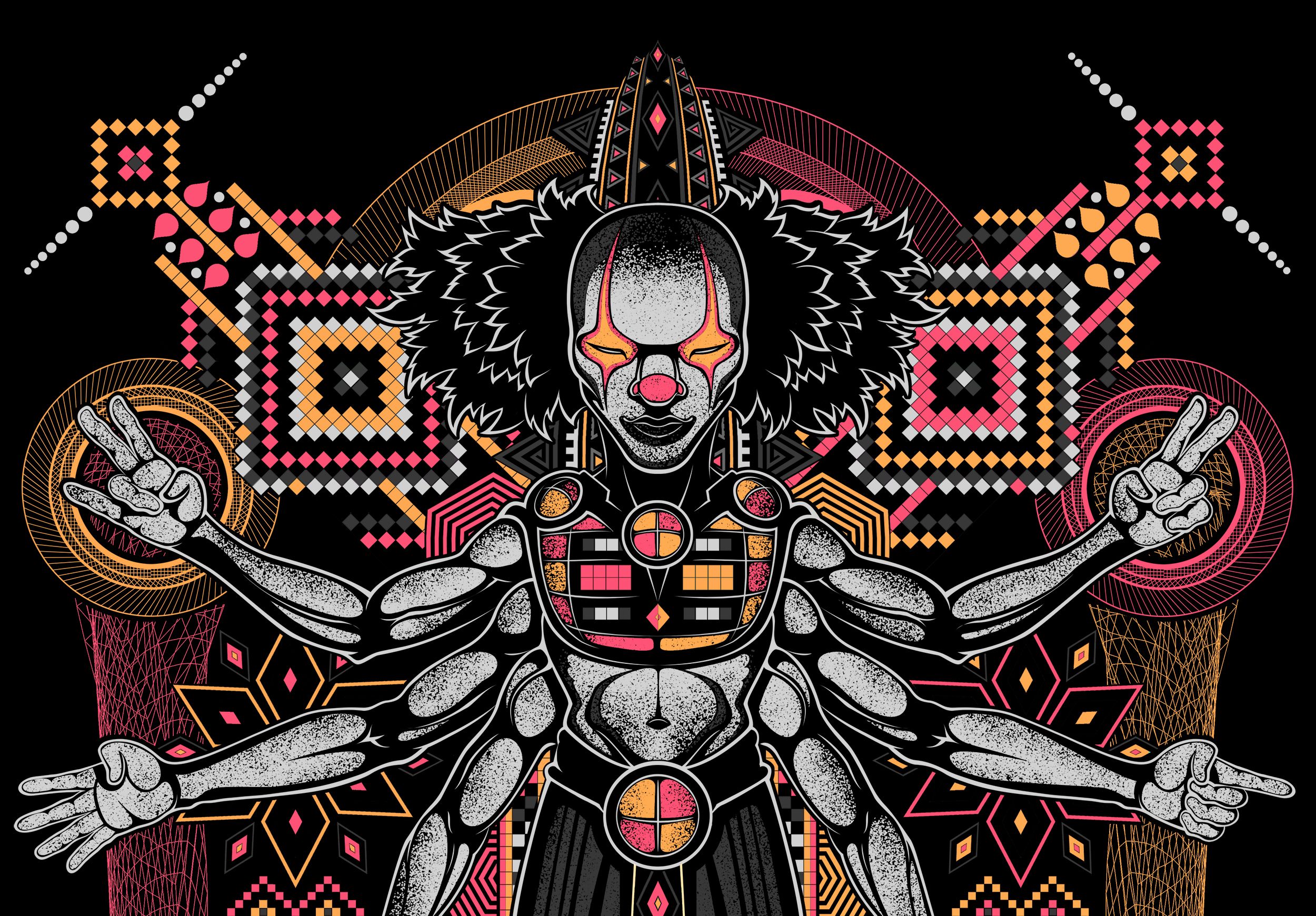
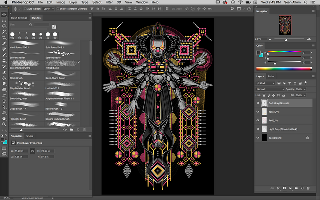
Good Day to You Steemians! Today we will walk through the creation of my UV Reactive Screen Print Design called "Heyoka", produced for Po10cdesignstudio.com. Though there are a variety of ways to create a Screen Print-ready file, my process relies on Photoshop CC and Corel Painter 2015.
The keys to a successful design are as follows-
- A Clear Composition
- Good Contrast in Color Usage
- Solid Color/Pixels ONLY (no gradients or pixels with less than 100% opacity)
- Clean Line work and Well Defined Shapes
- Limited Color Palette
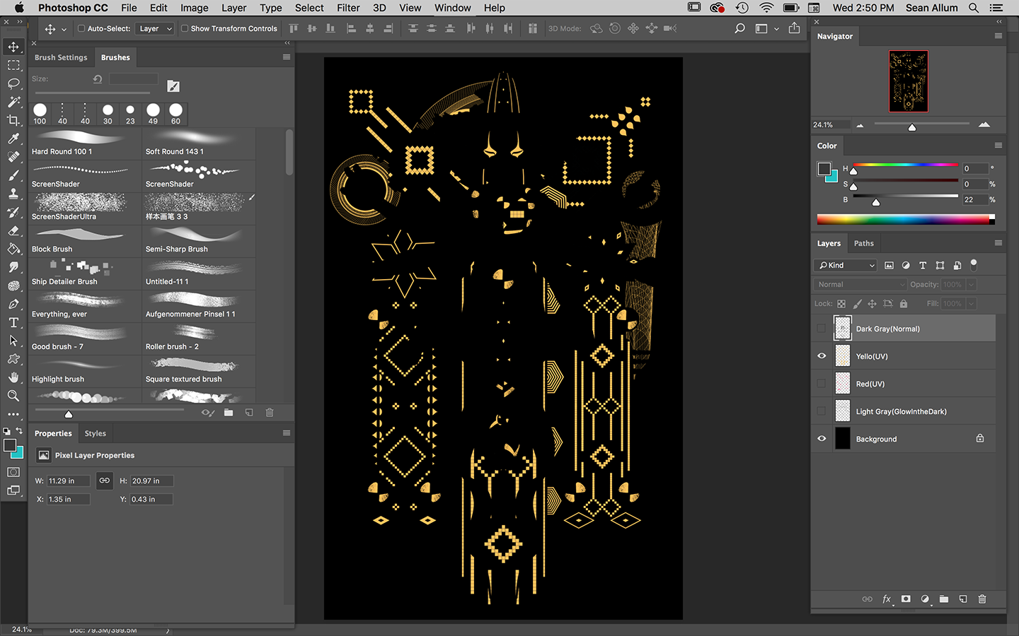
- Separate Your Colors/Screens By Layer i.e. 1 Shade of Gray = 1 Layer with Only 1 Shade of Gray = 1 Screen
- Variety in Shape/Form, Texture and Light/Dark Contrast

Heyoka Speed Lapse Process Video
WATCH THIS FIRST
We will begin with my Process Video so you can get an idea of how everything builds up logically. After the video I will break down some fundamentals for a successful design and some tips and tricks to help you get ahead of the curve.
Enjoy.
Et Voila!
Easy Peazy Right! Follow along for some keen insights into the techniques in the video.

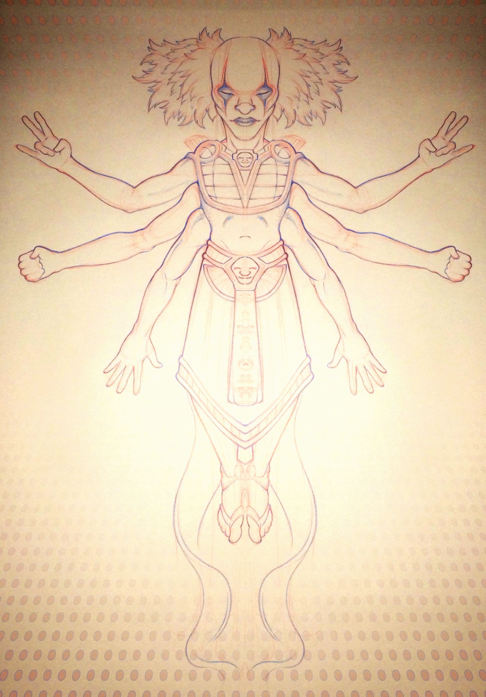
Initial Pencil Sketch
Your Screen Design should always start with a strong composition. A well-designed central figure is a positive way to ensure a powerful image. Create 6-8 thumbnail images at about 2"x 2" each to get a feel for your composition. Once you have a good design then start creating your sketch.
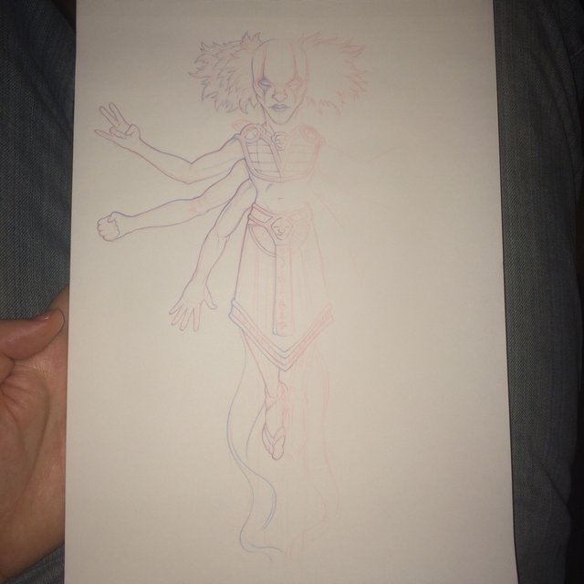
-----(Mirrored in Photoshop)-----
-Create a New Layer and Fill with Black.
-Reduce the Opacity to about 85% so you can see your sketch.
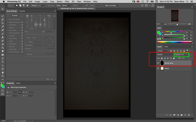
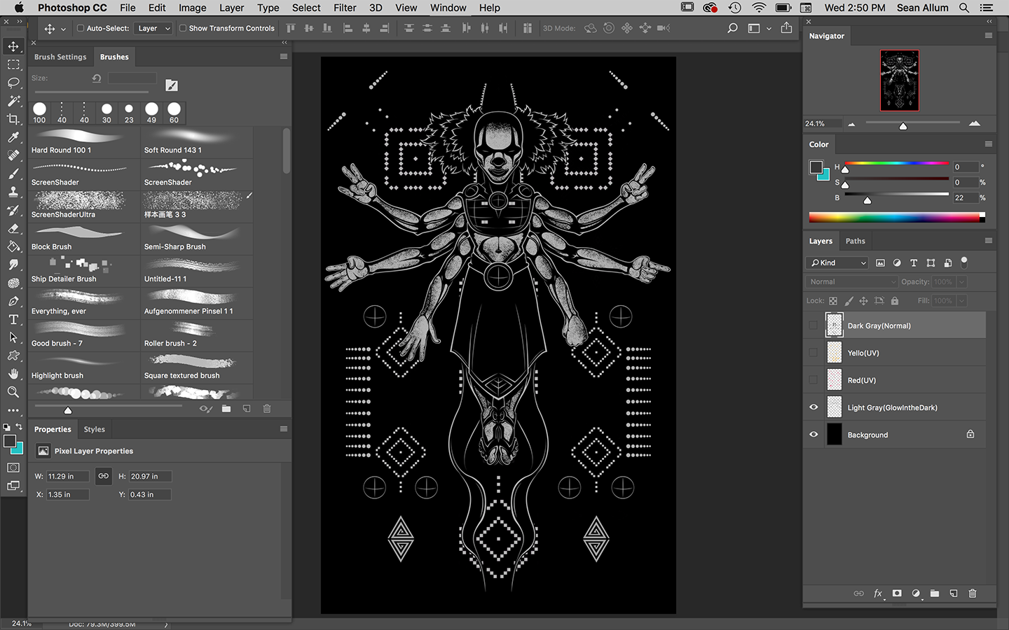
-Create a New Layer and name it "Lines". This Layer will be designated only for Line work until you are ready to collapse your layers in your final file.
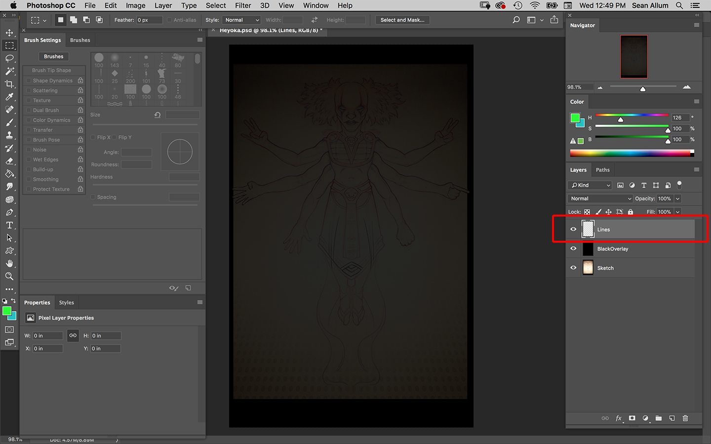

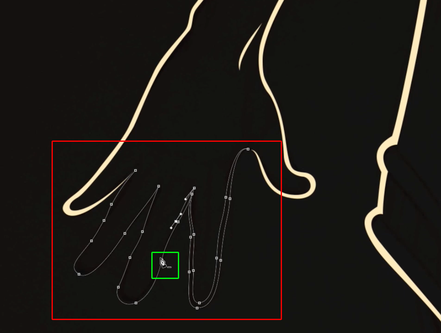
Understanding the Pen Tool And Strong Linework
All of my linework is always crafted with Photoshop's Pen Tool. I understand that my video was pretty fast (some parts are sped up 300x) but if you are familiar with Photoshop or Illustrator you will notice a heavy emphasis on my use of the Pen Tool.
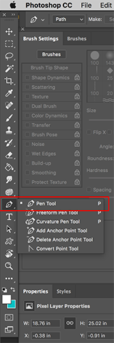
If you don't know what the Pen Tool is please refer to this quick tutorial of its function by Guru99.
The Pen Tool is a necessity for creating smooth graphic curves known as "Bezier Curves". It is fundamental for creating beautiful, animation style line work and clean patches of color.
As you learned in the Pen Tool tutorial you will be creating "Selections" from the Paths you create with your Pen Tool. To do this you need to click on your Paths panel and click the "Selection" icon from the bottom of the panel.
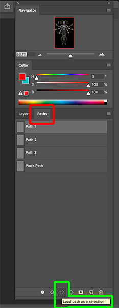
You will notice that after you click the "Selection" icon that your Pen Tool Path will change to a line made of "marching ants" and this is your "Selection". This Selected area can now be filled with color.
Make sure you are using a 100% Opacity brush to fill your selections. No gradation in opacity.
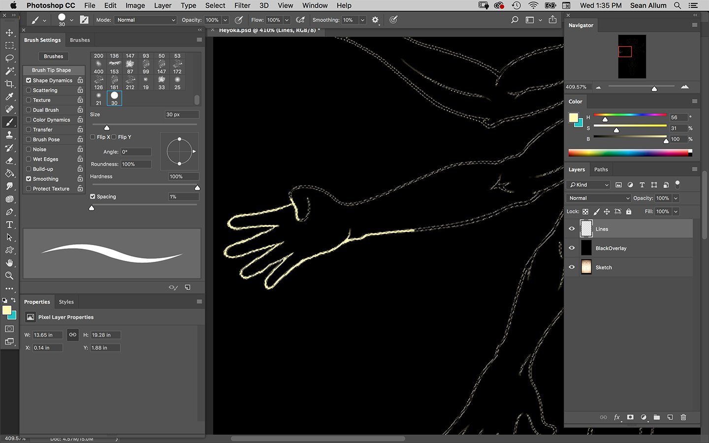
After your lines are laid in
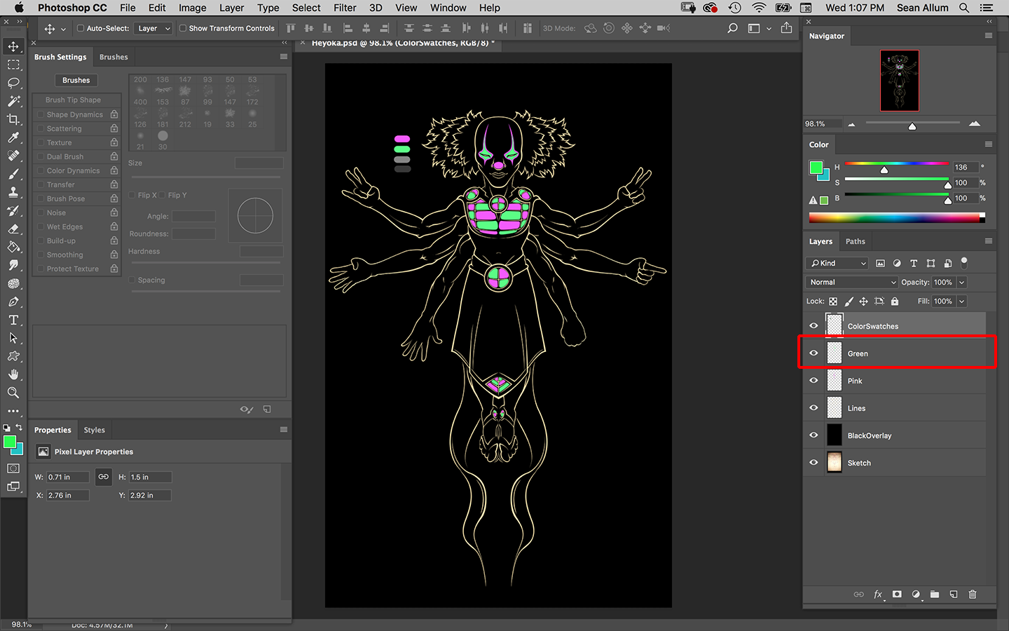
You want to make sure your layer is named "Lines" (or something like it) and create a new layer to start blocking in your colors.
Remember that each layer will correspond to 1 Screen in the printing process. More layers = More Screens = More Money spent on Production
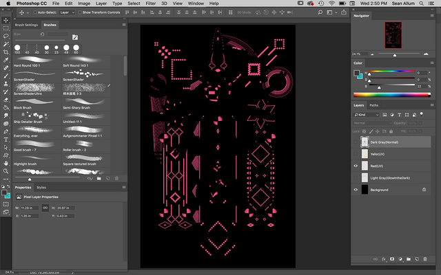
-I will usually choose 4 or 5 colors in addition to my "Lines" Layer and create a few "Color Swatches" on another layer so I can easily color pick as I go.
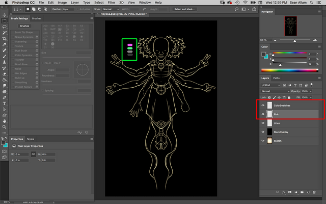
PIIIIIIIIINK!
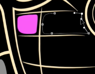
Return to your Pen tool and start blocking in paths where you want to color.
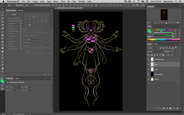
GRRRREEEENNN!!!!
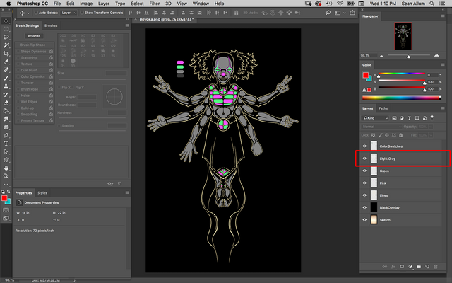
LIGHT GRAY
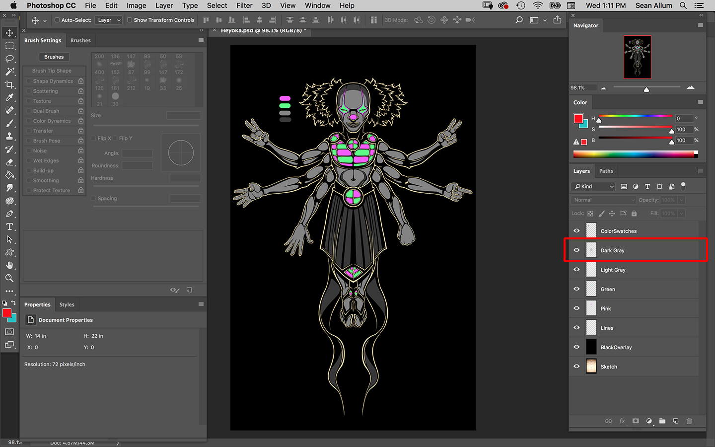
DARK GRAY
Creating a Stipling Effect for Texture
Now that you understand the basic process of creating layers based on Colors that correspond to Screens its time to create a bit of texture. Solid colors can work just fine but I discovered a technique for adding a bit of interest to your color layers.
In order to do this we will need to create a Stipling Brush.
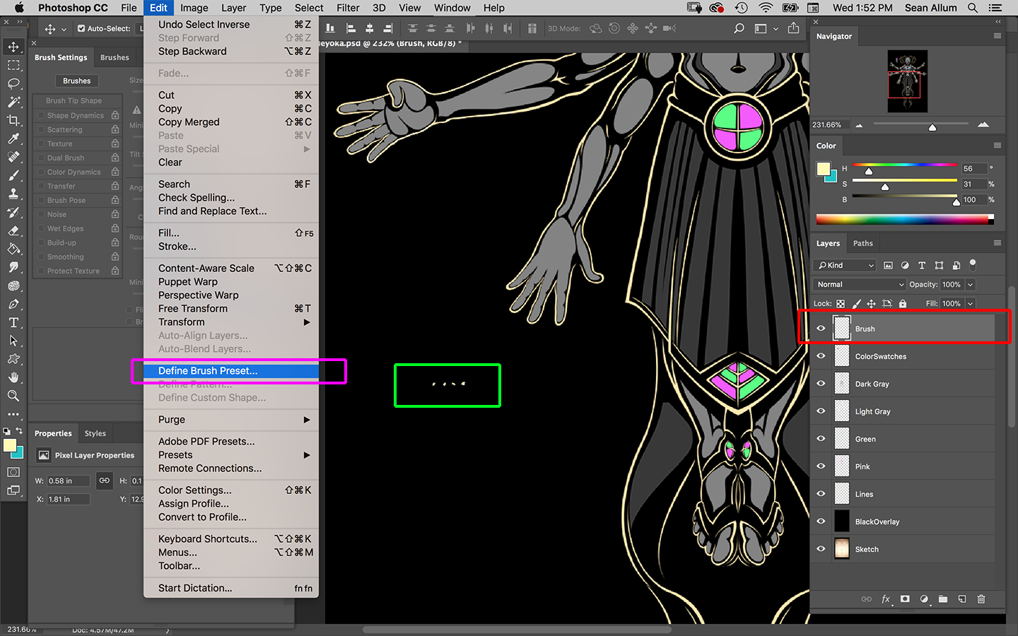
-Start by Creating a New Layer called Brush. (Red Box in Image Below)
-Create a line of 4 small, 100% opacity dots and select them with your Magic Wand. (Green Box in Image Below)
-Select "Define Brush Preset" from your Edit Navigation dropdown (Purple Box in Image Below)
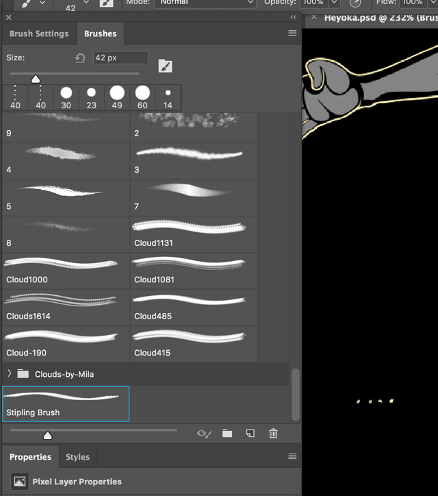
-Choose your Brush Preset from the Brush Preset Menu
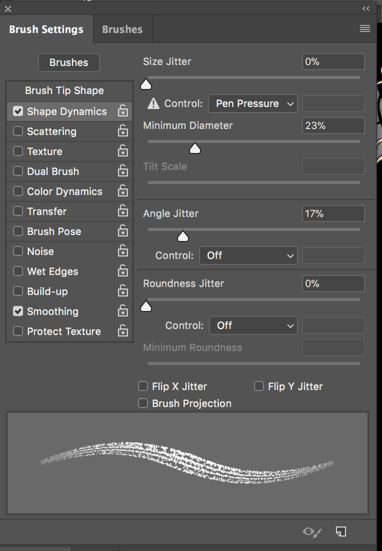
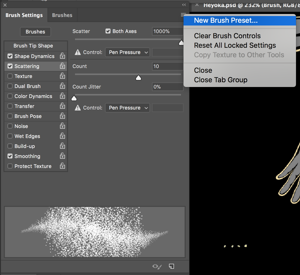
-Click on your Brush Settings and Check the "Shape Dynamics" box. Make sure all of your settings look like the image below.
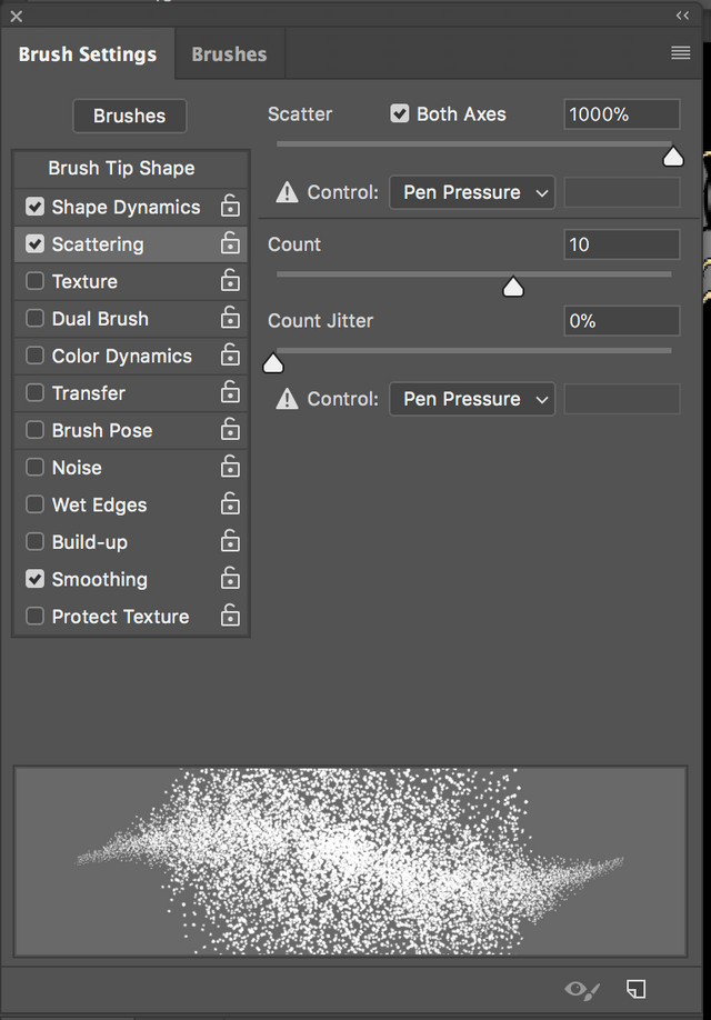
-Next click the "Scattering" box and make sure all of your settings look like the image below.
-Save your Brush Preset from the dropdown at the top right corner of your Brush Settings panel.
Create a New Layer for Each Color
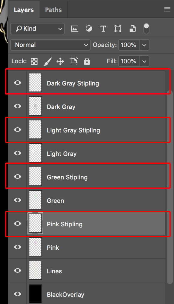
-From here, Choose any one of your original Color Layers (that you have color on) and use your Magic Wand to select the layer content.
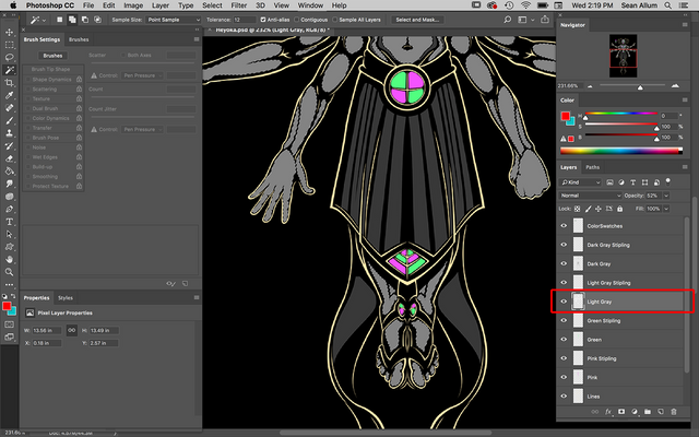
Turn off the eyeball icon to the left of the color layer and select your new stipling layer.
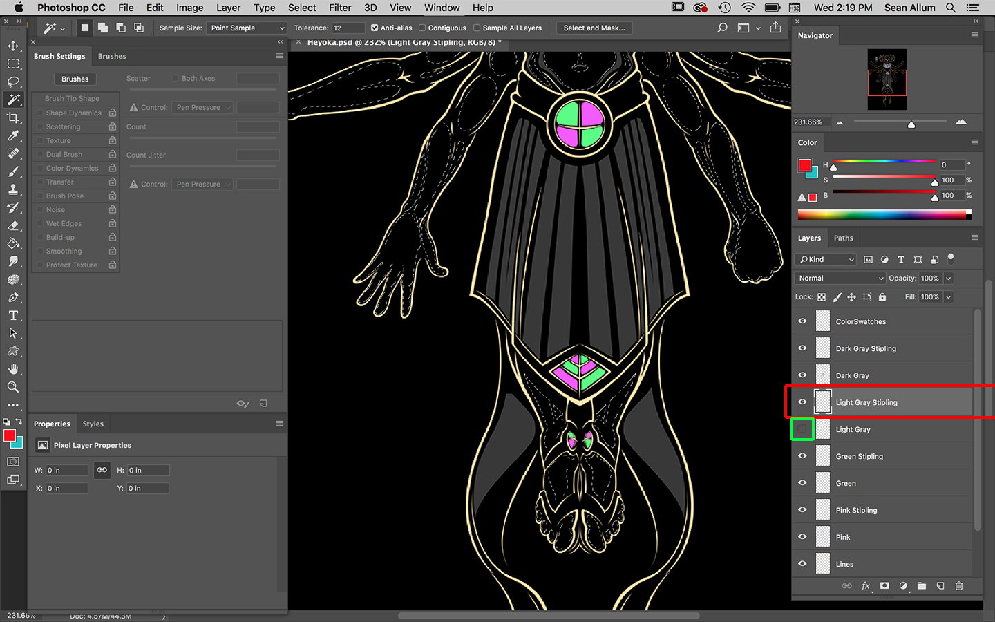
Begin to lay in your stipling with Stipling brush.
Remember to select your corresponding Stipling Layer each time you change colors.
Once you are satisfied with the look of your fresh, texturized color its time to begin creating your background.
Creating The Background
I employed multiple tools to create Heyoka's background. As you saw in the video of my process, I switched programs from Photoshop CC to Corel Painter. I had previously created a few patterns in Photshop that I "captured" with Painter's Pattern Pen and basically painted in the pattern with a couple of strokes.
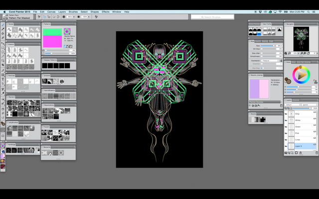
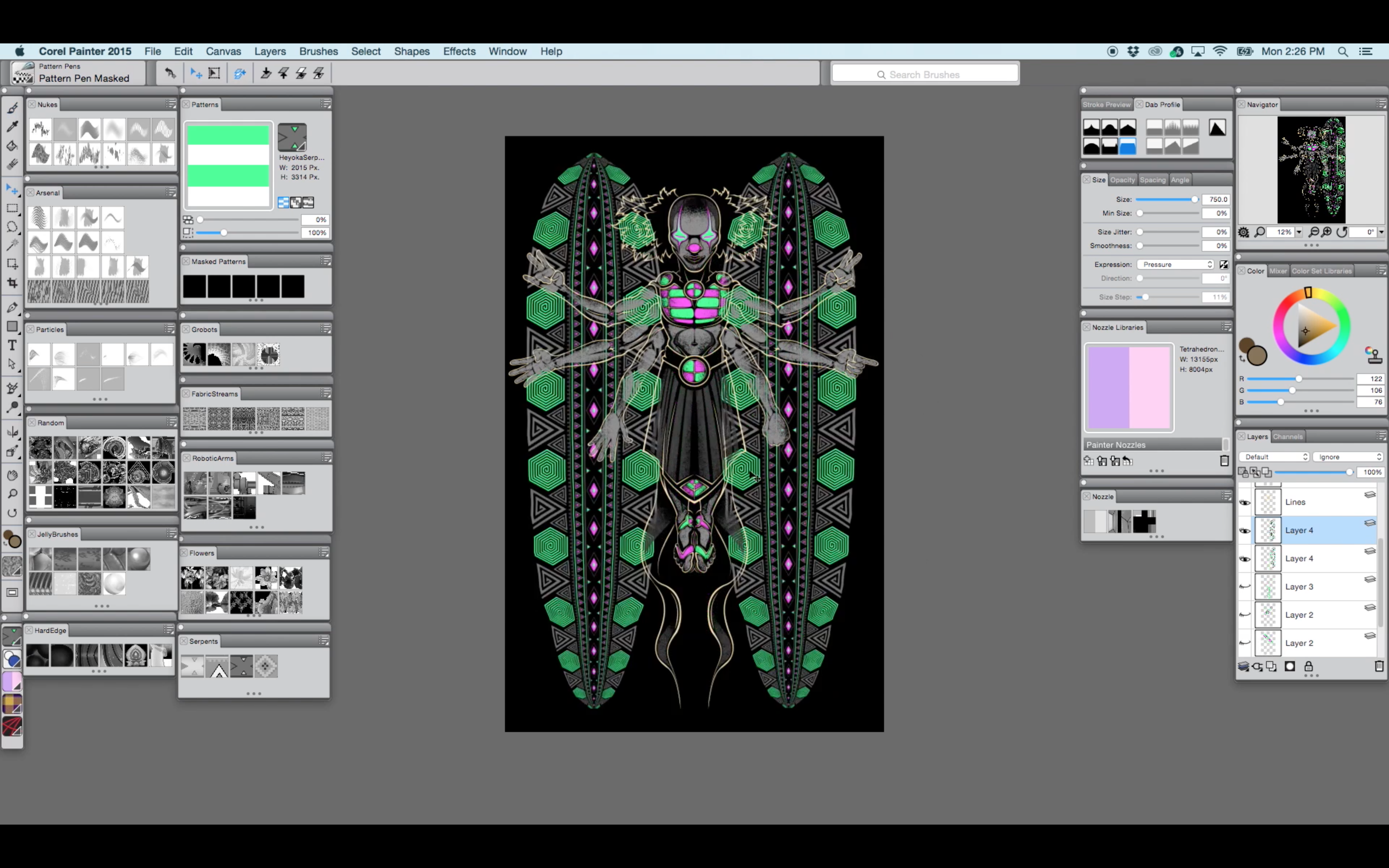
These patterns can be completely created and placed using Photoshop and then warped to your liking. I returned to Photoshop shortly after this step anyways and began erasing into them to achieve the desired effect.
Finalizing Your Image
Play around with your background and change up the colors to suit you. Even though I made the image with pink and green I ended up shifting to orange and red because I enjoyed the contrast with the gray. I chose to alternate colors from side to side in as many cases as possible and I think the end result is quite stunning.
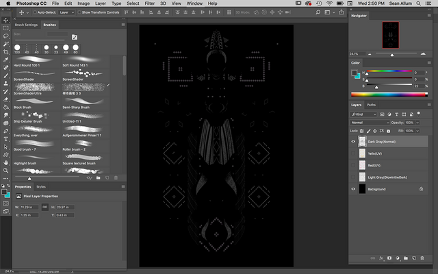
Your final steps are to ensure that all of your layers, named correctly and are separated and ready for your printer.
-Label your "UV" layers so your printer knows when they should be using UV reactive inks.
-Spend considerable time cleaning up. Make sure there are no "stray" pixels in your design.
-Make completely sure that your colors are where you want them and that you don't have red on your green layer, for instance.
-Make sure that all pixels are 100% opacity. Any low opacity pixels will translate to 100% on your screens and can significantly impact the look and cleanliness of your design.
Boom!
Shirts For Sale :)
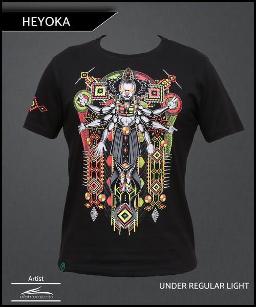
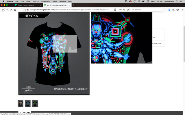
You can purchase Heyoka here
http://www.po10cdesignstudio.com/short-sleeved-t-shirts/heyoka-glow-dark/p-7407033-95990306731-cat.html#variant_id=7407033-37184541406

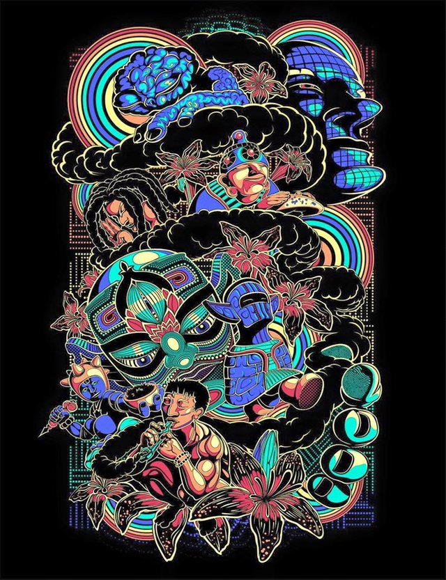
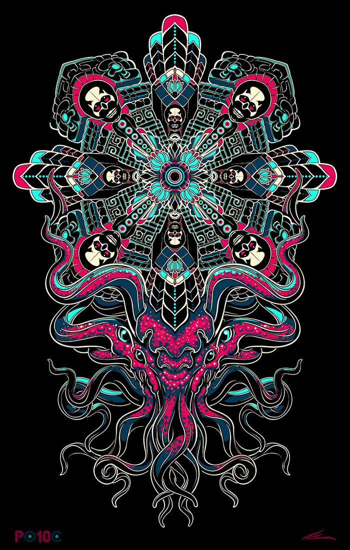
BONUS- Screen Designs by Eloh Projects
Thank You For Reading
Please Follow, Resteem, and Upvote
I value you and appreciate all of your support.
Til Next Time
Love,
Wow those are some sick designs! Cthulu is so amazing, love the way the Mandala and the tentacly organic part are meant to be together. Followed :)
Right on Adam. I have followed your work for sometime through Facebook. Thanks for the compliments. Keep up the good work.
I'm not used to everyone having different alias names on here anymore, I have come across a few where we are connected on FB lol
Thanks so much for this! Awesome seeing all of your steps!
Sure thing. Please Resteem if you don't mind. Its hard to get these out in front of people's attention. Thank you for commenting.
I appreciate this being in text and not in video.
Yeah. I figured it would be a lot easier to follow if I broke it down. Combined with the process video I hope its pretty comprehensive. Thanks Poet.
Dopeness
Muchas Gracias.
Wow, thank you so much! I read your whole post very carefully, and I feel soooo enlightened and empowered right now! Excellent explanations and helpful illustrations. I'm not sure if I'll be able to recreate your steps, but I will definitely try with some small design of mine! I know I have to start with digital art, however it's easier said than done. But you made it seem doable! Your tutorial is great, I'm looking forward to see more of your educational posts! And your art is simply mind-blowing, I've visited your website and tumblr, I'm sooo inspired right now. I'm so glad I've found you through @slothicorn on Discord. I think I've found myself a new mentor ;) Geez I'm under some very strong impression... haha!
Thanks again and take care,
Klaudia
Alright!! @shinyforest. Great to know I contributed to your expression. Thanks for the great feedback. Feel free to ask me for help anytime.
Mass Respect for the pen tool work! I use the pen tool all the time in my work and never thought to use it to make such expressive line work. Thanks for bring my attention to this.
Hey! Awesome. Glad the post has come in handy for someone with experience. Great to know. Thank you and happy to help.
Thanks for putting this together. My Photoshop is pretty old, like 2007 maybe, and I've never really learned how to use it properly, but just reading this I learned a few tricks to try next time I'm on there. The old PS is on my old iMac g4, and the screen has become pretty dim there.
Yeah, there isn't much here that can't be done on early versions. Glad you picked up a tip or two. If you ever have any questions feel free to ask.
I do have a question! You may be the one who knows what I'm talking about: back in the 1990s some friends and I did an experiment using a blacklight, LSD, and some UV paints, and discovered, by accident, a distinct 3D effect under the lights with particular colors. The blue appeared as the foreground, the green in the mid range, while orange seemed to be the most distant. With those colors acting as measures of depth to the eye, I was able to create some striking 3D designs on a black poster board. Since then, I haven't been able to reproduce the effect without all of the ingredients listed above, yet I still tend to adhere to that formula of depth that I saw that night in the fluorescent paints overlaying one another on a black background in my art.
My question: was I just tripping, or is there something to the way our eye perceives distance based on color in your ultraviolet artwork?
Ahh interesting. I am familiar with this effect though I don't understand the exact cause for it beyond the cake that you baked:) Perhaps I do have a bit of insight from a digital perspective. I have looked at my own work on a computer screen with some nice 3D glasses. To my surprise, white recedes and black comes forward. I wasn't cognitively engaged with this fact until I saw through the glasses, in fact I thought it was the opposite. White always seemed to push forward but it isn't how it actually functions. After seeing this effect, I noticed that many great artists, especially concept artists in the entertainment industries, use this trick to create great depth. You will see it over and over again in digital paintings, specifically environment paintings. A big bright sky with elements fading into light atmosphere and bold, blocky dark colors in the foreground. There must be something happening in the rods and cones of the eyeball that can be enhanced with the appropriate mixture. Its like our eyesight is tuned to perceive depth at its greatest degree under a sky lit by sun as we peer out of a forest.
Not my paintings, just pointing out the use of the technique
I made a post recently on that effect, I actually learned it in college, to use value and intensity as a gauge of distance: https://steemit.com/art/@therealpaul/a-simple-trick-creating-distance-and-depth-in-landscape-art-by-using-the-colors-themselves
@originalworks
The @OriginalWorks bot has determined this post by @elohprojects to be original material and upvoted it!
To call @OriginalWorks, simply reply to any post with @originalworks or !originalworks in your message!
Love all of the process breakdown. I've been meaning to try CorelDraw. You make it look easy.