Compositional Analysis and Appreciation of Master Works
This is an essay and analysis I wrote for school two weeks ago. I thought I would share it with you all as it may be helpful. It looks at a few pieces of art from classic American Illustrators. Included are some simple compostional studies in pen and marker that break the pieces down to simpler shapes.
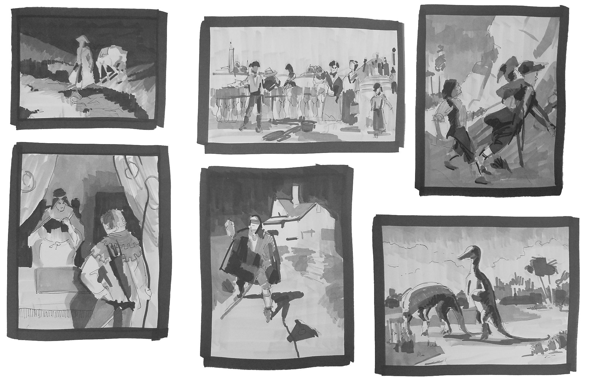
1. Fredric Remington, “In From the Night Herd”
Why did the artist choose this particular Composition?
Remington structured this painting with a counterclockwise movement of the eyes that passes through every point that would be in the rule of the thirds. The eye is immediately drawn to the horse which leads us to the standing cowboy. We can see just enough of his face and the direction of his vision to lead us to the sleeping cowboy in front of him. His line of vision takes us through the top left point if the image was divided into thirds. The eye then passes through the bottom left and leads us to the second sleeping cowboy closest to us. This then draws us back up the horses leg to run through the circle again. The flow of the image moves this way because of the way the horse is standing but also from the direction the cowboy is looking. Generally, we look from the face to what the face is looking at, not the other way around. So this subtly tells us which way Remington want's our eyes to move within his composition.
Why these values?
The values are in place to reinforce this counterclockwise flow of the composition. The very dark value of the background is there to provide contrast for the horse and the standing cowboy. The dark values of the sleeping cowboys against the lighter value grass is there to provide a path, with subtle interesting detail, for the eye to follow in order to loop back to the horse.
What did the artist want the viewer to look at first?
It is clear that we are supposed to look at the horse first. Not only is the horse the brightest and most contrasted part of the entire image, but it's rear is sitting right in the upper right thirds section. All other secondary points are either too low in contrast or are not directly nestled in one of the four corners of the thirds division of the painting.
What is the main emotion the artist was trying to convey?
It seems that Remington is trying to portray a feeling of rugged serenity. The sleeping men asleep in the glow of a low fire. There is a romanticism to the cowboy way of life here. It is a sort of idolizing of simple and rustic masculinity.
Was the artist successful or not?
Remington was very successful. The ethereal lighting of the scene and the movement of the composition that takes you around the image in order to soak up the subtle details of life on the range do a fantastic job of romanticizing and idolizing the work on the range.
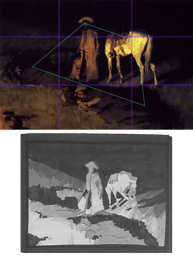
2. Frank Duveneck, “The Water Carriers of Venice”
Why did the artist choose this particular Composition?
Duveneck wanted to focus on the female in the blue blouse holding the copper pale. Everything about the image is intended to draw the eyes to her. The angle of the staircase in the background leads the viewer right to her face. The fisherman on the left is looking her way and the woman in red behind her is also facing her direction. The railing the fisherman is leaning on creates a horizontal line that leads us to her as well. Everything is sucking us into her and she is staring at the viewer as well, smiling.
Why these values?
Everything that isn't a human figure is a very light value. There is a soft dreamy off white color to everything which is generally a significantly lighter value than the darker values in the skin, hair, and clothing of the human figures in the scene. This forces the viewer to see the scenery as secondary to the bustle of the people in the scene hence the title of the image being “The Water Carriers of Venice” and not just “Venice”. There is a story to be told and the values of the scenery tell us that the people in the scene are more important than the setting.
What did the artist want the viewer to look at first?
Based on the angles and vision as well as the fact that she is looking at us and more contrasted against the background than any other figure as well as resting roughly in the upper right third of the image, it seems to be the woman holding the bucket smiling at the viewer.
What is the main emotion the artist was trying to convey?
The overall image creates a sense of peace. The lovely pastel and of white colors of the background remind one of almost traditional depictions of heavenly places in the clouds. People are working, but the fishermen seems very relaxed. Children are playing and look like they have been swimming. People are living simple lives in a beautiful place.
Was the artist successful or not?
By all estimations it seems the image is a success. It shows the peaceful and idolized location of Venice with happy and relaxed people living admirable and simple lives. The image finds beauty and peace in the simple act of collecting water, fishing, and playing.
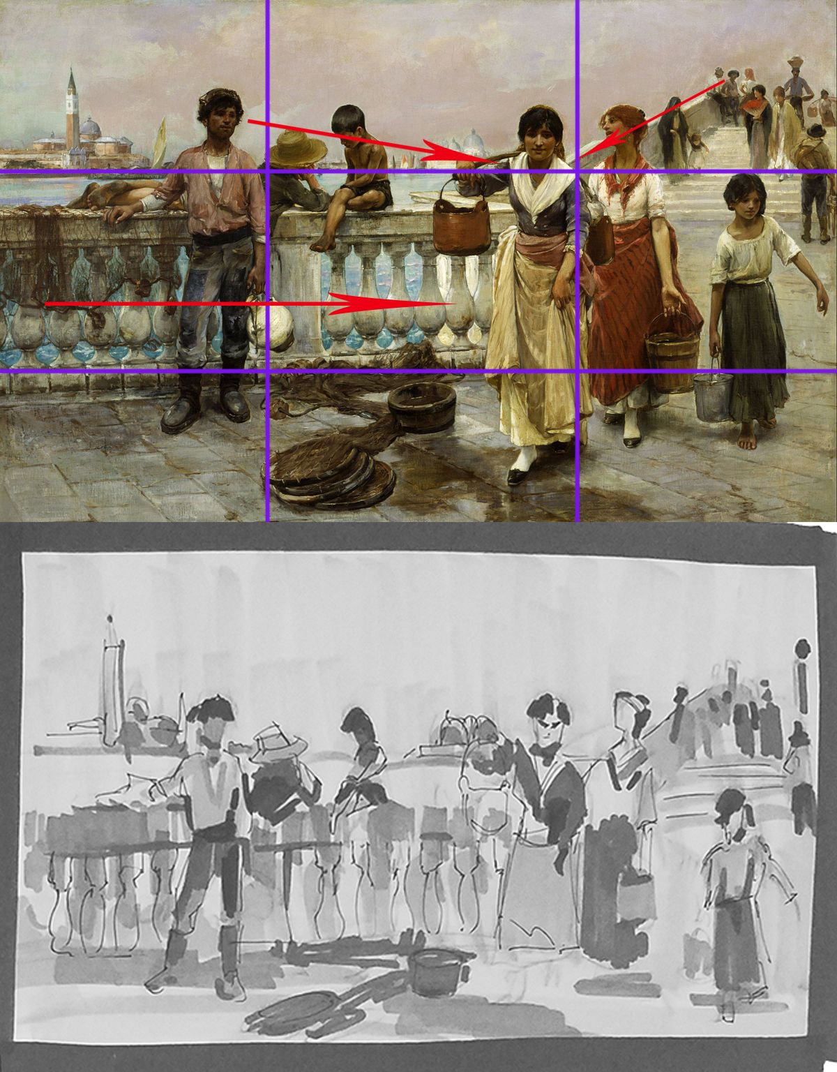
3. N.C. Wyeth, “The Hostage”, illustrated for Treasure Island
Why did the artist choose this particular Composition?
Wyeth wanted a dynamic composition that would show the struggle between the hostage and his captors. A hard and dynamic triangle is sometimes a great way to show this. The boy and the pirate are leaning away from each other as opposite sides of the triangle. They are generally a much more contrasted element against the bleach white cliffs hit with a tinge of yellow from the sun. Even the landscape enforces this idea of struggle as there is a subtle reinforcement of the triangle shapes by the plains of the ground and rocks directly at their feet. The cliffs in the back also act as a frame as they themselves contrast against the sky.
Why these values?
The characters are obviously in the shade of, based on the scenery, what is probably a large cliff or rocky formation. This allows them to be contrasted nicely against the much lighter cliffs in the background and accentuates the triangle created by the two figures leaning away from each other in a tug-of-war. The ground and everything that is not a character has a softer texture as well as lighter value compared to the characters. Even the boys shirt, which is white, and we still perceive as white (which shows Wyeth's mastery of color) is still darker than the yellow cliffs behind him in a value scale.
What did the artist want the viewer to look at first?
Wyeth wanted us to see the pirate holding the boy first. His eyes are pretty much level with the top horizontal thirds division line, which would also be where the horizon line is. His head is contrasted sharply against the cliffs which allows us to clearly make out his attitude based on the very limited information we have regarding facial features. His demeanor is cruel and impatient and this is expressed more through his body language and aggressive forward movement than anything else.
What is the main emotion the artist was trying to convey?
Wyeth is trying to convey struggle and strife between a much more powerful person and much weaker one being dragged along. There is that sense of being taken captive, which is a universal feeling. Individuals can feel captive to many things, like other people, but also addictions and more abstract, metaphysical, and psychological things as well.
Was the artist successful or not?
Often times it feels like those psychological things or people are leading you someplace you may not want to go and there isn't much you can do at the moment to stop that. That is probably why this illustration has lasted so long. It captures a basic human struggle. With this mind, it seems Wyeth was indeed successful. He was illustrating for a book but had his main focus be something very familiar to many, even if it is dressed as a pirate.
4.N.C. Wyeth, “Robin Hood Meets Maid Marian”
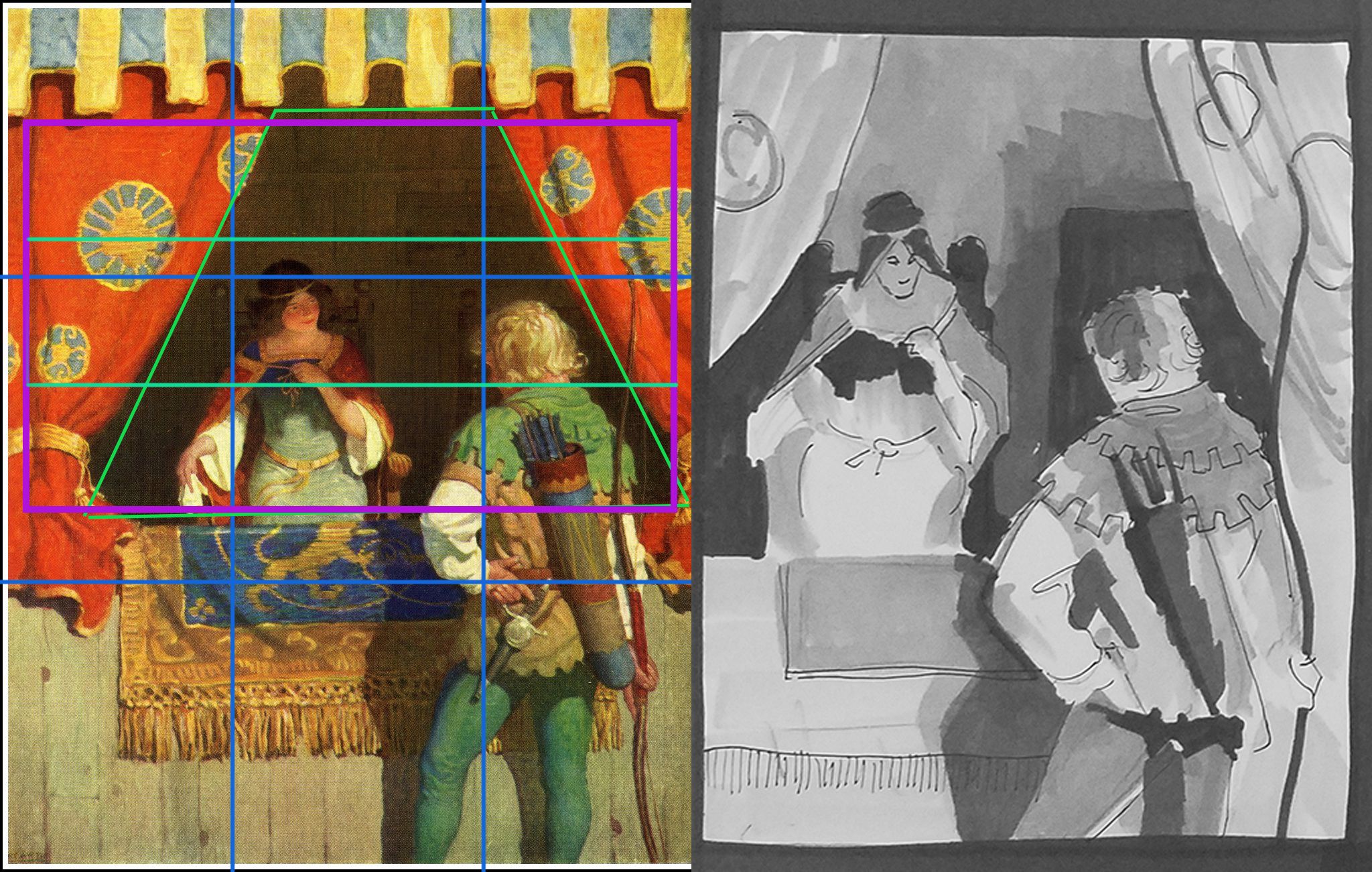
Why did the artist choose this particular Composition?
Wyeth chose a more simple and traditional rule of thirds composition with Maid Marian and Robin Hood falling roughly at points of interest. They are also somewhat framed by the curtains of Maid Marian's tent and the wood paneling that divides the two of them. Within this frame, you can subdivide into thirds further and see that they still roughly fall, again, on the important division lines that divide the area into thirds.
Why these values?
The values are important as the values on the characters are brighter than the darker area within the tent that is framing them. This contrast helps the figures to stick out and become more prominent. Further, Marian is an overall darker value that Robin Hood so that they do not compete for attention. This was brilliant planning and compositional work by Wyeth.
What did the artist want the viewer to look at first?
The order of contrast and value is what indicates to the viewer where to look first. The first area to look at is Robin hood. He is more centered on the right third of the scene than Marian. His blond hair is a lighter value than the background and is much more contrasted than Marian who is partial in shadow, though still fairly contrasted against the background. This gradation of value and the placement of characters is key to controlling where the viewer looks first.
What is the main emotion the artist was trying to convey?
Robin Hood and Marian are love interests in the classic Robin Hood story. It's clear based on that alone, and by the title of the peace, that flirtation and the beginnings of Romance are the emotions Wyeth is trying to bring forth. Marian's expression is subtle but expresses a sort of shy interest in Robin. Robin Hood, though we cannot see his face, is in a pose of relaxed confidence. His weight is mostly on his right leg and it's clear through his body language that he is attempting to be a “smooth operator”.
Was the artist successful or not?
Yes. Though Wyeth's composition is relatively simple, it works. It really doesn't need to be complex given the subject matter and the story he is trying tell. The focus is on Robin Hood and Maid Marian and how they are looking at each other. The contrast and values along with the framing of the characters only works to draw our eyes to these subtle queues and tells the story of a budding romance.
5. N.C. Wyeth, “Blind Pew”, Illustration for Treasure Island
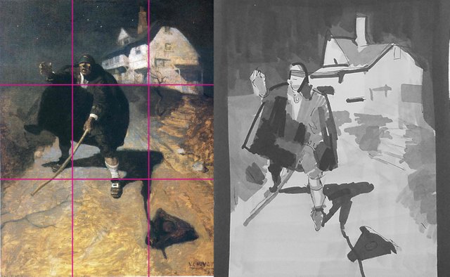
Why did the artist choose this particular Composition?
Wyeth chose another simple rule of thirds type composition for this piece. The character's face is roughly situated right on the upper left division point. The house, the subtle stairs, and the road with how it curves all direct us to that point of interest.
Why these values?
The values of this scene are interesting for a number of reasons. The important one is that the character is actually very close in value to the dark night sky. Even his face and skin tone is close. The brightest and most contrasted element in the whole scene is probably the white house in the background. This opposite the other pieces covered here in this analysis. What makes this interesting is how the house is so contrasted yet it isn't the focus and we do not linger on it so much as the character. This is for reasons which will be explained in the next part.
What did the artist want the viewer to look at first?
Wyeth wanted us to look at the character first. That is clear. The reason for this, despite the house being the most contrasted element in the scene and resting on a division of the thirds as well is for a multiple of reasons. First the perspective of the house leads the eye over it and to the face of the character. The house itself is very bright, but the detail is simplified and unclear. It's more just a white surface with subtle details of windows and doors in perspective that create lines point the viewer to the face of the character. The character's face is also very detailed and his expression of fear and confusion is what draws the viewer in. Yes he is darker, but it's his fine detail in comparison to the washed out detail of the house that makes our eyes fall on him and stay there.
What is the main emotion the artist was trying to convey?
Wyeth is trying to convey a multiplicity of emotions. The main ones being fear and confusion. The expression of emotion on his face is clear that he is in fear and confused. This, with his wide stance and his hat on the ground in front of him along with his reaching and grasping hand sell this emotion. His hand in particular shows this fear. He reaches forward, maybe looking for his hat to figure out where he is to know avail. He feels nothing and sees nothing. For him, all he is experiencing is fear and blackness. That is indeed terrifying.
Was the artist successful or not?
Yes. This image has transcended it's original use on “Treasure Island”. The expression and execution of the image as described above elevate the image from an illustration from “Treasure Island” to a timeless illustrating for fear, confusion, and foreboding terror.
6. Charles R. Knight, “Trachodon”
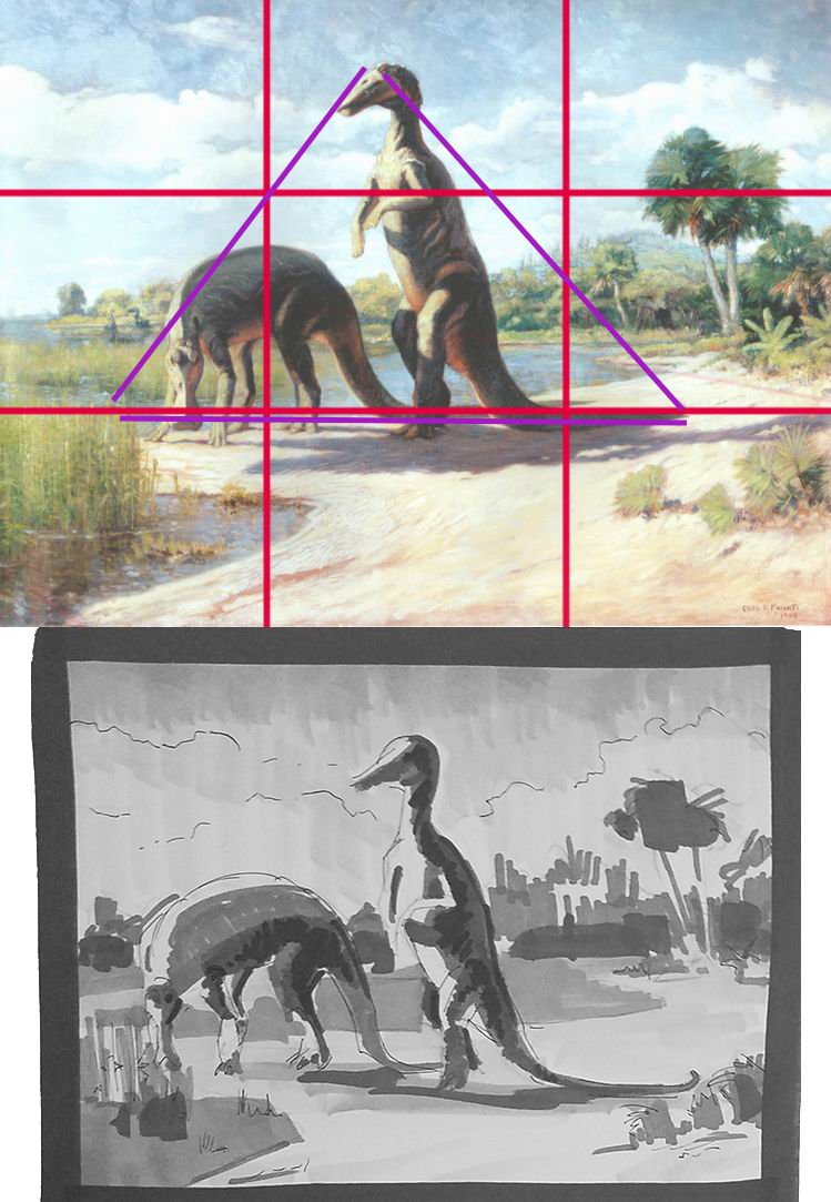
Why did the artist choose this particular Composition?
Knight was an artist who used very scientific methods to reconstruct long dead creatures. He always painted them in a lively manner that made them come alive almost. This image is no exception. Here we see some dinosaurs by a water source eating. The left most creature is very much in the bottom third of the image (if this is divided up by the rule of thirds. The shape of the both creatures creates a triangle shape that allows the eyes to move about the scene and things like the trees in the background or the reeds coming out of the water on the far left encapsulate the image and keep our eyes from wandering off the image.
Why these values?
Much like the last image, value plays a critical role. Both creatures themselves have very hot highlights on the left, indicating the direction that the sun is shining from. They contrast nicely against the light blue sky as well which allows the viewer to see their forms. The contrast also creates a hierarchy with the creatures. The left on is closer in value to it's background (the plants and water behind) than the upright creature.
What did the artist want the viewer to look at first?
The artist wanted us to look at the upright dinosaur. It is contrasted the most with the background and it's head is at the peak of a triangle created with the other dinosaur. The second dinosaur blends a bit more with the background because of it's lower position. The standing dinosaur is also in a more dynamic and interesting pose.
What is the main emotion the artist was trying to convey?
This isn't abundantly clear to me. Considering the analytical and scientific approach Knight used in his illustrations and murals, perhaps it's awe and wonder at nature. We see the same kind of animal in two different poses which shows a dynamic nature. Based on the size of the creatures and where the horizon line is, it's reasonable to surmise that these are very large creatures.
Was the artist successful or not?
In this reproduction, I don't think so. However, this is a mural piece and I think this is the kind of large image that probably needs to be seen in person in all of it's glory in order to fully appreciate the sense of awestruck wonder Knight is probably trying to convey. As it is as a small image, it's an amazing painting. But not seeing it as Knight intended detracts from it's overall impact.
Hello @loganarchy, thank you for sharing this creative work! If you're interested, take a look at our magazine @creativecrypto. We are all about art on the blockchain, and learning from creatives like you. Swing by and say hello!