Acrylic Painting-Looking into the Mist
Hello everyone! 🎨Been quite a while since I have posted. Besides just being busy, with spring coming the weather really effects my migraines. Barometric pressure is a huge culprit. If you get migraines and are effected by weather, I have been using an app called MigraineX. I actually bought a pair of ear plugs that this app works with. I have not really tested them completely, but the app does send me warnings when the air pressure will change in advance so that I can get my meds and things ready and try for prevention. Although, Midwest weather is very unpredictable so it has been off by a day or two. Still a nice thing to look at, especially this time of year when it's very erratic.
Anywho, thought I would post something, I did this painting a while ago for some practice. I would recommend people starting out with acrylics to try and limit the color pallet. In all reality, once you get better at shadows, light, and just depth in general, you can use any color you want and your painting will come out amazing.
If you want to skip to the process of this painting it will be down below, first I'll talk just a little bit more about color and value.
Color can be a huge deterrent when doing acrylic paintings. I know I stuck with graphite for a very long time, only attempting anything with color very scarcely. There's a lot to color I just didn't understand. Some things don't mix, some colors don't look good with each other, some colors are warm, some are cool. However, what I didn't consider was the BIGGEST importance when using color is the value. You can make a florescent green, orange, yellow painting look realistic, with correct value.
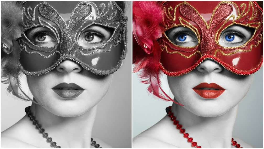
Determining value with graphite is easier than it is with color. Some colors are naturally darker. Such as red. In a black and white photo, red will look very dark. For example, look at this beautiful photo courtesy of pixabay. The red may come off as a bright and light color. But when you take the color out, it's darker than what you would think.
Even with acrylic paint you can always start with just white, black, and mix some gray, and do color washes over top. I have yet to do that since I was lacking a good mixing white, which I also recommend. That makes your palette very inexpensive also to begin with. You can get some very nice paints to work with.
The whole concept of value is not a new thing obviously, and is touched on quite a bit. Although, it's such an important thing I figured I would also just reiterate it some more.
And back to the painting I did.
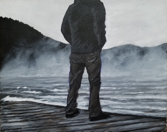
Black and white may not seem very exciting but I'll have to say this is one of my favorite paintings I've done. It's not 100% black and white, just touches of color. I used a reference photo I got from pixabay.com. They are a wonderful sight for artist and at the moment is free with royalty free photos. The painting is very very close to the reference photo.
Here is my process.
I didn't use that plate with tin foil very long! I was being lazy but quickly threw it out because the paint just kept drying out on me! I got my wet palette made and set out very soon after that. If you don't know what a wet palette is, you can make one, and your paint will stay wet for HOURS while painting. I have a post about how to make one here .
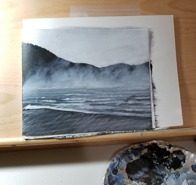
Unfortunately, I did not get any photos of the process before this point. It was actually quite simple to get to this point. If I remember correctly I figured out where I wanted my horizon line and painted a straight line. I did the water first. Now, I re-worked the water a bunch. It's a crazy thing that happens. I look at the water now and think it looks great, but while I was painting, I thought it looked terrible.
Water is a very abstract thing really. Rendering it is actually pretty easy for the most part. This is a point where you shouldn't get too hung up on the reference photo, just go for close. It drove me crazy, and I think that's why I didn't get many photos up until now because I decided I would keep going, but since I did the water first and didn't like it, I didn't think the piece would turn out very good.
I recommend, and I need to do this as well, always give some parts of your work some time. Over working happens so easy, and can ruin a painting. When your face is in it, things may not look right, but in actuality, they look great. So, it's a tough one to figure out and that'll come with time. I'm still struggling with it, because some things actually do need to be worked quite a bit. Finding that balance is hard.

The mountains came next I think, I also think I was lazy and just used pure black which is fine. I see a lot of people recommend NOT using pure black because it takes some depth away. I figured since I would be putting mist/fog down it would be fine, so that's what I did. The mountains were easy though. Just basic, elementary shapes of mountains. No need to add detail or anything.
The mist turned out way better than I thought.
I used very little paint and scrubbed them in. I tried to balance out how much water to use because I didn't want to completely dry brush them in. I also didn't want them to look like blotches. This is also how I do clouds. A very stiff brush really helps with this and the bristles do need to be on the very dry side, but watch out for complete dry brushing as it does take a way, a lack of a better term, the flow and airiness of the mist.
Next the bridge, which caused a lot of trouble. You can see there are some chalk lines where the boards were to go. I did this so many times and eventually actually got out a protractor to see the actual angel of the bridge and the boards to compare to the reference photo. Actually, protractors, rulers, compasses are a great tools to have when it comes to drawing and painting. It depends on your painting. The better people get, the looser the paintings can be, with detail still "suggested". For me, I wanted to get it right, considering the dock is in the foreground. If you're having problems with accuracy, don't be afraid to bust out a protractor to find angles of things if you have a reference photo handy.
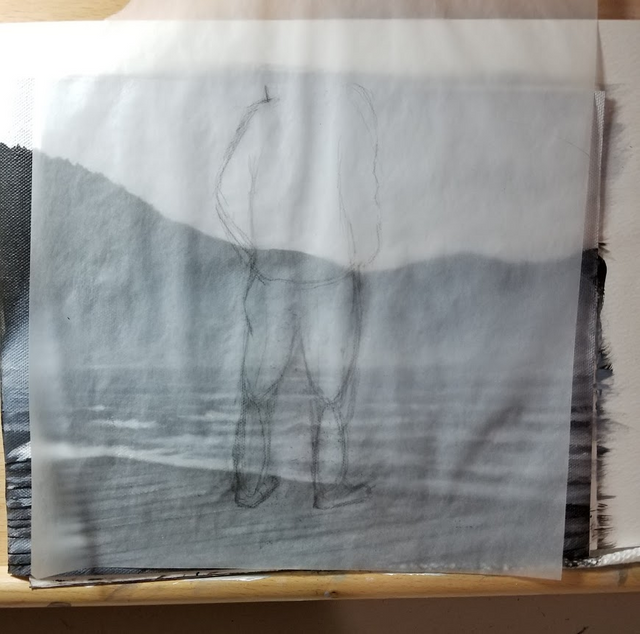
Now I wanted to put my guy in. I did a sketch on paper and then wanted to transfer the sketch to the canvas. This was very difficult considering I don't have transfer paper lol. I tried using the method of doing both sides with graphite, and transferring the graphite to the painting. Some of it I could see, some if it I couldn't. Messing up on free-handing the man was the last thing I wanted. Eventually I got a somewhat usable transfer, and made it work.
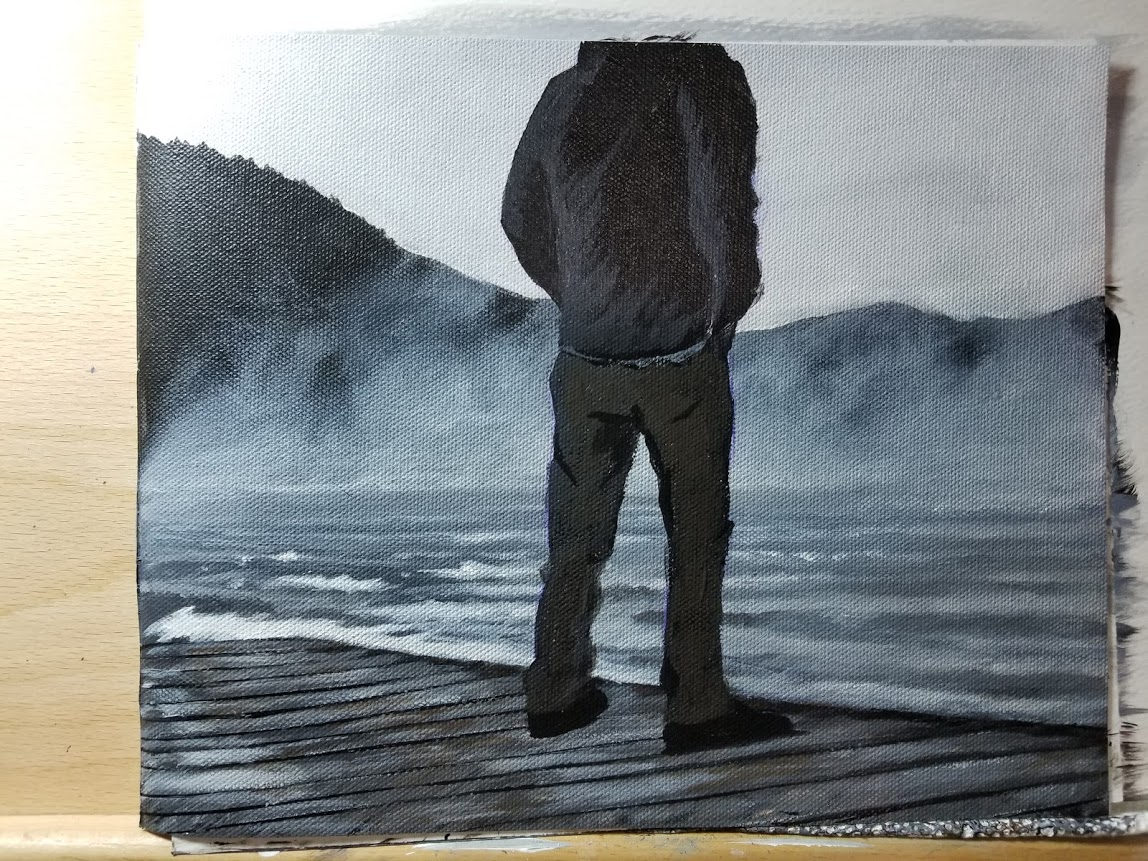
I don't have photos, but once I got the transfer down, I outlined the man lightly with white chalk and carefully blocked my colors in. White chalk or charcoal will come right off with water. Make sure your paint is completely dry before taking the charcoal off! The shirt was a black, and the pants are a dark greenish-gray. Now, I didn't completely use black and white on the painting. I mixed a little blue in with my blacks. On the dock I used a few shades of brown, some cool and warm browns to add to the age. And then just a little green in for the pants. The water also has a little blue mixed in.
Trying to follow the reference photo closely I started adding more detail in the clothing. I started with the shadows with very light washes of black with a small brush. And then for my highlights I used dark grays and gradually lightened my paint mix up as I wanted to make sure I didn't have super bright highlights. Back to the idea of value, it took me a while to realize just how dark most highlights actually are. That is still something I am trying to learn.
Fortunately, if you do go too light, washes are excellent in toning down color. You could actually start with white and then tone it down. Although, a pure bright white might prove just a little difficult if you need a color on the darker side. It would take quite a few washes. It's all trial and error in the beginning though.
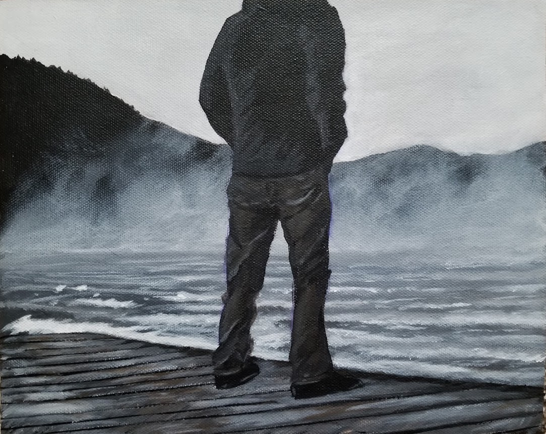
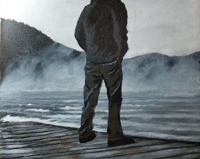
And the finished product! I really like how this turned out and it was pretty simple really. The mountains were very basic, then the scrubbed in mist. The water, as mentioned, would have been fine had I just left it how it was in my opinion. I overworked it just a little but it turned out alright. Water looks more complicated than it is. Although, when done right (which you can learn fairly quick) they can make any painting really stand out. I think that's why a lot of people, myself included, try and do water most often. Although, water can be done WAY better than how I have been doing, that's true, but if you're just learning, with a few techniques, you can be doing exceptional water in no time.
I think the biggest trouble I had was the dock and the man. The shape of the man mostly, and his silly shoes! Perspective is a tough one, and I struggled with that in this painting, but all in all, I think it turned out alright.
I think paintings like this are a huge recommendation from me to beginners. You work on some techniques, there's not much going on as far as detail goes, the colors are limited, you learn more about value, and the final result will look better than you thought.
Nice work! :3
Thank you so much : )
Oh My Good Lord, I am speechless........... How about that.......... that’s got to be the first time ever. This is a magnificent painting girlfriend WOW! Do you know I went to your blog to see what you’ve been doing these passed couple of days and I spotted this jewel right away, I thought it was a photograph of a beautiful ocean scene. Love the ocean and miss it tremendously. I was born in San Diego California, right by the ocean. So as I went to touch on the post I saw you painted it. In my opinion, this is absolutely the best painting I’ve seen you do. Brilliant the way you talked about how you created it, and all the other great advice about painting. A great post! In my opinion the best fine art paintings on realism are the ones that look like photographs from afar. That’s this one. This needs to be hanging in a fine art gallery and if I had the money to buy it you bet I would.
AWWwww thank you so much @lildebbiecakes : ) What's funny is that I also really lOVE this painting and I really think that anyone with a little painting experience could have the same result, it was a really good subject. I had started it for practice and it's just one of those subjects I think anyone could do!
That's awesome I would miss the ocean too. I really want to go and see it. I have seen the Gulf of Mexico, I went on like my only actual vacation and went to Galviston Texas, it was really fun. Although we went in April and it wasn't really warm beach weather, it was in the 70's but the water was still cold.
I love your little picture there! That's such a good idea!
Congratulations @renascence! You have completed some achievement on Steemit and have been rewarded with new badge(s) :
Click on any badge to view your own Board of Honor on SteemitBoard.
For more information about SteemitBoard, click here
If you no longer want to receive notifications, reply to this comment with the word
STOP