Design | Logo for @weku-edu
First Things First
I would like to thank weku-edu, for this opportunity to help create a logo for them. weku-edu approached me three weeks ago asking if I could create a logo for them, an initiative much like @steemiteducation but on the weku platform. If many of you do not know, weku is another social blogging platform that has just launched a few months ago that is pretty similar to Steemit. Instead, you get weku tokens and weku dollars.
During the Hardfork 20 patching period, I needed to get my 'steemit fix' and to prevent myself from withdrawal because it felt like a part of me has disappeared when I couldn't post on Steemit. So I decided to get an account on weku to have an additional outlet for me to keep my momentum going. Anyways, I'm grateful that I'm able to create this simple logo for weku-edu and I hope that this would helped the initiative bring its support forward in a more professional manner.
weku-edu Official Logo
The Idea
I was blank when I was asked to create a logo for educational initiative. Like what do you put on the logo? Books? Graduation Hat? Scrolls? I went to do a little research on educational logos and there were just what I expected. Books, scrolls and the graduational hat. I wanted something 'global' because when you put internet + social blogging = no boundaries. Yes, there is literally no boundaries to the things that you can achieve in this era when everything is almost instant and you can work in the comfort of your own home and still get paid.
The weku's brand colour is a bright orange so I figured that would be the main colour palette of the whole logo. I also didn't want to put the stereotypical elements in there, ie. the books, graduation hat, etc etc. And since weku-edu is an International Global initiative, I figured why not just add a globe in it as one of the elements.
Creating Elements

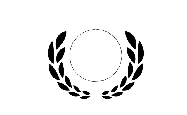
I've always liked this first element that I've created. It's called a laurel wreath. I'm sure you've seen it in some of the designs or logos that relate to Greece and Rome. It symbolizes victory and honor. In the ancient times in Greece, the laurel wreath was crowned on the victors of both in athletic competitions and commandeering triumph. I've decided to go with this because during ancient times, the Greek scholars were one of the tops in the world in education and knowledge. So what better way to represent weku-edu with the laurel wreath.

I duplicated the laurel wreath to create the layout of the whole logo. The globe which will later be added in the center of the whole logo. After happy with my wreaths, I started on the globe by first outlining the size of it in the center.

I wanted to go for a polygonal earth to keep things 'modern' but after much trial and error, it didn't look good at all. So I stuck to the normal flat design of things. I mapped out the continents on the globe and tried giving it a gradient colour for starters. I wanted to see how it could gel with the wreaths. You know how sometimes when you have artistic/creative block and everything you do just didn't work out right. This was one of those moments. I tried a few colour templates and designs and had to redo a few over and over till I think it looks decent. At one point, I almost scrapped the whole design and take a break from things.

When I've tried almost everything that I could think of, I thought to myself, why not just go back to basic solid colours and we'll start from there. Hence, I gave the globe a weku colour of orange and it looked so much better instantly.

Then I decided to add a shield emblem element after I got the size of the globe. I wanted weku-edu to be the 'protectors' of education on weku that supports quality educational posts from weku-ians and then the globe would be on top of the shield meaning that is is 'protector of the world's education'. Hahaha, does that make sense?
Colour Grading

Changed the globe to a bluish green colour to make it stand out among the 'orange-ness'. I also set the laurel wreaths to be gold colour to make it look prestigious. After awhile, I felt like the logo was lacking some depth to it and it didn't look solid. So I decided to add on a little fake 3d effect to the shield emblem by giving it a whiter orange outline to make it look like the shield is bending outwards.


Finalizing
Added the 'WEKU EDUCATION' text in varsity fonts. I mean... when you talk about education, it makes me think about varsities, basketball teams and jerseys. So to keep things hip, I went for the varsity font to finish the logo off.
WUALAH!!! The official @weku-edu logo is done. I don't know about you guys but I kinda like the colour of the green and orange because they don't take away from each other and it isn't distracting but still able to look at the logo as a whole.
Well, I hope that you guys enjoyed my thought process behind this because I certainly enjoyed sharing it with you guys. More artsy fartsy stuff and designs coming up soon. Stay tune will ya!~
Thank You
If you like what I do, check out my other posts on meetups, animation, and designs.
Get your Personalized Steemit Profile Banner,Logos & GIFs


Posted from my blog with SteemPress : http://zord189.vornix.blog/2018/10/03/design-logo-for-weku-edu/
Does anyone know who is behind WEKU and what their plan is?
Honestly i do not know, they aren't really transparent and the whole platform is pretty centralized. Who knows wat might happen
Have to say your graphic design and logo skills are top notch :) nice work as usual bro👋
Thanks man! A man gotta find ways to feed himself ey? ;D Hahaha
wonderful work my friend zord. thanks for the step process. very eye-catching logo.
Thank you @ykdesign <3
That's cool! I love it when they tell it from beginning to end. From idea to implementation))
Coming from a great artist like yourself makes me happy! Thank you!
I like it... a lot
The colours too
Did like your thought process and will be looking out for those artsy-fartsy stuff hahaha
Thanks @kaerpediem. :) Haha, this was a simple logo, had to get it done within the free time I had
This is simple to you?
hmmmm wonder what the intricate's like ;)
Hahaha, I got lots of other really complex ones...
I really like this! Instantly reminds me of a college logo. And the complimentary colors work so well too. Great job!
Haha, i usually try to go for a more pastel lighter colour but also wanted to emphasized the globe and words. Thanks!
Wow, that's really awesome! Could I commission you to create a banner for my posts too? Does not have to be this elaborate but just have my steemit name and upvote follow resteem or something to that effect? What would you charge for that? Really nice work!
Sure, just drop me a DM in discord and we can discuss further :D
Oh! The most wanted man in the www! ahahah Jeez, are u even going to have time to do my banner?! This looks cool. Good job!
Thank you for sharing your posts with us. This post was curated by TeamMalaysia as part of our community support. Looking forward for more posts from you.
To support the growth of TeamMalaysia Follow our upvotes by using steemauto.com and follow trail of @myach
Vote TeamMalaysia witness bitrocker2020 using this link vote bitrocker2020 witness