A Better Life with Steem: Continuing with Bootstrap Responsive Website
Hello guys, hope this post finds everyone in good health. I would like to continue here the journey of my last [post](https://steemit.com/betterlife/@leoumesh/a-better-life-with-steem-learning-bootstrap-for-responsive-website-development). In that post, I had created a responsive navbar with some background image and 'Learn More' button. After this part, I have created a short section which you can see below:
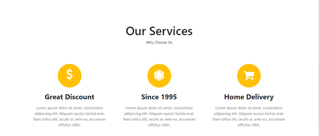
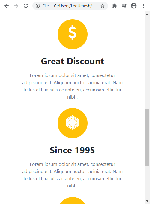
I can't properly capture the responsiveness as it was too long. Here's the simple demo.
Continuing from the last post, you need to add following HTML code to your index.html. Put this where your last div tag was closed.
<section class="container ourservices text-center">
    <h1>Our Services</h1>
    <p>Why Choose Us</p>

    <div class="row rowsetting">
        <div class="col-lg-4 col-md-4 col-sm-4 col-10 d-block m-auto">
            <div class="imgsetting d-block m-auto bg-warning"><i class="fa fa-usd fa-3x text-white"></i>

            </div>

            <h2>Great Discount</h2>
            <p>Lorem ipsum dolor sit amet, consectetur adipiscing elit. Aliquam auctor lacinia erat. Nam tellus elit, iaculis ac ante eu, accumsan efficitur nibh.</p>
        </div>

        <div class="col-lg-4 col-md-4 col-sm-4 col-10 d-block m-auto">
            <div class="imgsetting d-block m-auto bg-warning"><i class="fa fa-first-order fa-3x text-white"></i>

            </div>

            <h2>Since 1995</h2>
            <p>Lorem ipsum dolor sit amet, consectetur adipiscing elit. Aliquam auctor lacinia erat. Nam tellus elit, iaculis ac ante eu, accumsan efficitur nibh.</p>
        </div>

        <div class="col-lg-4 col-md-4 col-sm-4 col-10 d-block m-auto">
            <div class="imgsetting d-block m-auto bg-warning"><i class="fa fa-shopping-cart fa-3x text-white"></i>

            </div>

            <h2>Home Delivery</h2>
            <p>Lorem ipsum dolor sit amet, consectetur adipiscing elit. Aliquam auctor lacinia erat. Nam tellus elit, iaculis ac ante eu, accumsan efficitur nibh.</p>
        </div>
    </div>

</section>
We need to do some styling too. So in style.css file, add this code:
.ourservices{
    padding: 100px 0px 60px;
    height: 700px;
}

.ourservices h1{
    font-size: 50px;
}

.rowsetting{
    margin: 80px 0px;
}

.rowsetting p{
    padding: 10px;
    color: #6c757d;
}

.rowsetting h2{
    margin-top: 20px;
    font-weight: bolder;
    font-size: 30px;
}

.imgsetting{

    border-radius: 50%;
    height: 100px;
    width: 100px;
}

.fa-shopping-cart{
    margin-top: 24px;
}

.fa-usd{
    margin-top: 20px;
}

.fa-first-order{
    margin-top: 24px;
}
Get the source code of this project upto this point by clicking here. Remember there's no bootstrap css or js files as I am using it from content delivery network.
@leoumesh
The webpage is responsive????