[0252] Bitcoin Green: Why Rebranding Is A Bad Idea
For those who have followed the blog, you'll know I am supportive of startups in the crypto space. I've written lots of articles ( more than 250 ) talking about the pro's of these projects and why I think they are viable on the open market.
Every now and then however, I see decisions made that are counter productive to the aims of the project. So I voice my criticism to get the team to think about and maybe re-think their decisions. Critical I may be, it's not "FUD". It's constructive and my intent is to move the project in a better direction than how it is being steered currently.
While reading through my Twitter feed, I came across a Tweet that made me pay attention. It was from one of my favourite Bitcoin spinoffs, Bitcoin Green.
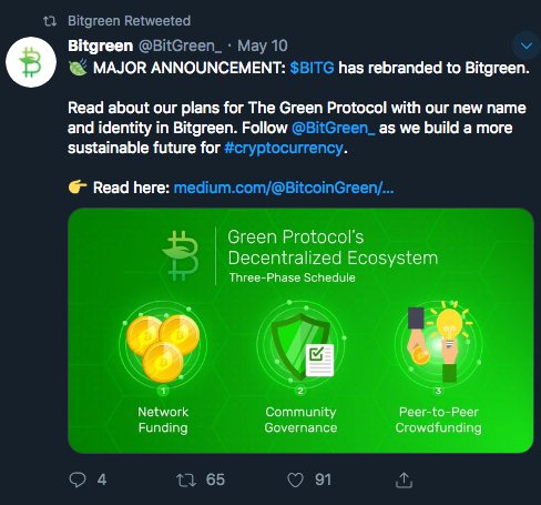
As the tweet suggests, they have rebranded from Bitcoin Green to the short-version, BitGreen.
"Why would you do this?", I thought. I then dot pointed my objection in a Tweet and posted it.
Here's my rationale why this is a really bad idea.
Rebranding 101
When AntShares rebranded to #NEO, it made sense. When BitQuence rebranded to #Ethos, it made sense. Both of these startups sharpened up their marketing and it was a move in a better, clearer direction. ( To be completely honest, I don't know why they were called their original ugly names in the first place. )
But when BitCoin Green rebranded, it doesn't make sense. For several reasons.
Before I get to those reasons, the golden rule of branding is "only change your identity when it makes perfect sense" and puts you in a stronger position in the minds of your customers.
For some strange reason, it is trendy in the crypto space to announce a rebrand, which alarms me greatly because changing your identity is a radical thing to do. And jarring, as in the case of Bitcoin Green. I'm not saying the team have not thought it through or know better than I do, but you have to be 100% sure when you go through a rebrand that it will pay off better than using the old name and logo.
Bitcoin: The King of Crypto Brands
Let's break this down. Bitcoin Green is now BitGreen. From one angle, the team has removed four letters to shorten the word. Having done that they have removed the word that was powering the brand.
Bitcoin.
The word "bitcoin" is a goldmine and has brand recognition in the crypto space. And after another bull run, it's soon to have public recognition as the coin climbs to $50k and beyond. Bitcoin, when that happens, will be a household word.
Not only is it readily identifiable, bitcoin is also un-trademarked due to the open source license of bitcoin. Which means anyone can legally use the word in their title.
So, for a fork of Bitcoin like Bitcoin Green, it makes sense to use the word bitcoin as it brings strong brand recognition.
Having chopped out the word Bitcoin, BitGreen is now a generic brand that quite frankly is mixed into the hundreds of other bit-crypto's out there.
BitMoney.
BitRewards.
BitGreen.
BitBay
Altcoin #1,001...
In a sea of altcoins, what's the difference between them all?
It blows my mind that projects don't choose strong, identifiable names for projects. The name should sell the concept peeps! The tendency to write in Klingon-ese and think that code is understand by the general public is mind boggling.
Green: Capturing The Environmental Market
The original name, Bitcoin Green was readily identifiable. It's bitcoin. It's green. It's a green version of bitcoin.
To anyone in the crypto space, you can tell that it's a form of bitcoin ( with staking ). To anyone new, they can tell that it's an environmental version of bitcoin.
This is where the marketing comes in. If bitcoin provides a strong sense of identity in a market saturated with projects, then the word "green" is the spear tip of the marketing campaign.
It's perfect for targeting millennial, who are by nature environmentally minded.
Thereby making the project easy to sell. All you'd need to say is, "heard of bitcoin? Well, we're the green version of bitcoin". A concept that the old, original name sold without sales or marketing teams opening their mouths.
As bitcoin rises in price and therefore popularity, it would have been a cinch to bash the bitcoin brand over it's power hungry ways and swap out customers from bitcoin to the bitcoin green brand.
Easy peezy.
All the Bitcoin Green team has to do was ride on the back of bitcoin's success, like a flea on a dogs back. Now, however, BitGreen has to distinguish itself from all the other Bit-cryptos out there and verbally draw a picture in peoples minds that it is a green version of bitcoin.
Something that the old name and logo did automatically. Thereby making the time, money and effort put into a rebrand even less of a good idea.
The Logo
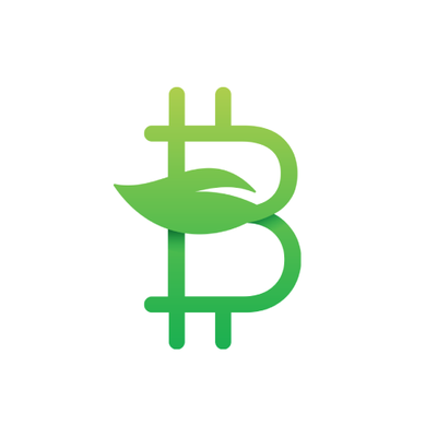
Now that I have covered the words "bitcoin" and "green", I have to talk about the new logo. Not to sound like a negative Nancy, there are issues with it as well.
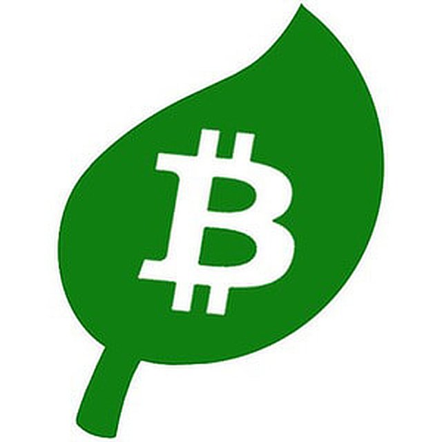
The original Bitcoin logo is iconic. The style is simple and that is a good thing. It's a great logo because it scales well and is viewable at different resolutions. Even tiny favicons on your browser tabs are clearly read.
The new design has departed visually from the bitcoin style and has adopted a complex design, which your brain interprets differently. Now you have color gradation, straight lines, leaves and worst of all, a thin font.
Which will be hard to read at smaller scales.
The old logo was perfect. It was bitcoin presented on a mint green leaf. Which is also the color for health.
The new logo is nice but doesn't compare to the old logo for the reasons listed above. It's a step backwards in my mind. While I am only one person, I think I have a case to think of a roll back of the rebrand.
Summary
To be honest, my first impression of the new brand name and logo was jarring. To the same scale of the 'tweaks' that Microsoft did when introducing their new live tiles in Windows 8 & the non-sensical removal of the start button.
I have to say it but this rebrand is a mistake. It doesn't magnify the message, it dilutes it. It doesn't value add, it removes the million dollar bitcoin brand name. It doesn't make sense.
If I were marketing manager, I'd roll the idea back. Reinstall the old logo and name and then begin blasting bitcoin for being a power hungry beast. And continue to do so while signing up millenials to the new and improved version of bitcoin.
Which is the original mission. Now the mission is to prove that the change of identity was a good idea.
Thanks for watching,
Brendan Rohan - Indie developer of 'next gen' natural medicine from Melbourne, Australia
Www.Skyflowers.co ( see "botany" tab for the plant research )
Www.ClinicalFlowerTherapy.com
Social @iSkyflowers
YouTube Skyflowers.Tv
If you support natural medicine and an independent research project that began in 1997, then steem me. The creds I get will help me provide a solid body of information that future generations can build upon.
DISCLAIMER: This article and all information on this channel & all content is offered purely for educational & entertainment purposes. Always do your own research when investing money and seek the help of a registered financial advisor.