Bitcoin Bearish Scenario to 3K - See Measured Move Patterns in Chart
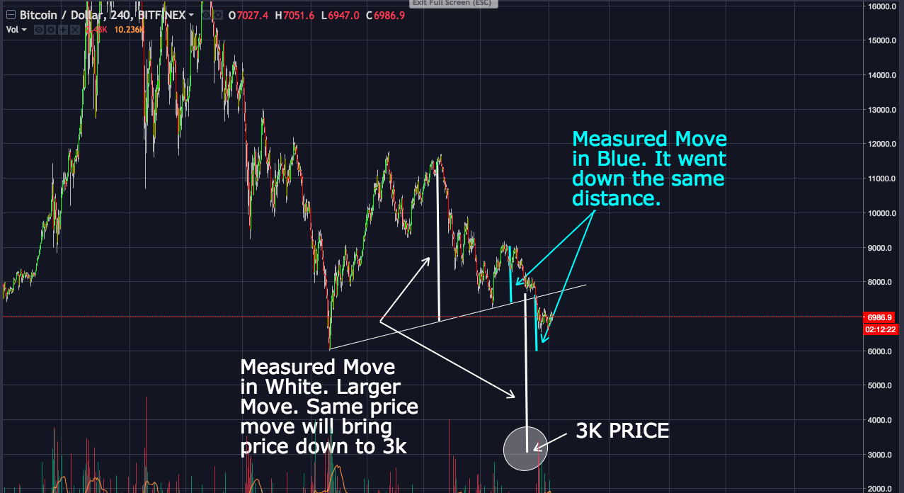
The chart below represents measured moves when trend line support is broken.
The first small trend line is in blue. When broken we had a measured move down. Draw a line from the peak and copy from when the price broke the trend line. It is almost exactly the same length.
The second larger trendline is shown in white which starts from the 6k price and connects to the 7.5k price. If you look at the length of the white line and copy it when price broke down the white trend line we end up exactly at 3k.
A good way not to stress about thinking where the bottom is is to average in your buys going down. So if your holding on to any cash, as the market goes down like a stepping ladder just put in buy orders. For example, put buy orders in at 6k, 5.5k, 5k, 4.5k, 4,, 3.5, and 3k. Then add up all your buys to see what average you bought in.
Disclaimer: I am not a financial advisor. These posts are only for entertainment purposes only. Due your own due diligence when making any financial decisions.