✅ BitsharesTalk Logo Design Entries - Help Us Choose A Winner - Vote for YOUR Favorite!
![]()
We're getting ready to launch our new BitsharesTalk forums (BitsharesTalk.io) and revamp our weekly Bitshares Open Source Hangouts with a fresh new look. These act as the meeting place for all those interested in helping to develop new tools, advancing the Bitshares platform, discussing worker proposals, and all other aspects of cryptocurrency and blockchain as it pertains to the Bitshares Community.
BitsharesTalk.io Logo Design Contest
Last week we asked the community to help design a new logo for the BitsharesTalk forums...
WOW! The response was EPIC!
Here are the Top 5 Designs
The BitsharesTalk Dev Team reviewed the logo designs as they were submitted and admittedly had some early favorites, but as the designs entries continued to come in that choice was becoming more difficult. Now we want to hear from you.
![]()
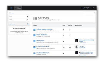
Take a moment to check out the BitsharesTalk.io BETA website and review the Top 5 logo designs selected by the team. Then drop a reply below with your favorite logo (A,B,C,D,E) in the comments below.
🔆 Keep in mind we have been testing these logo options in the BETA website, but a "final" has not been officially chosen just yet. So don't let whichever logo you see in the site at the moment sway your choice. As I mentioned, we are testing them all out.
In one week when this post ends, we will count up the community votes and weigh that against the Dev Team's choices and select a final winner.
To keep things fair, since we are extended the judging on the design contest, Each of the Top 5 entrants listed above have earned 30 BeyondBits for Round 1.
The official winner's logo will earn and additional 50 BeyondBits!
Join the BeyondBitcoin Communities
Please join in the discussions with us by becoming a member in ANY or ALL of the BeyondBitcoin and Bitshares communities. We have a wealth of knowledge and information waiting for you.
EOSTalk Discord
EOS.IO related community and topic discussions.
https://discord.gg/WaN27D2
Whaleshares Discord
Steemit community discussions, contests and events.
https://discord.gg/E9Rm9yT
Project Milkbox Discord [NEW]
Project Milkbox community and topic discussions.
https://discord.gg/dw58678
Bitshares Discord
Bitshares development community and discussions.
https://discord.gg/z2MSfWg
for me it's A
I like C the best.
Really? So funny. LOL.
My design: (post on 2018-04-04 18:56:36)
Manuelcruz's design: (post on 2018-04-04 22:50:06)

I post first, and he use same shape and same colors! How fair is this @officialfuzzy?
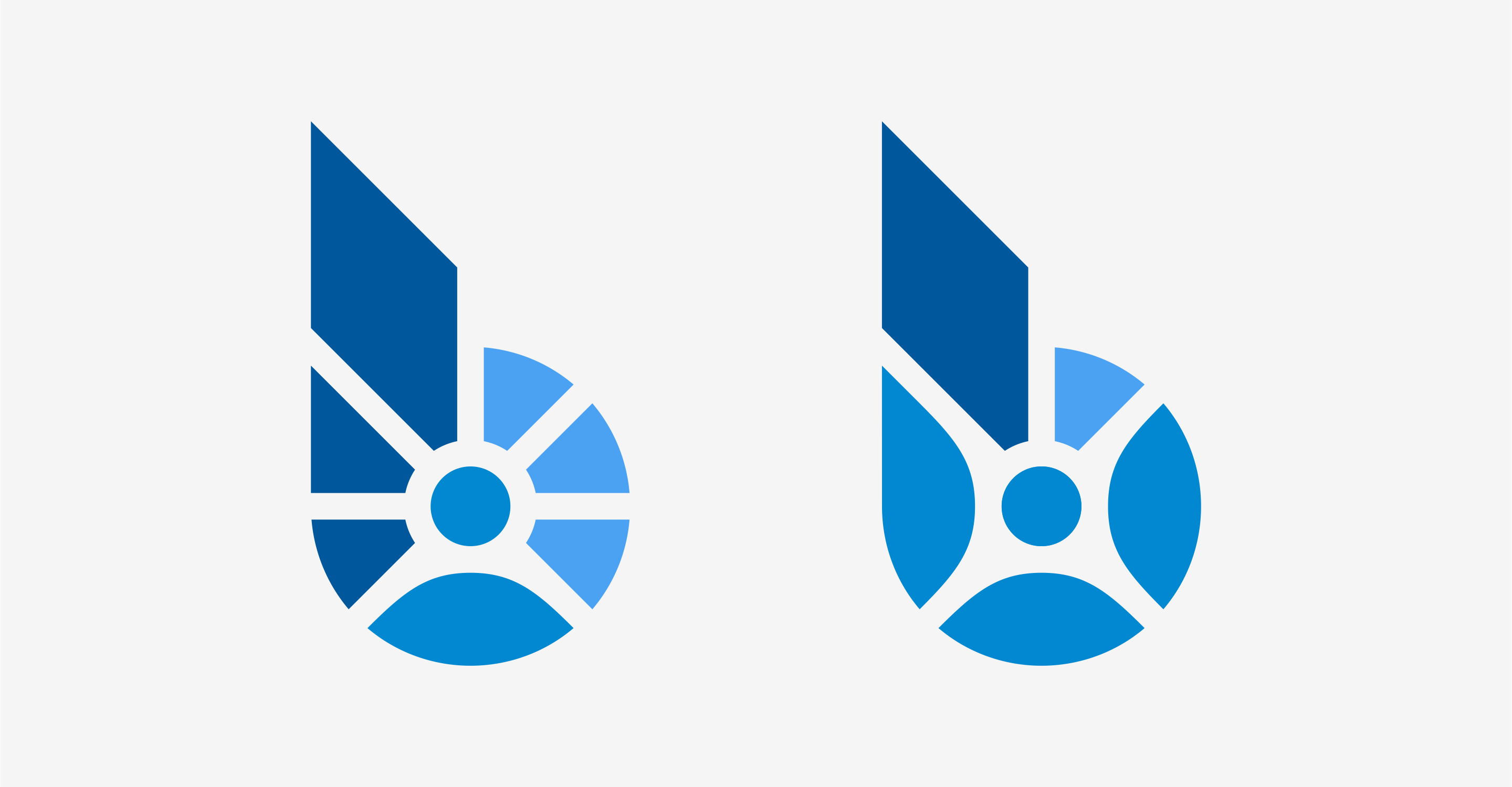
I did notice the logo and as you can tell for this one:
it looks like 4 people (like a conversation---or "coming together")
As you can see with the one on the right it does the something similar, but we felt it was something a bit more . And the one on the left, though nice, does not give the sense of multiple people coming together...which is the reason why this one (the one with 4 people coming together elegantly) is what became a finalist.
As far as plagiarism comment, I understand why some may say that because lets be honest...Without the FIRST ONEs (made by naufal), the this one would not exist.
However, the trouble with this...is that with naufal alone, this design woudnt have existed either. So what do we choose? Obviously the work of both of these people had a role in the creation of the logo.
So I'll gladly let you both share the rewards earned by the placement of this design.
What. Really. Wow. That is really bad idea. Plagiarsm 100%
99% agree..
But his solution still an improvment of yours.. little but perceptible..
really bad situation..
cause it was my favourite..
=(
Thats is my second logo, the other option. If the owner chose B logo, they should choose me. Although I'm not sure that my logo will win, but I can't forgive the plagiarism!
When I saw them yesterday I was thinking about what you have already done :D Since I liked the B the most I was thinking that the curves were a bit overused, well to be frank I don't like the top, on yours the user was pretty much indistinguishable for me before I read your post, after that I can say yeah great idea :)
Anyways it's the way of the world, I did leave my comment above since podan was the one to respond to you first and I suppose I like arguing :D
It's a bad situation for sure, but I don't run the contest and I wasn't aware of it, I don't know any of you people so I can't say who did what, therefore I can't be certain it's plagiarism, the logo is really simple to make, maybe he got an idea from you, maybe he just converted the points to a curve ...
Either way I know your frustration, you worked hard on this, took your time for a week, thought about it a lot and you see the same thing posted by someone else ... the plus side is you get rewards from utopian, I'd say you are getting the better end of the stick in this situation, you were rewarded for your work, unlike manuel in this case.
I wouldn't call it plagiarsm, well not 100%. the designs are pretty simple, anyone can pretty much come up with it and I kind of doubt, well I suppose there is a chance, but really, I'd say it's probable ie. 20% to be sure it's 100% ... there are so many things to account for,
If we were judging by their works @naufal wins by a long shot, (I don't want to get into my opinion on your platform) sadly people aren't measured by their works but by opinions, so I can't say anything more because I don't know, there are many unanswered questions and you shouldn't be quick to judge.
well my thinking goes like this, there is a chance he saw the logo and did some minor changes, so that's 50% it's plagerism, but when you think about it the designs are quite rudimentary so I'd say probably, maybe maybe we can bump the odds to 30% :D ....
I don't know anyone so my opinion is pretty much drained on this point, here is another design that is 100% Not plagerised by your quick standards.
https://busy.org/@manuelcruz/bitshares-logo-concept-design
Is it not? Even not 100%, really? So I need to relearn about plagiarsm.
And, why do you mix the gravy in the porridge? Not related to. I didn't discuss the design links you provided. I have no problem with that.
I vote D
We do see the roots of "B" in your logo design, while at the same time seeing this as a more "evolved" version of the concept. Given how fast the designs were coming in, the thought of it being stolen outright did not come to mind for anyone on the dev team. It was simply seen as an completed thought on the concept of connecting people together. The colors are dismissed in our decision process since the logos would be converted to 1 color, white or blue, in practical application. Keep in mind that even the winning design might be edited/modified by the dev team before it is officially adopted as the logo.
Perhaps, a note by @manuelcruz giving credit for the base idea to you would have went a long way to making this a cooperate effort, which is what we always want these initiatives to be.
You will definitely be rewarded equally for you efforts in starting the design down its origin path.
split between B and D for me, one has a really nice overall shape(B) the second has the shapes really nice(good scale and balanced image)
A - just looks really simple and doesn't mean anything specific, well bitshares chat or talk I suppose.. but too simple and doesn't stand out, I find no basis to compare, all 4 with the exception of B are made in the same style.
C - looks like something I would make :D :) as far as I have learned the lines might get really flimsy if you use that in a website. To me it looks interesting, but also too simple and too cluttered as well. B does a better job of conveying the same message
E - I'd say it's pretty much like A but with proportions and shapes that are arranged in a "worst" way (the dots are small, the chat blob doesn't fit into the whole model as well as A and D)
In conclusion, B looks the best to me, simple and to the point :P
Good luck @manuelcruz and good luck to the participants, I would argue with 80% of the people here :D
Well good luck anyways :)
:D. Really?
really what, you have something to say?
I don't mind laughing :D
well nevermind, I don't know what you mean by really, could be pointed towards a few things.
so yes really :D
I vote for A
I chose C with its luxuries.
@furqan19
I am interested in D, exquisite
My pick is A, as it's closer to the original Bitshares logo but clearly shows its a discussion group.
C Look good for me, i choice it, if i have a vote.
I like "C" the best 👍