Minor Graphene UI Advanced Mode CSS Tinkering (OpenLedger)
Preamble
The exchange on Bitshares has always made my eyes hurt. It may be the typography proportions, or maybe it's the abundance of high contrast hairline borders. It's gotten so bad, that I've started tinkering with the CSS. I've noticed @openledger has been putting some work into the GUI, which has inspired me to write this post. Here's where 10 minutes got me.
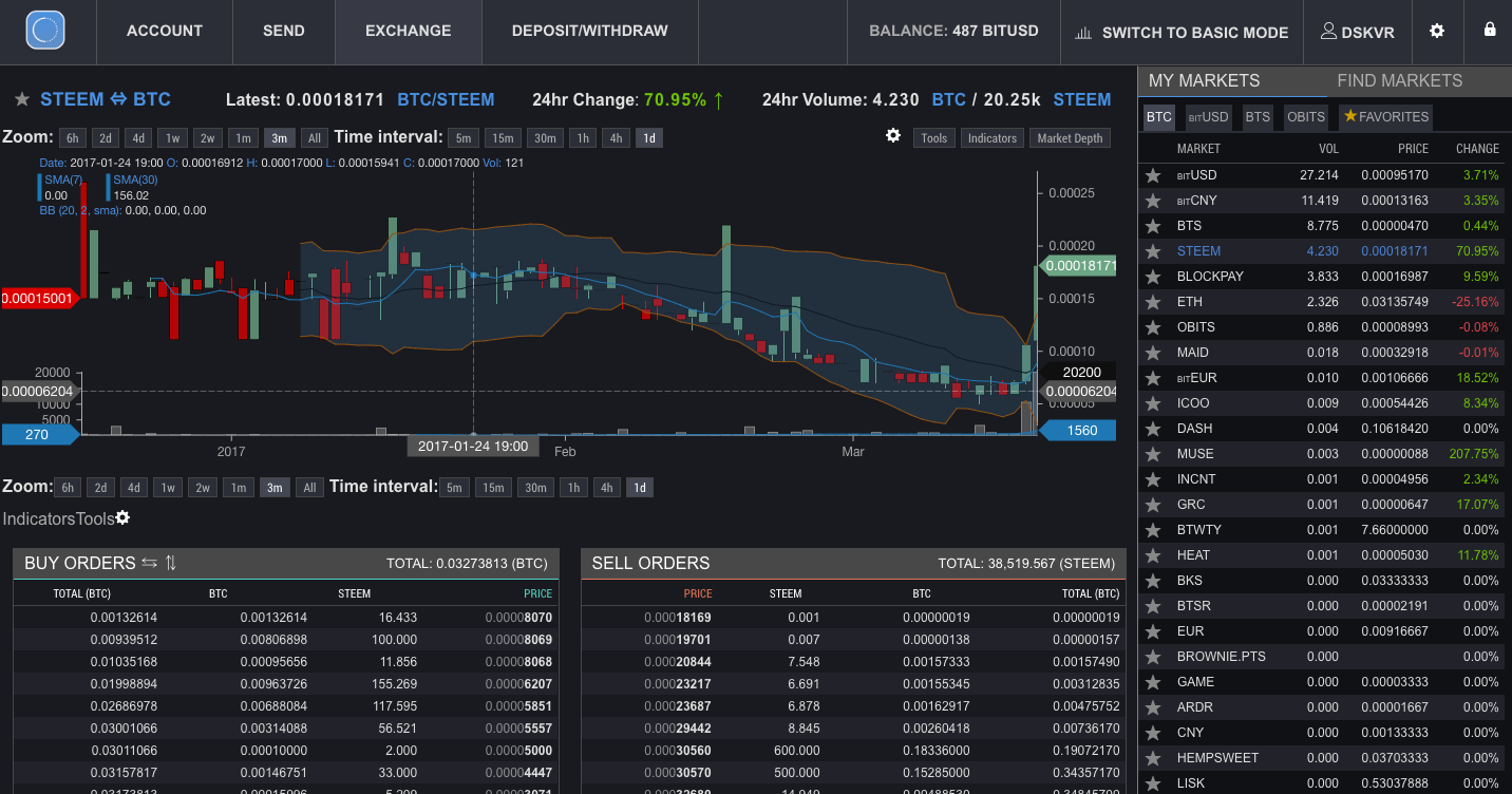
Before
After
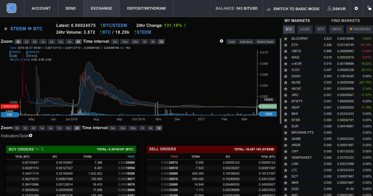
Changes
- I removed as many high-contrast hairline borders as I could, making some lower contrast
- Darkened the backgrounds
- Made the alternative even/odd rows in tables lower-contrast
- Added contextual coloring to the headers of tables
- Altered heading typography by increasing the font-weight and decreasing the font-size.
- Added a thick extra low-contrast border around the exchange tables.
Observations
- Important highlighted texts, such as Pair Links and 24 Hour Change, stand out more.
- Soft edges make for a less harsh experience.
- Darker overall experience provides more depth.
- Use of contextually relevant colors allows for a more intuitive experience.
- Smaller/Bolded text for table headings are more pronounced and have a better aesthetic.
Wrapping up
If there is a positive response to this post, I'll put a few more hours into working concepts and stylesheets. Stylesheets could then be appended to the DOM of OpenLedger safely in a variety of ways.
What do you think?
Your reward for being in
Promotedis an upvote and 0.032 SBD extra promotion.Good job, keep your contents promoted! :)