EVERYTHING YOU NEED TO KNOW ABOUT REAL TIME CLIMATE CHANGE IN ONE LOCATION
Electroverse is, relatively speaking, a new website that documents climate change during the Grand Solar Minimum. That is their claim and purpose and so far have done an excellent job of it. They also host this page
https://electroverse.net/live-data-sets/
Which hosts the various datasets pertaining to climate all in one location for your convenience. Aren't you lucky?
DATASET 1
LATEST GLOBAL AVERAGE TEMPERATURE
University of Alabama Huntsville(UAH) Satellite-based Temperature of the Lower Global Atmosphere
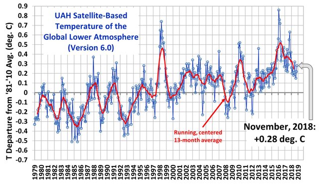
These temperature readings charted by Dr Roy Spencer are not calibrated with any global surface-based thermometer records of temperature or with any models derived from computer-modelling such what NOAA and others within the IPCC purvey does who claim the Global Mean Temperature to be at least one degree Celsius higher and that the globe is burning up. These temperatures are based on the natural microwave thermal emissions from oxygen(O2) in the atmosphere. The intensity of the signals these microwave radiometers measure at different microwave frequencies is directly proportional to the temperature of different, deep layers of the atmosphere. The instruments that measure these readings are those housed in NOAA satellites. Claims that Dr Roy Spencer's charting of this data is somehow influenced by "BIG OIL" has no basis. On his website, Dr Roy Spencer states "Dr. Spencer’s research has been entirely supported by U.S. government agencies: NASA, NOAA, and DOE. He has never been asked by any oil company to perform any kind of service. Not even Exxon-Mobil." Though, that does not prevent warmists to claim otherwise.
DATASET 2
LATEST ARCTIC SEA ICE THICKNESS
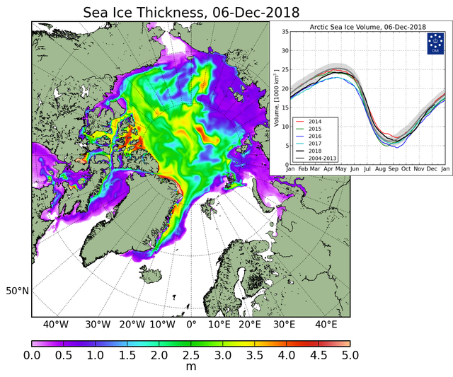
This dataset is courtesy of the Danish Meteorological Institute and it too has no association with BIG OIL. There is some contention between the various sea ice datasets, but it seems to me, that based on other sea ice datasets, global warmers have attempted to venture to the North Pole under some illusion that it was melting or had melted courtesy of these other datasets, while the DMI said otherwise. Follow this link to the DMI and there they have a feature which allows you to compare the present state of the ice to past recordings, thereby giving you the opportunity to do comparisons from year over year on the same day, which is truly the only way to compare Sea Ice Thickness.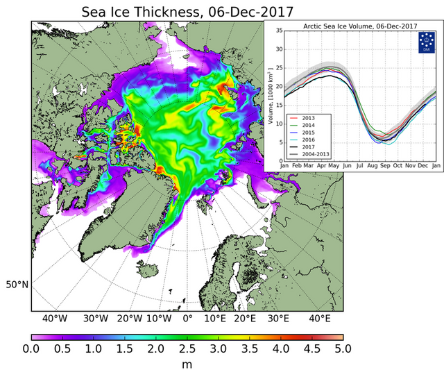
What we see is on the Russian side of the pole a little less ice which is to be expected considering the drought-driven heatwave that hit Europe, Ukraine and Russia this past year driven by the Meridional Jet Stream that is now causing record cold and snowfall throughout North America. But meanwhile, we see an increase in ice thickness near the pole over last year, as well as, increased ice thickness around Greenland and the Queen Elizabeth Islands, Nunavut, Baffin Island and Greenland. In fact, I would say more gains there in ice thickness than losses on the Russian side. But that is just my opinion. What do you see?
DATASET 3
LATEST GREENLAND ICE SHEET TOTALS
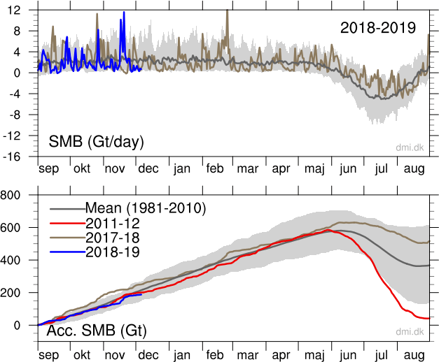
This dataset is also provided by the Danish Meteorological Institute and what it shows us is that 2017-18 had vastly significant gains over the multidecadal mean(1981-2010) especially during Sep-Oct-Nov which saw the levels go beyond the standard of deviation. This year 2018-19 so far has not done as well as last year, but it is well within the variable and shows no sign of disappearing as the mainstream media likes to falsely state. I am reminded of this news release just a short while ago talking about P-38 planes that landed on the Greenland Ice Sheet in 1947 and are now buried under 250 feet of snow and ice, clearly showing that during that time of global warming of the 20th Century there was clearly more ice gains than losses in Greenland.
DATASET 4
DAILY AND MONTHLY SUNSPOT NUMBER (LAST 13 YEARS
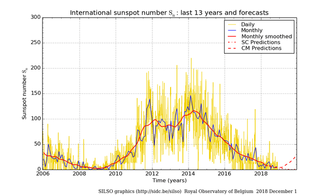
Dataset provided by The Royal Observatory of Belgium shows a very low sunspot count at present. There is a problem with this dataset as it does not provide any relevant data showing the geo-effectiveness of these sunspots. Sunspots that are closer to the solar equator as well as, being centred on the sun are more likely to have a magnetic connection with Earth as are sunspots further away from the solar equator or are out on the solar limb. An X-40 Solar Flare on the far side of the sun will do nought to the Earth, compared to a similar flare at the centre of the solar equator facing the Earth. In the latter position, such a flare today with the weakened magnetosphere of the earth would likely have a devastating effect on the global electric circuit. In general, sunspots centrally located have a magnetic connection with Earth and it is this connection where much heat is transferred that is not taken into account by the IPCC and its Total Solar Irradiance. This heat is then falsely claimed to come from manmade Co2. It is also this relevant point, re geo-effectiveness which the IPCC ignores and tries to show that there is no relationship between sunspots and Global Mean Temperature. 2016 was a warm year but based on the sunspot count we see no significant increase in sunspots, but, it would not surprise me if the sunspots we did experience were very much geo-effective. I have no data to prove this and would welcome it if anyone knows of any. Suffice to say, it is not just about the number of sunspots, it is also about the location of the sunspots on the sun and their geo-effectiveness-their magnetic connectivity to Earth.
DATASET 5
LATEST CMIP6 SOLAR FORCING DATASET
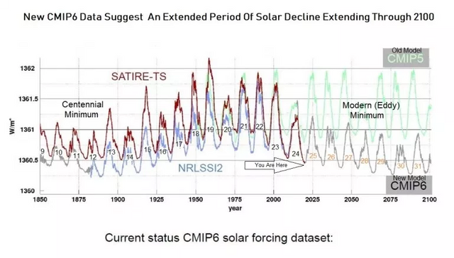
This graph represents the total amount of energy in w/m^2(watts per meter squared) that reaches the Earth. The old CMIP 5 model had a much higher expectation than the newer model resulting in numerous failed predictions versus observations. The latest predictions show a continued decrease in Solar Forcing up to 2100 which will likely result in a mini-ice age or worse. Considering the past failures of the CMIP models to overpredict Solar Forcing , it would not surprise me if this model is also overpredicting, especially in light of Professor Zharkova et al research on the Solar Dynamo Model in which she inadvertently stumbled upon data showing the dynamos moving out of phase with each other and in so doing will negate each other's energy thereby reducing, even more, the amount of solar forcing. The levels of solar forcing as predicted here(CMIP6) has not been seen in modern human history. This is why solar physicists are talking about a new mini ice age. It is this weakening of the sun that produces the Meridional Jet Stream which is the source of the extreme weather events we are witnesses to. Extreme weather events that are not unprecedented as they were observed during the Dalton and Maunder Minimums, as well as, during previous Grand Solar Minimums.
DATASET 6
LIVE COSMIC RAY COUNT
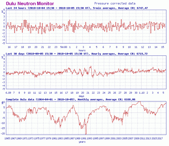
Cosmic Rays are high energy events in the UV and higher range that have intensified as the Earth's Magnetosphere has weakened. The top graph reveals the cosmic rays in the last 24 hours, the middle graph for the last 30 days and the bottom graph does a monthly count since 1965 and it shows overall an increase, if not nearly doubling from 5% to 10%. This is important for a number of reasons not limited to climate. While Henrik Svensmark has produced a paper showing a correlation between cosmic rays and rain nucleation(the production of cloud cover) which can have a cooling effect on the planet and may be responsible for the sudden downpours that drop a month's worth of rain in a few hours causing flash floods, it is also associated with heating the muons in siliceous volcanoes exciting the lava. At present we have twice as many erupting volcanoes, as usual, as well this will contribute to the uptick in earthquakes being experienced presently. Then there is the issue of human health as these cosmic rays can cause damage to DNA as well as have a host of other negative effects including, but not limited to, heart attacks, mental confusion, anxiety. If you take a lot of trans-Atlantic flights, the threat to your well-being due to cosmic rays will be much higher than someone who does not.
DATASET 7
STRATOSPHERIC RADIATION (MAR 2015- AUG 2018)
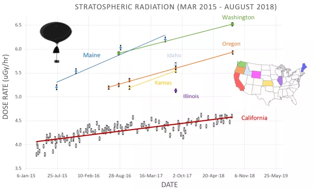
This too represents the amount of cosmic rays penetrating our atmosphere, though in this instance it differentiates between cosmic rays of a solar origin with those of a galactic origin. Another difference is that it shows there is a latitude relationship to the level of galactic cosmic rays. Those closer to the equator have less to be concerned about than those further away. While the weakened magnetosphere of the Earth is letting in more cosmic rays, it is the wekened magnetosphere of the sun, known as the heliosphere which is also weakening and this is related to the solar wind, which while it has kinetic properties, it also has electrical properties and as such should be called the solar sheet current. The solar wind is weakening and so too is the heliosphere which stretches well beyond Pluto and due to its weakening it is allowing in more galactic cosmic rays. One thing that this clearly demonstrates is that climatology will never quite succeed at long term predictions because it denies the interconnectivity of the solar system. If galactic cosmic rays can penetrate our atmosphere, and they do, producing all kinds of effects from rain nucleation to erupting volcanoes then clearly our climate is not isolated and is part of a larger cosmic whole. When the sun is more active, there are less galactic cosmic rays, but when the sun is quiet, as it has been during the last two solar cycles, it allows in more galactic cosmic rays.
DATASET 8
LIVE SPACE WEATHER OVERVIEW
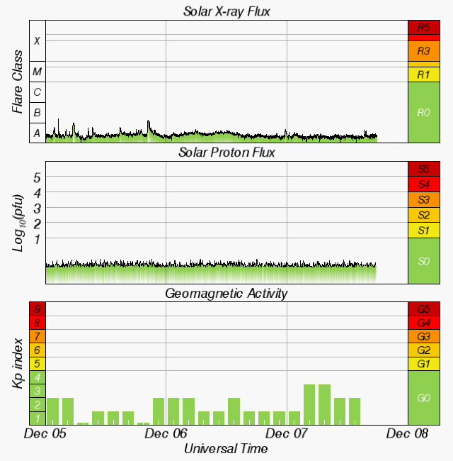
What this tells us is how is the sun behaving and what effect it is happening here on Earth. The first graph speaks of the Solar X-ray Flux produced by solar flares, filaments, etc. X-rays are high energy events on the electromagnetic spectrum. At present it is only producing events within the lowest solar flare category which results in a weakened magnetsphere as shown by the KP index In between these two graphs is the Solar Proton Flux and this represent the charge density of the solar electric sheet current aka the solar wind. When increased this will cause geo-magnetic storms which will exacerbate any tropical storms in place. I saw this twice this past year with Hurrican Michale and Florence where two days after a geo-magnetic storm both of those storm insified, much to the surprise of meterologists everywhere.
This dataset is provided by NASA/NOAA If you visit this page you will find more data pertaining to the sun-earth connection including solar wind speed,
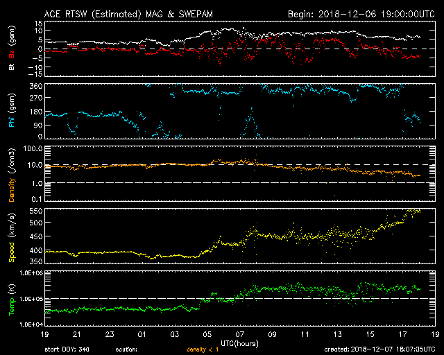
which is well above 550km/sec. If we were seeing an increase in density as well it would protend to a geo-magnetic disturbance, but it is not. To get a good analysses of this I highly reccommend subscribing to Ben Davidson of the Suspicious0bservor channel on youtube or facebook. On this page you will also find reports of Auroroas and other space weather observations that may be f interest for you especially if you are a ham radio operator.
With these eight datasets courtesy of Electroverse you are fully armed to observe Climate Change during this Grand Solar Minimum named The Eddy Minimum that is causing the earth to chill as well as global crop losses. With these datasets you should be able to argue any global warming propaganda thrown in your face.
"KNOWLEDGE IS POWER"~Sir Francis Bacon
Thankyou for reading. If you would like to see more posts like this then please feel free to follow me. Leave an interesting comment or question and I shall follow you. Let's get a conversation started.
Be sure to like. Feel free to share in other social media.
Compiled and written by Freddie Thornton
PEACE
@daemon-nice