Revealing the Globalist Propaganda published by the CBC during the Grand Solar Minimum
As the planet continues to cool as shown in the sea surface temperatures below, Canadian Broadcasting Corporation reports "30 years later, former NASA scientist wishes he hadn't been right about climate change", except, the fact is, he isn't. This is propaganda for the globalist depopulation agenda coupled with their dream of a one world fascist tyrannical government.
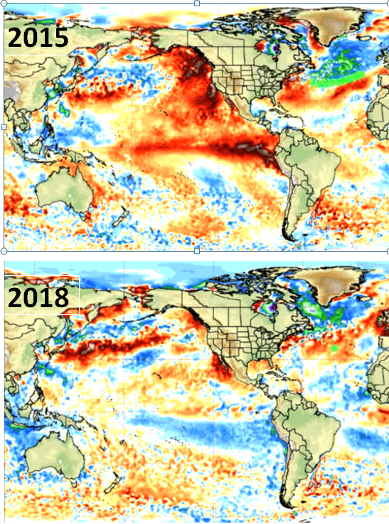 couretsy of weatherbell.com
Anthropogenic Global Warming is a failed hypothesis, all GCMs based on this hypothesis failed in their predictions from 90-300%, thereby falsifying the hypothesis.
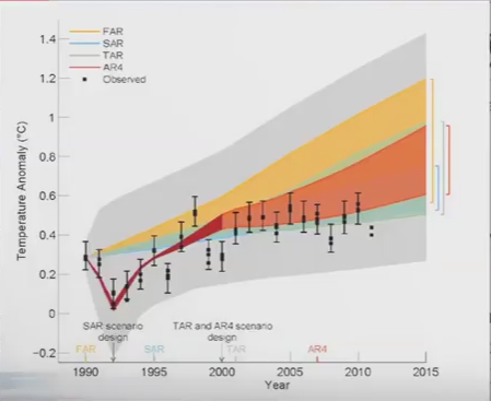
Graph courtesy of Steve McKittrick
Global Warming as was seen during the 20th century was a cyclic event and the claims of anthropogenic accelerating of the warming have been disproven a number of times, and when it comes down to it, there is no changing the mind of an AGW alarmist as theirs is an ideological belief and it is such ideological beliefs that rob a rational person of the ability to reason. They will dismiss all the science that shows that the AGW claims are false as the lies of the oil companies which is one of the greatest ironies of the whole climate change debate, because the UN agencies that collate and distribute this global warming propaganda such as UNEP, WMO or ICPP were all created by the life-long friend of oil baron Rockefeller and oilman himself till the day he died, Maurice Strong. And it was Maurice Strong who wrote the mandate for the IPCC limiting what they do to the human contribution to climate change. Therefore the IPCC terms of reference are limiting and as such are not scientific.
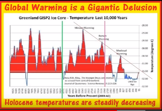
The warming of the 20th century was a repeating blip that occurs approximately every 1000+/- years and a thousand years ago during the Medieval Warming it was much warmer and go back another 1000+/- years to the Roman Warming when it was even warmer. These are not lies but data obtained from proxy records such as ice cores. From this data set alone, we can see that if it was warmer back then when CO2 levels were lower then human industrialization did not contribute to the warming of the 20th century.
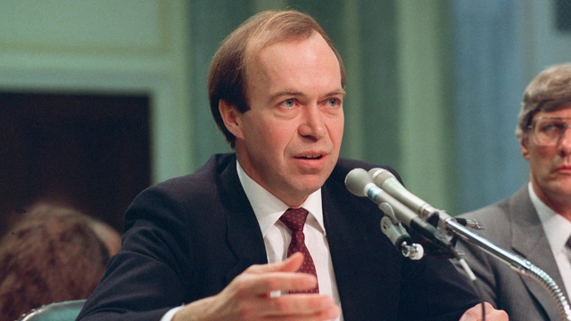
There is an interesting story about this testimony in Dr Tim Ball's book "The Deliberate Corruption of Climate Science" of how they planned this testimony to take place on what was historically known to be the hottest day of June and had all the windows open so the AC was ineffective, so that as he was testifying everyone present was sweating profusely driving home viscerally the point they were trying to make. In the CBC article, they even reference it as "a record hot June day ".
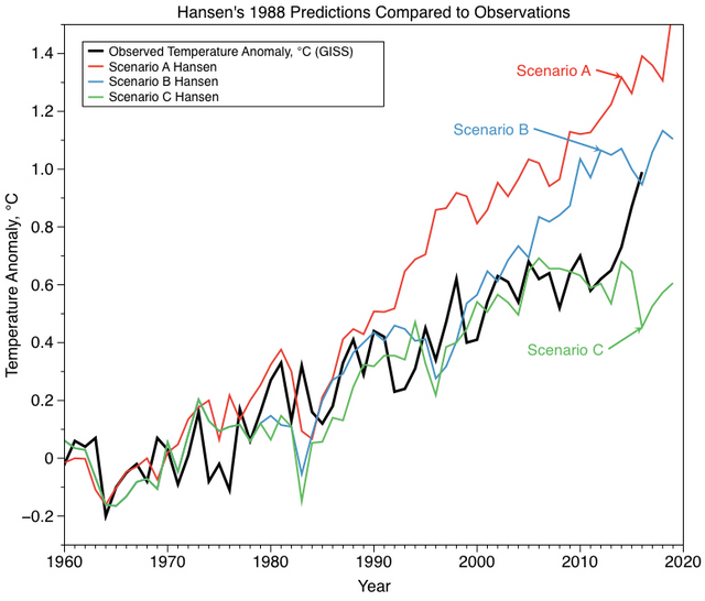
Back to the CBC article; they say, "Three decades later, most climate scientists who have been interviewed rave about the accuracy of Hansen's predictions given the technology of the time."
Most climate scientists? The accuracy of Hansen's predictions?
Hansen's predictions were not accurate which is why they do not show a list of his so-called "accurate predictions". If they were, I am sure like anyone wishing to prove their case they would show what predictions he made and how they turned out true. As for the claim of "most climate scientists", it is irrelevant if Hansen's predictions are not corroborated by observation. And such claims of consensus in science are not scientific. The history of science is rife with examples of when consensus science proved to be wrong. In science it is not about consensus, it is about following the data..
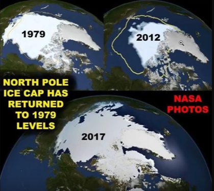
In the CBC propaganda piece, they show an image of sea ice levels from September 2017 to prove their case that Arctic Ice is melting, but the question you must ask yourself is why would they show you sea ice from 2017, why not a more recent image. And is there any relevance of using an image from September?
Last query first. If you know the cyclic pattern of sea ice melt in the Arctic you would know that this September image represents sea ice at the end of the summer melt for after September the ice begins to refreeze. This is a case of cherry-picking data to present the worst case scenario when the ice would be at its lowest for the entire year.
Or better yet.
%20GSM%20Update%207_14_18%20-%20Galactic%20Center%20Revealed%20-%20Volcanic%20Uptick%20-%20Gl_'%20-%20www_youtube_com_watch_v=2MyEfIe1i58.png)
This graph from the Danish Meteorological Institute shows a year over year comparison and compared to this time last year Arctic Ice is increasing and has eclipsed the 30-year average. why use an image from 2017 because Arctic Ice is not melting as the mainstream media liars keep claiming and in 2018 it is at its highest level in decades.
To end this propaganda piece by the CBC they quote James Hansen.
"If scientists are not allowed to talk about the policy implications of the science, who is going to do that? People with financial interests?" Hansen asked.
And it has been people with "financial interests" that have been pushing this AGW narrative from AL Gore partnering with former Goldman Sachs CEO to create a company that trades carbon credits to which Mr Gore seems to profit to the tune of $50,000,000.00/yr. Yes, that is fifty million dollars a year. To Enron, prior to its collapse, it was integral in lobbying for a cap and trade program for carbon because it had profited immensely from the previous cap and trade program for sulfur dioxide, to Maurice Strong who created and defined all the UN agencies that bring you this lie.
The world is cooling as we head into the Eddy Minimum also known as The Cosmic Ray Maximum. Global mean temperatures according to GISS is down 0.6*C as winters the past two years were longer than normal causing crop losses globally. First by freezing, then by torrential rains and flooding, then by hail and to top it off, to hammer the nails in the coffin of many crops, a summer drought. This has happened before during prior global cooling periods, but the mainstream media won't tell you that.
IceAge Farmer's interactive crop loss map
Check out the map linked above where crop losses are being recorded. Each and every flag on this map constitutes a serious crop loss event and more often than not, constituted a regional crop loss and not just a single farmer's crop loss. The one thing I do not know is how many years of these crop losses will it take to pose a threat to all of humanity. I am certain in my belief that within a year or two we will see a lot more price caps on food in poor countries as they try to limit exports to richer countries so as to feed their own people. Grain crops the past two years have been devastated globally and one can expect to see price increases from 20-30% by the end of this year.
By continuing to believe this FALSE FLAG that is Anthropogenic Global Warming is to potentially put your life at risk. If you are not preparing to ensure your food security you may find yourself not only cold but hungry. The historical record of events like we are about to see are dismal and paint a scary picture of depopulation due to starvation and disease. And depopulation has been on the Globalist Agenda ever since Malthus first made his predictions regarding overpopulation. For more information that supports the claims herein, check out some of my other posts on this subject.
Glaciers in the Grand Solar Minimum
The Grand Solar Minimum and the New Cold War
Thank you for reading. If you would like to see more posts like this then please feel free to follow me. Leave an interesting question or comment below and I shall follow you.
Let's get a conversation started.
Compiled and written by Freddie Thornton
PEACE
@daemon-nice