Simple Methods For Beginners In Graphic Design
Yes, if you are not even graduated from graphic design school, still you can enjoy some achievement with DIY philosophy. So this reading is about how graphics are designed and what are the general principles that can be applied. Before reading any further please keep in mind that I am not a professional graphic designer. I just wanted to share from a hobbyist point of view how some thoughts can be expressed more powerfully by using practical methods on visuals.

Photo by Glenn Carstens-Peters on Unsplash
Of course, graphic design cannot be limited to a blog entry, it has a lot of disciplines to learn, like color theory, calligraphy, photography, vectors, and pixels etc … Here in this entry, I am simply sharing what could be done by using design programs like Canva. Also, the main point is to explain how to make a simple design instead of explaining how to use specific software, you may find alternative programs or platforms that offer different features instead of Canva.
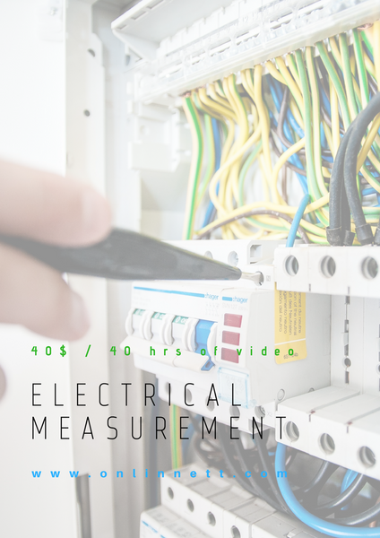
To visualize the words below, I will just make an example design of an educational poster, maybe a poster of an online course specialized in technical training. None of the links or information is real!
A Picture Worth A Thousand Words
As you know when it comes to expressing ideas, images or illustrations are great tools instead of words. So the first thing I did is to search for images in Canva library with “industrial” keyword. My aim was to find something industrial since our audience is from the technical world. When I am satisfied with the image that includes some electrical components, I just placed on the canvas and resized it. Then I decreased the opacity not to distract the viewer's attention by rich colors.
As a side information, they say that the human eye follows patterns from top left to bottom right. Well, of course, it may differ depending on which part of the world you are from.

Use Contrast Wisely To Highlight
On the other hand, maybe the best way to highlight something in a graphic is to use contrast. It can be the size of the words, pictures, empty vs filled space, complementary colors, directions and alike. I think it helps you to identify one element with respect to another one. So it is a kind of biasing happens here. Maybe our visual perception likes to compare stuff around, to identify them.
Here I added some text with different sizes and thickness to create contrast. I wanted to catch the viewer eye by highlighting “electrical measurement”. So if he or she is a technical person from the related field, then this brochure can continue to serve its purpose. Also, I wanted to put the web address (imaginary) of the service if more information needed. Another piece of text gives some important information since it is about the price and the medium of the course delivery. My aim was to put the price for all the course as well as the duration. So by just looking you can understand the course is in video format, takes 40 hrs to complete and the total price is 40 $.

But the problem here is the text is dissolving in the background. It is not easy to read. So we need a safe space for the text. It could be done by an empty white shape.

Repeat Repeat Repeat
As you know if something is repeated often, then the chances for it to be remembered goes high as well. It will not only strengthen the idea but also make it ordinary as something you are used to. As of everything the doses has to be just of right amount. So here I chose to repeat colors of green and blue from background cables. And main title in black which is also the probe’s color in the background. There may be other elements to repeat in your design, it is not limited to colors, it can be shapes, patterns etc...
Additionally, I placed an imaginary logo with blue and green colors at the top.

Seperation
The text of relevant areas has to be separated from the rest. Or you can think that identical ideas or information has to be together and should be distinguishable from other elements. It is also a visual categorization.
To apply this idea, course information, topic and URL also separated from each other by different font types as well as color, size and thickness variations. But still keeping all the text in one area instead of distributing all around.
Align Properly
There should also be a consistent way to tidy up items in the design. This can be easily established by use of alignment. Edges of shapes or finishing can be used for alignment. But for text, it is not advised to align a paragraph with the justified type which stretches the text from the right and left to the sides. This is just not natural and creates unexpected spacings between words that distract eyes when reading.
If you look at the design, the green, blue and black text has the same starting and ending lines. This can be achieved by playing the space between characters which is called tracking. You can also adjust space between lines by playing with the leading.
Last Words
Before publishing the design if we look at the general picture, white space used for the text can be mixed with the background where this visual will be used. Just to avoid viewers eye to escape into this distraction, I found it useful to confine everything with a frame. If you ask why is it orange, then my answer would be to choose a complementary color right across green and blue to create a triad…

That’s it for now, hope this small share helps you sometime in somewhere.
Resource:
The Non-Designer's Design Book - Robin Williams
Congratulations! This post has been upvoted from the communal account, @minnowsupport, by m1alsan from the Minnow Support Project. It's a witness project run by aggroed, ausbitbank, teamsteem, someguy123, neoxian, followbtcnews, and netuoso. The goal is to help Steemit grow by supporting Minnows. Please find us at the Peace, Abundance, and Liberty Network (PALnet) Discord Channel. It's a completely public and open space to all members of the Steemit community who voluntarily choose to be there.
If you would like to delegate to the Minnow Support Project you can do so by clicking on the following links: 50SP, 100SP, 250SP, 500SP, 1000SP, 5000SP.
Be sure to leave at least 50SP undelegated on your account.