Technical analysis rules
I have been trading Forex and Stocks for about 3 years now, and still have much to learn. One thing I have learned is to try and keep the charts from too many indicators, and clutter. My key indicators are MACD, RSI, 200MA, and volume. I use a series of charts to determine trends and entry.
Multiple time frame analysis is the best way, I have found, to enter into any stock, currency, or crypto.
So we have to determine what type of trader we are, whether we can handle our emotions for long periods of time, or whether we just like to live our daily lives without the thought of checking our portfolio a million times to see if we're up or down. Personally, I am a swing trader, usually my trades last a month to a couple months. Sometimes even a year. With crypto though, it seems more like a long term play, and whenever i'm in a decent amount of profit, I will then diversify my funds out into other crypto's or even convert back to Fiat to diversify elsewhere.
So as a swing trader, I use the Daily(D), 4 hour(4H), and the 1 hour(1H) charts.
On the daily chart, you find the overall trend, the direction of the stock, currency, or crypto,
After identifying the overall direction, you then dial down to the 4 hour chart and get more information on the general trend, identifying if the trend overall is being followed by the more detailed 4H chart..
Following 4H we dial down to the 1H chart and finally fine tune the entry, searching for the lowest volume areas and looking for the reversal in the trends.

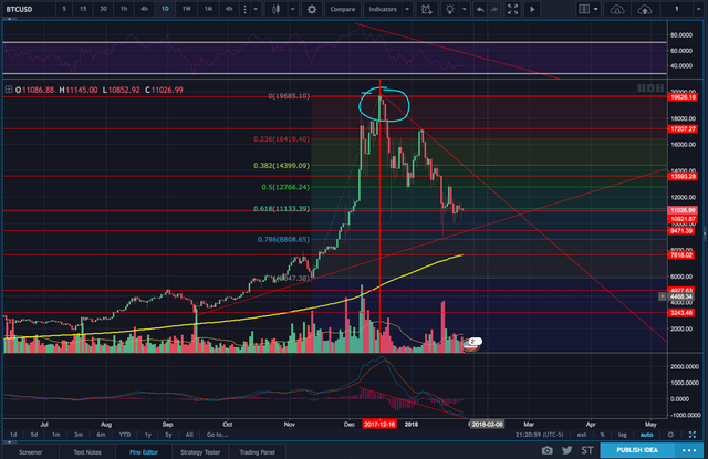
Shown here is a 1 Day chart of bitcoin, The circled area is the All Time high. RSI and MACD histogram, as well as MACD and signal lines have peaked out previously. So there are some signals already. But let's dial down to the 4hr.

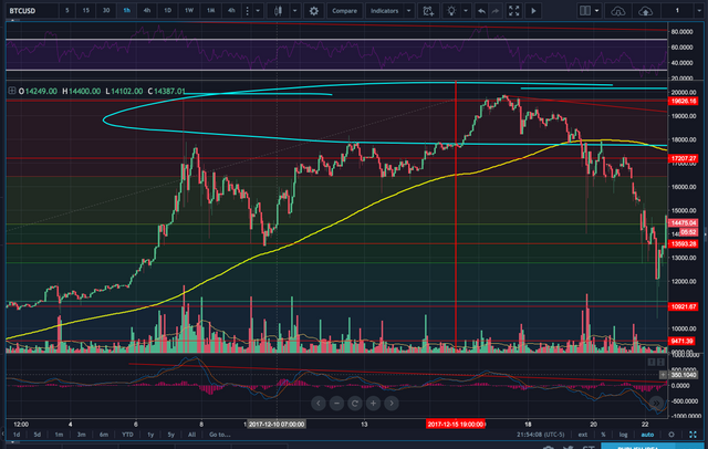
The 4hr chart shows us from the previous high, where the RSI spike was, that price was already not sustaining the move up. Volume was already coming down which showed that price wasn't going to be sustainable at the top. The MACD histogram didnt follow the price move back up to 20k. And the RSI didnt go higher than before with the sustained gradual move to 20k.

In the 1 hr chart, we see also that volume was following with the march up to 20k.

With the zoomed in picture of the 1 hr chart. We see that the peak at 20k, circled at the top in blue, and above that in purple is the RSI, the RSI had been coming down already, diverging from the price. We go to the middle blue circle, which shows that volume is decreased here at the top.
And the bottom blue circle, we see that the MACD histogram wasn't following the price movement up anymore, the pink lines had flipped downwards into the negative area. The signal and MACD lines are coming down from there as well.