RE: I'm starting to learn Node.js and Steem apis: Lorenz curves of post rewards for past two weeks
I think it's important to point out that the last couple of weeks have been – unusual, to put it mildly, compared to historical data
Yes, the focus on recent weeks wasn't because I think that's the most interesting data, but just to keep things constrained while the project is in its early phases. Once I have more automation in the flow and more confidence that everything is working properly I'll have it look at a longer historical record.
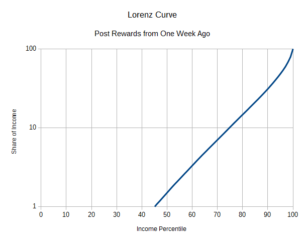
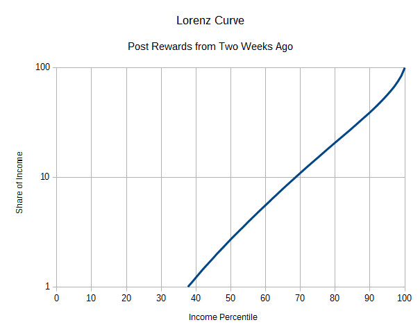
It might be helpful to do a log scale on the share percentages along the Y axis.
I've never seen a curve like this on a nonlinear scale before, but I suppose it couldn't hurt to see if it helps make it easier to interpret the data. It's not clear to me that the curves should be exponential if we're just extrapolating from first principles, but from eyeballing these it does seem to be a good approximation. Here's what it looks like when I switch the charts from the first post to log scale on the Y axis.
This is a pretty good plan. It's also really good stage to start thinking about what kind of tools you can use to present your findings in graphical form a little more clearly. Habits you build at this point will serve you really well going forward.
In particular, start looking at ways that you can put these curves on the same graph so that they can be visually compared in a very direct way. Different colors on each and a slightly lower opacity for the line so that you can see when they cross is a good start. Also, for logarithmic Y axes, you're going to really want to do more than one horizontal indicator bar so that the casual observer can see that the progression is logarithmic and tightening as it goes up. No more than eight or it gets really messy in this amount of space, but less than five I don't find to be quite as useful.
I was just reading an article the other day on graph presentation (though focusing on temporal series rather than snapshots, but you will want to be doing temporal series relatively soon if you keep going down this path) that was really helpful.
Looking at what we have right in front of us with these curves, even without laying them over one another we can see that the left side starts further to the right in the newer data but it still retains that interesting upward hook feature at the end, even with a logarithmic presentation. A cynical take might be that a lot of the accounts that were getting the smallest shares of income stopped posting between those periods – but since we don't know who those accounts are (and some of my poking around a couple of years ago suggests that there are a lot of very small post/reward collectors who aren't human at all), it's impossible to really interpret what that might mean.
Good stuff.