The Curie Logo - The creative process behind
Today I would like to dedicate this space to the design I did for the contest of the @curie community. The creative process, which led me to submit different achievements, is part of a single elaboration, made up of revisions, corrections and extensions that I believe deserve to be told a bit.
My landing on steemit is recent, I started to understand the elements that make up this social for a short time.
Time enough to establish that activities such as those carried out by communities like Curie are essential for this wonderful ecosystem.
Representing concepts such "meritocracy" and "discovery" do not fall under the canons of traditional design. Not really. This is why I took the opportunity, as a unique opportunity.
The canons that I imposed for this realization had to be:
- Meritocracy
- Community
- Joy
The Joomla Logo - The Open Source Matters Foundation
For this, I immediately put some good music, and started this project:
🎧 The right soundtrack for me was Tycho's "Specter", enjoy the listen, is highly recommended.
In the first phase I collected some ideas for the representation, and capture the concepts behind great logos. There are good examples around, such Joomla , MySpace , which has made their logo a powerful tool for communication. The result of this first approach was a simply symbol:
To which I added the element of the upvote.
However I was not satisfied with the resultant. Although the composition expressed valid concepts of community, as per my habit and experience, I began to connote inverse aspects to the primary concept, as an action of self-evaluation. This logo could have expressed the exact opposite: that is, concepts of centralization and "round table" effect.
So I started again to sketch other solutions:
But I was not satisfied with the result yet.
I drew on some design experiences that took place in the last period. In particular, the logo created for the "Scoop" product of Saggoss Inc. London, You can take a look here. In this case my client appreciated the concept of circular element, cellular, aggregation. So I thought about resuming these concepts, and rework them for Curie.
Personally I love the representations of organic elements through geometrical schemes, when this happens, You could obtain a result of very strong harmony.
The first solution obtained had a strongly geometric and irradiating appearance.
I was not satisfied yet.
I needed to give a more dynamic sense, that would expose energy and movement.
So I thought about giving a ray bending:
On this result I decided to stop. Adopting a curvature allowed to add notable elements, without altering the good perceptibility of the logo. The geometric arrangement and the orientation of the elements has returned a strong balance, guaranteed by the optical play of the weights.
Optical weights are actually unconscious perceptions, which are attributed to symbols and visual elements. These are very important, in reality they change a lot from culture to culture, in my case "as a Western culture" the values returned are mainly three:
- The central part: or rather "the ratio" (read as latin word), the motive of all this energy.
- The right side, expresses friction, dynamic effort and descent. An energy negative necessary to get its positive. Concepts that go well with meritocracy, the effort of study and the achievement of knowledge.
- The left side, instead, expresses concepts such as ascent, ascent, positive energy and sustainer. Concepts that join with meritocracy, the existential becoming supported by effort, the reward.
All expressed in a continuous progress, as suggested by the good @SkippyZA almost to evoke the ancient art of oriental mandalas.
The points, in a community context, finally become people, energy, joy and life.
Well yes, joy finally. The very reason to exist for any community.
Despite the "venal" meanings that I feel to attribute to steemit, I feel I have found in Curie a community in search of an authentic values. Made of good contents, of people who celebrate life and human beings every day. Is this the same sense of modern "currency" in actual and future living?
Joy?
Absolutely yes.
They are.
Let's make it joyful:
Another point that led me to dwell on this solution was usability.
For a good brand to be effective, I make sure that this can be used in a creative and fun way without diminishing the essence, indeed, trying to understand how the essence of the logo can be enhanced and brought to new levels. This is why I created a series of ready-to-use graphic elements:
Blog Messaging
Power Signature
Blog Elements
Last but not least, the Typography.
Being a brand built on absolute geometries, I wanted to keep geometric shapes even in the typography, but at the same time give a touch of personality. I have a good source for this goal, and it is the Emigre foundry. Their fonts are legendary, characterized by harmonious shapes and geometries and rich in personality, such as to sound like pop music for our eyes.
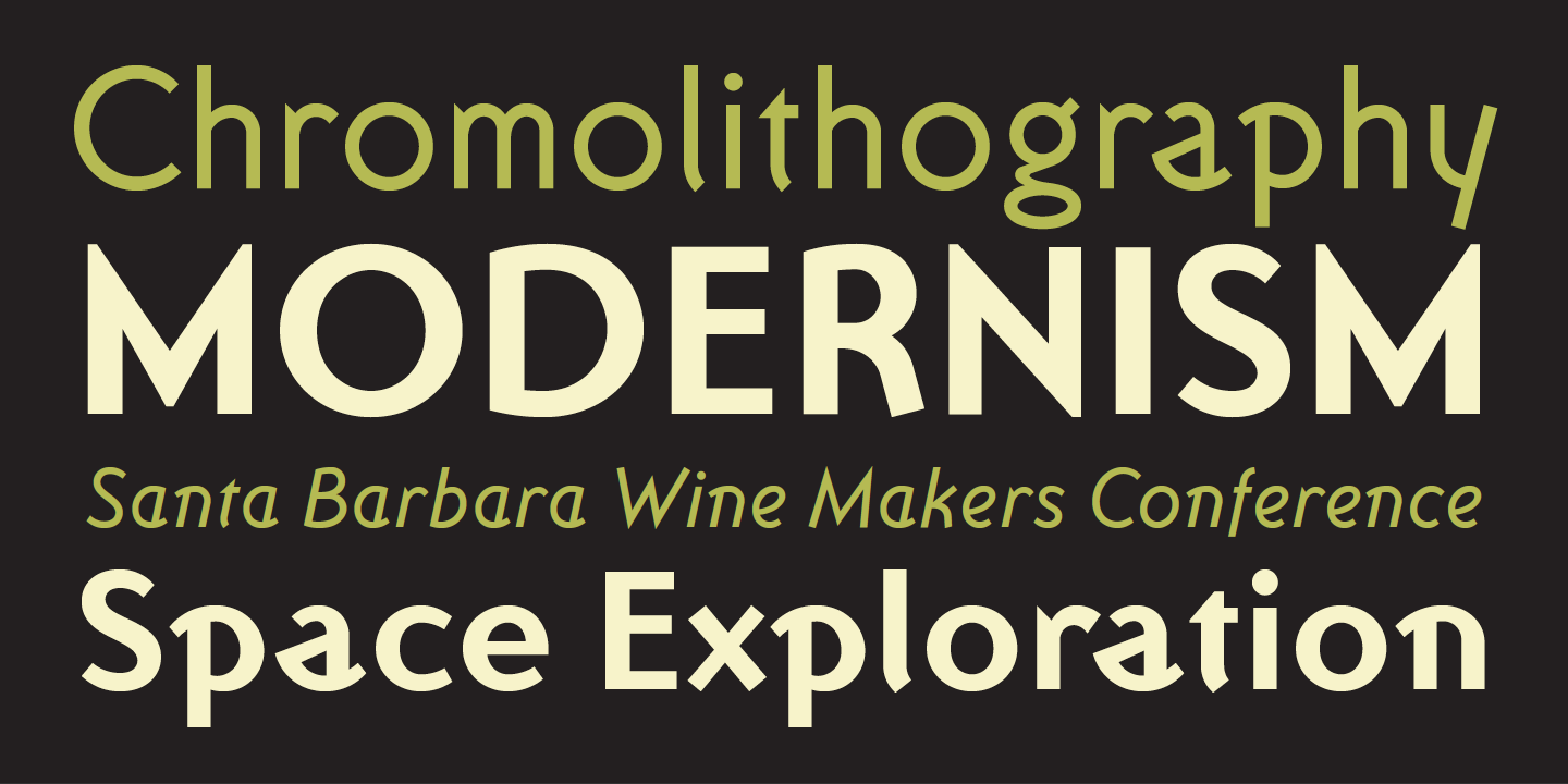
Ottomat Font - is property of Emigre, Inc Designed by Claudio Piccini
In my case, the choice fell on "Ottomat" font, designed by the excellent Claudio Piccinini. The package will be donated with license of use to the Curie team for any purpose. For those who want to deepen the vision of this talented designer and his personal elaboration of the Ottomat font there is a pleasant interview on the Planet Typography magazine:
http://www.planet-typography.com/news/designer/piccinini.html
Enjoy!
I’ve done a little bit of reading up on logo design before, I was surprised at the depth of meaning that can be put into a logo. The key is that it needs to be clever yet simple (looking). Logos are deceiving in that way. I loved seeing your process and reading about your thoughts going into the development. Very fascinating, I find logos tend to lean more on psychology that other forms of art, really interesting 😃
hi @wildempress, thank for sharing Your perceptions, it's the kind of reflections I like. 💚
The logos making is absoluting a fascinating process.
I agree that the logo design is lean to psycology, but I see also a matching with all the arts. I thinking about music. A good pop-music also makes everyone agree. I belive that most of the cases, it's always a matter of solicitation, watching a logo, listening music, enjoy arts or literature.
Very creative and looks amazing as well. you must win this.
Earned yourself a new follower.
Good luck btw!
@overdye was in fact the winner :)
How did you know? wasn't it announced only 20 minutes ago?
@carlgnash is one of the topmost top curie curators. He probably had a hand in choosing the winner.
😆 "Topmost top" sounds very revering and I love how you threw it in.
hello buddy congrats you really done great and your design was exceptional keep up the good work.
Good post!
Hi @oliveralexander,
Many Thanks!
congrats!buddy your the winner your design was creative and with valuable meaning .
hi Overdye.... congratulation , your design attracts currie's attention and make hime choice you as a winner.
Not easy job :-)
there were really so many solutions.
Beautiful experience!
Hi Diego, I am writing this as an appreciation for you, i hope you like it :-) warm greeting from Indonesia.
https://steemit.com/contest/@ihansunrise/congratulation-overdye-the-1st-winner-curry-logo-design-contest
Honored by your post. Really.
Thank you for spending such sweet words.
🙏
Thank you so much.
💚💚
By the way, I really love Your country,
Hope to visit once in my life!
Genius concept you put together! Especially power signature aspect!
Thanks @scuzzy!!
So happy You like it!
😊
Congrats for the winning man! Excellent work!! I love this logo!
Thanks @dexpartacus
Would be nice see it used soon!
I hope too!😉
Really well done! Good job and congrats!
Many Thanks @askeb,
I'm glad You like it!
Congratulations @overdye, this post is the third most rewarded post (based on pending payouts) in the last 12 hours written by a Dust account holder (accounts that hold between 0 and 0.01 Mega Vests). The total number of posts by Dust account holders during this period was 16380 and the total pending payments to posts in this category was $3316.75. To see the full list of highest paid posts across all accounts categories, click here.
If you do not wish to receive these messages in future, please reply stop to this comment.